
Old Rocks
Diamond Member
- Thread starter
- #221
LOL. So you are going to show me how one degree in a thousand years has the same slope as over one degree in one hundred and fifty years. This should be fun.Good God, again, you claim to be an engineer?No. The slopes are not very different. Use your eyes. But even if they were, that doesn't mean diddly squat. The reality is that we are still below the peak temperatures of the last 4 interglacial cycles. What part of this do you not understand?LOL Goddamn! Engineer, eh? Lordy, lordy. The slopes of the lines are very different on a graph with the same scales for time and temperature. That you cannot grasp that puts a lie to your claim to be an engineer.
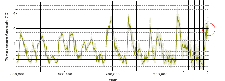

In the upper graph, on the Y axis, the distance for ten degrees is the same as the distance for one degree on the bottom graph. On the X axis, the distance on the upper graph for 200,000 years is only about 700 years on the bottom graph. So the slopes are very different if you put them on the same scales. It took, on the upper graph, a minimum of ten thousand years to warm from the bottom of the glacial, to the maximum warmth of the interglacial. That is less than a degree every thousand years.
So, on the bottom graph, put a dot at -1 degrees at 500. Now put a dot at 0 degrees at 1500. Draw a line between them. That is your slope for the glacial to interglacial warmup. Now look at that slope on the last 150 years. That is a fairly accurate comparison of the two slopes. Dingleberry, you are rapidly demonstrating that you intellect is in the same class as SSDD and Frankie boi.
So, you have a rise of about 1 degree in a thousand years, and you have a rise of over 1 degree in 150 years, and you are stating that you cannot see them on the lower graph? Man, no way you are an engineer. Yes, you can calculate the slope of a line, but you can also graph that line. And the line on that graph from -1.0 degrees at 500, to 0 degrees at 1500, a span of 1000 years, has a far lower slope than the line on that graph that shows the slope of the rise in the last 150 years. That you would argue with that demonstrates you are completely unable to read simple graphs.
I guess I am going to have to show you graphically what I am saying for you to understand.


