We get all that. The point in question is what you said in post #8.
excalibur said:
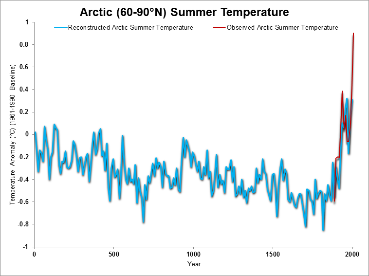
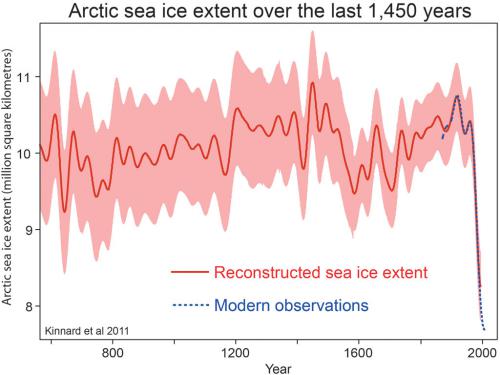
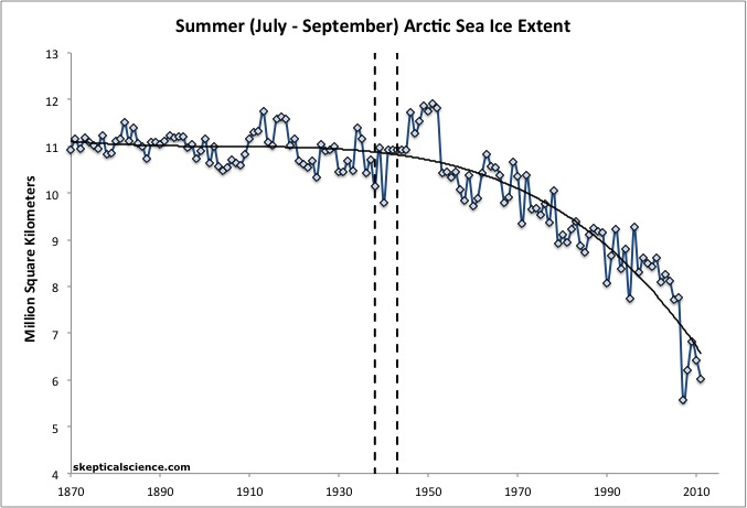
There is actually satellite data from the early 1970's until 1979, which shows that the AGW crowd chooses to ignore. Why? Does not fit their meme
So, first you told us all how awful it was that the pre-1979 data wasn't being displayed.
We then displayed the pre-1979 data.
Now you're telling us how awful it it that the pre-1979 data _is_ being displayed.
Why the sudden complete flipflop?
It appears as if you're cherrypicking, deliberately leaving out the data that contradicts your claims. Good data exists prior to 1973, and you refuse to use it. Throwing out good data is a mark of pseudoscience.