Correlation between temperature and CO2

It seems to me that you are the one who is profoundly stupid. You don't grasp the implications of what you say.

Without CO2 all the 15 micron IR produced by the surface would fly away to space at the speed of light. You cannot expel energy faster than that.

It still flies off into space at the speed of light. Pressure and water vapor's ability to hold energy is what maintains our temperature...other than water vapor, the composition of the atmosphere is irrelevant.

You are a dupe.
 
Somehow, I think I will go with atmospheric physicists like Jim Hansen, rather than a anonymous poster on a internet board. Virtually all the atmospheric physicists state that the GHGs are the primary cause of the rapid warming that we are seeing.

The correlation is what it is. The data is what it is.

Are you arguing that the data is wrong? That the correlation is wrong?

Isn't it true that something like a fifth of all anthropogenic CO2 has been released since the millennium? With very little warming even with all the adjustments?

CO2 warming is exaggerated not non-existent.
CO2's impact can not be discerned from noise in our climatic system.. When you assess all natural causes, the amount that is man caused is so minuet that it is meaningless.. The water cycle simply lays it waste.


I agree that it is difficult to discern the CO2 signal from the noise.

What the actual size of CO2's warming influence is is up for debate. Just because it is lost in the noise, that does not mean it is tiny, just inseparable. I think the 1C/2xCO2 is probably pretty close. Of course we don't know how much it took for the first degree of warming. Are we in the fifth doubling or the tenth?

Where do the feedbacks occur? Some are close to the surface but others could be further up and even less understood. And let's not forget that the quality of the energy trapped and recycled by CO2 is poor. The potential for doing work and powering changes is low to non-existent. The climate models are wrong in equating it as equal to solar input.

The climate sensitivity estimates for doubling CO2 have dropped a lot over the last twenty years. From well over 3C to less than 2C, even though model predictions for a hundred years out remain the same (?!?!?).
where I liked the chart you posted, the fact remains, that after years of attempting to prove CO2 warms, you have failed. And you continue to fail. CO2 warming is non existent. Unless you have an experiment.
 
Somehow, I think I will go with atmospheric physicists like Jim Hansen, rather than a anonymous poster on a internet board. Virtually all the atmospheric physicists state that the GHGs are the primary cause of the rapid warming that we are seeing.

The correlation is what it is. The data is what it is.

Are you arguing that the data is wrong? That the correlation is wrong?

Isn't it true that something like a fifth of all anthropogenic CO2 has been released since the millennium? With very little warming even with all the adjustments?

CO2 warming is exaggerated not non-existent.
CO2's impact can not be discerned from noise in our climatic system.. When you assess all natural causes, the amount that is man caused is so minuet that it is meaningless.. The water cycle simply lays it waste.


I agree that it is difficult to discern the CO2 signal from the noise.

What the actual size of CO2's warming influence is is up for debate. Just because it is lost in the noise, that does not mean it is tiny, just inseparable. I think the 1C/2xCO2 is probably pretty close. Of course we don't know how much it took for the first degree of warming. Are we in the fifth doubling or the tenth?

Where do the feedbacks occur? Some are close to the surface but others could be further up and even less understood. And let's not forget that the quality of the energy trapped and recycled by CO2 is poor. The potential for doing work and powering changes is low to non-existent. The climate models are wrong in equating it as equal to solar input.

The climate sensitivity estimates for doubling CO2 have dropped a lot over the last twenty years. From well over 3C to less than 2C, even though model predictions for a hundred years out remain the same (?!?!?).
When you consider that the current warming trend is not unusual or faster than previous trends and that CO2 rise is offset from warming by as little as 20 years but always lags warming,it is a trailing indicator and not a cause.

Even in your OP you can see the crossover from warming to cooling as the paths cross and temp falls while CO2 continues to climb.. CO2 will soon follow.

Now all you need is proof that CO2 is causing warming as your graphing shows quite clearly that it is not a cause.
HEY IAN....THIS^^^^^^^^^^^ Billy's got it perfect. fking perfect thanks Billy!!!!
 
The Four Known Scientific Ways Carbon Dioxide Cools Earth’s Climate | Principia Scientific International

Ian, again......you need back radiation and folks, it ain't there. just ain't

"Back-Radiation
Greenhouse gas theory to support the notion of global warming, postulates heat transfer from cold atmosphere down to warm surface, heating surface further. The Kiehl-Trenberth diagram says back-radiation transfer rate is 333, which is 2.1x that impinging surface from the sun, 161. This extraordinary value defies common experience.

I have shown the existence of any back-radiation would violate the Second Law of Thermodynamics; heat only transfers from hot to cold or from high intensity radiators to lower intensity radiators. If back-radiation existed, it would lead to creation of energy, a violation of the First Law of Thermo, constituting a perpetual motion machine of the first and second kinds, which is impossible, but just what AGW proponents need to support their perpetual global warming idea."

I loved this at the end of the piece:

"Since I can’t find a mathematical description of a consensus greenhouse gas theory, I call it a greenhouse gas hunch. After all, CO2 is green plant food. No self-respecting environmentalist would consider depriving Earth’s flora of its sustenance. Even for personal political or financial gain. Would they?"
 
It seems to me that you are the one who is profoundly stupid. You don't grasp the implications of what you say.

Without CO2 all the 15 micron IR produced by the surface would fly away to space at the speed of light. You cannot expel energy faster than that.

It still flies off into space at the speed of light. Pressure and water vapor's ability to hold energy is what maintains our temperature...other than water vapor, the composition of the atmosphere is irrelevant.

You are a dupe.

You have been repeatedly shown the radiation profile reaching a satellite from the atmosphere. Some bands radiate at the full power of surface temperature, showing they escape directly. The CO2 15 micron band radiates at a power that corresponds to about minus 60C, far up in height and considerably less than surface temperature.

I know you want to sidetrack over to water but we should clear up CO2 first. Do you agree that more 15 micron radiation goes in at the bottom than comes out at the top? If you disagree then what is your evidence?
 
The Four Known Scientific Ways Carbon Dioxide Cools Earth’s Climate | Principia Scientific International

Ian, again......you need back radiation and folks, it ain't there. just ain't

"Back-Radiation
Greenhouse gas theory to support the notion of global warming, postulates heat transfer from cold atmosphere down to warm surface, heating surface further. The Kiehl-Trenberth diagram says back-radiation transfer rate is 333, which is 2.1x that impinging surface from the sun, 161. This extraordinary value defies common experience.

I have shown the existence of any back-radiation would violate the Second Law of Thermodynamics; heat only transfers from hot to cold or from high intensity radiators to lower intensity radiators. If back-radiation existed, it would lead to creation of energy, a violation of the First Law of Thermo, constituting a perpetual motion machine of the first and second kinds, which is impossible, but just what AGW proponents need to support their perpetual global warming idea."

I loved this at the end of the piece:

"Since I can’t find a mathematical description of a consensus greenhouse gas theory, I call it a greenhouse gas hunch. After all, CO2 is green plant food. No self-respecting environmentalist would consider depriving Earth’s flora of its sustenance. Even for personal political or financial gain. Would they?"


I don't think you have a fucking clue about any of the PSI 'proofs' that you linked to. I dare you to prove me wrong.

One interesting point that they made concerns Trenberth's cartoon. He took the shortcut of representing all the energy leaving the surface, and all the energy returning from the atmosphere, as radiation. Yet he also added in a spot for thermal and the water cycle that was outside of the actual energy budget.

I have pointed out this flaw on numerous occasions only to be met with deafening silence. I won't repeat myself unless there is specific interest.
 
Somehow, I think I will go with atmospheric physicists like Jim Hansen, rather than a anonymous poster on a internet board. Virtually all the atmospheric physicists state that the GHGs are the primary cause of the rapid warming that we are seeing.

No, not virtually all. Only the ones who are getting paid to fool dupes like you...hook..line....and sinker!


I think narrowness of focus and groupthink, combined with a liberal sprinkling of incompetence, are enough to explain the pathetic performance of climate scientists.
 
You have been repeatedly shown the radiation profile reaching a satellite from the atmosphere. Some bands radiate at the full power of surface temperature, showing they escape directly. The CO2 15 micron band radiates at a power that corresponds to about minus 60C, far up in height and considerably less than surface temperature.

Well, at least you are partly right. Those profiles have come up in conversation, but your belief in models is so strong, that even when you see the evidence that they are wrong, you are unable to accept the fact. As I have said before, it is pointless to go over this with you because you can't accept anything that doesn't jibe with your beliefs, but what the hell, someone may get something out of this even if you can't.

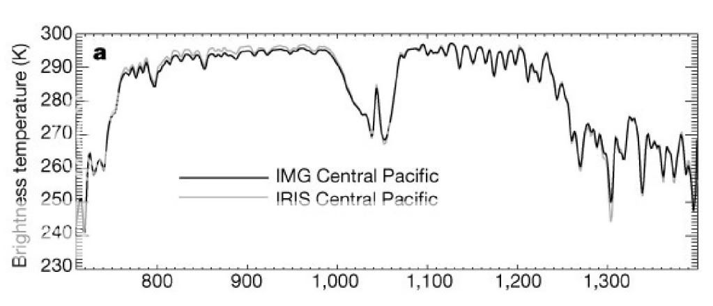
Here is an overlay of snapshots of outgoing long wave radiation taken in 1970 by the sattellite IRIS and in 1997 by the sattellite IMG in 1997. Both snapshots were taken over the central pacific at the same time of the year and under the same conditions.

GT20pic2.jpg


If AGW theory were correct, and the physics that you so fervently believe in were correct, the IMG data from 1997 should show less outgoing longwave radiation in the CO2 wavelengths than the IRIS data from 1970 as there is certainly more CO2 in the atmosphere in 1997 than there was in 1970. As you can see, the longwave radiation from the two separate snapshots is identical indicating no additional absorption of outgoing longwave radiation in the CO2 wavelengths even though there is more CO2 in the atmosphere. What you believe simply isn't happening.

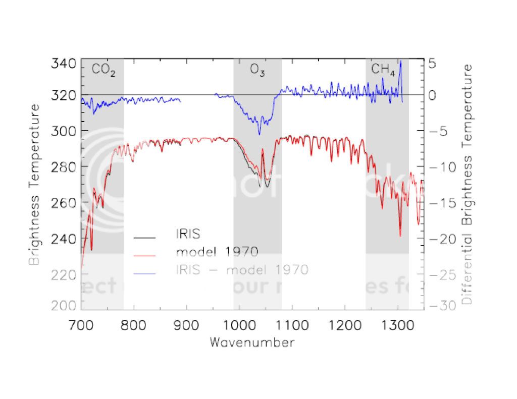
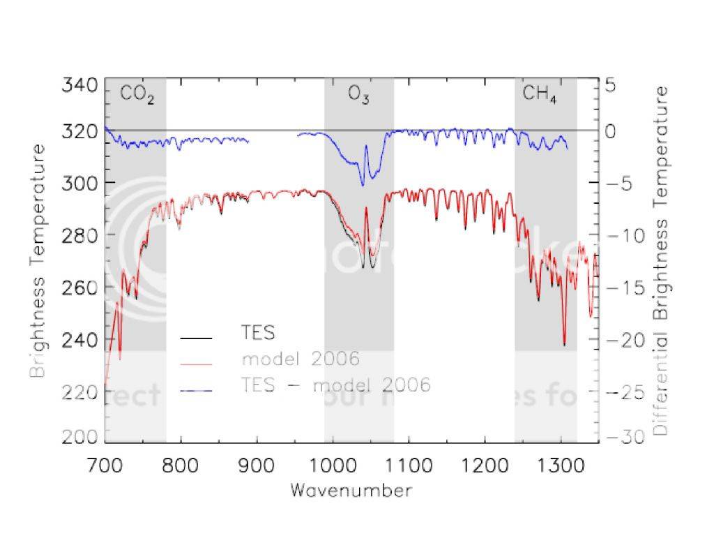
The next two images were taken by IRIS in 1970 and TES in 2006 respectively. In these graphs, the black line represents the actual measurement taken by the sattellite, the red line represents the prediction based on the physics you so fervently believe in and the blue line represents the difference between the model data and the actual data.

GT20pic4.jpg
GT20pic3.jpg


Now copy and print out the two graphs and overlay them. You will find that the black lines (ACTUAL MEASURED DATA) are identical indicating this time, that there is no difference between outgoing longwave radiation in the CO2 absorption spectrum between 1970 and 2006. Again, IF WHAT YOU BELIEVE IS HAPPENING WITH ENERGY IN THE ATMOSPHERE WERE ACTUALLY HAPPENING then the outgoing longwave radiation should be less in 2006 than it was in 1970....it isn't. As the blue lines (difference between actual observation, and the model prediction) on the graphs indicate. As you can see, this is not the case. There has been no increase in the absorption of outgoing longwave radiation in the CO2 spectrum between 1970 and 2006 in spite of the presence of more atmospheric CO2. The higher figures on the blue line indicate that the actual measurement is considerably higher than the model predicts.

The fact is that what you claim is happening simply is not happening because what you believe is happening is magic and as the graphs from 1970 to 2006 clearly indicate, there is no magic in the real world. There is no reduction of outgoing LW IR in the CO2 bands. There is some measured difference in the H2O bands but then water vapor can actually capture and hold on to IR whereas CO2 simply absorbs it and either loses it to a collision with another molecule or emits it on to cooler pastures.

You are wrong ian...your understanding of the physics is wrong and what you believe is happening in the atmosphere is demonstrably not happening.

I know you want to sidetrack over to water but we should clear up CO2 first. Do you agree that more 15 micron radiation goes in at the bottom than comes out at the top? If you disagree then what is your evidence?

CO2 is perfectly clear to anyone not so blinded by their belief in magic that they can't see it when it is posted right before their eyes. CO2 does nothing but absorb and then lose the energy to cooler areas of the atmosphere. That is all it does. It doesn't even slow the escape of IR to space by a nanosecond.

And as to what I "believe"...it doesn't matter..and more importantly, it doesn't matter what you believe either... The graphs above clearly show that all of the additional atmospheric CO2 increase between 1970 and 2006 has had exactly zero effect on the outgoing LW in the CO2 absorption bands. The models predicted a difference but none was measured. Chalk up yet another predictive failure for your hypothesis.

Once again Ian, in real science, how many predictive failures does a hypothesis get before it is scrapped and work begins on a hypothesis that more closely resembles the real observable world?
 
The single focus on just fossil fuels has hindered complete research into why so many of our planets atmospheres are changing.
We need more data that would include the wild fluctuations in our magnetic poles, the change of our axis from the Japan earthquake, more readings and study of our oceans.
We need to add data of the changes our Suns atmosphere.
Add more study & data as to why Mars poles are mirroring our own poles.
Add why Jupiter's red spot has been shrinking since the 1930's.
 
You have been repeatedly shown the radiation profile reaching a satellite from the atmosphere. Some bands radiate at the full power of surface temperature, showing they escape directly. The CO2 15 micron band radiates at a power that corresponds to about minus 60C, far up in height and considerably less than surface temperature.

Well, at least you are partly right. Those profiles have come up in conversation, but your belief in models is so strong, that even when you see the evidence that they are wrong, you are unable to accept the fact. As I have said before, it is pointless to go over this with you because you can't accept anything that doesn't jibe with your beliefs, but what the hell, someone may get something out of this even if you can't.

Here is an overlay of snapshots of outgoing long wave radiation taken in 1970 by the sattellite IRIS and in 1997 by the sattellite IMG in 1997. Both snapshots were taken over the central pacific at the same time of the year and under the same conditions.

GT20pic2.jpg


If AGW theory were correct, and the physics that you so fervently believe in were correct, the IMG data from 1997 should show less outgoing longwave radiation in the CO2 wavelengths than the IRIS data from 1970 as there is certainly more CO2 in the atmosphere in 1997 than there was in 1970. As you can see, the longwave radiation from the two separate snapshots is identical indicating no additional absorption of outgoing longwave radiation in the CO2 wavelengths even though there is more CO2 in the atmosphere. What you believe simply isn't happening.

The next two images were taken by IRIS in 1970 and TES in 2006 respectively. In these graphs, the black line represents the actual measurement taken by the sattellite, the red line represents the prediction based on the physics you so fervently believe in and the blue line represents the difference between the model data and the actual data.

GT20pic4.jpg
GT20pic3.jpg


Now copy and print out the two graphs and overlay them. You will find that the black lines (ACTUAL MEASURED DATA) are identical indicating this time, that there is no difference between outgoing longwave radiation in the CO2 absorption spectrum between 1970 and 2006. Again, IF WHAT YOU BELIEVE IS HAPPENING WITH ENERGY IN THE ATMOSPHERE WERE ACTUALLY HAPPENING then the outgoing longwave radiation should be less in 2006 than it was in 1970....it isn't. As the blue lines (difference between actual observation, and the model prediction) on the graphs indicate. As you can see, this is not the case. There has been no increase in the absorption of outgoing longwave radiation in the CO2 spectrum between 1970 and 2006 in spite of the presence of more atmospheric CO2. The higher figures on the blue line indicate that the actual measurement is considerably higher than the model predicts.

The fact is that what you claim is happening simply is not happening because what you believe is happening is magic and as the graphs from 1970 to 2006 clearly indicate, there is no magic in the real world. There is no reduction of outgoing LW IR in the CO2 bands. There is some measured difference in the H2O bands but then water vapor can actually capture and hold on to IR whereas CO2 simply absorbs it and either loses it to a collision with another molecule or emits it on to cooler pastures.

You are wrong ian...your understanding of the physics is wrong and what you believe is happening in the atmosphere is demonstrably not happening.

I know you want to sidetrack over to water but we should clear up CO2 first. Do you agree that more 15 micron radiation goes in at the bottom than comes out at the top? If you disagree then what is your evidence?

CO2 is perfectly clear to anyone not so blinded by their belief in magic that they can't see it when it is posted right before their eyes. CO2 does nothing but absorb and then lose the energy to cooler areas of the atmosphere. That is all it does. It doesn't even slow the escape of IR to space by a nanosecond.

And as to what I "believe"...it doesn't matter..and more importantly, it doesn't matter what you believe either... The graphs above clearly show that all of the additional atmospheric CO2 increase between 1970 and 2006 has had exactly zero effect on the outgoing LW in the CO2 absorption bands. The models predicted a difference but none was measured. Chalk up yet another predictive failure for your hypothesis.

Once again Ian, in real science, how many predictive failures does a hypothesis get before it is scrapped and work begins on a hypothesis that more closely resembles the real observable world?


First off, I want to thank SSDD for a great American Thinker article!

Articles: The AGW Smoking Gun

This is exactly the right attitude to have towards peer reviewed papers. Look at the data and form your own conclusions. If they disagree with the official conclusion then that is a good area to investigate.

Well done SSDD. Everyone should spend the two minutes to read the article.
 
Modtran_DoubleCO2_NewEquilibrium.gif


Here is the modtran model for doubling CO2 from 300 to 600 ppm. Not a lot of change in CO2 irradiance.

GT20pic4.jpg

GT20pic3.jpg


SSDD'S graphs are a little hard to read because they stop part way into the CO2 band but the portion that is there shows a small decrease in CO2 irradiance.

Was SSDD trying to prove or disprove my case?

Ian you doofus...can you read? The red line, which you point out shows slightly less IR in the CO2 band is the model...the black line is the observation and the observation from 1970 to 2006 is that there is no difference between outgoing CO2 in 1970 and 2006 despite the additional CO2 in the atmosphere.

I even used colored text to point out to you that the black line was observation...the red line was the model and the blue line was the difference between the two...THE RED LINE IS THE MODEL and the black line shows that the model, and the physics upon which the model was based is flawed. THE RED LINE IS NOT ACTUAL DATA...IT IS MODEL OUTPUT.... For Pete's sake, how many times does this have to be pointed out to you?


I was referring to the black line. The differences we are looking for are small. At irradiance 260 at the far left of the graph the black line is visible under the red in both of your graphs, and 2006 is lower than 1970. It is unfortunate that much of the CO2 band is truncated.

It may also be over reaching to compare 1970 technology results to 2006 results.

There are no differences...and the reason the black line is visible under the red..just the same in both graphs is because the model (the red line) predicted less outgoing LW IR in the CO2 emission band. The model was wrong...you have to look at the black lines which I why I suggested that you print out the two graphs and overlay them. The black lines on both graphs are identical...the black line is observation..the red line is failed model prediction.
 
SSDD'S graphs mostly cover the atmospheric window where most of the radiation escapes directly.

I took a ruler out and estimated the top of the line. The 2006 brightness temperature looks to be about 1/2 degree warmer. Does that sound about right? The snapshots must have been taken in the tropics because the temperature is over 20C.

2006 has a warmer temp but lower CO2 irradiance (I will accept similar or even the same irradiance). That is quite consistent with my position.


BULLSHIT.... The black lines from TES and IRIS are identical...the only difference is the red line which is failed model prediction.

Look at the blue line at the top of each graph...they show you the difference between observation and model prediction...which, what do you know...matches your idiot misunderstanding of what you are seeing. The blue line clearly shows that they were measuring more outgoing IR than the model predicted. I can't believe that you are misunderstanding these graphs that badly considering that they are clearly labeled in the middle of the f'ing graph.
 
Last edited:
Modtran_DoubleCO2_NewEquilibrium.gif


Here is the modtran model for doubling CO2 from 300 to 600 ppm. Not a lot of change in CO2 irradiance.

GT20pic4.jpg

GT20pic3.jpg


SSDD'S graphs are a little hard to read because they stop part way into the CO2 band but the portion that is there shows a small decrease in CO2 irradiance.

Was SSDD trying to prove or disprove my case?

Ian you doofus...can you read? The red line, which you point out shows slightly less IR in the CO2 band is the model...the black line is the observation and the observation from 1970 to 2006 is that there is no difference between outgoing CO2 in 1970 and 2006 despite the additional CO2 in the atmosphere.

I even used colored text to point out to you that the black line was observation...the red line was the model and the blue line was the difference between the two...THE RED LINE IS THE MODEL and the black line shows that the model, and the physics upon which the model was based is flawed. THE RED LINE IS NOT ACTUAL DATA...IT IS MODEL OUTPUT.... For Pete's sake, how many times does this have to be pointed out to you?


I was referring to the black line. The differences we are looking for are small. At irradiance 260 at the far left of the graph the black line is visible under the red in both of your graphs, and 2006 is lower than 1970. It is unfortunate that much of the CO2 band is truncated.

It may also be over reaching to compare 1970 technology results to 2006 results.

There are no differences...and the reason the black line is visible under the red..just the same in both graphs is because the model (the red line) predicted less outgoing LW IR in the CO2 emission band. The model was wrong...you have to look at the black lines which I why I suggested that you print out the two graphs and overlay them. The black lines on both graphs are identical...the black line is observation..the red line is failed model prediction.


The models slightly over predicted OLR, across the whole range, with only the ozone band having a noticeable difference.

The average differential between the model and reality is about 1/2 a degree of brightness. Anytime you can't see the black line it is within that range.

We are looking for a temperature difference that is also in that range. Do you think we have the necessary precision to make definitive claims here?
 
SSDD'S graphs mostly cover the atmospheric window where most of the radiation escapes directly.

I took a ruler out and estimated the top of the line. The 2006 brightness temperature looks to be about 1/2 degree warmer. Does that sound about right? The snapshots must have been taken in the tropics because the temperature is over 20C.

2006 has a warmer temp but lower CO2 irradiance (I will accept similar or even the same irradiance). That is quite consistent with my position.


BULLSHIT.... The black lines from TES and IRIS are identical...the only difference is the red line which is failed model prediction.

Look at the blue line at the top of each graph...they show you the difference between observation and model prediction...which, what do you know...matches your idiot misunderstanding of what you are seeing. The blue line clearly shows that they were measuring more outgoing IR than the model predicted. I can't believe that you are misunderstanding these graphs that badly considering that they are clearly labeled in the middle of the f'ing graph.


Why do you not check your assumptions? 295 (actual) minus 296 (model) is minus one.

Did you not read the caption on the graphs?
 

Forum List

Back
Top