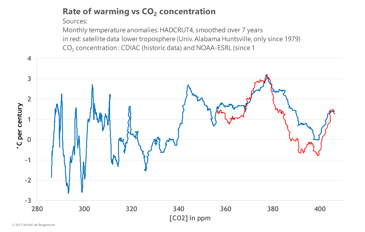
I quite like this graph. It is much better than simply overlaying two graphs versus time for the variables of temperature and CO2. eg-
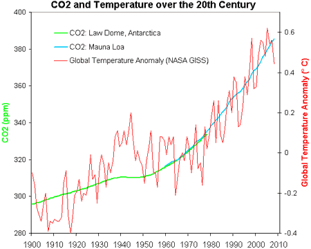
The second graph is an example of how any two increasing variables can be made to look related by creative use of the two y axis scales.
The first graph is the actual correlation between the two variables. Because the correlation fluxuates between positive and negative values we know it is not the prime driver of warming. Because the correlation spends more time in the positive phase we can assume that CO2 does cause some warming.
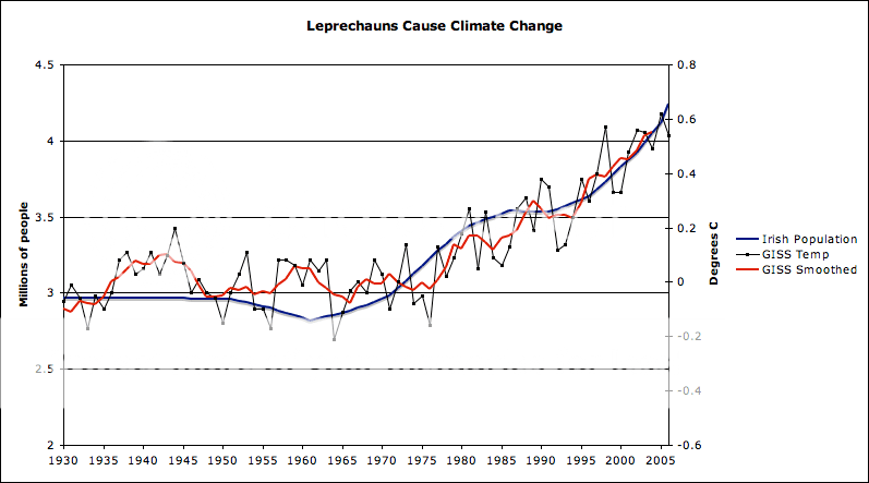
Sounds about right to me.
Last edited: