SSDD
Gold Member
- Nov 6, 2012
- 16,672
- 1,966
- 280
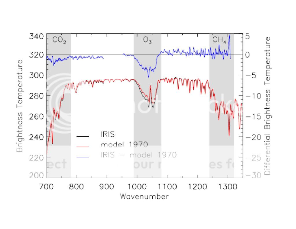
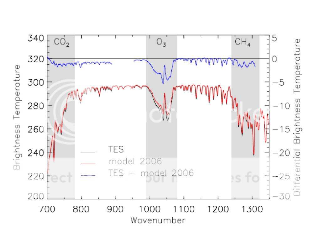
The average differential between the model and reality is about 1/2 a degree of brightness. Anytime you can't see the black line it is within that range.
Still misreading...wherever you can see the black line is where the models were wrong...the only relevant line in those graphs insofar as your position goes is the difference between the black line observation in 1979 and the black line observation in 2006...and there is no difference...they are identical in the wavelengths at issue.
Temperature is irrelevant as CO2 has no effect on temperature...and brightness temperature isn't going to be of any use to you in proving your beliefs anyway.