2011 global temperature thread

Global Highlights

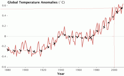
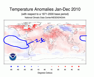
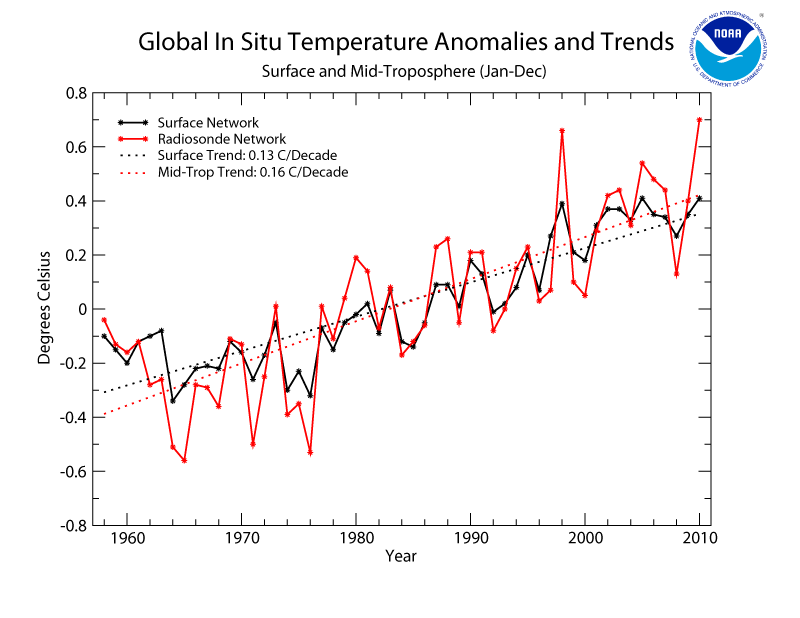
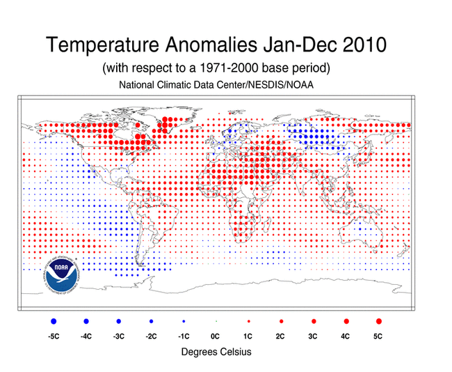
* For 2010, the combined global land and ocean surface temperature tied with 2005 as the warmest such period on record, at 0.62°C (1.12°F) above the 20th century average of 13.9°C (57.0°F). 1998 is the third warmest year-to-date on record, at 0.60°C (1.08°F) above the 20th century average.


* The 2010 Northern Hemisphere combined global land and ocean surface temperature was the warmest year on record, at 0.73°C (1.31°F) above the 20th century average.
The 2010 Southern Hemisphere combined global land and ocean surface temperature was the sixth warmest year on record, at 0.51°C (0.92°F) above the 20th century average.

* The global land surface temperature for 2010 tied with 2005 as the second warmest on record, at 0.96°C (1.73°F) above the 20th century average. The warmest such period on record occurred in 2007, at 0.99°C (1.78°F) above the 20th century average.

* The global ocean surface temperature for 2010 tied with 2005 as the third warmest on record, at 0.49°C (0.88°F) above the 20th century average.

* In 2010 there was a dramatic shift in the El Niño–Southern Oscillation, which influences temperature and precipitation patterns around the world. A moderate-to-strong El Niño at the beginning of the year transitioned to La Niña conditions by July. At the end of November, La Niña was moderate-to-strong.

Global Top 10
Warmest Years (Jan-Dec)* Anomaly °C Anomaly °F
2010 0.62 1.12
2005 0.62 1.12
1998 0.60 1.08
2003 0.58 1.04
2002 0.58 1.04
2009 0.56 1.01
2006 0.56 1.01
2007 0.55 0.99
2004 0.54 0.97
2001 0.52 0.94

The 1901-2000 average combined land and ocean annual temperature is 13.9°C (56.9°F), the annually averaged land temperature for the same period is 8.5°C (47.3°F), and the long-term annually averaged sea surface temperature is 16.1°C (60.9°F).

201001-201012.gif


Enso-Pacific from equator to 20 north and south and 90-140 west.

January 15th 2005
anomnight.1.15.2005.gif


April 16th 2005
anomnight.4.16.2005.gif


7-16-2005
anomnight.7.16.2005.gif


10-18-2005
anomnight.10.18.2005.gif


12-17-2005
anomnight.12.17.2005.gif


As you can see there was NO NINA in 2005. In fact the first of the year may of had a weak nino. The decrease of our stars output had yet to be seen that we are seeing today...Pretty impressive when you think about it. Id say more of a moderate year....This year meaning 2010 seen 4 months of nino and 7 and 1/2 of nina. Temperatures within the tropics shown above dropped more this year because of this monster to...Far more.


2005 peaked at .51c within the tropics for one month and went down to around .09c by Dec...With .2-.3c being the norm within the tropics that year based on UAH data. http://vortex.nsstc.uah.edu/data/msu/t2lt/uahncdc.lt
 
Last edited:
NASA has just released its analysis of the 2010 temperature data here, which finds:

Global surface temperatures in 2010 tied 2005 as the warmest on record….

To measure climate change, scientists look at long-term trends. The temperature trend, including data from 2010, shows the climate has warmed by approximately 0.36°F per decade since the late 1970s. “If the warming trend continues, as is expected, if greenhouse gases continue to increase, the 2010 record will not stand for long,” said James Hansen, the director of GISS.

The record temperature in 2010 is particularly noteworthy, because the last half of the year was marked by a transition to strong La Niña conditions, which bring cool sea surface temperatures to the eastern tropical Pacific Ocean.

These records are also especially impressive because we’ve been in “the deepest solar minimum in nearly a century.” .
 
NASA Research Finds 2010 Tied for Warmest Year on Record

January 12, 2011
GHCN_GISS_HR2SST_1200km_Anom12_2010_2010_1951_1980.gif

Global surface temperatures in 2010 tied 2005 as the warmest on record, according to an analysis released Wednesday by researchers at NASA's Goddard Institute for Space Studies (GISS) in New York.
GISS temperature data graph

In 2010, global temperatures continued to rise. A new analysis from the Goddard Institute for Space Studies shows that 2010 tied with 2005 as the warmest year on record, and was part of the warmest decade on record. (Image credit: NASA/Earth Observatory/Robert Simmon)
+ View large GIF or download PDF

The two years differed by less than 0.018 degrees Fahrenheit. The difference is smaller than the uncertainty in comparing the temperatures of recent years, putting them into a statistical tie. In the new analysis, the next warmest years are 1998, 2002, 2003, 2006, 2007 and 2009, which are statistically tied for third warmest year. The GISS records begin in 1880.

The analysis found 2010 approximately 1.34°F warmer than the average global surface temperature from 1951 to 1980. To measure climate change, scientists look at long-term trends. The temperature trend, including data from 2010, shows the climate has warmed by approximately 0.36°F per decade since the late 1970s.

"If the warming trend continues, as is expected, if greenhouse gases continue to increase, the 2010 record will not stand for long," said James Hansen, the director of GISS.

The analysis produced at GISS is compiled from weather data from more than 1000 meteorological stations around the world, satellite observations of sea surface temperature and Antarctic research station measurements. A computer program uses the data to calculate temperature anomalies — the difference between surface temperature in a given month and the average temperature for the same period during 1951 to 1980. This three-decade period acts as a baseline for the analysis.

The resulting temperature record closely matches others independently produced by the Met Office Hadley Centre in the United Kingdom and the National Oceanic and Atmospheric Administration's National Climatic Data Center.

The record temperature in 2010 is particularly noteworthy, because the last half of the year was marked by a transition to strong La Niña conditions, which bring cool sea surface temperatures to the eastern tropical Pacific Ocean.

"Global temperature is rising as fast in the past decade as in the prior two decades, despite year-to-year fluctuations associated with the El Niño-La Niña cycle of tropical ocean temperature," Hansen and colleagues reported in the Dec. 14, 2010, issue of Reviews of Geophysics.

A chilly spell also struck this winter across northern Europe. The event may have been influenced by the decline of Arctic sea ice and could be linked to warming temperatures at more northern latitudes.

Arctic sea ice acts like a blanket, insulating the atmosphere from the ocean's heat. Take away that blanket, and the heat can escape into the atmosphere, increasing local surface temperatures. Regions in northeast Canada were more than 18 degrees warmer than normal in December.

The loss of sea ice may also be driving Arctic air into the middle latitudes. Winter weather patterns are notoriously chaotic, and the GISS analysis finds seven of the last 10 European winters warmer than the average from 1951 to 1980. The unusual cold in the past two winters has caused scientists to begin to speculate about a potential connection to sea ice changes.

"One possibility is that the heat source due to open water in Hudson Bay affected Arctic wind patterns, with a seesaw pattern that has Arctic air downstream pouring into Europe," Hansen said.
Related Links

Within the nasa/giss data
2010 had a 63
2005 62
So 2010 came up on top...But so tiny of a difference that they just declared tie.

http://data.giss.nasa.gov/gistemp/tabledata/GLB.Ts+dSST.txt

GHCN_GISS_HR2SST_1200km_Anom12_2010_2010_1951_1980.POL.gif


GHCN_GISS_HR2SST_1200km_Anom12_2010_2010_1951_1980_zonal.gif


GHCN_GISS_HR2SST_1200km_Anom0112_2010_2010_1951_1980.POL.gif
 

Attachments

  • $509796main_GISS_annual_temperature_anomalies.gif
    $509796main_GISS_annual_temperature_anomalies.gif
    25.9 KB · Views: 108
Last edited:
The first 12 days over the planet appear to be warmer then Dec...Europe within the next 10-15 days may avg normal. Parts of central Russia appear to be near as below normal as it was. Northern Asia below normal, but Alaska is near normal....

Post your predictions for January.

My first predictions for anomalies
Uah .14
Noaa .41
Giss .42
 
NASA Research Finds 2010 Tied for Warmest Year on Record

January 12, 2011
GHCN_GISS_HR2SST_1200km_Anom12_2010_2010_1951_1980.gif

Global surface temperatures in 2010 tied 2005 as the warmest on record, according to an analysis released Wednesday by researchers at NASA's Goddard Institute for Space Studies (GISS) in New York.
GISS temperature data graph

In 2010, global temperatures continued to rise. A new analysis from the Goddard Institute for Space Studies shows that 2010 tied with 2005 as the warmest year on record, and was part of the warmest decade on record. (Image credit: NASA/Earth Observatory/Robert Simmon)
+ View large GIF or download PDF

The two years differed by less than 0.018 degrees Fahrenheit. The difference is smaller than the uncertainty in comparing the temperatures of recent years, putting them into a statistical tie. In the new analysis, the next warmest years are 1998, 2002, 2003, 2006, 2007 and 2009, which are statistically tied for third warmest year. The GISS records begin in 1880.

The analysis found 2010 approximately 1.34°F warmer than the average global surface temperature from 1951 to 1980. To measure climate change, scientists look at long-term trends. The temperature trend, including data from 2010, shows the climate has warmed by approximately 0.36°F per decade since the late 1970s.

"If the warming trend continues, as is expected, if greenhouse gases continue to increase, the 2010 record will not stand for long," said James Hansen, the director of GISS.

The analysis produced at GISS is compiled from weather data from more than 1000 meteorological stations around the world, satellite observations of sea surface temperature and Antarctic research station measurements. A computer program uses the data to calculate temperature anomalies — the difference between surface temperature in a given month and the average temperature for the same period during 1951 to 1980. This three-decade period acts as a baseline for the analysis.

The resulting temperature record closely matches others independently produced by the Met Office Hadley Centre in the United Kingdom and the National Oceanic and Atmospheric Administration's National Climatic Data Center.

The record temperature in 2010 is particularly noteworthy, because the last half of the year was marked by a transition to strong La Niña conditions, which bring cool sea surface temperatures to the eastern tropical Pacific Ocean.

"Global temperature is rising as fast in the past decade as in the prior two decades, despite year-to-year fluctuations associated with the El Niño-La Niña cycle of tropical ocean temperature," Hansen and colleagues reported in the Dec. 14, 2010, issue of Reviews of Geophysics.

A chilly spell also struck this winter across northern Europe. The event may have been influenced by the decline of Arctic sea ice and could be linked to warming temperatures at more northern latitudes.

Arctic sea ice acts like a blanket, insulating the atmosphere from the ocean's heat. Take away that blanket, and the heat can escape into the atmosphere, increasing local surface temperatures. Regions in northeast Canada were more than 18 degrees warmer than normal in December.

The loss of sea ice may also be driving Arctic air into the middle latitudes. Winter weather patterns are notoriously chaotic, and the GISS analysis finds seven of the last 10 European winters warmer than the average from 1951 to 1980. The unusual cold in the past two winters has caused scientists to begin to speculate about a potential connection to sea ice changes.

"One possibility is that the heat source due to open water in Hudson Bay affected Arctic wind patterns, with a seesaw pattern that has Arctic air downstream pouring into Europe," Hansen said.
Related Links

Within the nasa/giss data
2010 had a 63
2005 62
So 2010 came up on top...But so tiny of a difference that they just declared tie.

http://data.giss.nasa.gov/gistemp/tabledata/GLB.Ts+dSST.txt

GHCN_GISS_HR2SST_1200km_Anom12_2010_2010_1951_1980.POL.gif


GHCN_GISS_HR2SST_1200km_Anom12_2010_2010_1951_1980_zonal.gif


GHCN_GISS_HR2SST_1200km_Anom0112_2010_2010_1951_1980.POL.gif
There are problems with Hansens work on the temperature record, for starters 1998 was the warmest year on record not 2005, the only way 2005 comes out on top is if you accept their manipulations of data, for intance the gridding over of SST's in the arctic with land surface tempertures, also the gridding over of in situ data in Bolivia, Canada, Russia, and other places where in situ data was available and they chose to ignore it in favor of their gridded models. Plus the UHI logorythm they use which has pretty concluseively been proven far from adequate due to the basis of the assumptions in its construction. I have no doubt that they think they're right and can justify these manipulations, I have lees doubt than that, that they actually are, or that the justifications are anything but. In short, there is nothing which James Hansen is connected to that I will trust for anythig.
 
In spite of the fact that everybody else's data shows basically the same thing as Hansen's. Yes, there are minor desrepancies concerning which was warmest, 1998, 2005, or 2010. As Dr. Christy has repeatedly stated, differances that are not statistacally significant. And 9 of the 10 warmest years have been since 2000. The only year that was not in the last decade was 1998, and that was the strongest El Nino on record. And we have equaled that with a moderate El Nino for 5 months, and a strong La Nina for 7 months. Not only that, the sun is still in a reletively quiet phase.

No Ben, Dr. Hansen is justly regarded as the leading climatologist in the US, if not the world. All the slander that fools like you can muster will not change that.
 
1998 got the record for having the most powerful mega nino in recorded history going back to the 1880s. beating the 1981-1982 nino that scientist once believed couldn't be done.
2005 got it for being a warmer on avg moderate year.
2010 Got it for being a moderate nina year. Why?

When you have out the years this is about what you get...2010 had Jan-April being nino, sure. Nina developed and by June was developed into a moderate event.. By Sept was a strong event.

Remember my 3 key factors on how enso events effect the temperature of our planet?
1# max or min anomaly
2# Size and extent of of the area effected. Bigger=bigger anomaly over a bigger area=bigger effect on temperatures of the planet.
3# Time=how many months?

Truth be had the nina of 2010 was fucking huge in size. Even so there is a period of 3-4 months before the effects can be had---it was in size matching the 1999, 2008 events. That is just a fact of life. truth be had most of the nina started in the summer of 2009...Sure the effects where had in 2010 too, but we are comparing 1998, 2005 to 2010. Truth be had again->The tropics are far below 1998 and even 2005. This means that the areas that are predicted to warm at 2-3 times as fast as the rest of the planet,,,The arctic are taking up more. That fact that a monster nina couldn't take 2010 down below the 5 without breaking a sweat is showing this to be true.

Do I expect 2011 with NO nino and with the most powerful motherfucking nina since 1976 to be within the top 5. FUCK NO! Truth be had the nino over the first 4 months of 2010 forced 2010 to avg out with a weak to moderate nina...I estimate near -.8c over the tropics based on the enso rating scale.

Why was 1998 higher then 2005 within the fucking UAH? The UAH factors in the ENSO far stronger then the surface data of the NOAA, giss. It is bias in that way. The surface data I watch from not more then 6 stations in canada shows 4-15c higher then avg for the 30 day avg. Who to say that cant change the fucking weather patterns and jet stream.

Funniest thing of it is the UAH, Noaa, Giss for 2010 are within .015c of each other. giss, Noaa comes out on top and UAH just below 1998. Ties!!!

1998 was .4c outside of the baseline, 2010 .21c outside that. Difference=increase of .19c.

The planet is warming, but where the fuck is the warm water since 2005? That is the next question to ask.
 
Last edited:
It is to fucking bad that 2011 has a monster Nina---biggest since 1976 that may make this year 5-7th rank based on Giss, Nasa data at the end of the day...Because people here are going to scream and whine like fucking babies about a ice age coming. People need to get it through there mother fucking head that we are not going to have a ice age inti the next major ice age, which may NOT come for another 3-10 thousand years...What we have going on is ass raping the biggest mother fucking sun spot minimum since the Dalton minimum. One that was fairy close to this one dropped the decades of the 1910-1919 .02 to .04c. The Dalton 2-3 times that...In which if we keep seeing this super minimum bottom of the ground sun spot max we could be disusing such. Friends since 2005 our planet and what ever has been going on has been masked by this. This is why we are below the ipcc predictions since the first years of the 2000s.

.03c is two years of baseline raise. In that sun spot cycle had one, YES one crappy sun spot minimum much to this one. If this keeps going then we discuse Dalton. I go over what kinds of temperature drops occurred with that some other time, but it was a good drop. You need to understand that 1998 happened with a very strong nino and 2005 occurred with a moderate warm enso of .1 to .5 within 3.4,,,,This year based on some temperature maps of the eastern pacific , Ive seen from Noaa, Giss shows that the area avged below normal. That is what Im pointing out...There was NO nino effect on the surface of the area between 20 north and south from south America to 180 west. It was -.5 or below avged out for 2010.

There is NO FUCKING ICE AGE COMING. The reason that it is not or appears not to be going up as fast is because of the sun spot minimum. 1910-1919 went down, Dalton went down, ect and then on. The natural factors must be factored in.

I promise you that if 2012 see just moderate conditions we see a top 2 year if not number one. Promise you...Even with the sun spot cycle acting like 1910-1919 and 1810-1840. 2013, 2014, 2015 just becomes easier...The compounding the sun spot event that we are seeing;;;Saying that we are now .02c below what we should be seeing...So by 2014 should be -.04c or more...Giss for 2010 with the conservative -.02c below what we would of had and more possibly .03 to .04c already. That would of gave 2010, .65 to .67 within nasa and noaa. These are my estimates using past events to measure what today would be...Give us another moderate year and I show you right here and you can go crazy with cartoons and jokes on my fucking ass if I'm wrong in 2012 or 2013. What ever that is a moderate or nino year without a nina.

I'm taking a chance saying 2012 or 2013 because my data Ive put together says 2014-2015, but this year shows that we could of seen a speed up???? If not then I'm laughed at and made a idiot. I have reason to believe that the warming of the 1980s and 1990s is going on and is just being masked.

Trust me there is NO ice age coming. Period. I was once a believer of that trash and believed our planets temperature was decreasing. It turned out a crock! At age 14 I got not by fire but by ice and believed every fucking word. Yes some of it is true, but the factors that make up those cycles cant and wont out power the warming. Trust me.

Noaa map of 2010 showing the nina when avged out over most of the biggest fucking ocean on earth. This is within the attchment. 2005 is posted above showing no nina and far warmer.
map_blended_mntp_13_2005_pg.gif
 

Attachments

  • $201001-201012.gif
    $201001-201012.gif
    82.5 KB · Views: 103
Last edited:
It is to fucking bad that 2011 has a monster Nina---biggest since 1976 that may make this year 5-7th rank based on Giss, Nasa data at the end of the day...Because people here are going to scream and whine like fucking babies about a ice age coming. People need to get it through there mother fucking head that we are not going to have a ice age inti the next major ice age, which may NOT come for another 3-10 thousand years...What we have going on is ass raping the biggest mother fucking sun spot minimum since the Dalton minimum. One that was fairy close to this one dropped the decades of the 1910-1919 .02 to .04c. The Dalton 2-3 times that...In which if we keep seeing this super minimum bottom of the ground sun spot max we could be disusing such. Friends since 2005 our planet and what ever has been going on has been masked by this. This is why we are below the ipcc predictions since the first years of the 2000s.

.03c is two years of baseline raise. In that sun spot cycle had one, YES one crappy sun spot minimum much to this one. If this keeps going then we discuse Dalton. I go over what kinds of temperature drops occurred with that some other time, but it was a good drop. You need to understand that 1998 happened with a very strong nino and 2005 occurred with a moderate warm enso of .1 to .5 within 3.4,,,,This year based on some temperature maps of the eastern pacific , Ive seen from Noaa, Giss shows that the area avged below normal. That is what Im pointing out...There was NO nino effect on the surface of the area between 20 north and south from south America to 180 west. It was -.5 or below avged out for 2010.

There is NO FUCKING ICE AGE COMING. The reason that it is not or appears not to be going up as fast is because of the sun spot minimum. 1910-1919 went down, Dalton went down, ect and then on. The natural factors must be factored in.

I promise you that if 2012 see just moderate conditions we see a top 2 year if not number one. Promise you...Even with the sun spot cycle acting like 1910-1919 and 1810-1840. 2013, 2014, 2015 just becomes easier...The compounding the sun spot event that we are seeing;;;Saying that we are now .02c below what we should be seeing...So by 2014 should be -.04c or more...Giss for 2010 with the conservative -.02c below what we would of had and more possibly .03 to .04c already. That would of gave 2010, .65 to .67 within nasa and noaa. These are my estimates using past events to measure what today would be...Give us another moderate year and I show you right here and you can go crazy with cartoons and jokes on my fucking ass if I'm wrong in 2012 or 2013. What ever that is a moderate or nino year without a nina.

I'm taking a chance saying 2012 or 2013 because my data Ive put together says 2014-2015, but this year shows that we could of seen a speed up???? If not then I'm laughed at and made a idiot. I have reason to believe that the warming of the 1980s and 1990s is going on and is just being masked.

Trust me there is NO ice age coming. Period. I was once a believer of that trash and believed our planets temperature was decreasing. It turned out a crock! At age 14 I got not by fire but by ice and believed every fucking word. Yes some of it is true, but the factors that make up those cycles cant and wont out power the warming. Trust me.

Noaa map of 2010 showing the nina when avged out over most of the biggest fucking ocean on earth. This is within the attchment. 2005 is posted above showing no nina and far warmer.
map_blended_mntp_13_2005_pg.gif
Trusting james hanson and his interpretation of data is takling a big chance. I agree that AGW is a bunch of hyper overblown bunk. But believing 2010 was the "warmest" year on record, or that 2005 was based on Hansen... well, I just won't do it. Hansen is an AGW alarmist pushing an agenda and justifying funding for himself, nothing more. The guy has been caught more thn once massaging the data.
 
http://www.physorg.com/news/2011-01-nasa-s...tronger-la.html

NASA satellites capture a stronger La Nina

The La Niña is evident by the large pool cooler than normal (blue and purple) water stretching from the eastern to the central Pacific Ocean, reflecting lower than normal sea surface heights. "This La Niña has strengthened for the past seven months, and is one of the most intense events of the past half century," said Climatologist Bill Patzert

49-nasasatellit.jpg


New NASA satellite data indicate the current La Niña event in the eastern Pacific has remained strong during November and December 2010.

A new Ocean Surface Topography Mission (OSTM)/Jason-2 satellite image of the Pacific Ocean that averaged 10 days of data was just released from NASA. The image, centered on Dec. 26, 2010, was created at NASA's Jet Propulsion Laboratory (JPL), Pasadena, Calif.

"The solid record of La Niña strength only goes back about 50 years and this latest event appears to be one of the strongest ones over this time period," said Climatologist Bill Patzert of JPL. "It is already impacting weather and climate all around the planet."

"Although exacerbated by precipitation from a tropical cyclone, rainfalls of historic proportion in eastern Queensland, Australia have led to levels of flooding usually only seen once in a century," said David Adamec, Oceanographer at NASA's Goddard Space Flight Center, Greenbelt, Md. "The copious rainfall is a direct result of La Niña's effect on the Pacific trade winds and has made tropical Australia particularly rainy this year."

The new image depicts places where the Pacific sea surface height is near-normal, higher (warmer) than normal and lower (cooler) than normal. The cooler-than normal pool of water that stretches from the eastern to the central Pacific Ocean is a hallmark of a La Niña event.
50-nasasatellit.jpg


This Ocean Surface Topography Mission (OSTM)/Jason-2 satellite image of the Pacific Ocean is based on the average of 10 days of data centered on Dec. 26, 2010. The new image depicts places where the Pacific sea surface height is higher (warmer) than normal as yellow and red, with places where the sea surface height is lower (cooler) than normal as blue and purple. Green indicates near-normal conditions. Sea surface height is an indicator of how much of the sun's heat is stored in the upper ocean. Credit: NASA JPL/Bill Patzert

Earth's ocean is the greatest influence on global climate. Only from space can we observe our vast ocean on a global scale and monitor critical changes in ocean currents and heat storage. Continuous data from satellites like OSTM/Jason-2 help us understand and foresee the effects of ocean changes on our climate and on climate events such as La Niña and El Niño.

The latest report from NOAA's Climate Prediction Center (CPC) noted that "A moderate-to-strong La Niña continued during December 2010 as reflected by well below-average sea surface temperatures (SSTs) across the equatorial Pacific Ocean." The CPC report said that La Niña is expected to continue well into the Northern Hemisphere spring 2011.


...

Ben you may have a point, but UAH, Noaa back giss this year.
Cooler SST's have been being reported for a few years, I have no issue with them though there have been a couple times they haven't done due dilligence in callibrating the satalites for drift and what-not. To their credit they did fix the problem and produce new SST records to adjust. Other than that GISS and NOAA work from the same data and use the same adjusting techniques, if their data didn't all but match its because they did something wrong. Incidently the NCDC also use the same data, they are all linked. I will say however that NOAA IMO has more integrity than GISS most of the time.
 
sfctmpmer_07b.fnl.gif


temperature data throughout canada...
tn71917_30.gif

station.gif

tn71924_30.gif

gistemp_station.py


tn71925_30.gif


tn71938_30.gif


http://www.cpc.ncep.noaa.gov/products/global_monitoring/temperature
/tn71095_30.gif
tn71090_30.gif

tn71915_30.gif


tn71926_30.gif


tn71809_30.gif


tn71739_30.gif


tn71912_30.gif


tn71907_30.gif


Another thing Ive notice is europe is now avg for January...Yes very extreme Dec, but avg Jan. North Asia appears to be the area of interest right now...But it appears the planet is recovering.

Mid Month predictions
Rss .18
Uah .20
Giss .44
 
Last edited:
Europe is back to normal...

Anyways just did eureka Canada and found .9c of warming since 2000 and 2.2c since 1980. In case your wondering that is 2.2/30 years to find from 1980-2010, which is .0733 per year or .733c per decade...

Since 2000 to 2010 it has warmed .9c, which is .09c per year or .9c per decade.
 

Attachments

  • $station.gif
    $station.gif
    26.8 KB · Views: 141
Last edited:
In spite of the fact that everybody else's data shows basically the same thing as Hansen's. Yes, there are minor desrepancies concerning which was warmest, 1998, 2005, or 2010. As Dr. Christy has repeatedly stated, differances that are not statistacally significant. And 9 of the 10 warmest years have been since 2000. The only year that was not in the last decade was 1998, and that was the strongest El Nino on record. And we have equaled that with a moderate El Nino for 5 months, and a strong La Nina for 7 months. Not only that, the sun is still in a reletively quiet phase.

No Ben, Dr. Hansen is justly regarded as the leading climatologist in the US, if not the world. All the slander that fools like you can muster will not change that.
James Hansen is the most discreditted idiot that calls himself a climatologist there is. his work is sloppy, at times fraudulent and he is nothing more than an activist with a seat at the table. Anyone who trusts anything he says is a fool. And, as i sated, yes, they are in agreement, that would be because they all work of the same fucked up data and all use the same fucked up techniques to "adjust" it. It is not "everybody elses data" that shows the same thing, its other agencies using the same exact data that shows similar things... how could that possibly be surprizing?
 
Here is some idea of the warming...

1998 had .6c anomaly, but the baseline was near .375 +- .05. What this means because of that super nino we where a amazing .225c outside the baseline. By 2005 the baseline/running avg raised to .475 or near .1c higher then 1998 and .075 higher then 2000. So 2005 had .62 based on noaa data, which .62-.475=.145c outside the baseline. 2010 baseline raised to .545, so .62-.545 is .085 outside the baseline.

We did this in a year that the tropics between 20 north/south from south America to 180 west avged nina conditions. Within the deepest sun spot min in 100 years...

So between 1998-2010 the baseline raised .17c based on this data. Of course there is a error of .05, so .12 to .22.

2008 had .48c and so far we are some what above it...With moderate conditions by mid year forecasted...How far outside the baseline of 2011, which is now .56c? If we where as beneath our line as 2008 this year that would be .08c or 35.5555% of the difference between the baseline and the nino of 1998. This is with a nina that has not been seen since 1976.

My thinking for 2011 may be near .51-.53 at the end of the day. To account for the raise in the avg. One more thing---How much warming would occur with .12-1.7c warming per decade by 2100? .12c per decade=1.08c, .15c 1.35c and .17c brings us 1.53c of warming. So between 1 to 1.5c of warming we are trending towards. Of course if we where constant to 2100 at todays rate.

I hope you enjoyed the data:tongue:

Based on sat data we are .5 to .7c in ch5 then 2008 right now. http://discover.itsc.uah.edu/amsutemps/execute.csh?amsutemps
 
Last edited:
Here is some idea of the warming...

1998 had .6c anomaly, but the baseline was near .375 +- .05. What this means because of that super nino we where a amazing .225c outside the baseline. By 2005 the baseline/running avg raised to .475 or near .1c higher then 1998 and .075 higher then 2000. So 2005 had .62 based on noaa data, which .62-.475=.145c outside the baseline. 2010 baseline raised to .545, so .62-.545 is .085 outside the baseline.

We did this in a year that the tropics between 20 north/south from south America to 180 west avged nina conditions. Within the deepest sun spot min in 100 years...

So between 1998-2010 the baseline raised .17c based on this data. Of course there is a error of .05, so .12 to .22.

2008 had .48c and so far we are some what above it...With moderate conditions by mid year forecasted...How far outside the baseline of 2011, which is now .56c? If we where as beneath our line as 2008 this year that would be .08c or 35.5555% of the difference between the baseline and the nino of 1998. This is with a nina that has not been seen since 1976.

My thinking for 2011 may be near .51-.53 at the end of the day. To account for the raise in the avg. One more thing---How much warming would occur with .12-1.7c warming per decade by 2100? .12c per decade=1.08c, .15c 1.35c and .17c brings us 1.53c of warming. So between 1 to 1.5c of warming we are trending towards. Of course if we where constant to 2100 at todays rate.

I hope you enjoyed the data:tongue:

Based on sat data we are .5 to .7c in ch5 then 2008 right now. Error!


..........................................
201001-201012.gif


Temperature Trends

During the past century, global surface temperatures have increased at a rate near 0.07°C/decade (0.13°F/decade), but this trend has increased to a rate of approximately 0.17°C/decade (0.31°F/decade) during the past 30 years. There have been two sustained periods of warming, one beginning around 1910 and ending around 1945, and the most recent beginning about 1976. Temperatures during the latter period of warming have increased at a rate comparable to the rates of warming projected to occur during the next century with continued increases of anthropogenic greenhouse gases.

Temperature measurements have also been made above the Earth's surface over the past 53 years using balloon-borne instruments (radiosondes) and for the past 32 years using satellites. These measurements support the analyses of trends and variability in the troposphere (surface to 10-16 km) and stratosphere (10-50 km above the earth's surface).
RATPAC and Surface plot

The best source of upper air in-situ measurements for studying global temperature trends above the surface is the Radiosonde Atmospheric Temperature Products for Assessing Climate (RATPAC) dataset.
 
Hadley center---Even so it is not earth wide because it excludes a shit load of the planet. Here is the numbers.

1995 0.275 0.286 0.264 0.367 0.183 0.275 0.271 0.368 0.182 0.368 0.182
1996 0.124 0.134 0.113 0.220 0.027 0.124 0.119 0.221 0.026 0.221 0.026
1997 0.356 0.367 0.346 0.449 0.264 0.356 0.352 0.449 0.264 0.449 0.263
1998 0.517 0.528 0.506 0.609 0.424 0.517 0.512 0.610 0.423 0.610 0.423
1999 0.263 0.275 0.252 0.356 0.170 0.263 0.258 0.357 0.170 0.357 0.169
2000 0.239 0.250 0.228 0.334 0.144 0.239 0.234 0.334 0.144 0.334 0.143
2001 0.399 0.411 0.388 0.495 0.304 0.399 0.394 0.496 0.303 0.496 0.303
2002 0.456 0.467 0.445 0.554 0.358 0.456 0.450 0.554 0.358 0.554 0.357
2003 0.459 0.470 0.449 0.558 0.361 0.459 0.453 0.558 0.360 0.558 0.360
2004 0.431 0.443 0.420 0.529 0.334 0.431 0.425 0.530 0.333 0.530 0.333
2005 0.474 0.485 0.464 0.577 0.372 0.474 0.468 0.578 0.371 0.578 0.371
2006 0.427 0.437 0.417 0.527 0.328 0.427 0.421 0.527 0.327 0.527 0.327
2007 0.402 0.412 0.392 0.502 0.301 0.402 0.396 0.503 0.301 0.503 0.301
2008 0.312 0.322 0.302 0.410 0.214 0.312 0.306 0.411 0.214 0.411 0.214
2009 0.439 0.449 0.429 0.534 0.344 0.439 0.433 0.535 0.344 0.535 0.343
2010 0.518 0.528 0.509 0.623 0.414 0.518 0.512 0.623 0.413 0.623 0.413

Without the arctic this is what it gets...Anyways its upper estimate, which would most like be a estimate to include the arctic is near .6223, which is higher then 1998 .60. this would be in line with the giss, noaa to a t.


...
To try and make these different effects clear we show the effects of these three components separately in the plots and data files for each time-series. The station and grid-box sampling uncertainties are shown in red, the coverage uncertainties in green, and the bias uncertainties in blue. The data files contain 12 columns:

* Column 1 is the date.
* Column 2 is the best estimate anomaly. (For the current year this will be the average for the year so far. The latest month that has been processed will appear in the monthly files).
* Columns 3 and 4 are the upper and lower 95% uncertainty ranges from the station and grid-box sampling uncertainties.
* Columns 5 and 6 are the upper and lower 95% uncertainty ranges from the coverage uncertainties.
* Columns 7 and 8 are the upper and lower 95% uncertainty ranges from the bias uncertainties.
* Columns 9 and 10 are the upper and lower 95% uncertainty ranges from the combined station and grid-box sampling, and coverage uncertainties.
* Columns 11 and 12 are the upper and lower 95% uncertainty ranges from the combined effects of all the uncertainties.

More details are given in the paper introducing the dataset.

http://hadobs.metoffice.com/hadcrut3/diagnostics/time-series.html

http://www.metoffice.gov.uk/climatechange/science/monitoring/hadcrut3.html
 
Last edited:
Hadley center---Even so it is not earth wide because it excludes a shit load of the planet. Here is the numbers.

1995 0.275 0.286 0.264 0.367 0.183 0.275 0.271 0.368 0.182 0.368 0.182
1996 0.124 0.134 0.113 0.220 0.027 0.124 0.119 0.221 0.026 0.221 0.026
1997 0.356 0.367 0.346 0.449 0.264 0.356 0.352 0.449 0.264 0.449 0.263
1998 0.517 0.528 0.506 0.609 0.424 0.517 0.512 0.610 0.423 0.610 0.423
1999 0.263 0.275 0.252 0.356 0.170 0.263 0.258 0.357 0.170 0.357 0.169
2000 0.239 0.250 0.228 0.334 0.144 0.239 0.234 0.334 0.144 0.334 0.143
2001 0.399 0.411 0.388 0.495 0.304 0.399 0.394 0.496 0.303 0.496 0.303
2002 0.456 0.467 0.445 0.554 0.358 0.456 0.450 0.554 0.358 0.554 0.357
2003 0.459 0.470 0.449 0.558 0.361 0.459 0.453 0.558 0.360 0.558 0.360
2004 0.431 0.443 0.420 0.529 0.334 0.431 0.425 0.530 0.333 0.530 0.333
2005 0.474 0.485 0.464 0.577 0.372 0.474 0.468 0.578 0.371 0.578 0.371
2006 0.427 0.437 0.417 0.527 0.328 0.427 0.421 0.527 0.327 0.527 0.327
2007 0.402 0.412 0.392 0.502 0.301 0.402 0.396 0.503 0.301 0.503 0.301
2008 0.312 0.322 0.302 0.410 0.214 0.312 0.306 0.411 0.214 0.411 0.214
2009 0.439 0.449 0.429 0.534 0.344 0.439 0.433 0.535 0.344 0.535 0.343
2010 0.518 0.528 0.509 0.623 0.414 0.518 0.512 0.623 0.413 0.623 0.413

Without the arctic this is what it gets...Anyways its upper estimate, which would most like be a estimate to include the arctic is near .6223, which is higher then 1998 .60. this would be in line with the giss, noaa to a t.


...
To try and make these different effects clear we show the effects of these three components separately in the plots and data files for each time-series. The station and grid-box sampling uncertainties are shown in red, the coverage uncertainties in green, and the bias uncertainties in blue. The data files contain 12 columns:

* Column 1 is the date.
* Column 2 is the best estimate anomaly. (For the current year this will be the average for the year so far. The latest month that has been processed will appear in the monthly files).
* Columns 3 and 4 are the upper and lower 95% uncertainty ranges from the station and grid-box sampling uncertainties.
* Columns 5 and 6 are the upper and lower 95% uncertainty ranges from the coverage uncertainties.
* Columns 7 and 8 are the upper and lower 95% uncertainty ranges from the bias uncertainties.
* Columns 9 and 10 are the upper and lower 95% uncertainty ranges from the combined station and grid-box sampling, and coverage uncertainties.
* Columns 11 and 12 are the upper and lower 95% uncertainty ranges from the combined effects of all the uncertainties.

More details are given in the paper introducing the dataset.

Met Office Hadley Centre observations datasets

Met Office: HadCRUT3: Global surface temperatures
1. My understanding is the "latest month on record" is Nov. Which I have little doubt of, it's hadley/CRU and its what they do... massage, manipulate and ignore what doesn't support their claims. It's a problem, but I do not believe there is a current temperature record that can be comletely trusted.
 

Forum List

Back
Top