- Banned
- #81
Sorry, fecalhead, but you are actually too moronic to have the capacity to comprehend just how moronic you really are......:"stupid people like you say when you're too moronic.... ""
Oh you mean things like ----- "the fact that solar irradiance has been DECLINING while temperatures have been RISING?"""
THAT KIND OF MORONIC ?? Now i get it...
Only retards like you you, fecalhead, imagine that minute changes in solar irradiance from many decades or centuries ago are still affecting the Earth's temperatures today. In the real world, this is the relevant graph.
You see a DECLINE in the Total Solar Irradiance (TSI) there TinkerBelle??
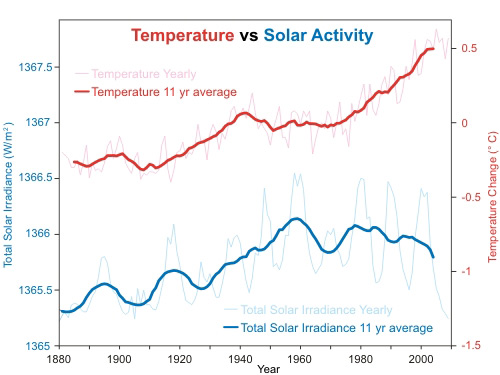
Annual global temperature change (thin light red) with 11 year moving average of temperature (thick dark red). Temperature from NASA GISS. Annual Total Solar Irradiance (thin light blue) with 11 year moving average of TSI (thick dark blue). TSI from 1880 to 1978 from Krivova et al 2007 (data). TSI from 1979 to 2009 from PMOD.
See --- now you really REALLY SCREWED up by posting crap from skepticalscience.. That "limp dick" hanging at the end of their phoney TSI curve DID NOT COME from the PMOD data.. It's a CRAYON PROJECT of the slackers at the fart factory that composes the bulk of your brain.. Even their link to the PMOD data is convieniently broken and would NEVER EVER work with .DAT suffix..
You really have to quit trying to pass off their desperate propaganda here.
welcome to pmodwrc

THAT'S what the PMOD data looks like since 1979.. No Limp Dick.. 2nd time you USMB brainless parrots have passed it off. Makes me think you couldn't find ANOTHER "limp dick" picture of TSI on the web.. Why do you suppose that is??
Take your plots and end the data in 2009, do an 11-year average then blow it up vertically and shrink it horizontally to match the time and TSI scale size on SS'splot. I think you'll find the match a lot closer than you think it is. 2009 puts you at the bottom of that valley that shows in every graph you put up.
Last edited: