- Thread starter
- #341
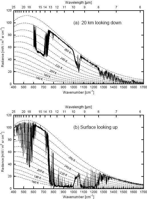
All the instruments you have shown were either cooled to a temperature lower than the atmosphere or they were only measuring changes in temperature of internal thermopiles....just you being fooled by instrumentationYes. And you've seen the data, seen photos of the instruments taking the readings, seen the manufacturer's documentation of the accuracy of the instruments, etc.
And here you are again. Asking for the same information. If I dredge up the old thread, or refind the information you will ignore it one more time, only to ask the same question in the future. You and Old Rocks are similar in that way. You can't remember things that you didn't want to actually see.
Can you elaborate a bit on this 'fooled by instrumentation' idea? In what way are we being fooled? Where does the cause and effect relationship break down? The measurements seem to be precise and repeatable.
Any example would be fine. Just go into detail on how the measurements are wrong, and in which direction. Then perhaps how these mistaken results have led to a faulty conclusion.