Watching the mad Canadian truckers defy death in their coast to coast protest -- it looks like a frozen tundra from Vancouver to Ottawa. And our low tonight in Middle Tenn is about the same as Saskatchewan, -- I decided to take a quick look at the Arctic Sea Ice extent at NSIDC (Nat Snow/Ice Data Center)
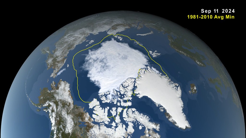
They buried the lead as usual on the MONTHLY chart -- said it was a good start -- but pulling up the chart that compares it to past years -- there's tiny bit MORE that COULD have been said.
View attachment 594148
Not ONLY did it have the highest Minimum pt this fall in 10 years, it's STILL ahead of the other 10 years as it builds to a peak. At this point in the curve, even ONE warm day can spoil it in SOME areas. But you generally dont get a warm day around the ENTIRE Arctic Ocean.


 No such thing exists....or has ever existed.
 ....the rubes win on ENVIRONMENT internet message boards....but nowhere else!