Navigation
Install the app
How to install the app on iOS
Follow along with the video below to see how to install our site as a web app on your home screen.

Note: This feature currently requires accessing the site using the built-in Safari browser.
More options
You are using an out of date browser. It may not display this or other websites correctly.
You should upgrade or use an alternative browser.
You should upgrade or use an alternative browser.
Romney On Whether Were Better Off: Of Course Its Getting Better
- Thread starter Lakhota
- Start date

Awesome graphic.
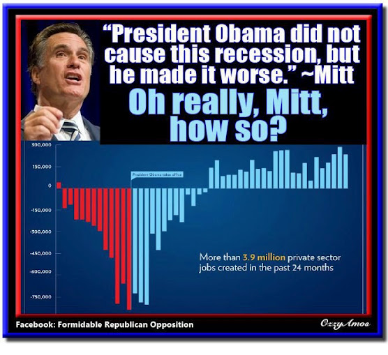
You realize that it takes 200K jobs per month just to keep up with population growth? Even a mediocre economy with a monkey at the wheel would yield 4.8 M jobs. Therefore, even Obama's 3.9 M jobs 'recovery' is more like a recession. Also, it's a pretty sh__ty number considering the billions in so-called stimulus dollars we spent.
- Thread starter
- #23
")
squeeze berry
Gold Member
Yes, the economy is getting better - in spite of NaziCon obstructionism. Obama has done a great job - while pulling an obstructionist elephant.
that's already been proven a lie
- Thread starter
- #25
Yes, the economy is getting better - in spite of NaziCon obstructionism. Obama has done a great job - while pulling an obstructionist elephant.
that's already been proven a lie
NO, it hasn't. Google is your friend...
squeeze berry
Gold Member
Awesome graphic.
never mind the graphic
the price of goods and services has risen while real wages have remained stagnant or declined.
Unemployment has not gone down significantly.
so, where is all the prosperity?
Just look at you grocery sales receipt if you think I'm wrong.
- Thread starter
- #27
Some Guy
Deregulated User
- Jan 19, 2010
- 2,437
- 426
- 130
Romney has no honor. None whatsoever.
So, you agree with Romney, meaning he has no honor?
I'm confused.
squeeze berry
Gold Member
Yes, the economy is getting better - in spite of NaziCon obstructionism. Obama has done a great job - while pulling an obstructionist elephant.
that's already been proven a lie
NO, it hasn't. Google is your friend...
we already when throught this chief lieshisassoff
Obama has had the benefit of a congressional majority for most of his term.
tjvh
Senior Member
- May 10, 2012
- 6,893
- 918
- 48
Awesome graphic.
never mind the graphic
the price of goods and services has risen while real wages have remained stagnant or declined.
Unemployment has not gone down significantly.
so, where is all the prosperity?
Just look at you grocery sales receipt if you think I'm wrong.
They don't pay for groceries with their own money... They swipe EBT cards to pay for their groceries with our money.
- Thread starter
- #33
that's already been proven a lie
NO, it hasn't. Google is your friend...
we already when throught this chief lieshisassoff
Obama has had the benefit of a congressional majority for most of his term.
Not true...
Democrats had a 60 seat majority from September 24, 2009 thru February 4, 2010. 4 months; not 2 years!!
President Obama DID NOT control Congress for Two Years! | The Pragmatic Pundit
CausingPAIN
Rookie
- Banned
- #36
I'll don't fully understand this chart, as I a read the chart it appears we're losing jobs at an accelerating rate to a bottom point, the maximum in any one month. A new management came in and over the next several months the proportional losses on a monthly basis started to reduce which was positive signs of maybe we're going in a different direction. Then at some point small it maybe and not satisfy to all, it appears on a monthly basis we have a positive net result in employed. I try to follow the logic and language of the debate over this issue. But unless there's another chart someplace that can make me come up with another conclusion to what this chart tells me. (And what I known to be true btw.) I got a basically go with things are getting better, and it's not that complicated to understand what this chart shows. But please continue, I find what you type entertaining and absur to the reality, but old. And also I find it disingenuous to post a chart like this, as how can I continue my day, as being reminded things are building positive in America

R
rdean
Guest
This generation of Republicans feel they don't owe the country a thing. Not one damn thing. This one fact explains why all their policies "fail".
Last edited by a moderator:
- Thread starter
- #38
well now people if the pragmaticPUNDIT says it's true it MUST BE
my gawd
Prove it wrong with "credible" facts. Dems controlled the House for the first two years of Obama's presidency, but only held a 60-seat majority in the Senate for about four months; however, even that is questionable when you factor in blue dog Democrats like Senator Ben Nelson from Nebraska. Democrats had to kiss Nelson's blue dog ass to get his vote - especially on Obamacare.
Stephanie
Diamond Member
- Jul 11, 2004
- 70,230
- 10,864
- 2,040
This generation of Republicans feel they don't own the country a thing. Not one damn thing. This one fact explains why all their policies "fail".
well you should feel blessed we don't believe we OWN you...
R
rdean
Guest
This generation of Republicans feel they don't own the country a thing. Not one damn thing. This one fact explains why all their policies "fail".
well you should feel blessed we don't believe we OWN you...
cimplee beecuz aye downt allwais eggamin kairfulllee airvree cingal word duzzant meen thaye arent troo.
Similar threads
- Replies
- 282
- Views
- 2K
- Replies
- 11
- Views
- 143
- Replies
- 445
- Views
- 4K
- Replies
- 54
- Views
- 641
- Replies
- 87
- Views
- 2K
Latest Discussions
- Replies
- 22
- Views
- 106
- Replies
- 28
- Views
- 579
- Replies
- 224
- Views
- 1K
- Replies
- 120
- Views
- 971
Forum List
-
-
-
-
-
Political Satire 8051
-
-
-
-
-
-
-
-
-
-
-
-
-
-
-
-
-
-
-
ObamaCare 781
-
-
-
-
-
-
-
-
-
-
-
Member Usernotes 469
-
-
-
-
-
-
-
-
-
-