Myth of arctic meltdown: Stunning satellite images show summer ice cap is thicker

Why would we want to do that? I suspect more than a few of us are employed and paid by that economy. If we wanted to go live on the street and sleep in the gutter, we don't actually have to take down the economy to do so.


the policies that you support are destroying our economy, the people you elect are destroying our economy. You either want that or you are amazingly stupid.
Amazingly stupid is my vote!!!!
 
Since we can't stop or reverse what's going to happen no matter what we do, wouldn't it be smarter to be prepared to adapt to change?

Stop making sense.

It's much easier to point the finger.

How are they making sense? Where's the proof what they've said is true? If GHG emissions have raised temps, why wouldn't lowering them do the reverse?

How much and how fast? Keep in mind several things:

1. Only the developed world would do ANYTHING. That means the US and some European countries. China and India will shortly dwarf anything the US is doing.
2. Severe cutbacks would destroy the US economy, and rapidly thereafter, the world's, and for what, a few tenths of a degree?
Luckily we have this type of steam to run turbines during the peak use hours on sunny days year round. Imagine what not burning fossil fuels on every sunny day would do to reduce our carbon footprint on the atmosphere?

Not only would tagging this extremely simple technology onto existing power plants be an excellent idea, it would be a highly profitable one. If companies were allowed to charge the same rates but burn less fuel each year, their profit margin would soar. We also would ultimately be less dependent upon foreign fossil fuels. And if we were smart enough, we could sell excess energy produced in solar thermal farms in our vast sunny West/Southwest to other countries.

The perfection of better combustion in automobiles with the introduction of platinum or other particulate catalysts BEFORE the power stroke [instead of foolishly doing it after in the catalytic converter] would at once increase fuel efficiency and reduce pollution. Aftermarket products could be easily reintroduced to accomplish this. These products were out before but got bought out or intimidated out of the market by Big Oil back in the 1980s and 1990s. We just need to take control of our freemarket back and tell Big Oil their day has come and gone. Time to switch their profiteering over to products that help the environment instead of screwing it up.

Imagine cleverly designing the more complete combustion of fuels in the tailpipe instead of before the combustion chamber! All the rigging bogging down the engine for smog to boot... I wonder how those old engineers could sleep at night. They probably watch all the snownado swarms and mega hurricanes and secretly grieve "I had a hand in that.."

This youtube video was taken in Lithuania in the dead of Winter:


There are multiple energy sources that can ultimately replace fossil fuels. The reality is, however, that they are very expensive and will take a long time to become cost effective enough to make a serious dent in fossil fuel consumption. A president who made energy independence a central part of his administration and who put ALL forms of energy into the mix would be wildly successful. If we can go to the moon in a decade, we can resolve this energy issue for ourselves, but we can't tie one hand behind our backs while we do it. Now, even if we achieve all of these goals, how much cooler is the earth going to be? According to all the models, it's supposed to be warmer than it is.
 
How do you believe we have tied our hands behind our back?

Because we have a president that is apparently opposed to the use of fossil fuels until we can develop a reliable, cost effective replacement. He should put ALL options on the table, spell out that we're going to utilize EVERY source under our control, open up land for oil, coal and gas exploration, all while creating a Manhattan Project for energy. That would reduce our dependence on foreign energy, kick start the economy like nothing else, and revitalize the country. The government should not be picking winners and losers based on politics.
The world has already developed reliable, cost effective, cleaner, non-carbon-emitting, renewable replacements for fossil fuels. Solar power, both PV and concentrating & wind power & ocean wave, tide and current power.

You seem to be in some kind of moronic denial of that fact, as well as in denial about the reality and dangers of AGW. You're probably another dupe of the fossil fuel industry propaganda campaign to protect their profits with lies and deception. You poor stooge.
 
Another crackpot denier cult thread filled with delusional twaddle.

Vanishing Arctic Sea Ice: Going Up the Down Escalator
SkepticalScience
by dana1981
7 September 2012
Over the past three decades, Arctic sea ice extent, area, and most importantly, volume have declined dramatically, to levels unseen in millennia. 2012 is absolutely shattering previous record lows, and we expect the continued long-term sea ice decline (which is predominantly human-caused) to have some serious adverse consequences. This is a difficult reality to face, and when faced with a difficult reality, denial is often a natural, inevitable reaction.

The easiest way to deny that a long-term change is happening is to focus on noisy short-term data, where it is easy to find any desired trend through cherrypicking - one of the 5 characteristics of scientific denialism. As we explored in Global Surface Temperature: Going Down the Up Escalator, one just needs to choose a few data points where the short-term trend goes in the opposite direction of the long-term trend and voilá! Nothing to worry about.

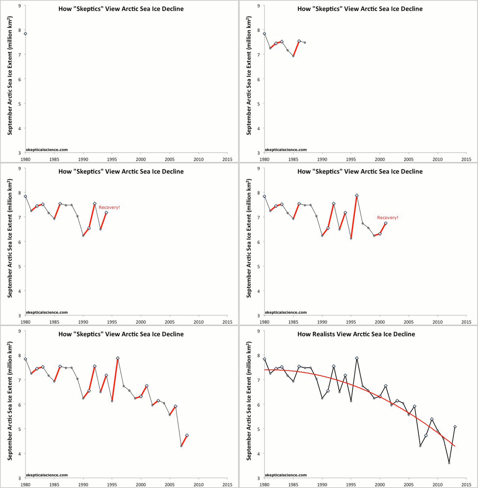
We have created a new animated GIF to depict in a simple and straightforward manner exactly why this focus on short-term data is misguided. The principle is very similar to 'going down the up escalator' for global temperatures. In this case, climate contrarians are trying to go up the down escalator, finding very brief periods during which Arctic sea ice extent increases, and proclaiming that it has "recovered," all the while ignoring the accelerating long-term decline (Figure 1).

2013_Arctic_Escalator_1024.gif

Figure 1: NSIDC September Arctic sea ice extent (blue diamonds) with "recovery" years highlighted in red, vs. the long-term sea ice decline fit with a second order polynomial, also in red.

The Neverending Recovery

2007 was the previous year in which the Arctic sea ice decline shattered all records. There is a principle in statistics known as "regression toward the mean," which is the phenomenon that if an extreme value of a variable is observed, the next measurement will generally be less extreme, i.e. we should not expect to observe record lows in consecutive years. This is because when extremes are reached and records are broken, a number of different variables generally have to align in the same direction to make this happen.

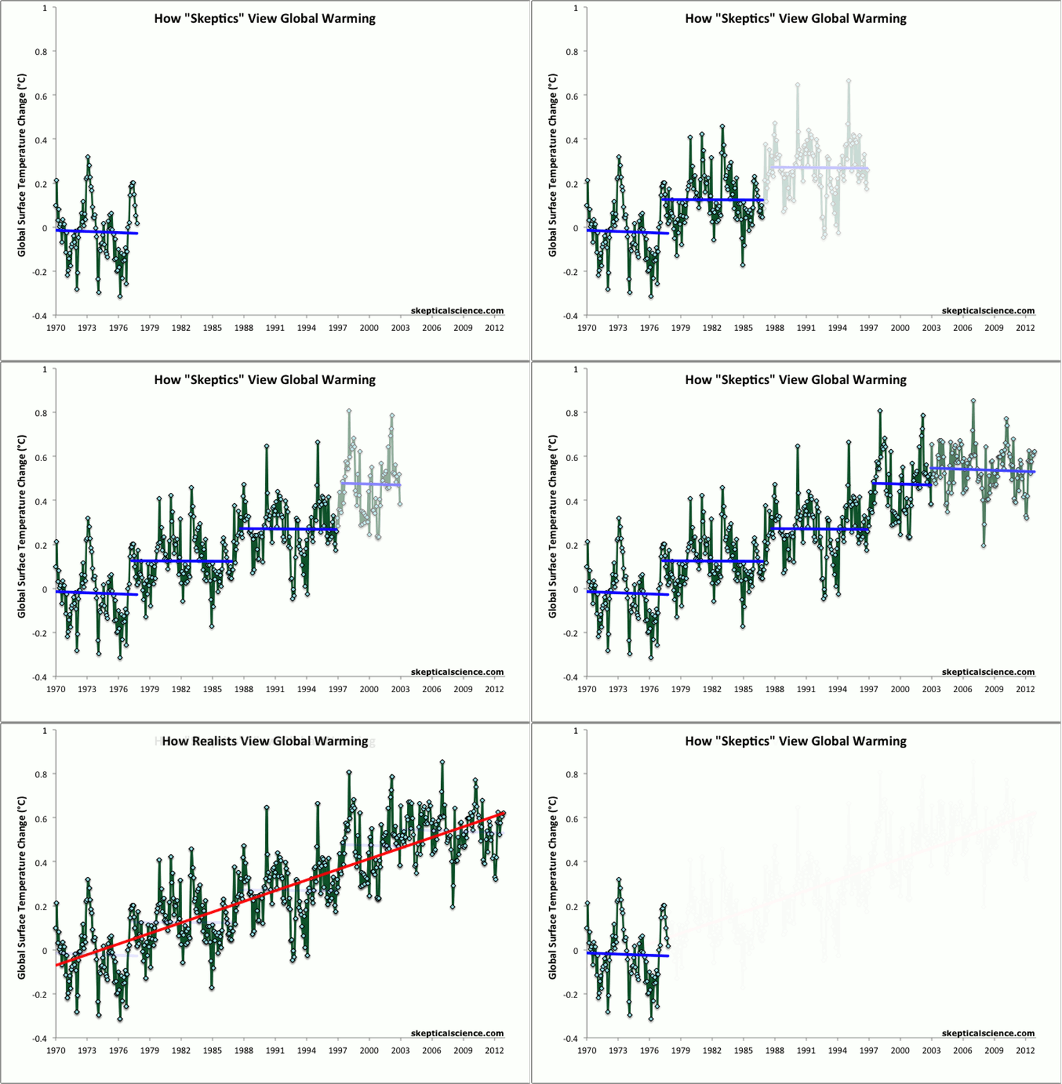
For example, 1998 was the hottest year on record and remained the hottest until 2005 because it involved a combination of an exceptionally strong El Niño, fairly high solar activity, low volcanic activity, and the increased human-caused greenhouse effect. All of the most important variables happened to align in the warming direction in 1998, which is why 1998 is often used as the starting point to argue that global warming has magically stopped, as illustrated in the global surface temperature escalator (Figure 2).

Escalator_2012_1024.gif

Figure 2: BEST land-only surface temperature data (green) with linear trends applied to the timeframes 1973 to 1980, 1980 to 1988, 1988 to 1995, 1995 to 2001, 1998 to 2005, 2002 to 2010 (blue), and 1973 to 2010 (red). The baseline period is 1950-1980.

Likewise, the record low Arctic sea ice extent in 2007 was not broken for another five years because on top of the long-term human-caused decline, 2007 involved a perfect combination of weather events and natural cycles contributing to even further sea ice loss.
Thus even when there is a long-term trend, extreme events are often followed by a regression toward less extreme values. This presents an opportunity for those who want to deny the existence of the long-term trend to characterize these regression years as "recoveries," claiming there is nothing to worry about because temperatures seem to be cooling (as in Figure 2) or because Arctic sea ice seems to be bouncing back to normal levels (as in Figure 1).

Slipping Down the Icy Escalator

For example, climate contrarians claimed that after the record low sea ice extent in 2007, the regression years of 2008 (e.g. here and here) and 2009 (here) showed that Arctic sea ice was recovering back to normal, and thus that there was nothing to worry about. This focus on this short-term two-year "recovery" while ignoring the long-term trend led the contrarians to make some very optimistic predictions about 2010 sea ice extent (here), which turned out to be very, very wrong as the brief "recovery" mirage ended and the long-term trend in Arctic sea ice decline continued to accelerate. Undeterred, the contrarians continued to make overly optimistic predictions in 2011 and 2012, which similarly turned out to be very, very wrong. We will have a blog post examining various Arctic sea ice predictions over the past several years once we have reached this year's minimum.

Figure 1 has been added to the Skeptical Science's Animated Climate Graphics Page, and is free for anyone to use and distribute. We suspect it may very well come in handy next year, as another regression toward less extreme values is likely, and if there is another regression, we can certainly expect the climate contrarians to once again proclaim that Arctic sea ice is on its way to a full recovery.

We wish their optimism were not misplaced, but sadly it is only a matter of time before the Arctic becomes ice free in the summer. Denying this reality will only allow the problem to continue doing more damage to ecosystems around the world.
 
Myth of arctic meltdown: Stunning satellite images show summer ice cap is thicker

And yet when I step out into the sun that appears more intensely radiating, that feels hotter every year, my skin starts feeling like its getting radiation burns within minutes. I've been around 50 years. This sun today is a different sun from the 4 decades previous to this one. Each decade it's gotten more and more intense feeling to be out in.

What used to take a couple of days of careful sunbathing to get a tan can now darken my skin significantly within just an hour. Don't need a NASA study to feel what's going on right on your skin.

Yes 'feeling' things is how the climate folks roll.
 
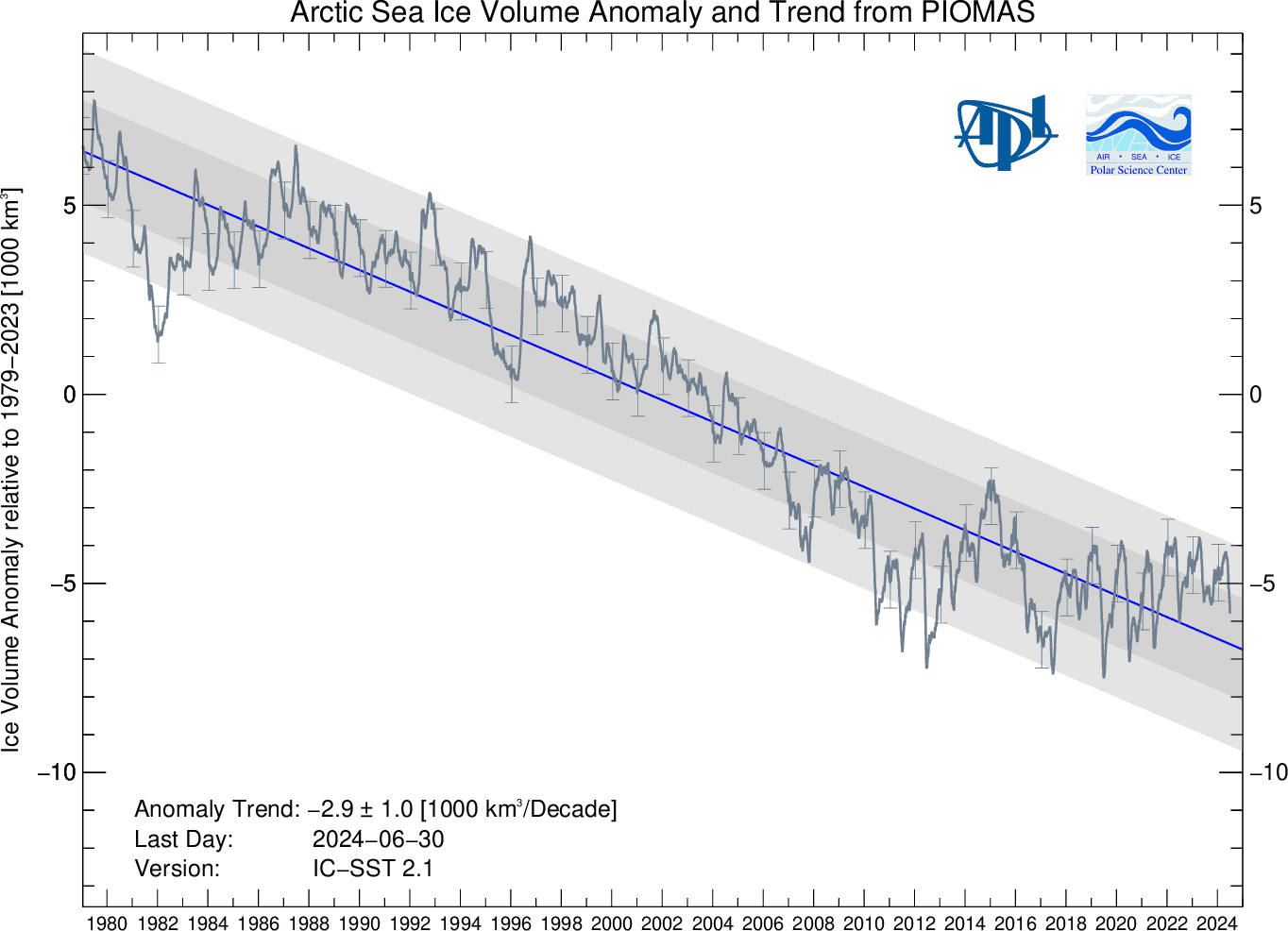
I agree that current ice extents are up ~40% over 2012 levels. What I don't agree with is that this point MEANS anything in the face of:

BPIOMASIceVolumeAnomalyCurrentV2.1.png

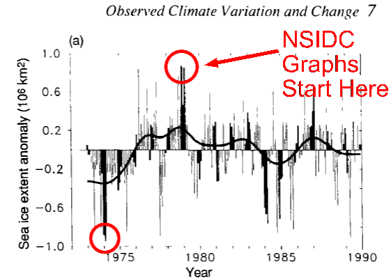
I don't think you could be honest if your life depended on it....why does your chart start in 1980? There were ice observations prior to 1980...any idea what they looked like?

screenhunter_2385-aug-29-15-29.gif
 
Perhaps because the discussion centered around the last 3 years. And we probably didn't use that piece of toilet paper you posted because it's crap. How about identifying its source? How about identifying its baseline? How about describing the methods by which the data were gathered? How about obtaining a copy of sufficient quality that the fucking thing could be read.

I have one other small problem with it, though. Arctic sea ice extents since 1979 have ranged from ~8 million square kilometers down to as low as ~3.5 million square kilometers. Why is it that the total range of your data, labeled only "sea ice", is +1 million square kilometers?

Eh, Mr Science? Got an answer for that?

Climate discussions are always centered around a specific, and very recent time period. Ever wonder why that might be? We all know that if we look outside that very limited period of time you wish to talk about your whole argument goes up in smoke.

And the IPCC itself once reported that the ice extent was much lower in 1974 than it was in 1979...back when there was some integrity within the organization. The graph I provided was from an IPCC report in 1990...

http://www.ipcc.ch/ipccreports/far/wg_I/ipcc_far_wg_I_full_report.pdf
 
Last edited:
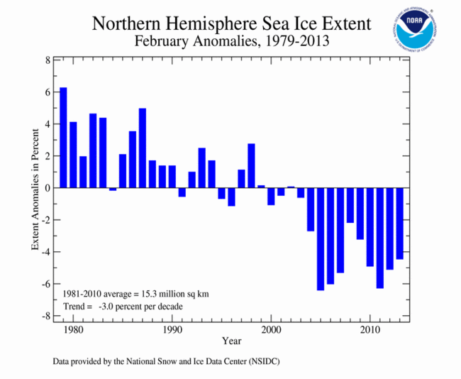
I typed all the text from your graphic into Google and then asked for images. I've looked through pages and pages and pages but haven't found your odd little graph. I did find this one:

201302.gif


This goes all the way back to 1979 (start of satellite data) and comes from NCDC/NOAA. It doesn't even resemble your data. And note the legend near the bottom: 1981-2010 average = 15.3 million square kilometers.
 
By the way...the graph I provided was from a 1990 IPCC report...

http://www.ipcc.ch/ipccreports/far/wg_I/ipcc_far_wg_I_full_report.pdf


This link leads to a very large document. You're going to have to do a little better than that.

I have downloaded the 414 page WG I of the First Assessment Report which you claimed was the source of those data. I have searched the entire document for "sea ice" and "climate variation" and not found it. I'm going to take a wild guess that you're lying.
 
How do you believe we have tied our hands behind our back?

Because we have a president that is apparently opposed to the use of fossil fuels until we can develop a reliable, cost effective replacement. He should put ALL options on the table, spell out that we're going to utilize EVERY source under our control, open up land for oil, coal and gas exploration, all while creating a Manhattan Project for energy. That would reduce our dependence on foreign energy, kick start the economy like nothing else, and revitalize the country. The government should not be picking winners and losers based on politics.
The world has already developed reliable, cost effective, cleaner, non-carbon-emitting, renewable replacements for fossil fuels. Solar power, both PV and concentrating & wind power & ocean wave, tide and current power.

You seem to be in some kind of moronic denial of that fact, as well as in denial about the reality and dangers of AGW. You're probably another dupe of the fossil fuel industry propaganda campaign to protect their profits with lies and deception. You poor stooge.


which of those will power an 18 wheeler, a train, or a plane across this country?
 
I don't think you could be honest if your life depended on it....why does your chart start in 1980? There were ice observations prior to 1980...any idea what they looked like?

screenhunter_2385-aug-29-15-29.gif

Still waiting for the source of these data. This graphic is not to be found in the document to which you linked. If I am wrong, give us a page number. I will apologize. Till then...


note the Y axis. It shows a change of .2 of a degree. Are you serious that this means anything?
 
Found it. You have my apologies. The graph you presented is found on page 224 of the linked document. However, it is not Arctic ice extents. It is the northern hemisphere's. The same page shows the snow anomaly (a downward trend) and the Southern Hemisphere's ice extents anomaly (interestingly, ALSO a downward trend).
 

Forum List

Back
Top