The Hockey Stick Graph Reality

[--that was actually used to affect public policy. More info at I Love CO2: Top 15 Climate Myths
comparison.gif

So, the Lamb graph, a very old graph of central England temps. Very dishonest of you to pretend it represented the world.

Oh, did your masters not tell you that was just for a spot in central England? Your masters lied to you. Yet even knowing that, you still lick their boots. Curious.
 
You're gonna hyperventilate with all that colorful fact. NONE of it represents an ACCURATE and well resolved picture of historical temperatures.. IT CAN'T.. Because combining all those dissimilar proxies doesn't give you ANY short term temperatures. It just produces (in ALL the hockey sticks -- except short time Hi Resolution series studies) a MEDIAN temperature with a resolution of 400 to 1000 years.... MEANING THAT -- there is NO EVIDENCE in those data preps that would SHOW PEAK temperature excursions over a 100 hundred or 400 yr period.. They are not there.

I'm not saying that. MARCOTT said it. And others in the climate community. The ONLY thing those long term proxies show is a rough MEAN temperature that has "information bandwidth" content only in the context of CENTURIES...

Burn your nasty ass out making conclusions that compare to modern HOURLY instrumentation. It's dishonest to do that -- so it's right up your alley TinkerBelle.. Nobody who's informed is buying the deception and the misrepresentation of bug shells, ice cores, tree rings as EQUIVALENT IN INFORMATION CONTENT to a thermometer. It's anti - science to deny it..

Denier cult gibberish! Lots of fraudulent claims without any supporting evidence. FAIL!


I'm gonna ask you 2 VERY simple questions to promote a discussion. I suspect with all the Big Font and Crayon stuff that you've slung up here these questions should be really simple for ya Tinkerbelle..

1) Do you expect to see and accurately measure temperature dynamics in the Marcott study that have features SHORTER than 500 years in duration?

2) If NOT --- how would you EVER discuss rates of change or RELATIVE HIGH temperatures being higher NOW in a 100 year period compared to the data processing result in the Marcott Hockey Stick?

Can't or don't WANT to answer?? Then get off my cloud...
 
I'm not doing this for a 4th or 5th time, but the right hand "modern instrumentation" record is tacked onto a data result that doesn't have the global spatial or time temporal resolution to resolve accurate PEAK or MIN measurements for any period LESS THAN ABOUT 500 years..

That's Flac's "You can't absolutely prove that sudden huge climate spikes don't occur naturally, therefore they always do, therefore this is natural!" logic.

Needless to say, it's not taken seriously by real scientists, or by anyone who understands how science works.

You also need to man-up (or cat-up) to the 2 questions I just asked TinkerBelle --- Squidward.

Can you do it?? Can we discuss this like adults? Or are you just gonna continue to blubber and rant?
And quit misquoting me --- it's annoying and unethical.
 
Besides the adjustments -- the whole thing is a LOT less scary without the immoral ruse of tacking on the modern instrumentation record to the right side.

Immoral because you say so? Very convincing. The rest of the world thinks it's very good science.

You're demanding that good data be discarded, solely because you don't like the results. You're engaging in a brazen cherrypicking fraud, and the immorality of that is clear to the whole world.
 
Dr. Mann's original Hockey-Stick Graph showing that global temperatures are rising way faster now than anytime in over a thousand years has been scientifically confirmed many, many times over by now by other teams of scientists all around the world, and it has been extended much farther back in time. It is now clear that late twentieth century and current warming is happening much faster than any previous warming over the entire Holocene period, or at least 11 thousand years.

Here's the science.

Paleoclimate: The End of the Holocene
Dr. Stefan Rahmstorf
RealClimate
16 September 2013
(excerpts)
Recently a group of researchers from Harvard and Oregon State University has published the first global temperature reconstruction for the last 11,000 years – that’s the whole Holocene (Marcott et al. 2013).

A while ago, I discussed here the new, comprehensive climate reconstruction from the PAGES 2k project for the past 2000 years. But what came before that? Does the long-term cooling trend that ruled most of the last two millennia reach even further back into the past?

Over the last decades, numerous researchers have painstakingly collected, analyzed, dated, and calibrated many data series that allow us to reconstruct climate before the age of direct measurements. Such data come e.g. from sediment drilling in the deep sea, from corals, ice cores and other sources. Shaun Marcott and colleagues for the first time assembled 73 such data sets from around the world into a global temperature reconstruction for the Holocene, published in Science. Or strictly speaking, many such reconstructions: they have tried about twenty different averaging methods and also carried out 1,000 Monte Carlo simulations with random errors added to the dating of the individual data series to demonstrate the robustness of their results.

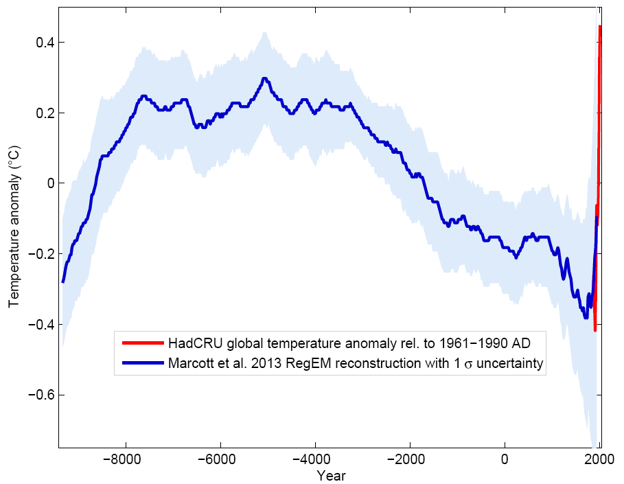
To show the main result straight away, it looks like this:


Figure 1 Blue curve: Global temperature reconstruction from proxy data of Marcott et al, Science 2013. Shown here is the RegEM version – significant differences between the variants with different averaging methods arise only towards the end, where the number of proxy series decreases. This does not matter since the recent temperature evolution is well known from instrumental measurements, shown in red (global temperature from the instrumental HadCRU data). Graph: Klaus Bitterman.

The climate curve looks like a “hump”. At the beginning of the Holocene -- after the end of the last Ice Age -- global temperature increased, and subsequently it decreased again by 0.7 ° C over the past 5000 years. The well-known transition from the relatively warm Medieval into the “little ice age” turns out to be part of a much longer-term cooling, which ended abruptly with the rapid warming of the 20th Century. Within a hundred years, the cooling of the previous 5000 years was undone. (One result of this is, for example, that the famous iceman ‘Ötzi’, who disappeared under ice 5000 years ago, reappeared in 1991.)

Comparison with the PAGES 2k reconstruction

The data used by Marcott et al. are different from those of the PAGES 2k project (which used land data only) mainly in that they come to 80% from deep-sea sediments. Sediments reach further back in time (far further than just through the Holocene – but that’s another story). Unlike tree-ring data, which are mainly suitable for the last two thousand years and rarely reach further. However, the sediment data have poorer time resolution and do not extend right up to the present, because the surface of the sediment is disturbed when the sediment core is taken. The methods of temperature reconstruction are very different from those used with the land data. For example, in sediment data the concentration of oxygen isotopes or the ratio of magnesium to calcium in the calcite shells of microscopic plankton are used, both of which show a good correlation with the water temperature. Thus each sediment core can be individually calibrated to obtain a temperature time series for each location.

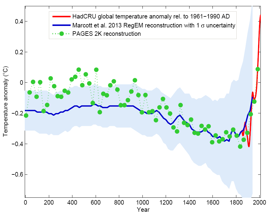
Overall, the new Marcott reconstruction is largely independent of, and nicely complementary to, the PAGES 2k reconstruction: ocean instead of land, completely different methodology. Therefore, a comparison between the two is interesting:

Figure 3 The last two thousand years from Figure 1, in comparison to the PAGES 2k reconstruction (green), which was recently described here in detail. Graph: Klaus Bitterman.

As we can see, both reconstruction methods give consistent results. That the evolution of the last one thousand years is virtually identical is, by the way, yet another confirmation of the “hockey stick” by Mann et al. 1999, which is practically identical as well (see graph in my PAGES article).

Conclusion

The curve (or better curves) of Marcott et al. will not be the last word on the global temperature history during the Holocene; like Mann et al. in 1998 it is the opening of the scientific discussion. There will certainly be alternative proposals, and here and there some corrections and improvements. However, I believe that (as was the case with Mann et al. for the last millennium) the basic shape will turn out to be robust: a relatively smooth curve with slow cooling trend lasting millennia from the Holocene optimum to the “little ice age”, mainly driven by the orbital cycles. At the end this cooling trend is abruptly reversed by the modern anthropogenic warming.

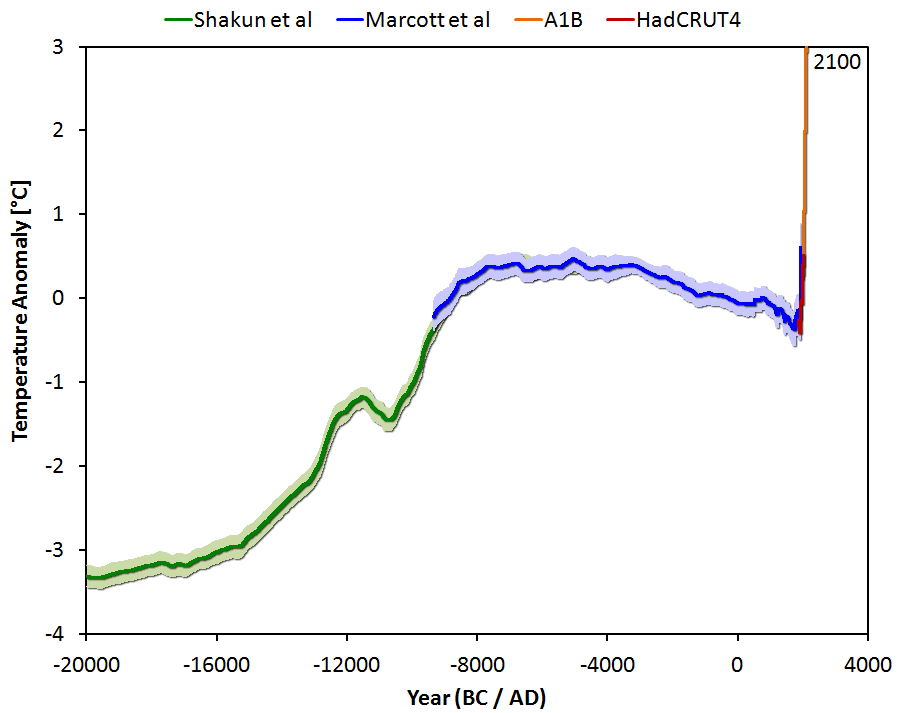
The following graph shows the Marcott reconstruction complemented by some context: the warming at the end of the last Ice Age (which 20,000 years ago reached its peak) and a medium projection for the expected warming in the 21st Century if humanity does not quickly reduce greenhouse gas emissions.


Figure 4 Global temperature variation since the last ice age 20,000 years ago, extended until 2100 for a medium emissions scenario with about 3 degrees of global warming. Graph: Jos Hagelaars.

Marcott et al. dryly state about this future prospect: "By 2100, global average temperatures will probably be 5 to 12 standard deviations above the Holocene temperature mean."

In other words: We are catapulting ourselves way out of the Holocene.

Just looking at the known drivers (climate forcings) and the actual temperature history shows it directly, without need for a climate model: without the increase in greenhouse gases caused by humans, the slow cooling trend would have continued. Thus virtually the entire warming of the 20th Century is due to man. This May, for the first time in at least a million years, the concentration of carbon dioxide in our atmosphere has exceeded the threshold of 400 ppm. If we do not stop this trend very soon, we will not recognize our Earth by the end of this century.


This piece of shit graph was destroyed way back in 2004 clown boy. Why do you trot this anti science crap out as if it is somehow meaningful? What mental defect do you suffer from junior? Or are you just plain old stupid?


Sustainable Energy
Global Warming Bombshell
A prime piece of evidence linking human activity to climate change turns out to be an artifact of poor mathematics.


"But now a shock: Canadian scientists Stephen McIntyre and Ross McKitrick have uncovered a fundamental mathematical flaw in the computer program that was used to produce the hockey stick. In his original publications of the stick, Mann purported to use a standard method known as principal component analysis, or PCA, to find the dominant features in a set of more than 70 different climate records.

But it wasnt so. McIntyre and McKitrick obtained part of the program that Mann used, and they found serious problems. Not only does the program not do conventional PCA, but it handles data normalization in a way that can only be described as mistaken.

Now comes the real shocker. This improper normalization procedure tends to emphasize any data that do have the hockey stick shape, and to suppress all data that do not. To demonstrate this effect, McIntyre and McKitrick created some meaningless test data that had, on average, no trends. This method of generating random data is called Monte Carlo analysis, after the famous casino, and it is widely used in statistical analysis to test procedures. When McIntyre and McKitrick fed these random data into the Mann procedure, out popped a hockey stick shape!"


"McIntyre and McKitrick sent their detailed analysis to Nature magazine for publication, and it was extensively refereed. But their paper was finally rejected. In frustration, McIntyre and McKitrick put the entire record of their submission and the referee reports on a Web page for all to see. If you look, youll see that McIntyre and McKitrick have found numerous other problems with the Mann analysis. I emphasize the bug in their PCA program simply because it is so blatant and so easy to understand. Apparently, Mann and his colleagues never tested their program with the standard Monte Carlo approach, or they would have discovered the error themselves. Other and different criticisms of the hockey stick are emerging (see, for example, the paper by Hans von Storch and colleagues in the September 30 issue of Science)."


Global Warming Bombshell

LOL Mr. Westwall, that is from 2004, this is from 2015;


Dr. Muller, "I was wrong".


Only because he had a nice shiny "sustainability" company to promote. Once money gets involved it's amazing how quickly their ethics fall by the wayside. Leave it to a complete moron, like you, to not understand that.
 
Besides the adjustments -- the whole thing is a LOT less scary without the immoral ruse of tacking on the modern instrumentation record to the right side.

Immoral because you say so? Very convincing. The rest of the world thinks it's very good science.

You're demanding that good data be discarded, solely because you don't like the results. You're engaging in a brazen cherrypicking fraud, and the immorality of that is clear to the whole world.

It would be immoral to patch on a chart of Brit Pound to yen ratio as determined in the 21st century to a 500 year "meta data" or proxy study of those values. Especially IMMORAL to than talk about yearly volatility of the index or the Local Maximums of the data per year.

Wouldn't it? So WhyTF would you ever tack on temperature data that we now measure HOURLY to data from 8,000 years ago that was essentially measured in 200 or 400 YEAR increments?
 
2 decades...no warming.
Nope! Those two decades had the same general warming trend as the previous two decades.


(Credit: NOAA)


Why does reality deny the truth of Global warming?
Reality confirms the truth of human caused global warming, CrazyFruitcake, it is your crackpot anti-science denier cult myths that deny reality.

UAH_LT_1979_thru_May_2015_v6.png


Real, accurate, recent measurements show a 2 decade pause

Frankie boi, that is really funny, you use something from two years ago to lie. LOL Here is the reality, according to Dr. Spencer;

UAH_LT_1979_thru_February_2017_v6-550x317.jpg


UAH Global Temperature Update for February, 2017: +0.35 deg. C. « Roy Spencer, PhD
 
Dr. Mann's original Hockey-Stick Graph showing that global temperatures are rising way faster now than anytime in over a thousand years has been scientifically confirmed many, many times over by now by other teams of scientists all around the world, and it has been extended much farther back in time. It is now clear that late twentieth century and current warming is happening much faster than any previous warming over the entire Holocene period, or at least 11 thousand years.

Here's the science.

Paleoclimate: The End of the Holocene
Dr. Stefan Rahmstorf
RealClimate
16 September 2013
(excerpts)
Recently a group of researchers from Harvard and Oregon State University has published the first global temperature reconstruction for the last 11,000 years – that’s the whole Holocene (Marcott et al. 2013).

A while ago, I discussed here the new, comprehensive climate reconstruction from the PAGES 2k project for the past 2000 years. But what came before that? Does the long-term cooling trend that ruled most of the last two millennia reach even further back into the past?

Over the last decades, numerous researchers have painstakingly collected, analyzed, dated, and calibrated many data series that allow us to reconstruct climate before the age of direct measurements. Such data come e.g. from sediment drilling in the deep sea, from corals, ice cores and other sources. Shaun Marcott and colleagues for the first time assembled 73 such data sets from around the world into a global temperature reconstruction for the Holocene, published in Science. Or strictly speaking, many such reconstructions: they have tried about twenty different averaging methods and also carried out 1,000 Monte Carlo simulations with random errors added to the dating of the individual data series to demonstrate the robustness of their results.

To show the main result straight away, it looks like this:


Figure 1 Blue curve: Global temperature reconstruction from proxy data of Marcott et al, Science 2013. Shown here is the RegEM version – significant differences between the variants with different averaging methods arise only towards the end, where the number of proxy series decreases. This does not matter since the recent temperature evolution is well known from instrumental measurements, shown in red (global temperature from the instrumental HadCRU data). Graph: Klaus Bitterman.

The climate curve looks like a “hump”. At the beginning of the Holocene -- after the end of the last Ice Age -- global temperature increased, and subsequently it decreased again by 0.7 ° C over the past 5000 years. The well-known transition from the relatively warm Medieval into the “little ice age” turns out to be part of a much longer-term cooling, which ended abruptly with the rapid warming of the 20th Century. Within a hundred years, the cooling of the previous 5000 years was undone. (One result of this is, for example, that the famous iceman ‘Ötzi’, who disappeared under ice 5000 years ago, reappeared in 1991.)

Comparison with the PAGES 2k reconstruction

The data used by Marcott et al. are different from those of the PAGES 2k project (which used land data only) mainly in that they come to 80% from deep-sea sediments. Sediments reach further back in time (far further than just through the Holocene – but that’s another story). Unlike tree-ring data, which are mainly suitable for the last two thousand years and rarely reach further. However, the sediment data have poorer time resolution and do not extend right up to the present, because the surface of the sediment is disturbed when the sediment core is taken. The methods of temperature reconstruction are very different from those used with the land data. For example, in sediment data the concentration of oxygen isotopes or the ratio of magnesium to calcium in the calcite shells of microscopic plankton are used, both of which show a good correlation with the water temperature. Thus each sediment core can be individually calibrated to obtain a temperature time series for each location.

Overall, the new Marcott reconstruction is largely independent of, and nicely complementary to, the PAGES 2k reconstruction: ocean instead of land, completely different methodology. Therefore, a comparison between the two is interesting:

Figure 3 The last two thousand years from Figure 1, in comparison to the PAGES 2k reconstruction (green), which was recently described here in detail. Graph: Klaus Bitterman.

As we can see, both reconstruction methods give consistent results. That the evolution of the last one thousand years is virtually identical is, by the way, yet another confirmation of the “hockey stick” by Mann et al. 1999, which is practically identical as well (see graph in my PAGES article).

Conclusion

The curve (or better curves) of Marcott et al. will not be the last word on the global temperature history during the Holocene; like Mann et al. in 1998 it is the opening of the scientific discussion. There will certainly be alternative proposals, and here and there some corrections and improvements. However, I believe that (as was the case with Mann et al. for the last millennium) the basic shape will turn out to be robust: a relatively smooth curve with slow cooling trend lasting millennia from the Holocene optimum to the “little ice age”, mainly driven by the orbital cycles. At the end this cooling trend is abruptly reversed by the modern anthropogenic warming.

The following graph shows the Marcott reconstruction complemented by some context: the warming at the end of the last Ice Age (which 20,000 years ago reached its peak) and a medium projection for the expected warming in the 21st Century if humanity does not quickly reduce greenhouse gas emissions.


Figure 4 Global temperature variation since the last ice age 20,000 years ago, extended until 2100 for a medium emissions scenario with about 3 degrees of global warming. Graph: Jos Hagelaars.

Marcott et al. dryly state about this future prospect: "By 2100, global average temperatures will probably be 5 to 12 standard deviations above the Holocene temperature mean."

In other words: We are catapulting ourselves way out of the Holocene.

Just looking at the known drivers (climate forcings) and the actual temperature history shows it directly, without need for a climate model: without the increase in greenhouse gases caused by humans, the slow cooling trend would have continued. Thus virtually the entire warming of the 20th Century is due to man. This May, for the first time in at least a million years, the concentration of carbon dioxide in our atmosphere has exceeded the threshold of 400 ppm. If we do not stop this trend very soon, we will not recognize our Earth by the end of this century.


This piece of shit graph was destroyed way back in 2004 clown boy. Why do you trot this anti science crap out as if it is somehow meaningful? What mental defect do you suffer from junior? Or are you just plain old stupid?


Sustainable Energy
Global Warming Bombshell
A prime piece of evidence linking human activity to climate change turns out to be an artifact of poor mathematics.


"But now a shock: Canadian scientists Stephen McIntyre and Ross McKitrick have uncovered a fundamental mathematical flaw in the computer program that was used to produce the hockey stick. In his original publications of the stick, Mann purported to use a standard method known as principal component analysis, or PCA, to find the dominant features in a set of more than 70 different climate records.

But it wasnt so. McIntyre and McKitrick obtained part of the program that Mann used, and they found serious problems. Not only does the program not do conventional PCA, but it handles data normalization in a way that can only be described as mistaken.

Now comes the real shocker. This improper normalization procedure tends to emphasize any data that do have the hockey stick shape, and to suppress all data that do not. To demonstrate this effect, McIntyre and McKitrick created some meaningless test data that had, on average, no trends. This method of generating random data is called Monte Carlo analysis, after the famous casino, and it is widely used in statistical analysis to test procedures. When McIntyre and McKitrick fed these random data into the Mann procedure, out popped a hockey stick shape!"


"McIntyre and McKitrick sent their detailed analysis to Nature magazine for publication, and it was extensively refereed. But their paper was finally rejected. In frustration, McIntyre and McKitrick put the entire record of their submission and the referee reports on a Web page for all to see. If you look, youll see that McIntyre and McKitrick have found numerous other problems with the Mann analysis. I emphasize the bug in their PCA program simply because it is so blatant and so easy to understand. Apparently, Mann and his colleagues never tested their program with the standard Monte Carlo approach, or they would have discovered the error themselves. Other and different criticisms of the hockey stick are emerging (see, for example, the paper by Hans von Storch and colleagues in the September 30 issue of Science)."


Global Warming Bombshell

LOL Mr. Westwall, that is from 2004, this is from 2015;


Dr. Muller, "I was wrong".


Only because he had a nice shiny "sustainability" company to promote. Once money gets involved it's amazing how quickly their ethics fall by the wayside. Leave it to a complete moron, like you, to not understand that.

Link? Or is that an 'alternative fact', otherwise known as a stinky fact pulled from your asshole.
 
Dr. Mann's original Hockey-Stick Graph showing that global temperatures are rising way faster now than anytime in over a thousand years has been scientifically confirmed many, many times over by now by other teams of scientists all around the world, and it has been extended much farther back in time. It is now clear that late twentieth century and current warming is happening much faster than any previous warming over the entire Holocene period, or at least 11 thousand years.

Here's the science.

Paleoclimate: The End of the Holocene
Dr. Stefan Rahmstorf
RealClimate
16 September 2013
(excerpts)
Recently a group of researchers from Harvard and Oregon State University has published the first global temperature reconstruction for the last 11,000 years – that’s the whole Holocene (Marcott et al. 2013).

A while ago, I discussed here the new, comprehensive climate reconstruction from the PAGES 2k project for the past 2000 years. But what came before that? Does the long-term cooling trend that ruled most of the last two millennia reach even further back into the past?

Over the last decades, numerous researchers have painstakingly collected, analyzed, dated, and calibrated many data series that allow us to reconstruct climate before the age of direct measurements. Such data come e.g. from sediment drilling in the deep sea, from corals, ice cores and other sources. Shaun Marcott and colleagues for the first time assembled 73 such data sets from around the world into a global temperature reconstruction for the Holocene, published in Science. Or strictly speaking, many such reconstructions: they have tried about twenty different averaging methods and also carried out 1,000 Monte Carlo simulations with random errors added to the dating of the individual data series to demonstrate the robustness of their results.

To show the main result straight away, it looks like this:


Figure 1 Blue curve: Global temperature reconstruction from proxy data of Marcott et al, Science 2013. Shown here is the RegEM version – significant differences between the variants with different averaging methods arise only towards the end, where the number of proxy series decreases. This does not matter since the recent temperature evolution is well known from instrumental measurements, shown in red (global temperature from the instrumental HadCRU data). Graph: Klaus Bitterman.

The climate curve looks like a “hump”. At the beginning of the Holocene -- after the end of the last Ice Age -- global temperature increased, and subsequently it decreased again by 0.7 ° C over the past 5000 years. The well-known transition from the relatively warm Medieval into the “little ice age” turns out to be part of a much longer-term cooling, which ended abruptly with the rapid warming of the 20th Century. Within a hundred years, the cooling of the previous 5000 years was undone. (One result of this is, for example, that the famous iceman ‘Ötzi’, who disappeared under ice 5000 years ago, reappeared in 1991.)

Comparison with the PAGES 2k reconstruction

The data used by Marcott et al. are different from those of the PAGES 2k project (which used land data only) mainly in that they come to 80% from deep-sea sediments. Sediments reach further back in time (far further than just through the Holocene – but that’s another story). Unlike tree-ring data, which are mainly suitable for the last two thousand years and rarely reach further. However, the sediment data have poorer time resolution and do not extend right up to the present, because the surface of the sediment is disturbed when the sediment core is taken. The methods of temperature reconstruction are very different from those used with the land data. For example, in sediment data the concentration of oxygen isotopes or the ratio of magnesium to calcium in the calcite shells of microscopic plankton are used, both of which show a good correlation with the water temperature. Thus each sediment core can be individually calibrated to obtain a temperature time series for each location.

Overall, the new Marcott reconstruction is largely independent of, and nicely complementary to, the PAGES 2k reconstruction: ocean instead of land, completely different methodology. Therefore, a comparison between the two is interesting:

Figure 3 The last two thousand years from Figure 1, in comparison to the PAGES 2k reconstruction (green), which was recently described here in detail. Graph: Klaus Bitterman.

As we can see, both reconstruction methods give consistent results. That the evolution of the last one thousand years is virtually identical is, by the way, yet another confirmation of the “hockey stick” by Mann et al. 1999, which is practically identical as well (see graph in my PAGES article).

Conclusion

The curve (or better curves) of Marcott et al. will not be the last word on the global temperature history during the Holocene; like Mann et al. in 1998 it is the opening of the scientific discussion. There will certainly be alternative proposals, and here and there some corrections and improvements. However, I believe that (as was the case with Mann et al. for the last millennium) the basic shape will turn out to be robust: a relatively smooth curve with slow cooling trend lasting millennia from the Holocene optimum to the “little ice age”, mainly driven by the orbital cycles. At the end this cooling trend is abruptly reversed by the modern anthropogenic warming.

The following graph shows the Marcott reconstruction complemented by some context: the warming at the end of the last Ice Age (which 20,000 years ago reached its peak) and a medium projection for the expected warming in the 21st Century if humanity does not quickly reduce greenhouse gas emissions.


Figure 4 Global temperature variation since the last ice age 20,000 years ago, extended until 2100 for a medium emissions scenario with about 3 degrees of global warming. Graph: Jos Hagelaars.

Marcott et al. dryly state about this future prospect: "By 2100, global average temperatures will probably be 5 to 12 standard deviations above the Holocene temperature mean."

In other words: We are catapulting ourselves way out of the Holocene.

Just looking at the known drivers (climate forcings) and the actual temperature history shows it directly, without need for a climate model: without the increase in greenhouse gases caused by humans, the slow cooling trend would have continued. Thus virtually the entire warming of the 20th Century is due to man. This May, for the first time in at least a million years, the concentration of carbon dioxide in our atmosphere has exceeded the threshold of 400 ppm. If we do not stop this trend very soon, we will not recognize our Earth by the end of this century.

Dr. Mann's original Hockey-Stick Graph showing that global temperatures are rising way faster now than anytime in over a thousand years has been scientifically confirmed many, many times over by now by other teams of scientists all around the world,

Is that why he won the Nobel Prize?
And that addresses the fact that the Mann Graph has been replicated many times by many different research teams using different proxies and statistical methods many times, how? Todd, you know damned well that kind of logic is no different than the shit that SSDD uses to justify his smart photons.
 
Your "Yale" plot has nothing to do with Yale and is ten years old. When you see a graph that says "Years Before Present", it means "Before 1950. It's intent was NOT to compare current warming to past interglacials but simply to show a correlation between temperature and CO2.

The current anomaly is rough a full centigrade degree above the 1960-1990 average.


And a full centigrade BELOW the 1930's.
Link, smells like another stinky fact, LOL
 
1) Do you expect to see and accurately measure temperature dynamics in the Marcott study that have features SHORTER than 500 years in duration?

2) If NOT --- how would you EVER discuss rates of change or RELATIVE HIGH temperatures being higher NOW in a 100 year period compared to the data processing result in the Marcott Hockey Stick?

Nope. And it's not relevant. We can't absolutely prove fairies don't radically change the climate of the earth on a yearly basis, but nobody decides climate science is pointless because of that. Your logic says we should, but your logic is awful.

Can you do it?? Can we discuss this like adults? Or are you just gonna continue to blubber and rant

Clearly you can't, because you refused to address the content of my post, and tried to deflect with insults. That's your usual thing. The key is to just go back to what you were trying to run from. I know you'll just hurl more insults and run again, but it's fun to make your intellectual vacuity clear.

Your train of logic is:

We can't absolutely prove sudden climate fluctuations aren't common and natural.

Hence, that has to be what's happening now.

That's shit science. You're the one making the positive assertion, that sudden climate fluctuations are common and natural. Hence, the burden of proof is on you to back up that claim, and everyone will ignore you until you do.

And quit misquoting me --- it's annoying and unethical.

Everything in quotes is not meant to be taken as a direct quote of someone. Even you know that. You knew I wasn't quoting you. You're feigning being stupid so you can take a dig at me.
 
Dr. Mann's original Hockey-Stick Graph showing that global temperatures are rising way faster now than anytime in over a thousand years has been scientifically confirmed many, many times over by now by other teams of scientists all around the world, and it has been extended much farther back in time. It is now clear that late twentieth century and current warming is happening much faster than any previous warming over the entire Holocene period, or at least 11 thousand years.

Here's the science.

Paleoclimate: The End of the Holocene
Dr. Stefan Rahmstorf
RealClimate
16 September 2013
(excerpts)
Recently a group of researchers from Harvard and Oregon State University has published the first global temperature reconstruction for the last 11,000 years – that’s the whole Holocene (Marcott et al. 2013).

A while ago, I discussed here the new, comprehensive climate reconstruction from the PAGES 2k project for the past 2000 years. But what came before that? Does the long-term cooling trend that ruled most of the last two millennia reach even further back into the past?

Over the last decades, numerous researchers have painstakingly collected, analyzed, dated, and calibrated many data series that allow us to reconstruct climate before the age of direct measurements. Such data come e.g. from sediment drilling in the deep sea, from corals, ice cores and other sources. Shaun Marcott and colleagues for the first time assembled 73 such data sets from around the world into a global temperature reconstruction for the Holocene, published in Science. Or strictly speaking, many such reconstructions: they have tried about twenty different averaging methods and also carried out 1,000 Monte Carlo simulations with random errors added to the dating of the individual data series to demonstrate the robustness of their results.

To show the main result straight away, it looks like this:


Figure 1 Blue curve: Global temperature reconstruction from proxy data of Marcott et al, Science 2013. Shown here is the RegEM version – significant differences between the variants with different averaging methods arise only towards the end, where the number of proxy series decreases. This does not matter since the recent temperature evolution is well known from instrumental measurements, shown in red (global temperature from the instrumental HadCRU data). Graph: Klaus Bitterman.

The climate curve looks like a “hump”. At the beginning of the Holocene -- after the end of the last Ice Age -- global temperature increased, and subsequently it decreased again by 0.7 ° C over the past 5000 years. The well-known transition from the relatively warm Medieval into the “little ice age” turns out to be part of a much longer-term cooling, which ended abruptly with the rapid warming of the 20th Century. Within a hundred years, the cooling of the previous 5000 years was undone. (One result of this is, for example, that the famous iceman ‘Ötzi’, who disappeared under ice 5000 years ago, reappeared in 1991.)

Comparison with the PAGES 2k reconstruction

The data used by Marcott et al. are different from those of the PAGES 2k project (which used land data only) mainly in that they come to 80% from deep-sea sediments. Sediments reach further back in time (far further than just through the Holocene – but that’s another story). Unlike tree-ring data, which are mainly suitable for the last two thousand years and rarely reach further. However, the sediment data have poorer time resolution and do not extend right up to the present, because the surface of the sediment is disturbed when the sediment core is taken. The methods of temperature reconstruction are very different from those used with the land data. For example, in sediment data the concentration of oxygen isotopes or the ratio of magnesium to calcium in the calcite shells of microscopic plankton are used, both of which show a good correlation with the water temperature. Thus each sediment core can be individually calibrated to obtain a temperature time series for each location.

Overall, the new Marcott reconstruction is largely independent of, and nicely complementary to, the PAGES 2k reconstruction: ocean instead of land, completely different methodology. Therefore, a comparison between the two is interesting:

Figure 3 The last two thousand years from Figure 1, in comparison to the PAGES 2k reconstruction (green), which was recently described here in detail. Graph: Klaus Bitterman.

As we can see, both reconstruction methods give consistent results. That the evolution of the last one thousand years is virtually identical is, by the way, yet another confirmation of the “hockey stick” by Mann et al. 1999, which is practically identical as well (see graph in my PAGES article).

Conclusion

The curve (or better curves) of Marcott et al. will not be the last word on the global temperature history during the Holocene; like Mann et al. in 1998 it is the opening of the scientific discussion. There will certainly be alternative proposals, and here and there some corrections and improvements. However, I believe that (as was the case with Mann et al. for the last millennium) the basic shape will turn out to be robust: a relatively smooth curve with slow cooling trend lasting millennia from the Holocene optimum to the “little ice age”, mainly driven by the orbital cycles. At the end this cooling trend is abruptly reversed by the modern anthropogenic warming.

The following graph shows the Marcott reconstruction complemented by some context: the warming at the end of the last Ice Age (which 20,000 years ago reached its peak) and a medium projection for the expected warming in the 21st Century if humanity does not quickly reduce greenhouse gas emissions.


Figure 4 Global temperature variation since the last ice age 20,000 years ago, extended until 2100 for a medium emissions scenario with about 3 degrees of global warming. Graph: Jos Hagelaars.

Marcott et al. dryly state about this future prospect: "By 2100, global average temperatures will probably be 5 to 12 standard deviations above the Holocene temperature mean."

In other words: We are catapulting ourselves way out of the Holocene.

Just looking at the known drivers (climate forcings) and the actual temperature history shows it directly, without need for a climate model: without the increase in greenhouse gases caused by humans, the slow cooling trend would have continued. Thus virtually the entire warming of the 20th Century is due to man. This May, for the first time in at least a million years, the concentration of carbon dioxide in our atmosphere has exceeded the threshold of 400 ppm. If we do not stop this trend very soon, we will not recognize our Earth by the end of this century.


This piece of shit graph was destroyed way back in 2004 clown boy. Why do you trot this anti science crap out as if it is somehow meaningful? What mental defect do you suffer from junior? Or are you just plain old stupid?


Sustainable Energy
Global Warming Bombshell
A prime piece of evidence linking human activity to climate change turns out to be an artifact of poor mathematics.


"But now a shock: Canadian scientists Stephen McIntyre and Ross McKitrick have uncovered a fundamental mathematical flaw in the computer program that was used to produce the hockey stick. In his original publications of the stick, Mann purported to use a standard method known as principal component analysis, or PCA, to find the dominant features in a set of more than 70 different climate records.

But it wasnt so. McIntyre and McKitrick obtained part of the program that Mann used, and they found serious problems. Not only does the program not do conventional PCA, but it handles data normalization in a way that can only be described as mistaken.

Now comes the real shocker. This improper normalization procedure tends to emphasize any data that do have the hockey stick shape, and to suppress all data that do not. To demonstrate this effect, McIntyre and McKitrick created some meaningless test data that had, on average, no trends. This method of generating random data is called Monte Carlo analysis, after the famous casino, and it is widely used in statistical analysis to test procedures. When McIntyre and McKitrick fed these random data into the Mann procedure, out popped a hockey stick shape!"


"McIntyre and McKitrick sent their detailed analysis to Nature magazine for publication, and it was extensively refereed. But their paper was finally rejected. In frustration, McIntyre and McKitrick put the entire record of their submission and the referee reports on a Web page for all to see. If you look, youll see that McIntyre and McKitrick have found numerous other problems with the Mann analysis. I emphasize the bug in their PCA program simply because it is so blatant and so easy to understand. Apparently, Mann and his colleagues never tested their program with the standard Monte Carlo approach, or they would have discovered the error themselves. Other and different criticisms of the hockey stick are emerging (see, for example, the paper by Hans von Storch and colleagues in the September 30 issue of Science)."


Global Warming Bombshell

LOL Mr. Westwall, that is from 2004, this is from 2015;


Dr. Muller, "I was wrong".


Only because he had a nice shiny "sustainability" company to promote. Once money gets involved it's amazing how quickly their ethics fall by the wayside. Leave it to a complete moron, like you, to not understand that.

Link? Or is that an 'alternative fact', otherwise known as a stinky fact pulled from your asshole.


Man, it is truly impressive how incredibly ignorant you are. Kudos to you, it must take immense effort to remain so blind...


"Power and Energy, Climate Change, Profitable Sustainability"

"Future 500/AHC Group: Professor Richard Muller to join Stakeholder Engagement Executive Workshop in November 2012

San Francisco, September 18, 2012

Professor Richard Muller, the renowned physicist and one-time climate skeptic whose breakthrough research on climate change stirred up the debate on the issue, will be featured in a private discussion with senior corporate executives at the Future 500/AHC Group stakeholder engagement working group.

Muller, who heads the Berkeley Earth Surface Temperature project, has received a lot of attention for his work, notably because his research was partly funded by a Foundation associated with Koch Industries, an oil and gas company."


Professor Richard Muller to join Stakeholder Engagement Executive Workshop - Future 500

Muller & Associates | Impartial Energy Expertise

Richard A. Muller - Wikipedia
 
It would be immoral to patch on a chart of Brit Pound to yen ratio as determined in the 21st century to a 500 year "meta data" or proxy study of those values. Especially IMMORAL to than talk about yearly volatility of the index or the Local Maximums of the data per year.

Wouldn't it?

Not particularly, no. The problem would be with gradually changing economic systems making it an apples and oranges thing, not with data splicing. However, temperature is always temperature. That doesn't change.

So WhyTF would you ever tack on temperature data that we now measure HOURLY to data from 8,000 years ago that was essentially measured in 200 or 400 YEAR increments?

Because temperature is temperature. It's attaching like to like. Exactly how it was determined is not important.
 
lol........the AGW climate crusaders think the USMB threads on the ENVIRONMENT are mainstream!! When is the last time we've seen the hockey stick on TV or in a paper? 2008? Its a relic of a former era like the plain dunkin' donut or a slinky.

nobody cares:bye1:

Lets not forget........CEO of CNN said about 18 months ago, "there just isn't any interest in climate change stories".:deal:

Go find the link yourself!!!:coffee:
 
The net result of this thread is to show that the denialists simply cannot face reality. The Mann Graph stands, has been reproduced many times by many research teams using different proxies from different areas in the world. Between that graph, and what we are seeing in the Arctic and Antarctic, reality is closing in on the very stupid and the venal in this debate on climate.
 
All this back and forth about this guys charts and that guys graph............hysterical. Might as well be an exercise in group navel contemplation. Its been over 10 years since people gave a shit about global warming.:up:

When politically, the President of the United States can go and decimate the EPA with the stroke of a pen, its all you need to know. Nobody is caring.:2up:

But you bozo AGW guys keep telling yourselves the deniers are obsolete!:eusa_dance::eusa_dance:
 
The net result of this thread is to show that the denialists simply cannot face reality. The Mann Graph stands, has been reproduced many times by many research teams using different proxies from different areas in the world. Between that graph, and what we are seeing in the Arctic and Antarctic, reality is closing in on the very stupid and the venal in this debate on climate.

On denier tombstones, it will say

"HE WAS A TOTAL BARKING KOOK"

That's will be the lifetime legacy of the deniers here. They won't be remembered for anything else. The scale of their insanity will wash away the memory of anything good they might have done. You'd think that would bother them, but no, it seems to thrill them, knowing that they'll only be remembered for being complete cranks.

So, getting back to the topic, let's list some of the independent ways hockey sticks have been measured.

Surace temps
Corals
Tree rings
Boreholes
Stalagmites
Glacier length
Ice cores

Dang. Planet earth certainly is working hard on the conspiracy. It's been faking all that stuff. The Earth clearly has a socialist bias.
 
Dr. Mann's original Hockey-Stick Graph showing that global temperatures are rising way faster now than anytime in over a thousand years has been scientifically confirmed many, many times over by now by other teams of scientists all around the world, and it has been extended much farther back in time. It is now clear that late twentieth century and current warming is happening much faster than any previous warming over the entire Holocene period, or at least 11 thousand years.

Here's the science.

Paleoclimate: The End of the Holocene
Dr. Stefan Rahmstorf
RealClimate
16 September 2013
(excerpts)
Recently a group of researchers from Harvard and Oregon State University has published the first global temperature reconstruction for the last 11,000 years – that’s the whole Holocene (Marcott et al. 2013).

A while ago, I discussed here the new, comprehensive climate reconstruction from the PAGES 2k project for the past 2000 years. But what came before that? Does the long-term cooling trend that ruled most of the last two millennia reach even further back into the past?

Over the last decades, numerous researchers have painstakingly collected, analyzed, dated, and calibrated many data series that allow us to reconstruct climate before the age of direct measurements. Such data come e.g. from sediment drilling in the deep sea, from corals, ice cores and other sources. Shaun Marcott and colleagues for the first time assembled 73 such data sets from around the world into a global temperature reconstruction for the Holocene, published in Science. Or strictly speaking, many such reconstructions: they have tried about twenty different averaging methods and also carried out 1,000 Monte Carlo simulations with random errors added to the dating of the individual data series to demonstrate the robustness of their results.

To show the main result straight away, it looks like this:


Figure 1 Blue curve: Global temperature reconstruction from proxy data of Marcott et al, Science 2013. Shown here is the RegEM version – significant differences between the variants with different averaging methods arise only towards the end, where the number of proxy series decreases. This does not matter since the recent temperature evolution is well known from instrumental measurements, shown in red (global temperature from the instrumental HadCRU data). Graph: Klaus Bitterman.

The climate curve looks like a “hump”. At the beginning of the Holocene -- after the end of the last Ice Age -- global temperature increased, and subsequently it decreased again by 0.7 ° C over the past 5000 years. The well-known transition from the relatively warm Medieval into the “little ice age” turns out to be part of a much longer-term cooling, which ended abruptly with the rapid warming of the 20th Century. Within a hundred years, the cooling of the previous 5000 years was undone. (One result of this is, for example, that the famous iceman ‘Ötzi’, who disappeared under ice 5000 years ago, reappeared in 1991.)

Comparison with the PAGES 2k reconstruction

The data used by Marcott et al. are different from those of the PAGES 2k project (which used land data only) mainly in that they come to 80% from deep-sea sediments. Sediments reach further back in time (far further than just through the Holocene – but that’s another story). Unlike tree-ring data, which are mainly suitable for the last two thousand years and rarely reach further. However, the sediment data have poorer time resolution and do not extend right up to the present, because the surface of the sediment is disturbed when the sediment core is taken. The methods of temperature reconstruction are very different from those used with the land data. For example, in sediment data the concentration of oxygen isotopes or the ratio of magnesium to calcium in the calcite shells of microscopic plankton are used, both of which show a good correlation with the water temperature. Thus each sediment core can be individually calibrated to obtain a temperature time series for each location.

Overall, the new Marcott reconstruction is largely independent of, and nicely complementary to, the PAGES 2k reconstruction: ocean instead of land, completely different methodology. Therefore, a comparison between the two is interesting:

Figure 3 The last two thousand years from Figure 1, in comparison to the PAGES 2k reconstruction (green), which was recently described here in detail. Graph: Klaus Bitterman.

As we can see, both reconstruction methods give consistent results. That the evolution of the last one thousand years is virtually identical is, by the way, yet another confirmation of the “hockey stick” by Mann et al. 1999, which is practically identical as well (see graph in my PAGES article).

Conclusion

The curve (or better curves) of Marcott et al. will not be the last word on the global temperature history during the Holocene; like Mann et al. in 1998 it is the opening of the scientific discussion. There will certainly be alternative proposals, and here and there some corrections and improvements. However, I believe that (as was the case with Mann et al. for the last millennium) the basic shape will turn out to be robust: a relatively smooth curve with slow cooling trend lasting millennia from the Holocene optimum to the “little ice age”, mainly driven by the orbital cycles. At the end this cooling trend is abruptly reversed by the modern anthropogenic warming.

The following graph shows the Marcott reconstruction complemented by some context: the warming at the end of the last Ice Age (which 20,000 years ago reached its peak) and a medium projection for the expected warming in the 21st Century if humanity does not quickly reduce greenhouse gas emissions.


Figure 4 Global temperature variation since the last ice age 20,000 years ago, extended until 2100 for a medium emissions scenario with about 3 degrees of global warming. Graph: Jos Hagelaars.

Marcott et al. dryly state about this future prospect: "By 2100, global average temperatures will probably be 5 to 12 standard deviations above the Holocene temperature mean."

In other words: We are catapulting ourselves way out of the Holocene.

Just looking at the known drivers (climate forcings) and the actual temperature history shows it directly, without need for a climate model: without the increase in greenhouse gases caused by humans, the slow cooling trend would have continued. Thus virtually the entire warming of the 20th Century is due to man. This May, for the first time in at least a million years, the concentration of carbon dioxide in our atmosphere has exceeded the threshold of 400 ppm. If we do not stop this trend very soon, we will not recognize our Earth by the end of this century.

Dr. Mann's original Hockey-Stick Graph showing that global temperatures are rising way faster now than anytime in over a thousand years has been scientifically confirmed many, many times over by now by other teams of scientists all around the world,

Is that why he won the Nobel Prize?
And that addresses the fact that the Mann Graph has been replicated many times by many different research teams using different proxies and statistical methods many times, how? Todd, you know damned well that kind of logic is no different than the shit that SSDD uses to justify his smart photons.

Leaving out the LIA and MWP.
Data molester.

He'll always have his Nobel, eh?
 

Forum List

Back
Top