Captain Caveman
Platinum Member
Obama disagreesBuildings don't last that long near the ocean ... folks will have to move long before sea-level catches up ...
Follow along with the video below to see how to install our site as a web app on your home screen.

Note: This feature currently requires accessing the site using the built-in Safari browser.
Obama disagreesBuildings don't last that long near the ocean ... folks will have to move long before sea-level catches up ...
Obama disagrees
Crick, something about graphs and science. When you zoom out and plot collated data, you see a wavy graph. For example, the graph coving hundreds of millions of years -I would have liked to have seen the original CERES article (study?) and see the work supporting their claims that all global warming disappears when the "data corruption" is considered, but the link provided requires providing an email, something I'm loathe to provide folks like that. It would have been nice to just see the names of the three scientists who did this work and who, apparently, make up "scientific experts from around the world in a variety of fields". Tell you what though. Here's some data unaffected by urban heat island effects.
View attachment 915160
View attachment 915161

Ocean heat content - Wikipedia
en.wikipedia.org
So, how exactly is that change made to disappear?
There was another point in the article that caught my attention. The authors claim that when data corruption is taken into consideration, global warming disappears AND that natural climate variation is a more likely cause of the observed changes. So... is it warming or is it not?

When, not if, the ice caps melt (because the earth annoyingly does this), sea levels will go up several hundred feet.What makes you think Obama's mansion is within two feet of local high tide? ... do you see the dock down on the water, that's a good three foot high ...
Do you honestly thing that dock will last the 150 years it will take for the ocean to engulf it? ... I know who built the mansion, and it will NOT be there in 150 years ...
When, not if, the ice caps melt (because the earth annoyingly does this), sea levels will go up several hundred feet.
The reason why a few inches of sea rise is disastrous, because folk built too close to water, beit the sea, rivers etc.. And whether someone gets flooded out this year or in 150 years, tough.
And whole the biggest sea rise clowns? The Netherlands. A good chuck is reclaimed sea bed behind dykes. If I was born there, I would have moved/emigrated years ago.
Allegedly, Hans Brinker put his finger in a dyke and saved Holland (part of the Netherlands) -Yes ... Netherlands ... 3rd Century AD ... they've survived haven't they? ...

Allegedly, Hans Brinker put his finger in a dyke and saved Holland (part of the Netherlands) -
Hans Brinker, or The Silver Skates - Wikipedia
en.m.wikipedia.org
Don't worry, I will keep on burning coal and wood. You can't beat a real fire.In the 3rd Century, this area was known as Gaul ... the border with Germania ran out about there ... large areas of land was either swallowed by the sea or sunk down ... the Romans, then Dutch have been successful since then for the most part ...
But keep burning coal to post on the internet ... we all know you don't believe an ounce of this bullshit catastrophism ... you're just looking for a cause to champion ... too lazy to look for real problems ...
I resemble that remark.too lazy to look for real problems ...

In general, they do not.I was reading trough my post wondering if it was making sense.
Is that a technical term? Spiky? Are we taking these measurements from a single location or from thousands of locations around the planet as climate scientists have been doing for decades now? You seem to note here that whether your take your data over a single day or a century, it will have a similar "spiky" appearance. That is a characteristic of chaotic or fractal systems called scale independent self similarity. You fail to note that the more locations you use and the longer the measurement period, the less "spiky" your data will be. That's because over longer terms, it is NOT chaotic.If you or I had the equipment to measure various things, like co2 ppm, oxygen ppm, humidity, temperature etc.. on a daily or weekly or monthly or yearly graph, or every decade or century, and plotted them on a graph, the results will give you a spiky graph.
Mainstream science's predictions re the climate have NOT flopped. They have been spot on. What YOU need to do is learn what predictions mainstream science have actually made and what your fossil fuel overlords have claimed they've made, because the two are NOT the same. CO2 levels have continued to climb as have global temperatures and the effects of increased temperatures.What it is, alarmists are making predictions from these spiky graphs, calling it science, and wonder why their predictions flop.
And oh so conveniently make invisible anything happening on a scale that might be pertinent to human culture. The rise of CO2 and temperature since 1850 is a crucial event to the species as a whole yet you suggest we make it disappear and ignore it.So zoom out, plot your figures every million or tens of million years. It's smoother. Draw you conclusions from that.
I think everyone should be listening to mainstream climate scientists and the IPCC who have been consistently warning us for decades now that we need to eliminate our use of fossil fuels and our emissions of greenhouse gases. And I think when someone suggests that we should do something with absolutely no valid scientific justification that serves no purpose other than to make the clear and compelling evidence of the problem we face disappear from view, we should tell that someone to take a long walk off a short pier and, when they climb out, put their head on straight and seek out a decent science education.So if you think everyone needs to panic from your heart attack spiky graphs and political science conclusions, then forget it.
I call them deniers because they are denying mainstream science. It's not laughable. It's infuriating and its sad.Calling them deniers because they won't whimper to your needs is laughable.
No, you do not.I and many follow science
This proves it.we follow the smooth graphs
Really? What does this "spiky", 800,000 year graph show?we notice over long periods of time, temp and co2 don't follow one another.

 net-zero.blog
No. This is just another in the long line of demonstrations of your severe science ignorance and your politically sourced anti-science prejudice.That is why you're called alarmists and your climate theory is a fraud.
A planet that is cooling.Or this 70 million year graph?
Not at the moment. And the purpose of those graphs was to put the lie to Caveman's claim that there was no correlation between CO2 and temperature over millions or tens of millions of years. You've made similar claims. Care to back them up with some data?A planet that is cooling.
Because it's an interglacial period which is still warming up to its preglacial temperature before reversing itself like it has been doing for 3 million years.Not at the moment. And the purpose of those graphs was to put the lie to Caveman's claim that there was no correlation between CO2 and temperature over millions or tens of millions of years. You've made similar claims. Care to back them up with some data?
I guess not.Not at the moment. And the purpose of those graphs was to put the lie to Caveman's claim that there was no correlation between CO2 and temperature over millions or tens of millions of years. You've made similar claims. Care to back them up with some data?
How far back in this "conversation" did you have to go to find that you conceited, ignorant weasel fuck? ; - )Show us how oh great guruess ... please explain why you think 4ºC = 34ºF ... and show your math please ...
Little girls shouldn't call others ignorant ... it's not lady-like ... makes us think you're a 12-year-old prostitute ...
…..you’re alone….Yes I know: "Another Climate Change thread ?!"
Well I'm not sure if this would fit within an existing thread or maybe should focus of one on it's own.
EXCERPTS from a recent article;
Scientists Expose Major Problems With Climate Change Data
‘Climate activism has become the new religion of the 21st century—heretics are not welcome and not allowed to ask questions,’ said astrophysicist Willie Soon.
...
Temperature records used by climate scientists and governments to build models that then forecast dangerous manmade global warming repercussions have serious problems and even corruption in the data, multiple scientists who have published recent studies on the issue told The Epoch Times.
The Biden administration leans on its latest National Climate Assessment report as evidence that global warming is accelerating because of human activities. The document states that human emissions of “greenhouse gases” such as carbon dioxide are dangerously warming the Earth.
The U.N. Intergovernmental Panel on Climate Change (IPCC) holds the same view, and its leaders are pushing major global policy changes in response.
But scientific experts from around the world in a variety of fields are pushing back. In peer-reviewed studies, they cite a wide range of flaws with the global temperature data used to reach the dire conclusions; they say it’s time to reexamine the whole narrative.
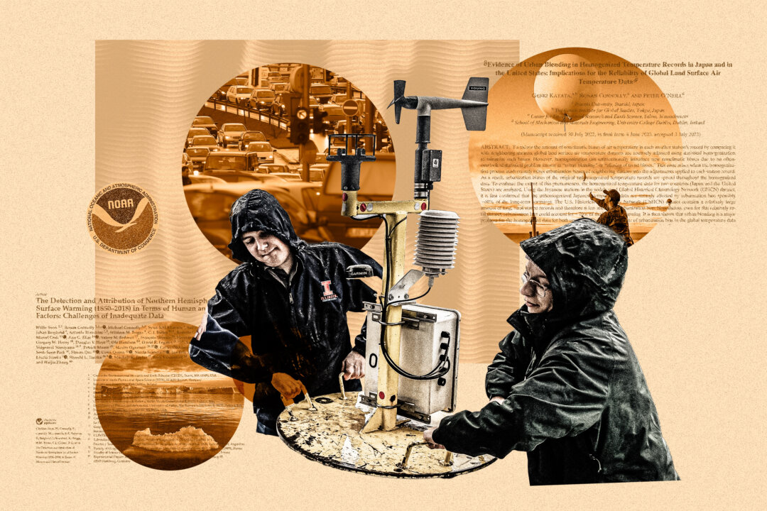
Problems with temperature data include a lack of geographically and historically representative data, contamination of the records by heat from urban areas, and corruption of the data introduced by a process known as “homogenization.”
The flaws are so significant that they make the temperature data—and the models based on it—essentially useless or worse, three independent scientists with the Center for Environmental Research and Earth Sciences (CERES) explained.
The experts said that when data corruption is considered, the alleged “climate crisis” supposedly caused by human activities disappears.
Instead, natural climate variability offers a much better explanation for what is being observed, they said.
Some experts told The Epoch Times that deliberate fraud appeared to be at work, while others suggested more innocent explanations.
But regardless of why the problems exist, the implications of the findings are hard to overstate.
With no climate crisis, the justification for trillions of dollars in government spending and costly changes in public policy to restrict carbon dioxide (CO2) emissions collapses, the scientists explained in a series of interviews about their research.
....
“When people ask about global warming or climate change, it is essential to ask, ‘Since when?’ The data shows that it has warmed since the 1970s, but that this followed a period of cooling from the 1940s,” he said.
While it is “definitely warmer” now than in the 19th century, Mr. Soon said that temperature proxy data show the 19th century “was exceptionally cold.”
“It was the end of a period that’s known as the Little Ice Age,” he said.
Data taken from rural temperature stations, ocean measurements, weather balloons, satellite measurements, and temperature proxies such as tree rings, glaciers, and lake sediments, “show that the climate has always changed,” Mr. Soon said.
“They show that the current climate outside of cities is not unusual,” he said, adding that heat from urban areas is improperly affecting the data.
“If we exclude the urban temperature data that only represents 3 percent of the planet, then we get a very different picture of the climate.”
...
One of the scientists involved in the analysis, Peter O’Neill, has been tracking and downloading the data daily from the National Oceanographic and Atmospheric Administration (NOAA) and its Global Historical Climatology Network since 2011.
He found that each day, NOAA applies different adjustments to the data.
“They use the same homogenization computer program and re-run it roughly every 24 hours,” Mr. Connolly said. “But each day, the homogenization adjustments that they calculate for each temperature record are different.”
This is “very bizarre,” he said.
“If the adjustments for a given weather station have any basis in reality, then we would expect the computer program to calculate the same adjustments every time. What we found is this is not what’s happening,” Mr. Connolly said.
....
In a new peer-reviewed study, the coalition of scientists estimate that as much as 40 percent of the observed warming since the 19th century used by the IPCC is actually the result of this urban heat bias—not CO2-driven global warming.
“When we look at non-urban temperature data for the land, oceans, and other temperature records, the warming is much less dramatic and seems similar to other warm periods prior to the Industrial Revolution,” Mr. Connolly said.
The IPCC doesn’t control for the urban heat island effect, he said.
...
Taken together, the rural-only record shows that the moderate warming is likely just a recovery from the Little Ice Age from about A.D. 1300 to A.D. 1900, which itself followed the Medieval Warm Period from about A.D. 800 to A.D. 1200 that saw Vikings farming in Greenland.
“The Medieval Warm Period seems to have been about as warm as the modern warm period, but only when we use the rural-only record,” Mr. Connolly said.
While there has been global warming since the end of the Little Ice Age, if the urban datasets are excluded, all of the primary global temperature estimates show “that the planet alternates between phases of warming and cooling,” he said.
...
Scientists Expose Major Problems With Climate Change Data
‘Climate activism has become the new religion of the 21st century—heretics are not welcome and not allowed to ask questions,’ said astrophysicist Willie Soon.www.theepochtimes.com
“The epoch times“:is a far right media source. This is all made up shit. there is NO link to any study.,Yes I know: "Another Climate Change thread ?!"
Well I'm not sure if this would fit within an existing thread or maybe should focus of one on it's own.
EXCERPTS from a recent article;
Scientists Expose Major Problems With Climate Change Data
‘Climate activism has become the new religion of the 21st century—heretics are not welcome and not allowed to ask questions,’ said astrophysicist Willie Soon.
...
Temperature records used by climate scientists and governments to build models that then forecast dangerous manmade global warming repercussions have serious problems and even corruption in the data, multiple scientists who have published recent studies on the issue told The Epoch Times.
The Biden administration leans on its latest National Climate Assessment report as evidence that global warming is accelerating because of human activities. The document states that human emissions of “greenhouse gases” such as carbon dioxide are dangerously warming the Earth.
The U.N. Intergovernmental Panel on Climate Change (IPCC) holds the same view, and its leaders are pushing major global policy changes in response.
But scientific experts from around the world in a variety of fields are pushing back. In peer-reviewed studies, they cite a wide range of flaws with the global temperature data used to reach the dire conclusions; they say it’s time to reexamine the whole narrative.
Problems with temperature data include a lack of geographically and historically representative data, contamination of the records by heat from urban areas, and corruption of the data introduced by a process known as “homogenization.”
The flaws are so significant that they make the temperature data—and the models based on it—essentially useless or worse, three independent scientists with the Center for Environmental Research and Earth Sciences (CERES) explained.
The experts said that when data corruption is considered, the alleged “climate crisis” supposedly caused by human activities disappears.
Instead, natural climate variability offers a much better explanation for what is being observed, they said.
Some experts told The Epoch Times that deliberate fraud appeared to be at work, while others suggested more innocent explanations.
But regardless of why the problems exist, the implications of the findings are hard to overstate.
With no climate crisis, the justification for trillions of dollars in government spending and costly changes in public policy to restrict carbon dioxide (CO2) emissions collapses, the scientists explained in a series of interviews about their research.
....
“When people ask about global warming or climate change, it is essential to ask, ‘Since when?’ The data shows that it has warmed since the 1970s, but that this followed a period of cooling from the 1940s,” he said.
While it is “definitely warmer” now than in the 19th century, Mr. Soon said that temperature proxy data show the 19th century “was exceptionally cold.”
“It was the end of a period that’s known as the Little Ice Age,” he said.
Data taken from rural temperature stations, ocean measurements, weather balloons, satellite measurements, and temperature proxies such as tree rings, glaciers, and lake sediments, “show that the climate has always changed,” Mr. Soon said.
“They show that the current climate outside of cities is not unusual,” he said, adding that heat from urban areas is improperly affecting the data.
“If we exclude the urban temperature data that only represents 3 percent of the planet, then we get a very different picture of the climate.”
...
One of the scientists involved in the analysis, Peter O’Neill, has been tracking and downloading the data daily from the National Oceanographic and Atmospheric Administration (NOAA) and its Global Historical Climatology Network since 2011.
He found that each day, NOAA applies different adjustments to the data.
“They use the same homogenization computer program and re-run it roughly every 24 hours,” Mr. Connolly said. “But each day, the homogenization adjustments that they calculate for each temperature record are different.”
This is “very bizarre,” he said.
“If the adjustments for a given weather station have any basis in reality, then we would expect the computer program to calculate the same adjustments every time. What we found is this is not what’s happening,” Mr. Connolly said.
....
In a new peer-reviewed study, the coalition of scientists estimate that as much as 40 percent of the observed warming since the 19th century used by the IPCC is actually the result of this urban heat bias—not CO2-driven global warming.
“When we look at non-urban temperature data for the land, oceans, and other temperature records, the warming is much less dramatic and seems similar to other warm periods prior to the Industrial Revolution,” Mr. Connolly said.
The IPCC doesn’t control for the urban heat island effect, he said.
...
Taken together, the rural-only record shows that the moderate warming is likely just a recovery from the Little Ice Age from about A.D. 1300 to A.D. 1900, which itself followed the Medieval Warm Period from about A.D. 800 to A.D. 1200 that saw Vikings farming in Greenland.
“The Medieval Warm Period seems to have been about as warm as the modern warm period, but only when we use the rural-only record,” Mr. Connolly said.
While there has been global warming since the end of the Little Ice Age, if the urban datasets are excluded, all of the primary global temperature estimates show “that the planet alternates between phases of warming and cooling,” he said.
...
Scientists Expose Major Problems With Climate Change Data
‘Climate activism has become the new religion of the 21st century—heretics are not welcome and not allowed to ask questions,’ said astrophysicist Willie Soon.
Which makes it a counter-point and counter-balance to the FAR-LEFT MSM sources of fabricated propaganda that many fascists and statists like you prefer to cite and use.“The epoch times“:is a far right media source. This is all made up shit. there is NO link to any study.,

So were Newton and Galileo, at first.…..you’re alone….