DavidS
Anti-Tea Party Member
If this isn't proof of global warming being a farce, I don't know what is!
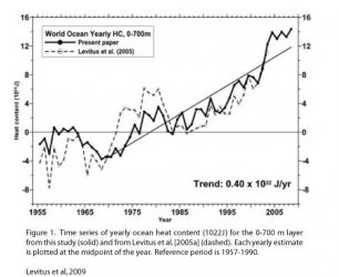
These are SST readings from 1997 and 2009. SST means sea surface temperature, meaning the temperature at the surface of the sea.
The blues and purples mean below average and the reds and oranges mean above average.
Please note: Despite the weatherman on TV's definition of "average" in terms of the correct definition for weather, "average" does NOT mean "normal." It means out of a collection of temperatures on this date for the past 50 years, this is the AVERAGE temperature, meaning it's been warmer and it's been colder and this is the middle temperature.

That's 1997. Look at all of the reds and oranges. Look at that pool of warm water by South America into the Pacific Ocean. This means that the water in that area is above average by a significant amount. In Summer 1997 we were in the midst of an El Nino, so this is quite normal for what an El Nino looks like.

This is today... or yesterday. First, look at all of the blues and purples. There's a good deal of them. But also look at the orange beginning to turn darker near South America. This would be consistent with a developing El Nino, which is what I've been saying would happen for months and what NOAA recently said was happening.
If we're in global warming, there should be far less blues and yellows and far MORE oranges and reds, meaning that we should be warmer than the average. But we're not. In fact, we're cooler now than we were during July 1997. Why is that? Because we recently emerged from a very strong La Nina that's lasted from 2005 on. Whereas the last El Nino that developed from a La Nina was in 1996, the La Nina in 1995-1996 wasn't very strong at all. But wait a minute - how could we have a very strong La Nina when we have global warming going on?
The fact of the matter is, don't read any stupid pro or against websites, don't listen to the shit you hear on TV or radio. Look at these two maps. We're not warming. At all.
Our temperatures are dependent upon ENSO cycles. When we have a La Nina, we're cold and dry. When we have an El Nino, we're warm and wet. When we're neutral, it can go either way. So while I don't predict this upcoming winter to be anywhere close to as cold as last winter, I do predict much of the US will have a very nice snow season.
These are SST readings from 1997 and 2009. SST means sea surface temperature, meaning the temperature at the surface of the sea.
The blues and purples mean below average and the reds and oranges mean above average.
Please note: Despite the weatherman on TV's definition of "average" in terms of the correct definition for weather, "average" does NOT mean "normal." It means out of a collection of temperatures on this date for the past 50 years, this is the AVERAGE temperature, meaning it's been warmer and it's been colder and this is the middle temperature.
That's 1997. Look at all of the reds and oranges. Look at that pool of warm water by South America into the Pacific Ocean. This means that the water in that area is above average by a significant amount. In Summer 1997 we were in the midst of an El Nino, so this is quite normal for what an El Nino looks like.
This is today... or yesterday. First, look at all of the blues and purples. There's a good deal of them. But also look at the orange beginning to turn darker near South America. This would be consistent with a developing El Nino, which is what I've been saying would happen for months and what NOAA recently said was happening.
If we're in global warming, there should be far less blues and yellows and far MORE oranges and reds, meaning that we should be warmer than the average. But we're not. In fact, we're cooler now than we were during July 1997. Why is that? Because we recently emerged from a very strong La Nina that's lasted from 2005 on. Whereas the last El Nino that developed from a La Nina was in 1996, the La Nina in 1995-1996 wasn't very strong at all. But wait a minute - how could we have a very strong La Nina when we have global warming going on?
The fact of the matter is, don't read any stupid pro or against websites, don't listen to the shit you hear on TV or radio. Look at these two maps. We're not warming. At all.
Our temperatures are dependent upon ENSO cycles. When we have a La Nina, we're cold and dry. When we have an El Nino, we're warm and wet. When we're neutral, it can go either way. So while I don't predict this upcoming winter to be anywhere close to as cold as last winter, I do predict much of the US will have a very nice snow season.