
SSDD
Gold Member
- Nov 6, 2012
- 16,672
- 1,966
- 280
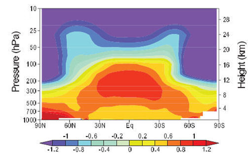
The models predict a distinctive pattern of warming - a hot spot of enhanced warming in the upper troposphere over the tropics, shown as the large red spot in the diagram below. Radiosonde data from weather balloons show no such "hot spot" pattern. If it was there we would have easily detected it.
Model Predicted Warming
Actual Radiosonde Measured Warming
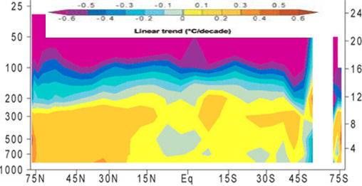
The predicted hot-spot is entirely absent from the observational record. This shows that most of the global temperature change cannot be attributed to increasing CO2 concentrations.
The models fail because they assume both water vapour and clouds strongly increase the CO2 induced temperature changes, whereas recent research shows both water vapour and clouds greatly reduce the temperature changes.
Friends of Science |
Crick provided me with a link that claims that the upper tropospheric hot spot was detected and documented with ground based thermometers....it got lost because of station moves and such...Imagine...ground based thermometers measuring a hot spot that is located 8Km up in the atmosphere while a million radiosondes and satellites couldn't find it...
") The bad news is 1 foot of global sea level raise the next 83 years = 2-3 feet along parts of the gulf and east coast. This is very bad news and even an 1c of extra warming person like me in the next 83 years is kind of worried.
The bad news is 1 foot of global sea level raise the next 83 years = 2-3 feet along parts of the gulf and east coast. This is very bad news and even an 1c of extra warming person like me in the next 83 years is kind of worried.


