IPCC Models have been Proven to be Wrong

ding

Confront reality
Oct 25, 2016
117,698
20,744
2,220
Houston
I am trying to compile all of the times the IPCC projections have been proven wrong or lowered. Please share your data so that we can have one location that houses their modeling failures

Their models are wrong.

Near-term global surface temperature projections in IPCC AR5 | Climate Lab Book

figure1.jpg


Methane mendacity – and madness

figure4.jpg


Global Warming as a Natural Response to Cloud Changes Associated with the Pacific Decadal Oscillation (PDO) « Roy Spencer, PhD

PDO-and-20th-Century-warming-Fig01.jpg


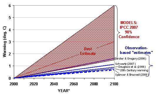
Fig. 1. Projected warming (assumed here to occur by 2100) from a doubling of atmospheric CO2 from the IPCC climate models versus from various observational indicators.


ipcc-model-vs-satellite-feedback-histogram.jpg


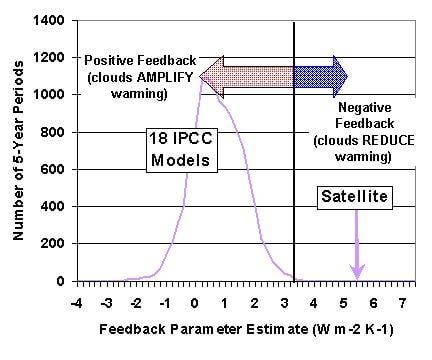
Fig. 2. Frequency histogram of total (reflected solar plus emitted infrared)feedback parameters computed from all possible 5 year periods in transient forcing experiments in 18 climate models tracked by the IPCC, versus the same calculation from Aqua CERES and NOAA-15 AMSU channel 5 satellite data.
 
Last edited:
Why the IPCC climate model is wrong

Why the IPCC climate model is wrong
This important lecture is by Roy Spencer who is part of the team that manages the various NASA satellites that monitor the earths climate, clouds, precipitation and other related atmospheric conditions. These satellites have only been monitoring temperature since 1979 and as Roy Spencer explains recently launched new satellites are beginning to provide significantly more data than previously. This means that for the first time there is actual data about many aspects of the earths atmosphere and weather which previously had only been estimated.

The reason this all matters is because the global warming scare is based on what various computer models of the earths climate say will happen if CO2 adds some extra heating to the climate system. Everyone accepts that on its own the CO2 will only add a small amount of heating over the next century even if there are no controls or reductions in emissions. The computer models say that this little bit of heating will trigger various other mechanisms that will push temperatures much higher. They say that there is some sort of dangerous tipping point which we are fast approaching.

This lecture shows that the latest data has shown these models to be wrong. As Roy Spencer explains even the modellers accept the new data and accept that the previous models are wrong. The new data seems to indicate that the feedback mechanism in the climate system actual act to reduce the warming effect of the CO2.

One final point. This lecture shows just how important the cloud-precipitation system is in controlling the earths weather and climate systems. This directly relates to the recent work of Professor Svensmark on a possible climate driver based on the cosmic ray effects on cloud formation. This theory is explained and explored here “A new solar theory of climate “, here ” Cosmic Rays and Climate” and here “Svensmark’s new solar theory of climate change


Last edited:
The chart below compares the model predicted change of outgoing radiation to the actual satellite measured change of outgoing radiation, both in response to changing sea surface temperatures.

Satellite Observed vs Predicted Outgoing Radiation
Lindzen_Choi2009.jpg

The red lines show the eleven climate models prediction of decreasing outgoing radiation as temperatures rise.

The green line in the middle of the chart shows the Earth Radiation Budget Experiment Satellite (ERBE) observed response. It shows that more outgoing radiation escapes to space as temperatures rise, rather than being trapped as the UN computer modellers believe. CO2 emissions do not trap much heat and do not cause significant global warming

Friends of Science |
I did tell IanC that the only thing I don`t agree with Spencer is his cold&warm body experiment.
But Spencer has it right with the effects clouds have. Especially in the 2.nd segment where he discusses cause and effect of temperature versus cloud formation.
Actually he understated it because that is an exponential relationship between temperature and the resulting vapor pressure of water as per the Clausius Clapeyron equation:
3_2.png


Now consider how much energy that will convey by convection since water vapor is much lighter than dry air. That energy transfer is called the "latent heat flux" and is measured by the Bowen ratio. The Bowen ratio for a desert is >10 for forests and grass lands 0.4 to 0.8, rain forests are 0.1 to 0.3 and tropical oceans < 0.1
Source:
Bowen ratio - Wikipedia
That alone should make it quite clear how idiotic it is to average the earth`s surface physical properties like albedo, emissivity including this one which I doubt the IPCC models even consider.
The Bowen ratio determines the so called evapotranspiration process:
Evapotranspiration - Wikipedia
And that one is of course an exponential function of temperature as per Clausius Clapeyron.
Which in the end means that cloud formation is also an exponential function of temperature increase and that in turn results in an overall negative feed back throttling any additional temperature increase. And that why the folks at CERN spend a lot of money on cloud formation experiments:
CLOUD experiment sharpens climate predictions | CERN
Aerosol particles form when certain trace vapors in the atmosphere cluster together, and grow to a sufficient size that they can seed cloud droplets. Higher concentrations of aerosol particles make clouds more reflective and long-lived, thereby cooling the climate,
 
Last edited:
I am a luke warmer ;) The bad news is 1 foot of global sea level raise the next 83 years = 2-3 feet along parts of the gulf and east coast. This is very bad news and even an 1c of extra warming person like me in the next 83 years is kind of worried.
 
I am a luke warmer ;) The bad news is 1 foot of global sea level raise the next 83 years = 2-3 feet along parts of the gulf and east coast. This is very bad news and even an 1c of extra warming person like me in the next 83 years is kind of worried.


No matthew...you are a screaming handwaving hysteric warmer nutball...all one need do is review your posts to gather that fact.... Hell, in the very post you claim to be a luke warmer, you make a hysterical handwaving statement with not the first bit of actual data to back you up.

At the present rate of increase, we will see a shade over 7 inches....only hand waving hysterics are claiming more than that...accept what you are matthew...it is bad enough to be a hysteric...and even worse to be in denial about what you are.
 
I am a luke warmer ;) The bad news is 1 foot of global sea level raise the next 83 years = 2-3 feet along parts of the gulf and east coast. This is very bad news and even an 1c of extra warming person like me in the next 83 years is kind of worried.


What an outrageous lie! you are no lukewarmer.

Being a lukewarmer means that you accept the tenet that there is a basic mechanism where CO2 alters radiative transfer which causes warming of the atmosphere and surface (the greenhouse effect), BUT reject the exaggerated feedbacks and catastrophic conclusions proclaimed by the warmers.

You jump to catastrophic predictions of doom at every turn.
 
I'll admit that temperturewise the models were too rebus with the warming these past 15 years....It took a nino these past 3 years to catch back up.

They are wrong because they are based on phony science. The climate change era we are going thru will be studied in the future. It will be a studied for the social phenomenon it is. It will be compared to the Black Plague. People didn't understand what caused the disease and reacted in some very strange ways.
The Flagellants Attempt to Repel

the Black Death, 1349

It's this kind of baseless beliefs that give rise to guys like Hitler. Trust me, our grandkids will ask us "what was it like when everybody thought the planet was heating up because of water vapor and carbon, were you scared, did you believe it?" I'll chuckle and say, it was really weird, otherwise normal people running around like idiots screaming the oceans are going to rise and bury New York City.
 
I am a luke warmer ;) The bad news is 1 foot of global sea level raise the next 83 years = 2-3 feet along parts of the gulf and east coast. This is very bad news and even an 1c of extra warming person like me in the next 83 years is kind of worried.
That won`t happen. Not with a negative feed back of 6.5 watts/m^2. This 1C temperature increase is also mostly speculation rather than a mathematical certainty.
Even if it does materialize that would not be that much of a proportional increase.
You must keep in mind that all the equations that govern the overall process use deg K for temperature. In deg K that +1 deg is a whole lot less spectacular + 1/287 increase than these graphs that are published where an "anomaly" of 1/2 of 1 degree or 0.5/287 is almost off the chart.
It`s done to maximize the impact on policy makers because that is what the IPCC is all about.
Misleading graph - Wikipedia
A truncated graph (also known as a torn graph) has a y axis that does not start at 0. These graphs can create the impression of important change where there is relatively little change.
800px-Truncated_Bar_Graph.svg.png


That is an example of a misleading graph and every goddamn graph these AGW propagandists publish fall into this category.
Graphing the increase as an anomaly is not just a method to conceal what is in fact a truncated graph it also allows you to exaggerate the Y axis scale even more without making it obvious:
755px-Global_Temperature_Anomaly.svg.png


This format is intentionally misleading and has one and only one purpose which is to conceal bullshit
200.gif
 
Last edited:
I am a luke warmer ;) The bad news is 1 foot of global sea level raise the next 83 years = 2-3 feet along parts of the gulf and east coast. This is very bad news and even an 1c of extra warming person like me in the next 83 years is kind of worried.


What an outrageous lie! you are no lukewarmer.

Being a lukewarmer means that you accept the tenet that there is a basic mechanism where CO2 alters radiative transfer which causes warming of the atmosphere and surface (the greenhouse effect), BUT reject the exaggerated feedbacks and catastrophic conclusions proclaimed by the warmers.

You jump to catastrophic predictions of doom at every turn.

Glad you didn't call yourself a skeptic....cause you aren't.
 
Another example of displaying data in a misleading way is this:
Global Climate | EARTH 103: Earth in the Future
"Global Climate
So let’s have a look at the climate as expressed by temperature:'
fig1.png


Now note the color/temperature bar
Up to 0 deg C it is how you would indeed see it with a thermal imaging device, but after that the color bar dives increasingly from yellow into the red and gets darker red as the temperature goes up.
They do that with the sole purpose to exaggerate the temperature level by exaggerating the contrast to the "normal" range just above +14 C
And that is the exact opposite how a real thermal image looks like. With an increase in temperature you see a change from what is their + 30 C color to what is their + 10 C color...they flipped it.
Here is a real thermal image and a color bar for the temperature range from +35 C and down:
thermal-imaging-4.jpg


It`s the exact opposite
 
I am a luke warmer ;) The bad news is 1 foot of global sea level raise the next 83 years = 2-3 feet along parts of the gulf and east coast. This is very bad news and even an 1c of extra warming person like me in the next 83 years is kind of worried.
That won`t happen. Not with a negative feed back of 6.5 watts/m^2. This 1C temperature increase is also mostly speculation rather than a mathematical certainty.
Even if it does materialize that would not be that much of a proportional increase.
You must keep in mind that all the equations that govern the overall process use deg K for temperature. In deg K that +1 deg is a whole lot less spectacular + 1/287 increase than these graphs that are published where an "anomaly" of 1/2 of 1 degree or 0.5/287 is almost off the chart.
It`s done to maximize the impact on policy makers because that is what the IPCC is all about.
Misleading graph - Wikipedia
A truncated graph (also known as a torn graph) has a y axis that does not start at 0. These graphs can create the impression of important change where there is relatively little change.
800px-Truncated_Bar_Graph.svg.png


That is an example of a misleading graph and every goddamn graph these AGW propagandists publish fall into this category.
Graphing the increase as an anomaly is not just a method to conceal what is in fact a truncated graph it also allows you to exaggerate the Y axis scale even more without making it obvious:
755px-Global_Temperature_Anomaly.svg.png


This format is intentionally misleading and has one and only one purpose which is to conceal bullshit
200.gif


Yup. There are many ways of manipulating and misdirecting with the way graphs are put together.

This is one of the most egregious.

main-qimg-cea7ce2e09666e046d06d6dfc80c6522


Any two components can be made to look connected if they are increasing or decreasing. Simply by overlaying them on the same graph and adjusting the two different scales.
 
I am a luke warmer ;) The bad news is 1 foot of global sea level raise the next 83 years = 2-3 feet along parts of the gulf and east coast. This is very bad news and even an 1c of extra warming person like me in the next 83 years is kind of worried.


What an outrageous lie! you are no lukewarmer.

Being a lukewarmer means that you accept the tenet that there is a basic mechanism where CO2 alters radiative transfer which causes warming of the atmosphere and surface (the greenhouse effect), BUT reject the exaggerated feedbacks and catastrophic conclusions proclaimed by the warmers.

You jump to catastrophic predictions of doom at every turn.

Glad you didn't call yourself a skeptic....cause you aren't.


Of course I am a Skeptic. I have spent the last seven years here poking holes in the IPCC narrative on numerous topics. You, on the other hand, are a denier. You are refractile to any evidence and simply reject things on general opinion.

Nope..you believe in the magic...you just don't think it is as strong as the far out wackos...skeptics question the greenhouse hypothesis itself....the greenhouse hypothesis itself predicted a tropospheric hot spot from additional CO2...AGW isn't an entirely separate hypothesis...AGW is nothing more than a tack on hypothesis for what the greenhouse hypothesis does when we add CO2 to the atmosphere?


So again...how many predictive failures does a hypothesis get in real science?
 
The models predict a distinctive pattern of warming - a hot spot of enhanced warming in the upper troposphere over the tropics, shown as the large red spot in the diagram below. Radiosonde data from weather balloons show no such "hot spot" pattern. If it was there we would have easily detected it.

Model Predicted Warming
temp_altitude_latitude_forecastwithscale.jpg


Actual Radiosonde Measured Warming
temp_altitude_latitude_actualwithscale.jpg


The predicted hot-spot is entirely absent from the observational record. This shows that most of the global temperature change cannot be attributed to increasing CO2 concentrations.

The models fail because they assume both water vapour and clouds strongly increase the CO2 induced temperature changes, whereas recent research shows both water vapour and clouds greatly reduce the temperature changes.

Friends of Science |

Empirical evidence is the stake through the heart of AGW.. Their models shown a failure, because they do not understand how the system works, yet they claim the "science is settled"..
 
The models predict a distinctive pattern of warming - a hot spot of enhanced warming in the upper troposphere over the tropics, shown as the large red spot in the diagram below. Radiosonde data from weather balloons show no such "hot spot" pattern. If it was there we would have easily detected it.

Model Predicted Warming
temp_altitude_latitude_forecastwithscale.jpg


Actual Radiosonde Measured Warming
temp_altitude_latitude_actualwithscale.jpg


The predicted hot-spot is entirely absent from the observational record. This shows that most of the global temperature change cannot be attributed to increasing CO2 concentrations.

The models fail because they assume both water vapour and clouds strongly increase the CO2 induced temperature changes, whereas recent research shows both water vapour and clouds greatly reduce the temperature changes.

Friends of Science |


Yup. If I remember correctly, the climate mafia over at RealClimate made a defense of the TS where they pivoted to stratospheric cooling as the 'real' signature of CO2 induced change. One of the main things to watch out for is the change of scale in the temperature colours. They like to misdirect by letting people assume they are comparing like vs like because the colours are similar but the actual numbers are quite different.
 

Forum List

Back
Top