NASA and NOAA
Posted on July 22, 2015 | 37 comments
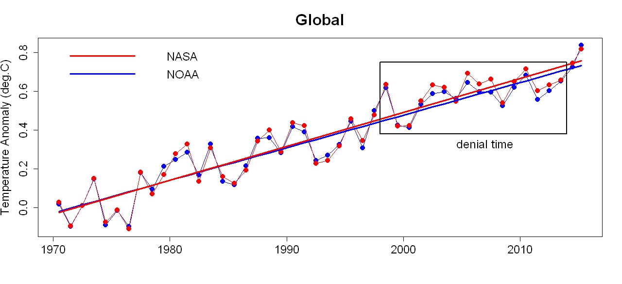
We now have data for global temperature at earth’s surface (which is where we live) through June of this year, from both NASA and NOAA. Graphs are a lot less messy if we convert monthly data to yearly, simply by computing annual averages. This year (2015) isn’t complete yet, but I’ll plot the 2015-so-far averages anyway, to give you an idea of how the year is shaping up compared to previous years. I’ll also put them on the same baseline, more easily to compare the two. Without further ado, here’s the result:
Those in denial of global warming, its human causation, and/or its danger, have been trying their best to convince everyone that global warming has mysteriously “paused” or exhibited some “hiatus.” They do so by turning their focus on an all-too-short time span:
The frailty of their belief is even more obvious if we zoom in on the data since 1970, and add trend lines (by linear regression) estimated from data since that time:
The data during “denial time” continues to follow the trend, plus the same amount of up-and-down fluctuation that global temperature has always shown, and always will. But if you’re in denial, it’s all too easy to see random fluctuation as a meaningful pattern whether true or not. If you have an ideological motive not to believe in global warming, it’s difficult not to do that.
The last two years have made the “pausemaniacs” a bit hot under the collar; 2014 set a new record for hottest year, and — as is clear from the data — 2015 is well on its way to break that record. That leaves “pausemaniacs” only two choices: either ignore what’s happening recently at earth’s surface (where we live), or just refuse to believe the data, usually based on slandering the scientists who provide it. You know, all those scientists from NASA and NOAA who have spent their lives studying climate.
Of course to make that work, it’s not enough to accuse just NASA and NOAA scientists of being lying fraudsters, you also have to believe that of scientists from the meteorological office of Great Britain, and from the Japan meteorological agency, and yet more. Once you start down the slippery slope of making global warming into a giant conspiracy, you can’t stop with just the U.S.
But I digress.
Since 1970 global temperature has marched steadily upward (together with those up-and-down fluctuations that are always happening). The warming rate is, according to NOAA data, 0.0166 +/- 0.0027 deg.C/yr, while using NASA data it’s 0.0174 +/- 0.0027 deg.C/yr. The two estimates are well within each other’s confidence intervals. Applying the same tests used here, where I demonstrated just how non-existent the non-existent “pause” is, we find no evidence that the rate has changed since 1970.
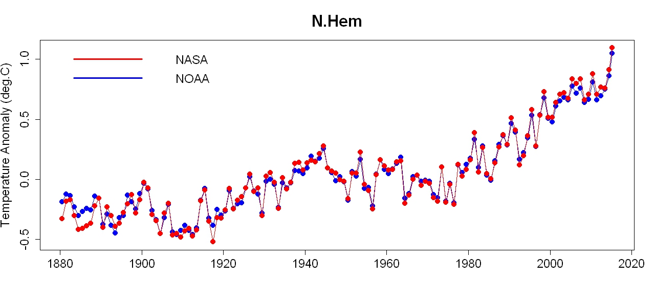
Most land area is in the northern hemisphere while the southern is mainly ocean. The oceans have a much greater heat capacity than land, so it takes more heat energy to raise their temperature. On this basis, scientists predicted quite a while ago that the northern hemisphere would warm faster than the southern.
In addition to global temperature, both NASA and NOAA also provide estimates for earth’s two hemispheres separately, which enables us to check the predicted hemispheric difference in warming rates. Here’s the entire time span for the southern hemisphere:
Notice that it covers less total range than the global data. Here it is since 1970:
NOAA lists the year-so-far as hotter than any previous year, but NASA doesn’t.
Here’s the data for the northern hemisphere (where most of us live):
Note that it covers more total range the the global data. Here it is since 1970:
Not only do both data sets show this-year-so-far hotter than any previous year, they do so by a large margin.
It turns out that the southern hemisphere is warming at a “mere” 0.0109 +/- 0.0026 deg.C/yr according to NOAA data, 0.0109 +/- 0.0020 deg.C/yr according to that from NASA. The northern hemisphere, however, is warming considerably faster, at 0.0220 +/- 0.0030 using NOAA data, 0.0238 +/- 0.0034 deg.C/yr using NASA data. The larger error ranges for the northern hemisphere are because, dominated by land rather than ocean, it shows larger fluctuations than the southern.
NASA also provides zonal data, to inform about how different latitude bands are heating up. This enables us to check another prediction from long ago, that the Arctic would warm much faster than the globe as a whole. NASA’s zonal data are already annual averages, so they don’t include 2015-so-far data, but here is the data for the Arctic region (latitudes 64N to 90N):


a couple of things to mention. first, you should identify that this is a blog article by Tamino rather than just having NASA NOAA as the title.
second, Karl15 is identified as the 'Pause Buster'. hiding the adjustments made since 1998 by rolling them into graphs from 1880 or even 1970 is a bit disingenuous. it is not the magnitudes that people are criticizing, it is the type of adjustments and how they are carried out. and amazingly every new methodology just happens to support the global warming story in just the way that is needed at the time. Matthew, I think you need to read the exchanges going back and forth between Tamino and Tisdale to get a more complete picture of what's going on. and perhaps rehash the some of the complaints from when Karl15 first came out. eg Has NOAA busted the pause in global warming Climate Etc.