3 Conservative Lies About Obama's Record Debunked in One Post

He doesn't wave pom poms. He drew a picture of Obama on his hand and makes out with it whenever he isn't typing up these threads.

And you have nothing as well.

Interesting!

ANY chance people can actually address the graphs and info in the OP?

Lol oh BDBoop.

Allow me to give you the real reason why I didn't break down his OP.

Conservaderrps started a thread with a list of points about Obamacare. Quantum_Windbag went through every single point and told him why he was wrong, Conservaderrps responded to Quantum with a long list of insults, addressing nothing that was said to him.

He's not here to discuss anything, he's here to fling poo at anyone who would dare say anything other than Obama is my Savior. So I'll fling a little of what I have as well and have fun while doing it :).

And the graphs.

There's posters breaking them down right now, the last thing I expect is Conservaderrps to come here and provide a constructive rebuttal. He's already proven in other threads he prefers the poo flinging.

You don't actually think there's a man who sat at his computer, created a screen name Conservaderrps, then started posting with the desire to have constructive dialogues about issues with people of different viewpoints did you?
 
Last edited:
Anyone can pick and choose data that says what they want it to say, whala a chart comes into existence that even matches the data. Neat little thing data is. :lol:

Well, yeah. the original OP chart is void of federal employees vs. private employees. I wonder why that is? Could it be because the federal government employs more people than the private sector, which would make the entire argument that Obama has not increased the size of government void and therefore a lie?

That's what i see here. The federal govt. has steadily grown while the states/locals are forced the slash spending due to budget shortfalls.

That graph was the only one I could find on it because it seems people want to talk about the pay between private/public more than the figures on how many people the federal govt. employs. Which by the way, is sad. The federal workers make almost double that of the private workers that pay the public workers salaries. That's not sustainable. Especially if federal payroll head counts continue to increase.

Private Sector Is Not Fine Public Sector Is Still Fat

ChangeInEmployment0108to0512.png

Can't rep you again so soon but thanks for the additional info that completely debunks the OPs statement. :lol:
 
Anyone can pick and choose data that says what they want it to say, whala a chart comes into existence that even matches the data. Neat little thing data is. :lol:

Well, yeah. the original OP chart is void of federal employees vs. private employees. I wonder why that is? Could it be because the federal government employs more people than the private sector, which would make the entire argument that Obama has not increased the size of government void and therefore a lie?

That's what i see here. The federal govt. has steadily grown while the states/locals are forced the slash spending due to budget shortfalls.

That graph was the only one I could find on it because it seems people want to talk about the pay between private/public more than the figures on how many people the federal govt. employs. Which by the way, is sad. The federal workers make almost double that of the private workers that pay the public workers salaries. That's not sustainable. Especially if federal payroll head counts continue to increase.

Private Sector Is Not Fine Public Sector Is Still Fat

ChangeInEmployment0108to0512.png

Right. So there you have it. The federal govt seems to not only go by unscathed during the horrific downturn, it actually has been adding heads to the payroll. While the private sector struggles, and mind you, these are the people who pay federal worker salaries, to keep from hemoraging more losses. Couple that with almost double the pay rates for public workers over private workers, adn you have grown the govt. significantly in comparison to the private sector.

Seems the snake is eating its tail here.......
 
Well, yeah. the original OP chart is void of federal employees vs. private employees. I wonder why that is? Could it be because the federal government employs more people than the private sector, which would make the entire argument that Obama has not increased the size of government void and therefore a lie?

That's what i see here. The federal govt. has steadily grown while the states/locals are forced the slash spending due to budget shortfalls.

That graph was the only one I could find on it because it seems people want to talk about the pay between private/public more than the figures on how many people the federal govt. employs. Which by the way, is sad. The federal workers make almost double that of the private workers that pay the public workers salaries. That's not sustainable. Especially if federal payroll head counts continue to increase.

Private Sector Is Not Fine Public Sector Is Still Fat


ChangeInEmployment0108to0512.png

Can't rep you again so soon but thanks for the additional info that completely debunks the OPs statement. :lol:

De nada.
icon14.gif
 
Lol oh BDBoop.

Allow me to give you the real reason why I didn't break down his OP.

Conservaderrps started a thread with a list of points about Obamacare. Quantum_Windbag went through every single point and told him why he was wrong, Conservaderrps responded to Quantum with a long list of insults, addressing nothing that was said to him.

He's not here to discuss anything, he's here to fling poo at anyone who would dare say anything other than Obama is my Savior. So I'll fling a little of what I have as well and have fun while doing it :).

And the graphs.

There's posters breaking them down right now, the last thing I expect is Conservaderrps to come here and provide a constructive rebuttal. He's already proven in other threads he prefers the poo flinging.

You don't actually think there's a man who sat at his computer, created a screen name Conservaderrps, then started posting with the desire to have constructive dialogues about issues with people of different viewpoints did you?

I see him pushing back on a daily basis at the vast array of poo flingers on the right.
 
Well, yeah. the original OP chart is void of federal employees vs. private employees. I wonder why that is? Could it be because the federal government employs more people than the private sector, which would make the entire argument that Obama has not increased the size of government void and therefore a lie?

That's what i see here. The federal govt. has steadily grown while the states/locals are forced the slash spending due to budget shortfalls.

That graph was the only one I could find on it because it seems people want to talk about the pay between private/public more than the figures on how many people the federal govt. employs. Which by the way, is sad. The federal workers make almost double that of the private workers that pay the public workers salaries. That's not sustainable. Especially if federal payroll head counts continue to increase.

Private Sector Is Not Fine Public Sector Is Still Fat


ChangeInEmployment0108to0512.png

Right. So there you have it. The federal govt seems to not only go by unscathed during the horrific downturn, it actually has been adding heads to the payroll. While the private sector struggles, and mind you, these are the people who pay federal worker salaries, to keep from hemoraging more losses. Couple that with almost double the pay rates for public workers over private workers, adn you have grown the govt. significantly in comparison to the private sector.

Seems the snake is eating its tail here.......


Moochers outweighing Producers...WE are headed SOUTH in the economy. The Private sector isn't FINE...and hasn't been under Obama. He's done nothing but add to the problem no matter how many bus trips he's making. He's lying though his teeth as is the OP that remains clueless.
 
Oh, I see. So you guys criticize the chart I provided for supposedly "cherry picking" out the Federal jobs, meanwhile you guys cherry pick the Federal jobs and ONLY focus on them. Public sector is public sector, Old Guys. When judging public sector jobs growth, you can break it down by Federal, State and Local, but the over all trend is still down.

So no, I don't think you've debunked shit. You've just done exactly what you accuse me of doing by totally ignoring my points (no surprise), and hyperfocusing on one data set. I haven't checked your links, but if I come up on a Right Wing agenda site from them, it'll further discredit you, as a warning.

I stand by points. Public sector jobs are down. You can micro-analyze all you want. Doesn't make my points any less accurate.
 
The left depends on individuals ignoring their own personal experience in favor of a leftist chart.
 
Well, yeah. the original OP chart is void of federal employees vs. private employees. I wonder why that is? Could it be because the federal government employs more people than the private sector, which would make the entire argument that Obama has not increased the size of government void and therefore a lie?

That's what i see here. The federal govt. has steadily grown while the states/locals are forced the slash spending due to budget shortfalls.

That graph was the only one I could find on it because it seems people want to talk about the pay between private/public more than the figures on how many people the federal govt. employs. Which by the way, is sad. The federal workers make almost double that of the private workers that pay the public workers salaries. That's not sustainable. Especially if federal payroll head counts continue to increase.

Private Sector Is Not Fine Public Sector Is Still Fat

ChangeInEmployment0108to0512.png

Can't rep you again so soon but thanks for the additional info that completely debunks the OPs statement. :lol:

This doesn't debunk anything, it's a fit of desperation the right wing trolls are rallying around and hi-fiving each-other, but does no do anything to refute the OP's facts.
 
And the graphs.

There's posters breaking them down right now, the last thing I expect is Conservaderrps to come here and provide a constructive rebuttal. He's already proven in other threads he prefers the poo flinging.

You don't actually think there's a man who sat at his computer, created a screen name Conservaderrps, then started posting with the desire to have constructive dialogues about issues with people of different viewpoints did you?

I see him pushing back on a daily basis at the vast array of poo flingers on the right.

Of course you do :lol:

But I can understand why you wouldn't want to answer the question I asked.
 
Oh, I see. So you guys criticize the chart I provided for supposedly "cherry picking" out the Federal jobs, meanwhile you guys cherry pick the Federal jobs and ONLY focus on them. Public sector is public sector, Old Guys. When judging public sector jobs growth, you can break it down by Federal, State and Local, but the over all trend is still down.

So no, I don't think you've debunked shit. You've just done exactly what you accuse me of doing by totally ignoring my points (no surprise), and hyperfocusing on one data set. I haven't checked your links, but if I come up on a Right Wing agenda site from them, it'll further discredit you, as a warning.

I stand by points. Public sector jobs are down. You can micro-analyze all you want. Doesn't make my points any less accurate.


Can't rep you again so soon but thanks for the additional info that completely debunks the OPs statement. :lol:

This doesn't debunk anything, it's a fit of desperation the right wing trolls are rallying around and hi-fiving each-other, but does no do anything to refute the OP's facts.

Ahhh but see this chart includes Federal, State, Local and private...........it leaves nothing out. So yea the OP is debunked.
 
Who needs graphs?


Unemployment is 8.2%

We have 16 trillion dollars in debt

Every year obama spends one trillion dollars MORE than he has so if you re elect him we will have a 20 trillion dollar debt.


Remember that on your way to the polls. Tell your friends too.
 
Oh, I see. So you guys criticize the chart I provided for supposedly "cherry picking" out the Federal jobs, meanwhile you guys cherry pick the Federal jobs and ONLY focus on them. Public sector is public sector, Old Guys. When judging public sector jobs growth, you can break it down by Federal, State and Local, but the over all trend is still down.

So no, I don't think you've debunked shit. You've just done exactly what you accuse me of doing by totally ignoring my points (no surprise), and hyperfocusing on one data set. I haven't checked your links, but if I come up on a Right Wing agenda site from them, it'll further discredit you, as a warning.

I stand by points. Public sector jobs are down. You can micro-analyze all you want. Doesn't make my points any less accurate.

YOU don't look at the total picture DERP. That is your problem you partisan HACK.
 
Government spending Bush vs. Obama.

The Truth About Who's Responsible For The Explosion In Government Spending - Business Insider

from 2000 to 2008, under President Bush, Federal spending rose by $1.3 trillion, from $1.9 trillion a year to $3.2 trillion a year.

From 2009 to 2011, meanwhile, under President Obama, federal spending has risen by $600 billion, from $3.2 trillion a year to $3.8 trillion a year. It has also now begun to decline.

In other words, federal government spending under President Bush increased 2X as much as it has under President Obama.

More Conservative nonsense tossed on its ass.


MORE Deflection to Booosh!

Give up son.:eusa_hand:
 
There's posters breaking them down right now, the last thing I expect is Conservaderrps to come here and provide a constructive rebuttal. He's already proven in other threads he prefers the poo flinging.

You don't actually think there's a man who sat at his computer, created a screen name Conservaderrps, then started posting with the desire to have constructive dialogues about issues with people of different viewpoints did you?

I see him pushing back on a daily basis at the vast array of poo flingers on the right.

Of course you do :lol:

But I can understand why you wouldn't want to answer the question I asked.

I did answer the question. This isn't a court of law, and you don't get to force me to answer in the specific way you wish. :thup:
 
image.png


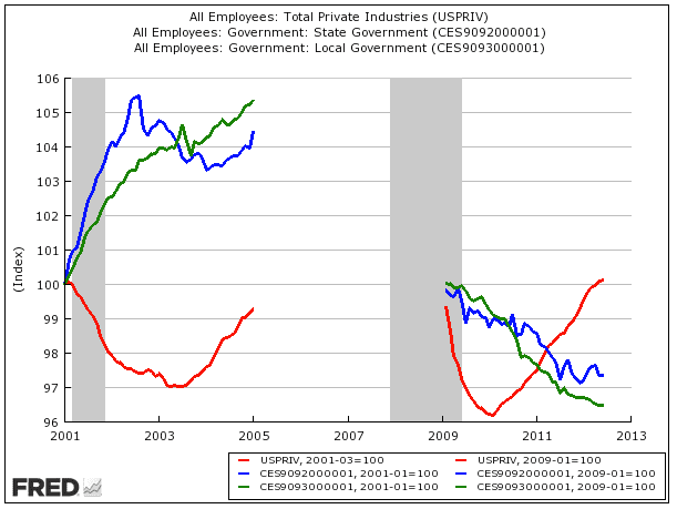
UPDATE: Jobs Under The First Bush Term Vs. Jobs Under The First Obama Term - Business Insider

The latest version of this chart showing Obama's first term (on the right) with Bush's first term (on the left).
In each one, the red line is private sector jobs. The green line is local government jobs. The blue line is state jobs

Original Story:
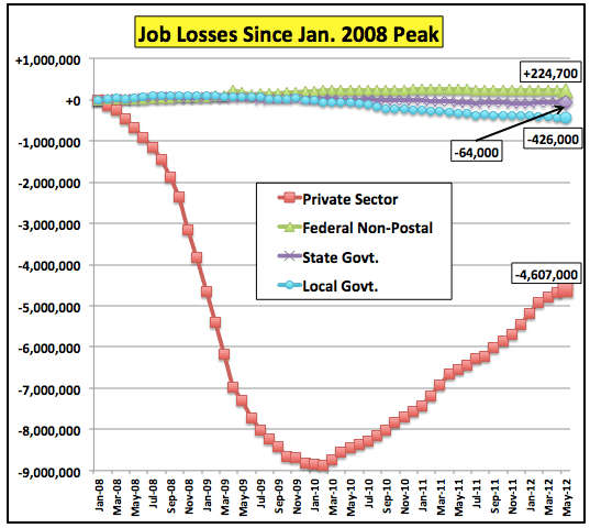
Austerity At Work | The Big Picture

Screen-Shot-2012-06-22-at-7.09.25-PM.png


ED-AP357D_laffe_D_20120611163003.jpg


Obama Jobs Record Lie #1: "Obama's unemployment numbers would look a lot worse if he didn't create a bunch of government jobs!"

DEBUNKED: The lines on the right, Obama's first term, show local AND state jobs plummeting downward. While, mysteriously, on the left, in Bush's first term, both shoot way up. Hmm. Weird.

Obama Jobs Record Lie #2: "Obama has killed the private sector!!!!"

DEBUNKED: Quite to the contrary, you can see from his red line compared to Bush's he actually added enough jobs in his first term to put his tally up above Bush's. So, yeah. There's some bullshit.

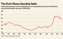
Obama Jobs Record Lie #3: "We'd have a lot better outlook if Obama wasn't spending us into a oblivion!!!"

DEBUNKED: As the last chart shows, Obama's spending has tipped drastically downward over his first term. Bush's climbed up and up and up his entire two terms.

Can't say I have ever heard any of the three lies you claim are being spouted off.

Are you making stuff up again ?
 
Who needs graphs?


Unemployment is 8.2%

We have 16 trillion dollars in debt

Every year obama spends one trillion dollars MORE than he has so if you re elect him we will have a 20 trillion dollar debt.


Remember that on your way to the polls. Tell your friends too.

Deficit grows...WE still don't have a freaking BUDGET...Public Debt and unfunded mandates are what $116+ Trillion?

Obama is still demanding a debt Ceiling raise...Moody's is thinking about another Credit Downgrade for us...

And Obama is doing SQUAT about it but rhetoric.
 

Forum List

Back
Top