ConservaDerrps
Rookie
- Banned
- #1
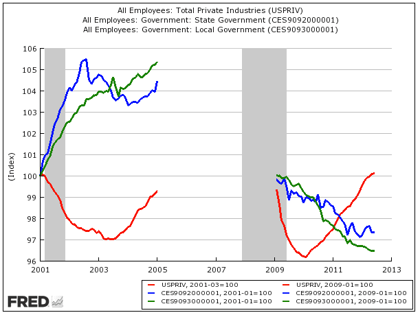
UPDATE: Jobs Under The First Bush Term Vs. Jobs Under The First Obama Term - Business Insider
The latest version of this chart showing Obama's first term (on the right) with Bush's first term (on the left).
In each one, the red line is private sector jobs. The green line is local government jobs. The blue line is state jobs
Original Story:
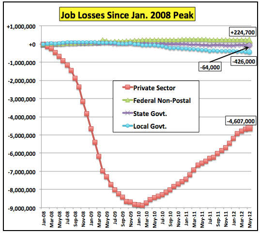
Austerity At Work | The Big Picture
Obama Jobs Record Lie #1: "Obama's unemployment numbers would look a lot worse if he didn't create a bunch of government jobs!"
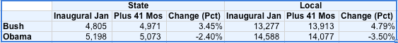
DEBUNKED: The lines on the right, Obama's first term, show local AND state jobs plummeting downward. While, mysteriously, on the left, in Bush's first term, both shoot way up. Hmm. Weird.
Obama Jobs Record Lie #2: "Obama has killed the private sector!!!!"
DEBUNKED: Quite to the contrary, you can see from his red line compared to Bush's he actually added enough jobs in his first term to put his tally up above Bush's. So, yeah. There's some bullshit.
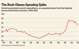
Obama Jobs Record Lie #3: "We'd have a lot better outlook if Obama wasn't spending us into a oblivion!!!"
DEBUNKED: As the last chart shows, Obama's spending has tipped drastically downward over his first term. Bush's climbed up and up and up his entire two terms.


") .
.