See how confused you really are. Did it bug you that much? The deeper red that shows the more intense the heat. The two photos show the deception by the Alarmists.The picture with the red was 2024. The 2017 picture was simply topographic green. It used no added colors at all. There is nothing unusual about using the spectrum to indicate relative temperatures. Is using blue for cooler temps alarmist? How about green for rain? Is that too scary? Deep blue for freezing temps? How about those pointy little arrows for wind? Isn't that actually threatening?
This color crap is just idiotic bullshit. If you numbskullls don't have a better argument to make than this, I don't have the faintest clue why you haven't just given up.
Navigation
Install the app
How to install the app on iOS
Follow along with the video below to see how to install our site as a web app on your home screen.
Note: This feature may not be available in some browsers.
More options
Style variation
You are using an out of date browser. It may not display this or other websites correctly.
You should upgrade or use an alternative browser.
You should upgrade or use an alternative browser.
What puts more CO2 into the atmosphere cars or forest fires?
- Thread starter kyzr
- Start date
What ******* deception? You yourself just said "the deeper red that shows the more intense the heat". That is precisely what they were trying to communicate and they got it through to you.See how confused you really are. Did it bug you that much? The deeper red that shows the more intense the heat. The two photos show the deception by the Alarmists.
ChemEngineer
Diamond Member
- Feb 5, 2019
- 7,741
- 8,019
- 2,140
"Climate experts believe the next ice age is on its way."
- Leonard Nimoy, 1978
References:
1970 - Colder Winters Held Dawn of New Ice Age - Scientists See Ice Age In the Future (The Washington Post, January 11, 1970)
1970 - Is Mankind Manufacturing a New Ice Age for Itself? (L.A. Times, January 15, 1970)
1970 - New Ice Age May Descend On Man (Sumter Daily Item, January 26, 1970)
1970 - Pollution Prospect A Chilling One (The Argus-Press, January 26, 1970)
1970 - Pollution's 2-way 'Freeze' On Society (Middlesboro Daily News, January 28, 1970)
1970 - Cold Facts About Pollution (The Southeast Missourian, January 29, 1970)
1970 - Pollution Could Cause Ice Age, Agency Reports (St. Petersburg Times, March 4, 1970)
1970 - Scientist predicts a new ice age by 21st century (The Boston Globe, April 16, 1970)
1970 - Pollution Called Ice Age Threat (St. Petersburg Times, June 26, 1970)
1970 - U.S. and Soviet Press Studies of a Colder Arctic (The New York Times, July 18, 1970)
1970 - Dirt Will Bring New Ice Age (The Sydney Morning Herald, October 19, 1970)
1971 - Ice Age Refugee Dies Underground (Montreal Gazette, Febuary 17, 1971)
1971 - Pollution Might Lead To Another Ice Age (The Schenectady Gazette, March 22, 1971)
1971 - Pollution May Bring Ice Age - Scientist Rites Risk (The Windsor Star, March 23, 1971)
1971 - U.S. Scientist Sees New Ice Age Coming (The Washington Post, July 9, 1971)
1971 - Ice Age Around the Corner (Chicago Tribune, July 10, 1971)
1971 - Danger: Ice age may lurk in dusty skies (The Christian Science Monitor, July 12, 1971)
1971 - New Ice Age Coming - It's Already Getting Colder (L.A. Times, October 24, 1971)
1971 - Another Ice Age? Pollution Blocking Sunlight (The Day, November 1, 1971)
1971 - Air Pollution Could Bring An Ice Age (Harlan Daily Enterprise, November 4, 1971)
1972 - Air pollution may cause ice age (Free-Lance Star, February 3, 1972)
1972 - Scientist Says New ice Age Coming (The Ledger, February 13, 1972)
1972 - Ice Age Cometh For Dicey Times (The Sun, May 29, 1972)
1972 - Ice Age Coming (Deseret News, September 8, 1972)
1972 - There's a new Ice Age coming! (The Windsor Star, September 9, 1972)
1972 - Scientist predicts new ice age (Free-Lance Star, September 11, 1972)
1972 - British Expert on Climate Change Says New Ice Age Creeping Over Northern Hemisphere (Lewiston Evening Journal, September 11, 1972)
1972 - Climate Seen Cooling For Return Of Ice Age (The Portsmouth Times, September 11, 1972)
1972 - New Ice Age Slipping Over North (The Press-Courier, September 11, 1972)
1972 - Beginning of new ice age (The Canberra Times, September 12, 1972)
1972 - Ice Age Begins A New Assault In North (The Age, September 12, 1972)
1972 - Weather To Get Colder (Montreal Gazette, September 12, 1972)
1972 - British climate expert predicts new Ice Age (The Christian Science Monitor, September 23, 1972)
1972 - Scientist Sees Chilling Signs of New Ice Age (L.A. Times, September 24, 1972)
1972 - Science: Another Ice Age? (Time Magazine, November 13, 1972)
1972 - Geologist at Case Traces Long Winters - Sees Ice Age in 20 Years (Youngstown Vindicator, December 13, 1972)
1972 - Ice Age On Its Way, Scientist Says (Toledo Blade, December 13, 1972)
1972 - Ice Age Predicted In About 200 Years (The Portsmouth Times, December 14, 1972)
1973 - New Ice Age coming? (Popular Science, January 1973)
1973 - The Ice Age Cometh (The Saturday Review, March 24, 1973)
1973 - Believe new ice age is coming (The Bryan Times, March 31, 1973)
1973 - 'Man-made Ice Age' Worries Scientists (The Free Lance-Star, June 22, 1973)
1973 - Fear Of Man-made Ice Age (The Spartanburg Herald, June 28, 1973)
1973 - Possibility Of Ice Age Worries The Scientists (The Argus-Press, November 12, 1973)
1973 - Weather-watchers think another ice age may be on the way (The Christian Science Monitor, December 11, 1973)
1974 - Ominous Changes in the World's Weather (PDF) (Fortune Magazine, February 1974)
1974 - Atmospheric Dirt: Ice Age Coming? (Pittsburgh Press, February 28, 1974)
1974 - Support for theory of a cooling world (The Canberra Times, May 16, 1974)
1974 - New evidence indicates ice age here (Eugene Register-Guard, May 29, 1974)
1974 - Another Ice Age? (Time Magazine, June 24, 1974)
1974 - 2 Scientists Think 'Little' Ice Age Near (Hartford Courant, August 11, 1974)
1974 - Climate: A Key to the World's Food Supply (NOAA, October, 1974)
1974 - Ice Age, worse food crisis seen (Chicago Tribune, October 30, 1974)
1974 - Imminent Arrival of the Ice (Radio Times, November 14, 1974)
1974 - Making a BBC Science Special [The Weather Machine] (New Scientist, November 14, 1974)
1974 - The Weather Machine (BBC, November 20, 1974)
1974 - New ice age 'could be in our lifetime' (The Canberra Times, November 22, 1974)
1974 - Believes Pollution Could Bring On Ice Age (Ludington Daily News, December 4, 1974)
1974 - Pollution Could Spur Ice Age, Nasa Says (Beaver Country Times, December 4, 1974)
1974 - Air Pollution May Trigger Ice Age, Scientists Feel (The Telegraph, December 5, 1974)
1974 - More Air Pollution Could Trigger Ice Age Disaster (Daily Sentinel, December 5, 1974)
1974 - Scientists Fear Smog Could Cause Ice Age (Milwaukee Journal Sentinel, December 5, 1974)
1975 - Climate Changes Called Ominous (The New York Times, January 19, 1975)
1975 - Climate Change: Chilling Possibilities (Science News, March 1, 1975)
1975 - B-r-r-r-r: New Ice Age on way soon? (Chicago Tribune, March 2, 1975)
1975 - Cooling Trends Arouse Fear That New Ice Age Coming (Eugene Register-Guard, March 2, 1975)
1975 - Is Another Ice Age Due? Arctic Ice Expands In Last Decade (Youngstown Vindicator, March 2, 1975)
1975 - Is Earth Headed For Another Ice Age? (Reading Eagle, March 2, 1975)
1975 - New Ice Age Dawning? Significant Shift In Climate Seen (Times Daily, March 2, 1975)
1975 - There's Troublesome Weather Ahead (Tri City Herald, March 2, 1975)
1975 - Is Earth Doomed To Live Through Another Ice Age? (The Robesonian, March 3, 1975)
1975 - The Ice Age cometh: the system that controls our climate (Chicago Tribune, April 13, 1975)
1975 - The Cooling World (Newsweek, April 28, 1975)
1975 - Cooling trend may signal coming of another Ice Age (The Sun, May 16, 1975)
1975 - Scientists Ask Why World Climate Is Changing; Major Cooling May Be Ahead (PDF) (The New York Times, May 21, 1975)
1975 - The Armadillos Are Heading South; Ice Age Coming? Chilling Thought for Humanity. (Chicago Tribune, June 2, 1975)
1975 - Summer of A New Ice Age (The Age, June 5, 1975)
1975 - In the Grip of a New Ice Age? (International Wildlife, July-August, 1975)
1975 - Experts ponder another ice age (The Spokesman-Review, September 8, 1975)
1975 - Oil Spill Could Cause New Ice Age (Milwaukee Journal Sentinel, December 11, 1975)
1976 - Deadly Harvest [Film] (Starring: Kim Cattrall, Clint Walker, 1976)
1976 - The Cooling: Has the Next Ice Age Already Begun? [Book] (Lowell Ponte, 1976)
1976 - Ice Age Predicted (Reading Eagle, January 22, 1976)
1976 - Ice Age Predicted In Century (Bangor Daily News, January 22, 1976)
1976 - It's Going To Get Chilly About 125 Years From Now (Sarasota Herald-Tribune, January 23, 1976)
1976 - Worrisome CIA Report; Even U.S. Farms May be Hit by Cooling Trend (U.S. News & World Report, May 31, 1976)
1977 - Blizzard - What Happens if it Doesn't Stop? [Book] (George Stone, 1977)
1977 - The Weather Conspiracy: The Coming of the New Ice Age [Book] (The Impact Team, 1977)
1977 - The Ice Age Cometh... (New York Magazine, January 31, 1977)
1977 - The Big Freeze (Time Magazine, January 31, 1977)
1977 - Has The Ice Age Cometh Again? (Calgary Herald, February 1, 1977)
1977 - Space Mirrors Proposed To Prevent Crop Freezes (Bangor Daily News, February 7, 1977)
1977 - Sunspot lull may bring on new ice age (The Christian Science Monitor, March 30, 1977)
1977 - We Will Freeze in the Dark (Capital Cities Communications Documentary, Host: Nancy Dickerson, April 12, 1977)
1978 - Ice! [Book] (Arnold Federbush, 1978)
1978 - The New Ice Age [Book] (Henry Gilfond, 1978)
1978 - Winter May Be Colder Than In Last Ice Age (Deseret News, January 2, 1978)
1978 - Current Winters Seen Colder Than In Ice Age (The Telegraph, January 3, 1978)
1978 - Winter Temperatures Colder Than Last Ice Age (Eugene Register-Guard, Eugene Register-Guard, January 3, 1978)
1978 - International Team of Specialists Finds No End in Sight to 30-Year Cooling Trend in Northern Hemisphere (The New York Times, January 5, 1978)
1978 - Little Ice Age: Severe winters and cool summers ahead (Calgary Herald, January 10, 1978)
1978 - Winters Will Get Colder, 'we're Entering Little Ice Age' (Daily Record, January 10, 1978)
1978 - Geologist Says Winters Getting Colder (Middlesboro Daily News, January 16, 1978)
1978 - It's Going To Get Colder (Boca Raton News, January 17, 1978)
1978 - Another Ice Age? (Kentucky New Era, February 12, 1978)
1978 - Another Ice Age? (Reading Eagle, February 13, 1978)
1978 - The Coming Ice Age (In Search Of TV Show, Season 2, Episode 23, Host: Leonard Nimoy, May 1978)
1978 - An Ice Age Is Coming Weather Expert Fears (Milwaukee Sentinel, November 17, 1978)
1979 - A Choice of Catastrophes - The Disasters That Threaten Our World [Book] (Isaac Asimov, 1979)
1979 - The Sixth Winter [Book] (John R. Gribbin, 1979)
1979 - The New Ice Age Cometh (The Age, January 16, 1979)
1979 - Ice Age Building Up (Daily Record, June 5, 1979)
1979 - Large Glacial Buildup Could Mean Ice Age (Daily Chronicle, June 5, 1979)
1979 - Ice Age On Its Way (Lewiston Morning Tribune, June 7, 1979)
1979 - Get Ready to Freeze (Daily Chronicle, October 12, 1979)
1979 - New ice age almost upon us? (The Christian Science Monitor, November 14, 1979)
____________________________
Every one a ******* newspaper or popular magazine. Why no peer-reviewed studies?"Climate experts believe the next ice age is on its way."
- Leonard Nimoy, 1978
References:
1970 - Colder Winters Held Dawn of New Ice Age - Scientists See Ice Age In the Future (The Washington Post, January 11, 1970)
1970 - Is Mankind Manufacturing a New Ice Age for Itself? (L.A. Times, January 15, 1970)
1970 - New Ice Age May Descend On Man (Sumter Daily Item, January 26, 1970)
1970 - Pollution Prospect A Chilling One (The Argus-Press, January 26, 1970)
1970 - Pollution's 2-way 'Freeze' On Society (Middlesboro Daily News, January 28, 1970)
1970 - Cold Facts About Pollution (The Southeast Missourian, January 29, 1970)
1970 - Pollution Could Cause Ice Age, Agency Reports (St. Petersburg Times, March 4, 1970)
1970 - Scientist predicts a new ice age by 21st century (The Boston Globe, April 16, 1970)
1970 - Pollution Called Ice Age Threat (St. Petersburg Times, June 26, 1970)
1970 - U.S. and Soviet Press Studies of a Colder Arctic (The New York Times, July 18, 1970)
1970 - Dirt Will Bring New Ice Age (The Sydney Morning Herald, October 19, 1970)
1971 - Ice Age Refugee Dies Underground (Montreal Gazette, Febuary 17, 1971)
1971 - Pollution Might Lead To Another Ice Age (The Schenectady Gazette, March 22, 1971)
1971 - Pollution May Bring Ice Age - Scientist Rites Risk (The Windsor Star, March 23, 1971)
1971 - U.S. Scientist Sees New Ice Age Coming (The Washington Post, July 9, 1971)
1971 - Ice Age Around the Corner (Chicago Tribune, July 10, 1971)
1971 - Danger: Ice age may lurk in dusty skies (The Christian Science Monitor, July 12, 1971)
1971 - New Ice Age Coming - It's Already Getting Colder (L.A. Times, October 24, 1971)
1971 - Another Ice Age? Pollution Blocking Sunlight (The Day, November 1, 1971)
1971 - Air Pollution Could Bring An Ice Age (Harlan Daily Enterprise, November 4, 1971)
1972 - Air pollution may cause ice age (Free-Lance Star, February 3, 1972)
1972 - Scientist Says New ice Age Coming (The Ledger, February 13, 1972)
1972 - Ice Age Cometh For Dicey Times (The Sun, May 29, 1972)
1972 - Ice Age Coming (Deseret News, September 8, 1972)
1972 - There's a new Ice Age coming! (The Windsor Star, September 9, 1972)
1972 - Scientist predicts new ice age (Free-Lance Star, September 11, 1972)
1972 - British Expert on Climate Change Says New Ice Age Creeping Over Northern Hemisphere (Lewiston Evening Journal, September 11, 1972)
1972 - Climate Seen Cooling For Return Of Ice Age (The Portsmouth Times, September 11, 1972)
1972 - New Ice Age Slipping Over North (The Press-Courier, September 11, 1972)
1972 - Beginning of new ice age (The Canberra Times, September 12, 1972)
1972 - Ice Age Begins A New Assault In North (The Age, September 12, 1972)
1972 - Weather To Get Colder (Montreal Gazette, September 12, 1972)
1972 - British climate expert predicts new Ice Age (The Christian Science Monitor, September 23, 1972)
1972 - Scientist Sees Chilling Signs of New Ice Age (L.A. Times, September 24, 1972)
1972 - Science: Another Ice Age? (Time Magazine, November 13, 1972)
1972 - Geologist at Case Traces Long Winters - Sees Ice Age in 20 Years (Youngstown Vindicator, December 13, 1972)
1972 - Ice Age On Its Way, Scientist Says (Toledo Blade, December 13, 1972)
1972 - Ice Age Predicted In About 200 Years (The Portsmouth Times, December 14, 1972)
1973 - New Ice Age coming? (Popular Science, January 1973)
1973 - The Ice Age Cometh (The Saturday Review, March 24, 1973)
1973 - Believe new ice age is coming (The Bryan Times, March 31, 1973)
1973 - 'Man-made Ice Age' Worries Scientists (The Free Lance-Star, June 22, 1973)
1973 - Fear Of Man-made Ice Age (The Spartanburg Herald, June 28, 1973)
1973 - Possibility Of Ice Age Worries The Scientists (The Argus-Press, November 12, 1973)
1973 - Weather-watchers think another ice age may be on the way (The Christian Science Monitor, December 11, 1973)
1974 - Ominous Changes in the World's Weather (PDF) (Fortune Magazine, February 1974)
1974 - Atmospheric Dirt: Ice Age Coming? (Pittsburgh Press, February 28, 1974)
1974 - Support for theory of a cooling world (The Canberra Times, May 16, 1974)
1974 - New evidence indicates ice age here (Eugene Register-Guard, May 29, 1974)
1974 - Another Ice Age? (Time Magazine, June 24, 1974)
1974 - 2 Scientists Think 'Little' Ice Age Near (Hartford Courant, August 11, 1974)
1974 - Climate: A Key to the World's Food Supply (NOAA, October, 1974)
1974 - Ice Age, worse food crisis seen (Chicago Tribune, October 30, 1974)
1974 - Imminent Arrival of the Ice (Radio Times, November 14, 1974)
1974 - Making a BBC Science Special [The Weather Machine] (New Scientist, November 14, 1974)
1974 - The Weather Machine (BBC, November 20, 1974)
1974 - New ice age 'could be in our lifetime' (The Canberra Times, November 22, 1974)
1974 - Believes Pollution Could Bring On Ice Age (Ludington Daily News, December 4, 1974)
1974 - Pollution Could Spur Ice Age, Nasa Says (Beaver Country Times, December 4, 1974)
1974 - Air Pollution May Trigger Ice Age, Scientists Feel (The Telegraph, December 5, 1974)
1974 - More Air Pollution Could Trigger Ice Age Disaster (Daily Sentinel, December 5, 1974)
1974 - Scientists Fear Smog Could Cause Ice Age (Milwaukee Journal Sentinel, December 5, 1974)
1975 - Climate Changes Called Ominous (The New York Times, January 19, 1975)
1975 - Climate Change: Chilling Possibilities (Science News, March 1, 1975)
1975 - B-r-r-r-r: New Ice Age on way soon? (Chicago Tribune, March 2, 1975)
1975 - Cooling Trends Arouse Fear That New Ice Age Coming (Eugene Register-Guard, March 2, 1975)
1975 - Is Another Ice Age Due? Arctic Ice Expands In Last Decade (Youngstown Vindicator, March 2, 1975)
1975 - Is Earth Headed For Another Ice Age? (Reading Eagle, March 2, 1975)
1975 - New Ice Age Dawning? Significant Shift In Climate Seen (Times Daily, March 2, 1975)
1975 - There's Troublesome Weather Ahead (Tri City Herald, March 2, 1975)
1975 - Is Earth Doomed To Live Through Another Ice Age? (The Robesonian, March 3, 1975)
1975 - The Ice Age cometh: the system that controls our climate (Chicago Tribune, April 13, 1975)
1975 - The Cooling World (Newsweek, April 28, 1975)
1975 - Cooling trend may signal coming of another Ice Age (The Sun, May 16, 1975)
1975 - Scientists Ask Why World Climate Is Changing; Major Cooling May Be Ahead (PDF) (The New York Times, May 21, 1975)
1975 - The Armadillos Are Heading South; Ice Age Coming? Chilling Thought for Humanity. (Chicago Tribune, June 2, 1975)
1975 - Summer of A New Ice Age (The Age, June 5, 1975)
1975 - In the Grip of a New Ice Age? (International Wildlife, July-August, 1975)
1975 - Experts ponder another ice age (The Spokesman-Review, September 8, 1975)
1975 - Oil Spill Could Cause New Ice Age (Milwaukee Journal Sentinel, December 11, 1975)
1976 - Deadly Harvest [Film] (Starring: Kim Cattrall, Clint Walker, 1976)
1976 - The Cooling: Has the Next Ice Age Already Begun? [Book] (Lowell Ponte, 1976)
1976 - Ice Age Predicted (Reading Eagle, January 22, 1976)
1976 - Ice Age Predicted In Century (Bangor Daily News, January 22, 1976)
1976 - It's Going To Get Chilly About 125 Years From Now (Sarasota Herald-Tribune, January 23, 1976)
1976 - Worrisome CIA Report; Even U.S. Farms May be Hit by Cooling Trend (U.S. News & World Report, May 31, 1976)
1977 - Blizzard - What Happens if it Doesn't Stop? [Book] (George Stone, 1977)
1977 - The Weather Conspiracy: The Coming of the New Ice Age [Book] (The Impact Team, 1977)
1977 - The Ice Age Cometh... (New York Magazine, January 31, 1977)
1977 - The Big Freeze (Time Magazine, January 31, 1977)
1977 - Has The Ice Age Cometh Again? (Calgary Herald, February 1, 1977)
1977 - Space Mirrors Proposed To Prevent Crop Freezes (Bangor Daily News, February 7, 1977)
1977 - Sunspot lull may bring on new ice age (The Christian Science Monitor, March 30, 1977)
1977 - We Will Freeze in the Dark (Capital Cities Communications Documentary, Host: Nancy Dickerson, April 12, 1977)
1978 - Ice! [Book] (Arnold Federbush, 1978)
1978 - The New Ice Age [Book] (Henry Gilfond, 1978)
1978 - Winter May Be Colder Than In Last Ice Age (Deseret News, January 2, 1978)
1978 - Current Winters Seen Colder Than In Ice Age (The Telegraph, January 3, 1978)
1978 - Winter Temperatures Colder Than Last Ice Age (Eugene Register-Guard, Eugene Register-Guard, January 3, 1978)
1978 - International Team of Specialists Finds No End in Sight to 30-Year Cooling Trend in Northern Hemisphere (The New York Times, January 5, 1978)
1978 - Little Ice Age: Severe winters and cool summers ahead (Calgary Herald, January 10, 1978)
1978 - Winters Will Get Colder, 'we're Entering Little Ice Age' (Daily Record, January 10, 1978)
1978 - Geologist Says Winters Getting Colder (Middlesboro Daily News, January 16, 1978)
1978 - It's Going To Get Colder (Boca Raton News, January 17, 1978)
1978 - Another Ice Age? (Kentucky New Era, February 12, 1978)
1978 - Another Ice Age? (Reading Eagle, February 13, 1978)
1978 - The Coming Ice Age (In Search Of TV Show, Season 2, Episode 23, Host: Leonard Nimoy, May 1978)
1978 - An Ice Age Is Coming Weather Expert Fears (Milwaukee Sentinel, November 17, 1978)
1979 - A Choice of Catastrophes - The Disasters That Threaten Our World [Book] (Isaac Asimov, 1979)
1979 - The Sixth Winter [Book] (John R. Gribbin, 1979)
1979 - The New Ice Age Cometh (The Age, January 16, 1979)
1979 - Ice Age Building Up (Daily Record, June 5, 1979)
1979 - Large Glacial Buildup Could Mean Ice Age (Daily Chronicle, June 5, 1979)
1979 - Ice Age On Its Way (Lewiston Morning Tribune, June 7, 1979)
1979 - Get Ready to Freeze (Daily Chronicle, October 12, 1979)
1979 - New ice age almost upon us? (The Christian Science Monitor, November 14, 1979)
____________________________
And Leonard Nimoy's scripted comment from "In Search Of?" Was that before or after the UFO's in the hollow Earth segment.
Last edited:
The red was way way too red. Why? Temperatures were cooler.What ******* deception? You yourself just said "the deeper red that shows the more intense the heat". That is precisely what they were trying to communicate and they got it through to you.
Sunsettommy
Diamond Member
- Mar 19, 2018
- 16,459
- 14,200
- 2,400
Every one a ******* newspaper or popular magazine. Why no peer-reviewed studies?
And Leonard Nimoy's scripted comment from In Search Of? Was that before or after the UFO's in the hollow Earth segment.
Oh man!!!!
You lie so casually now because I gave you the other day of several HUNDRED published papers predicting cooling, you have serious selective memory troubles,
285 Papers 70s Cooling 1 LINK
According to Stewart and Glantz (1985), in the early 1970s it was the “prevailing view” among scientists that the Earth was headed into another ice age. It wasn’t until the late ’70s that scientists changed their minds and the “prevailing view” began shifting to warming. This is in direct contradiction to the claims of PCF08, who allege warming was the prevailing view among scientists in the 1960s and early 1970s too. Furthermore, as recently as 1985, it was still acknowledged that “the causes of global climate change remain in dispute.”
Stewart and Glantz, 1985
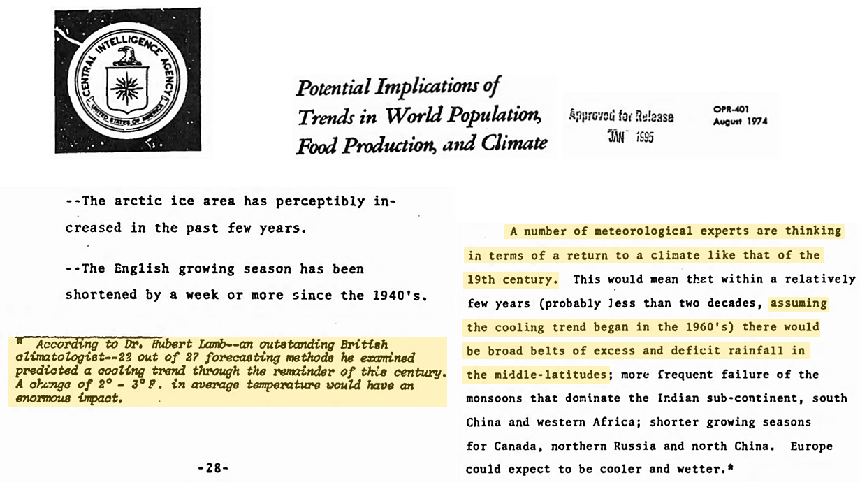
According to scientists reporting to the U.S. Central Intelligence Agency (1974), 22 of 27 forecasting methods predicted a cooling trend for the next 25 years, and “meteorological experts” were thinking an 1800s climate was around the corner, with the concomitant return to monsoon failures, shorter growing seasons, and “violent weather”.
U.S. Central Intelligence Agency,1974
Feel free to call your local station and tell them so.The red was way way too red. Why? Temperatures were cooler.
Here is how you strike me. A waterfall is in the park. I stand there admiring it's beauty. You walk up to me and say to me, move back, you are falling. I look at you like what did you drink. I am not remotely near falling. What are you seeing?Feel free to call your local station and tell them so.
You lie so casually now because I gave you the other day of several HUNDRED published papers predicting cooling, you have serious selective memory troubles
A few points:
- 285 studies is a small fraction of the total number of studies published over that span of time and a strong majority expressed concern about AGW.
- The list includes anyone not accepting AGW, not just predicting a new ice age.
- We are in an ice age - the Quaternary Period - that began 2.58 million years ago. The current warm period is known as an interglacial.
- This interglacial peaked at the Holocene Climate Optimum about 6,000 years ago and until the Industrial Revolution, the Earth had been slowly cooling.
- We are headed into the next glacial period but not for 10,000 years or more.
Is your AC up to date?A few points:
- 285 studies is a small fraction of the total number of studies published over that span of time and a strong majority expressed concern about AGW.
- The list includes anyone not accepting AGW, not just predicting a new ice age.
- We are in an ice age - the Quaternary Period - that began 2.58 million years ago. The current warm period is known as an interglacial.
- This interglacial peaked at the Holocene Climate Optimum about 6,000 years ago and until the Industrial Revolution, the Earth had been slowly cooling.
- We are headed into the next glacial period but not for 10,000 years or more.
Yes, Robert. Relevance?Is your AC up to date?
You don't need to worry about temperature.Yes, Robert. Relevance?
ChemEngineer
Diamond Member
- Feb 5, 2019
- 7,741
- 8,019
- 2,140
Robert, please stop wasting your time and ours responding to ecohypocrites like crick, so proud of flying to France and yet acting like Greta Thunberg to condemn civilized people.
____________________________
____________________________
Sounds great to me. Will do.Robert, please stop wasting your time and ours responding to ecohypocrites like crick, so proud of flying to France and yet acting like Greta Thunberg to condemn civilized people.
____________________________
I've got a better suggestion. How about discussing the issues of this forum rather than the posters?Robert, please stop wasting your time and ours responding to ecohypocrites like crick, so proud of flying to France and yet acting like Greta Thunberg to condemn civilized people.
____________________________
The words of many just like you warm my heart. I would never have thought to compliment and describe it as powerfully as so many have, including Dr. John Orosz, MD, who called it "beyond incredible. Should be required reading for every literate human."
- No spamming. Multiple posting of the same thing, advertising, and/or links to other sites.

USMB Rules and Guidelines
USMB Site Guidelines and Regulations List of Current Active Moderators: AyeCantSeeYou Dont Taz Me Bro katsteve2012 White 6 Registration Guidelines: Individuals are allowed only one (1) account. Anyone found to be in violation risk having all accounts banned. Site Wide Rules And Guidelines...
Similar threads
- Replies
- 0
- Views
- 241
- Replies
- 192
- Views
- 2K
- Poll
- Replies
- 1
- Views
- 84
New Topics
-

-

-

-
-
 Why do people like this Have a hard time
- Started by Deplorable Yankee
- Replies: 1