Iceman
Rookie
- Nov 4, 2013
- 2,227
- 131
- 0
- Banned
- #1
Submitted by Tyler Durden on 11/07/2013 17:10 -0500
Submitted by Simon Black of Sovereign Man blog,
Check out this chart below. It’s a graph of total US tax revenue as a percentage of the money supply, since 1900.
For example, in 1928, at the peak of the Roaring 20s, US money supply (M2) was $46.4 billion. That same year, the US government took in $3.9 billion in tax revenue.
So in 1928, tax revenue was 8.4% of the money supply.
In contrast, at the height of World War II in 1944, US tax revenue had increased to $42.4 billion. But money supply had also grown substantially, to $106.8 billion.
So in 1944, tax revenue was 39.74% of money supply.
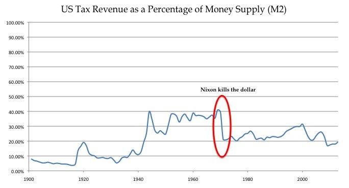
You can see from this chart that over the last 113 years, tax revenue as a percentage of the nation’s money supply has swung wildly, from as little as 3.65% to over 40%.
But something interesting happened in the 1970s.
1971 was a bifurcation point, and this model went from chaotic to stable. Since 1971, in fact, US tax revenue as a percentage of money supply has been almost a constant, steady 20%.
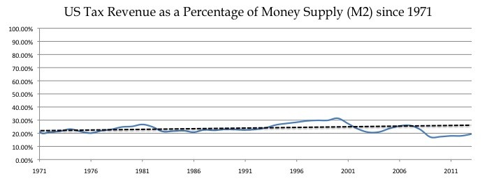
You can see this graphically below as we zoom in on the period from 1971 through 2013– the trend line is very flat.
What does this mean? Remember– 1971 was the year that Richard Nixon severed the dollar’s convertibility to gold once and for all.
And in doing so, he handed unchecked, unrestrained, total control of the money supply to the Federal Reserve.
That’s what makes this data so interesting.
Prior to 1971, there was ZERO correlation between US tax revenue and money supply. Yet almost immediately after they handed the last bit of monetary control to the Federal Reserve, suddenly a very tight correlation emerged.
Furthermore, since 1971, marginal tax rates and tax brackets have been all over the board.
In the 70s, for example, the highest marginal tax was a whopping 70%. In the 80s it dropped to 28%.
And yet, the entire time, total US tax revenue has remained very tightly correlated to the money supply.
The conclusion is simple: People think they’re living in some kind of democratic republic. But the politicians they elect have zero control.
It doesn’t matter who you elect, what the politicians do, or how high/low they set tax rates. They could tax the rich. They could destroy the middle class. It doesn’t matter.
The fiscal revenues in the Land of the Free rest exclusively in the hands of a tiny banking elite. Everything else is just an illusion to conceal the truth… and make people think that they’re in control.
Read Here: One Chart Showing Who's Really In Control | Zero Hedge
Submitted by Simon Black of Sovereign Man blog,
Check out this chart below. It’s a graph of total US tax revenue as a percentage of the money supply, since 1900.
For example, in 1928, at the peak of the Roaring 20s, US money supply (M2) was $46.4 billion. That same year, the US government took in $3.9 billion in tax revenue.
So in 1928, tax revenue was 8.4% of the money supply.
In contrast, at the height of World War II in 1944, US tax revenue had increased to $42.4 billion. But money supply had also grown substantially, to $106.8 billion.
So in 1944, tax revenue was 39.74% of money supply.
You can see from this chart that over the last 113 years, tax revenue as a percentage of the nation’s money supply has swung wildly, from as little as 3.65% to over 40%.
But something interesting happened in the 1970s.
1971 was a bifurcation point, and this model went from chaotic to stable. Since 1971, in fact, US tax revenue as a percentage of money supply has been almost a constant, steady 20%.
You can see this graphically below as we zoom in on the period from 1971 through 2013– the trend line is very flat.
What does this mean? Remember– 1971 was the year that Richard Nixon severed the dollar’s convertibility to gold once and for all.
And in doing so, he handed unchecked, unrestrained, total control of the money supply to the Federal Reserve.
That’s what makes this data so interesting.
Prior to 1971, there was ZERO correlation between US tax revenue and money supply. Yet almost immediately after they handed the last bit of monetary control to the Federal Reserve, suddenly a very tight correlation emerged.
Furthermore, since 1971, marginal tax rates and tax brackets have been all over the board.
In the 70s, for example, the highest marginal tax was a whopping 70%. In the 80s it dropped to 28%.
And yet, the entire time, total US tax revenue has remained very tightly correlated to the money supply.
The conclusion is simple: People think they’re living in some kind of democratic republic. But the politicians they elect have zero control.
It doesn’t matter who you elect, what the politicians do, or how high/low they set tax rates. They could tax the rich. They could destroy the middle class. It doesn’t matter.
The fiscal revenues in the Land of the Free rest exclusively in the hands of a tiny banking elite. Everything else is just an illusion to conceal the truth… and make people think that they’re in control.
Read Here: One Chart Showing Who's Really In Control | Zero Hedge
Last edited: