Navigation
Install the app
How to install the app on iOS
Follow along with the video below to see how to install our site as a web app on your home screen.
Note: This feature may not be available in some browsers.
More options
Style variation
You are using an out of date browser. It may not display this or other websites correctly.
You should upgrade or use an alternative browser.
You should upgrade or use an alternative browser.
Listen up for once, CO2 does NOT govern Climate
- Thread starter Robert W
- Start date
- Thread starter
- #22
We were dangerously low in the late 1800s. The entire idea behind green houses is to add a lot more CO2 for the health of the plants.The only way to finally prove that CO2 isn't the bogyman some claim it to be is to actually reduce it and see what happens.
- Thread starter
- #23
Here is a tip to help you understand this topic. See the hockey stick they use as proof? Correctly graphed it is really almost a flat line and not a huge jump up.He is well known to be a blithering idiot. Look up his claims for yourself. The pre-industrial level of CO2 in the atmosphere was 280 ppm. It is now 420 ppm, a 50% increase, and both isotopic analysis and simple bookkeeping calculations show that every bit of that increase is due to the combustion of fossil fuels.
Correctly graphed? Please explain.Here is a tip to help you understand this topic. See the hockey stick they use as proof? Correctly graphed it is really almost a flat line and not a huge jump up.
- Thread starter
- #25
The range is over 100 years and the changes are very very tiny. Correctly graphed, it looks like a flat line.Correctly graphed? Please explain.
jc456
Diamond Member
- Dec 18, 2013
- 160,585
- 40,140
- 2,180
demofks create all the chaos in the world. They are the fking masters of chaos.Its not a crisis... but anything the Dems can run on they change into an immediate crisis.... can you say gas lighting?....
jc456
Diamond Member
- Dec 18, 2013
- 160,585
- 40,140
- 2,180
you never heard of Michael Mann and the hockey stick?Correctly graphed? Please explain.
jc456
Diamond Member
- Dec 18, 2013
- 160,585
- 40,140
- 2,180
booring repetitive narratives!! ain't you got anything else?From Koonin's Wikipedia article
Reception of 2021 book Unsettled
Critics of Koonin's book Unsettled accused him of cherry picking data, muddying the waters surrounding the science of climate change, and having no experience in climate science.[24]
In a review in Scientific American, economist Gary Yohe wrote that Koonin "falsely suggests that we don't understand the risks well enough to take action":
The science is stronger than ever around findings that speak to the likelihood and consequences of climate impacts, and has been growing stronger for decades. In the early days of research, the uncertainty was wide; but with each subsequent step that uncertainty has narrowed or become better understood. This is how science works, and in the case of climate, the early indications detected and attributed in the 1980s and 1990s, have come true, over and over again and sooner than anticipated... [Decision makers] are using the best and most honest science to inform prospective investments in abatement (reducing greenhouse gas emissions to diminish the estimated likelihoods of dangerous climate change impacts) and adaptation (reducing vulnerabilities to diminish their current and projected consequences).[21]
Physicist Mark Boslough, a former student of Koonin, posted a critical review at Yale Climate Connections. He stated that "Koonin makes use of an old strawman concocted by opponents of climate science in the 1990s to create an illusion of arrogant scientists, biased media, and lying politicians – making them easier to attack."
Nonprofit organization Inside Climate News reported that climate scientists call Koonin's conclusions "fatally out of date ... and based on the 2013 physical science report of the Intergovernmental Panel on Climate Change (IPCC)."[10]
Mark P. Mills, a senior fellow at the Manhattan Institute, a conservative think tank, and faculty fellow at Northwestern University’s McCormick School of Engineering and Applied Science, lauded the book in The Wall Street Journal as "rebut[ing] much of the dominant political narrative". Twelve scientists analyzed Mills's arguments and said that he merely repeated Koonin's incorrect and misleading claims. Koonin responded with an article answering these critics.[
Please explain what you mean by "correctly graphed".The range is over 100 years and the changes are very very tiny. Correctly graphed, it looks like a flat line.
And let me make a really obvious point: how you graph it has no effect whatsoever on the actual values. After you explain "correctly graphed", why don't we have a talk about the significance of the actual values?
Last edited:
jc456
Diamond Member
- Dec 18, 2013
- 160,585
- 40,140
- 2,180
Real data?Please explain what you mean by "correctly graphed".
- Thread starter
- #31
If I want to alarm you, on any issue, I provide as Mann did a graph that exaggerates conditions. I would do as he did and mark down tiny increments as were they giant increments. The accurate graph is almost a perfect flat line.Please explain what you mean by "correctly graphed".
And let me make a really obvious point: how you graph it has no effect whatsoever on the actual values. After you explain "correctly graphed", why don't we have a talk about the significance of the actual values?
- Thread starter
- #32
If any temperature rises by 2 degrees over a 150 year span of time, the line for the graph looks like it is virtually a flat line.Please explain what you mean by "correctly graphed".
And let me make a really obvious point: how you graph it has no effect whatsoever on the actual values. After you explain "correctly graphed", why don't we have a talk about the significance of the actual values?
A good way to visualise it is using your auto speed. It rises by 2 mph over a time period of 150 years. It is virtually undetectable.
Okay, so you have no ******* idea what you meant by "correctly graphed". I spent most of my professional career making plots of error data from naval sensor systems: relative bearing error vs actual relative bearing, range error vs adjusted range. Once in a while, someone would hit the wrong key and data would get plotted at scales that would make all the information in the plot disappear - just as you claim is the proper way to present it. The purpose of a plot is to convey information, not hide it. That you think otherwise tells us where your priorities lie. And I emphasize "LIE".If any temperature rises by 2 degrees over a 150 year span of time, the line for the graph looks like it is virtually a flat line.
A good way to visualise it is using your auto speed. It rises by 2 mph over a time period of 150 years. It is virtually undetectable.
Oddball
Unobtanium Member
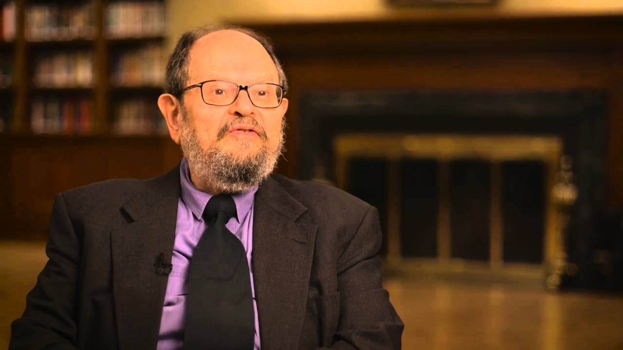
This video is by this planet's finest of all climate experts.
He explains the major errors we have been led to the alarmist camp by.
DeSmog Blog has a long article on Lindzen. The point that you should take from it is how large a portion of his total income over his entire professional career has been paid for by the fossil fuel industry.
Richard Lindzen
Richard Lindzen Credentials Background Richard S. Lindzen is former Alfred P. Sloan Professor of Meteorology at the Massachusetts Institute of Technology (MIT), a position he held from 1983 until his retirement in 2013.3“Faculty News,” EAPS, May 31, 2013. […]
 www.desmog.com
Oddball
Unobtanium Member
blablablablaDeSmog Blog has a long article on Lindzen. The point that you should take from it is how large a portion of his total income over his entire professional career has been paid for by the fossil fuel industry.
Richard Lindzen
Richard Lindzen Credentials Background Richard S. Lindzen is former Alfred P. Sloan Professor of Meteorology at the Massachusetts Institute of Technology (MIT), a position he held from 1983 until his retirement in 2013.3“Faculty News,” EAPS, May 31, 2013. […]
Your warmer cult has never ever correctly predicted anything.....Al Roker has a better track record.
mamooth
Diamond Member
Then summarize it for us, in your own words. Have the guts to state a point and stand behind it, instead of just yelling "BUT MAH VIDEO!".This video is by this planet's finest of all climate experts.
If you're not a brainless propaganda monkey, incapable of independent thought, that should be no problem for you.
<crickets>
Oh wait. You are a brainless propaganda monkey, only capable of cut-and-pasting propaganda. Never mind.
So, what else does TheParty want you to say? Run and check. You know how much they hate it when you go off-script.
- Thread starter
- #38
Interesting that you have no cure for climate. But keep on believing man is in charge of climate.Then summarize it for us, in your own words. Have the guts to state a point and stand behind it, instead of just yelling "BUT MAH VIDEO!".
If you're not a brainless propaganda monkey, incapable of independent thought, that should be no problem for you.
<crickets>
Oh wait. You are a brainless propaganda monkey, only capable of cut-and-pasting propaganda. Never mind.
So, what else does TheParty want you to say? Run and check. You know how much they hate it when you go off-script.
- Thread starter
- #39
I discussed that with Dr. Lindzen yet none of you who believe man is in charge of climate has to date shown proof he is in the pocket of the fossil industry. He told me simply, no, this is a false claim made against me.DeSmog Blog has a long article on Lindzen. The point that you should take from it is how large a portion of his total income over his entire professional career has been paid for by the fossil fuel industry.
Richard Lindzen
Richard Lindzen Credentials Background Richard S. Lindzen is former Alfred P. Sloan Professor of Meteorology at the Massachusetts Institute of Technology (MIT), a position he held from 1983 until his retirement in 2013.3“Faculty News,” EAPS, May 31, 2013. […]
- Thread starter
- #40
Differences in sea ice thickness
Because sea ice does not stay in the Antarctic as long as it does in the Arctic, it does not have the opportunity to grow as thick as sea ice in the Arctic. While thickness varies significantly within both regions, Antarctic sea ice is typically 1 to 2 meters (3 to 6 feet) thick, while Arctic sea ice is typically 2 to 3 meters (6 to 9 feet) thick. In some Arctic regions, ice thickens up to 5 meters (15 feet). However, Arctic sea ice has been thinning with more and more ice measuring only 1 to 2 meters (3 to 6 feet) thick.Similar threads
- Replies
- 0
- Views
- 197
- Replies
- 106
- Views
- 2K
- Replies
- 12
- Views
- 309
- Replies
- 78
- Views
- 1K
New Topics
-

-
-
 Boston Prepares for Pride Month With Monkeypox Vaccine
- Started by excalibur
- Replies: 1
-
Is science an evolutionary adaption by people hoping to succeed at natural selection?
- Started by Averies
- Replies: 2
-
Idea: Banning science in public schools and universities, and having them teach creationism as fact
- Started by Averies
- Replies: 1
Latest Discussions
-

-
Trump once again insults our military: Meet his criteria of fitness or get lost.
- Latest: MostBoringManInTheWorld
-

-
