How are the models that match up with our emissions doing?

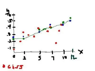
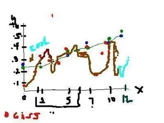
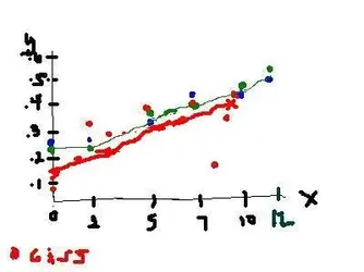
I had a little fun and made a c class graph...I put the giss yearly temperature in as "Red" dots. Secondly, I put the lower and higher estimate; being A2 or A1b1 as either green or blue dots. Finally, I put a lighter green line for the means of the model. I'd say over all the ipcc isn't doing to bad...Maybe, we're slightly on the low side, but I'd give it a B.

Remember, it is on a 1980-1999 baseline for the giss to match the ipcc models.
*2000, 2008 had fairly powerful ninas...Same as 2011. So these years are the years that fall way below the means. (Yes, I extended it out to 2012).

Yeah, I know it's not the best graph, but I feel I got the point across. Do you agree with it?

Are your comparisons to the IPCC based on their older models which have proven to be woefully off, or on the newer models based on the same assumptions that caused the failure of the older models but haven't had enough time yet to show how pifully inadequate they really are?

Here is the data
http://www.ipcc-data.org/data/ar4_multimodel_globalmean_tas.txt
 
LOL. Simple fact is that you cannot refute one of these facts. All are supported by observatonal data from scientists from all the nations of the world. Observations published in articles in peer reviewed journals in several nations.

All you can do is meaningless flapyap.


Of course I can. In fact, I can crush your entire argument with two questions.

How do you define signifigantly?

How does that definition relate to natural variability?
 
Significant, as when there is a continueing trend for 150 years that is still ongoing and accelerating. When that trend continues in the face of negative forcing that should be forcing it down. When there is a strong La Nina, a reduced TSI, and still, the year places in the top ten for the last 150 years, that is significant.

Observations of effects. The melting of the continental caps of Greenland and Antarctica, the retreat of the mountain glaciers, and the reduction of the volume of the Arctic Sea Ice to only 25% of it's previous normal. The ratio of records of heat versus cold set year after year, when this is all to one side, the warmer side, for several decades, this is significant.

Natural variability is in there. You can see it in the ups and downs of this graph. However, note that now the present downs exceed some of the earlier ups. That is significant.

UAH Global Temperature Update for August, 2011: +0.33 deg. C « Roy Spencer, Ph. D.
 
Significant, as when there is a continueing trend for 150 years that is still ongoing and accelerating. When that trend continues in the face of negative forcing that should be forcing it down. When there is a strong La Nina, a reduced TSI, and still, the year places in the top ten for the last 150 years, that is significant.

The fact that temperatures have leveled off for the past decade and a half in spite of increased atmospheric CO2 pretty much puts the lid on that flawed analysis.

Natural variability is in there. You can see it in the ups and downs of this graph. However, note that now the present downs exceed some of the earlier ups. That is significant.

So what you are saying is that there is nothing going on in the climate of earth at present that even approaches the bounds of natural variability. That's what I thought. When the behavior of the climate even begins to approach the most rural outlands of natural variability, let me know.

And wow, your graph goes all the way back to the 70's. Impressive.
 
Last edited:
Your proof of which is?

Reality.[/QUOT


OL. Simple fact is that you cannot refute one of these facts. All are supported by observatonal data from scientists from all the nations of the world. Observations published in articles in peer reviewed journals in several nations.

All you can do is meaningless flapyap.


Wrong again buckwheat. You made the assertion,. YOU have to back it up with empirical data. That's how science works MENSA boy.
 
Who here would agree that the ENSO can partly explain the difference between the models and reality? Seriously, 2002-2006 was a very positive enso 5 years. What did you get during this period. You got a period of slightly above the "models" means; notably 2002, 2005. What do you get when the enso flips in late 2006? 2007-2011 overall were -enso years. Including 2010, I dare say. These years from 2007, 2008, 2009 were all below the models means. Same as 1999-2001, which was another such period not much different from 2007-2011 as a negative enso.
Maybe the enso has 4-5 year cycles on the global level(effects on the globe), which goes from warm, cold, warm again and again. We all know that the oceans hold most of the energy within the climate system(93 percent of the heat). We're starting to find that the nina and nino carry this energy back and forth between the first 500 meters at least of the ocean(maybe 1,500 or more)...Nina is just upwelling the colder waters to the surface, while the warmer water circulates deep into the western Pacific.

Wirebender or Westwall would you agree? I believe this could be causing the short term to be below the means, but this will go up and down from above the means to below it.

First graph is the graph I posted above.
Second graph shows what I believe to be the global effects of the enso.
1# Cool period from 1999-2001.
2# Warm period overall from 2002-2006
3# Cool period from 2008-2011, but a short break in that with a strong nina during early 2010.
---Difference between 2005 and 2010 was 2005 was on the end of 3 warm enso years, so the overall atmosphere was warmed up, while 2010 is like sticking the pot on the stove and checking the temperatures 4 minutes later. The stove is on 250f a piece, but 2005 was boiling and 2010 only was starting to get warm before it was pushed back into a nina. The graph on the right more or less deals with this effect on a global scale.
 

Attachments

  • $Ipcc to giss.JPG
    $Ipcc to giss.JPG
    11.3 KB · Views: 77
  • $Ipcc to giss1.JPG
    $Ipcc to giss1.JPG
    16.7 KB · Views: 80
Last edited:
I just can't stop playing around with the graphs...Well here we go!

This graph is about the trend...
*Broad red line is 20 year trend from 1990-2010, which comes out to near .02c per year when you avg them. I extended this out to 2030.
*Light green is 2000-2010, which is clearly slower, but closer to .015/year...I extended this out to 2030.
*Lastly, I placed A2 in blue for 2000, 2010, 2020, 2030 and A1b for purple for 2020, 2030.
Well this is what we're concern with, not 2100. So the next 20 years is what is important.

Enjoy!
 

Attachments

  • $untitled10,20 year trend with models.JPG
    $untitled10,20 year trend with models.JPG
    11.2 KB · Views: 70
Last edited:
I just can't stop playing around with the graphs...Well here we go!

This graph is about the trend...
*Broad red line is 20 year trend from 1990-2010, which comes out to near .02c per year when you avg them. I extended this out to 2030.
*Light green is 2000-2010, which is clearly slower, but closer to .015/year...I extended this out to 2030.
*Lastly, I placed A2 in blue for 2000, 2010, 2020, 2030 and A1b for purple for 2020, 2030.
Well this is what we're concern with, not 2100. So the next 20 years is what is important.

Enjoy!

Matt- I think you are being disingenuous. I find it hard to believe you are unaware of the ongoing discussion over the accuracy of IPCC projections between dana81, author of the article @ skepticalscience and lucia (the blackboard) and other commentors.

to get the IPCC results even in the 2SD range it takes cherrypicking 2000 (dip after huge 1998 el nino) as the breakpoint between hindcast and forecast. after 11years of 0.012K/yr it will take the next nine years at 0.03K/yr to hit the IPCC prediction, or the next 19 years at 0.025K/yr to meet yours.

I will look over it and make sure the baselines are right.
 
Ok, my eyeballing was a little off.

So I figured out a smoothing avg of 5 years on a 1980-1999 baseline for giss data.
1987-1991 is avged to .02c
2006-2010 is avged at .316c

20 year equation for 1990-2010 is
f(x)=.0148x+.02

f(20)=.0148(20)+.02
f(20)=.316c check!

f(30)=.0148(20)+.02
f(30)=.464c for 2020

f(40)=.0148(30)+.02
f(40)=.612c for 2030

The ten year trend for 2000-2010 is

(0,.164)(10,.316)

equation
f(x)=.0152x+.164
f(x)=.0152(10)+.164
f(x)=.316 checks! for 2010

f(20)=.0152(20)+.164
f(20)=.468c for 2020

f(30)=.0152(30)+.164
f(30)=.64c by 2030


So yes it is quite a bit off the models

here they are
year A1b1, A2
2010 .408, .423
2020 .684, .615
2030 .944, .809

This is what I get for putting a 1951-1980 baseline with 1980-1999 baseline. 1951-1980 baseline makes 2020, 2030 +.2c warmer then those supposed to be for the trend on the old maps, which forced them to match the models. I also did a smoothing of 5 years with the new maps to get the means...1987-1991, 1997-2001, 2006-2010, each one of these have nino's and nina's. Had to as there is no map of the giss at 1980-1999 baseline.
 
Last edited:
Graph on left
The red line is the graph of the data I worked out...
Green is the models
Ipcc a1b and a2 and giss data set at 1980-1999 each.

Graph on right is a updated graph of the one on page 2# with the new baseline to show you 2000-2010.
 

Attachments

  • $untitledmodels.JPG
    $untitledmodels.JPG
    13.8 KB · Views: 48
  • $Ipcc to giss.JPG
    $Ipcc to giss.JPG
    12.7 KB · Views: 62
Last edited:
None of what you claim is supported by fact.

If you could, please tell us at what time in the history of the Earth temperatures have risen faster than they have in the last 100 years?

Thanks!

Sure. Here are the Vostok ice core data for the past 420,000 years. How many periods can you count where the temperature rose more quickly, and higher than the present?

VostokIceCores400000Kmed.jpg

You really are that stupid. No, there is no way that the scale on that graph is going to show the present increase. However, there is a more recent event where the temps changed more rapidly than they thus far have in the last 180 year. That was the entry and exit of North America and Europe into the Younger Dryas period.

NOAA Paleoclimatology Program - Perspective on Abrupt climate Change

Ah so you are saying that just because its not there doesn't mean its not there....:cuckoo:
 
Well hell, I thought it was going to be a thread about Christie Brinkley dreams and nocturnal emissions in our youth....but hell its just some more environmental fur ball nonsense shit...
 

Forum List

Back
Top