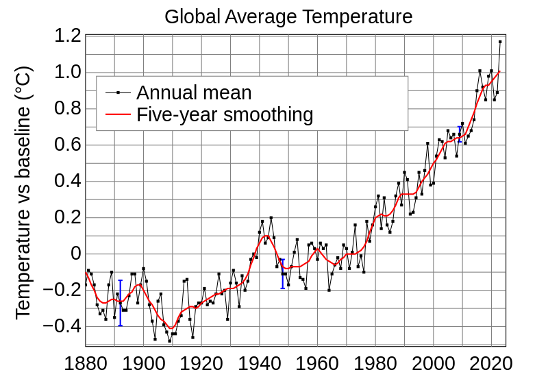
For decades this NASA graph based on the database of Great Britain's Climate Research Unit shows a dramatic increase in temperature was accepted by scientists as proving that there was a dramatic increase in earth's temperature starting in the late 1970s. CO2 levels also increased during this period starting in the late 1940s, leading to the conclusion that man was responsible for the temperature increase. However, this data is corrupted with the heat island effect. Also, note that the increase in atmospheric CO2 started in the late 1940s, just when earth was going through a cooling period. The heat island effect is supposed to have been mostly removed from the United States data set, which accounts for one-fourth of the worlds measuring stations. However, in the fall of 2009 and into the winter of 2010, it was revealed that rather than removing the heat island effect, NASA and NOAA may have actually amplified it. Also, the main temperature data base at the Climate Research Unit in Great Britain has deliberately corrupted the database used in producing the graph.

A serious error was found in the NASA temperature data for the United States in 2007. When corrected, it was determined that the warmest year in the past 100 years was not in 1998 and 2006 as previously believed, but was 1934, followed 1998. 1921 became the third hottest year, followed by 2006 and 1933. Out of the five hottest years, three occurred in the 1920s and 30s and only two were in the past 10 years. Notice that the US data do not have the same steep increase in temperature shown in the corrupted data of Britain's Climate Research Unit's data in the graph above. This dramatically changes scientists understanding of the importance of the warming that has occurred since 1975. The period between 1995 and 2009 is no warmer than the period between 1920 and 1935. This error in the NASA data has lead to discoveries of other errors in the data which are raising concern about data integrity of NASA's Goddard Institute of Space Studies.
More at: Lesson 1 Graphs n' Charts
Notice the first graph, that is the one that the AGW cultists post (or something similar) all the time.
The second graph is the corrected graph that that AGW cultists will deny exists. They claim they listen to NASA, but obviously they do not as empirical evidence shows.
Aug. 14 (Bloomberg) -- NASA has revised climate data to show 1934 as the hottest year on record in the U.S., ousting 1998 and challenging the argument that national temperatures are reaching new highs amid global warming.
NASA Fixes Data; 1934 Ousts 1998 as Hottest U.S. Year (Update1) - Bloomberg
However you will watch them feverishly use AGW propaganda to claim this is false, even though it is from NASA a source they claim to believe without question.