While I do not totally agree with this statement, I find it hilarious that it sent mamooth into yet another fit of poo flinging. The rhetoric of climate debate is even worse that that of American presidential politics.
Ian, given that you do nothing but scream insults at people now, you have no business projecting your own ugly nature on to rational people.
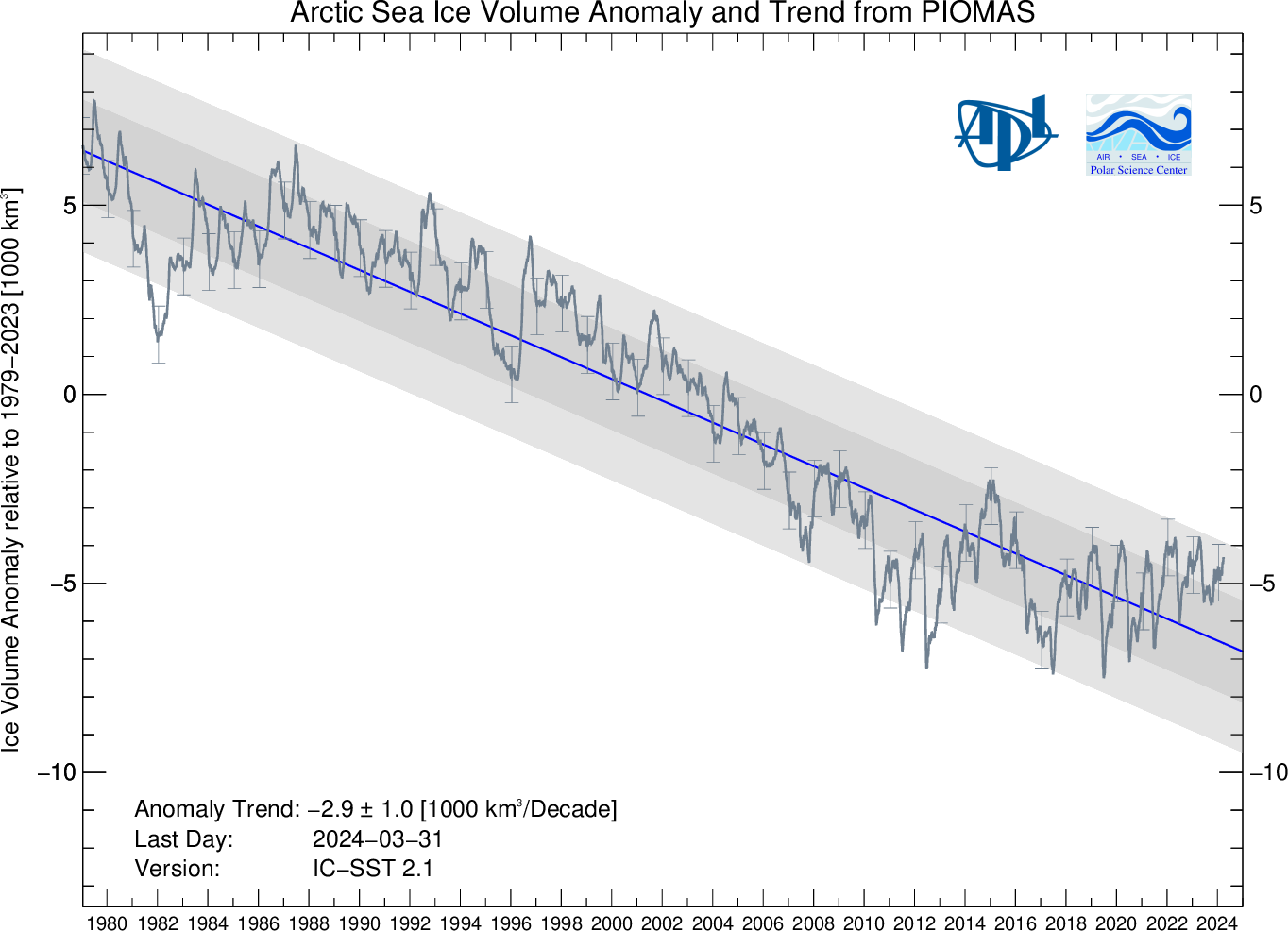
Now, instead of replying to your endless content-free insult posts in kind, I'll keep doing what upsets you the most, which is talk about the science.
Gross Deception About DMI’s “Missing Graph” | The Great White Con
Homewood, the author of your conspiracy theory, lied about it. There is no question about that. This is from his blog post:
"It must be pointed out that DMI has never stated that there is any problem with the 30% version, or reason to doubt it…"
This is what DMI said about the graph months before:
"The plot above replaces an earlier sea ice extent map, that was based on data with the coastal zones mapped out. The coastal map implied that the previous sea ice estimates were underestimated. The new plot displays the absolute sea ice extent. The old plot can still be viewed here <link> for a while."
That is, directly contrary to Homewood's claim, DMI flat out said the graph was a bad estimate, and removed it months ago.
Yet here you are claiming DMI was calling it perfect data up until a few days ago.
Ian, you've been parroting bullshit lies. You didn't know better before. Now you do, so you no longer have ignorance as an excuse.
Address that. Or just hurl insults and run back to your SafeSpace at WUWT, where reality isn't allowed in to torment you.