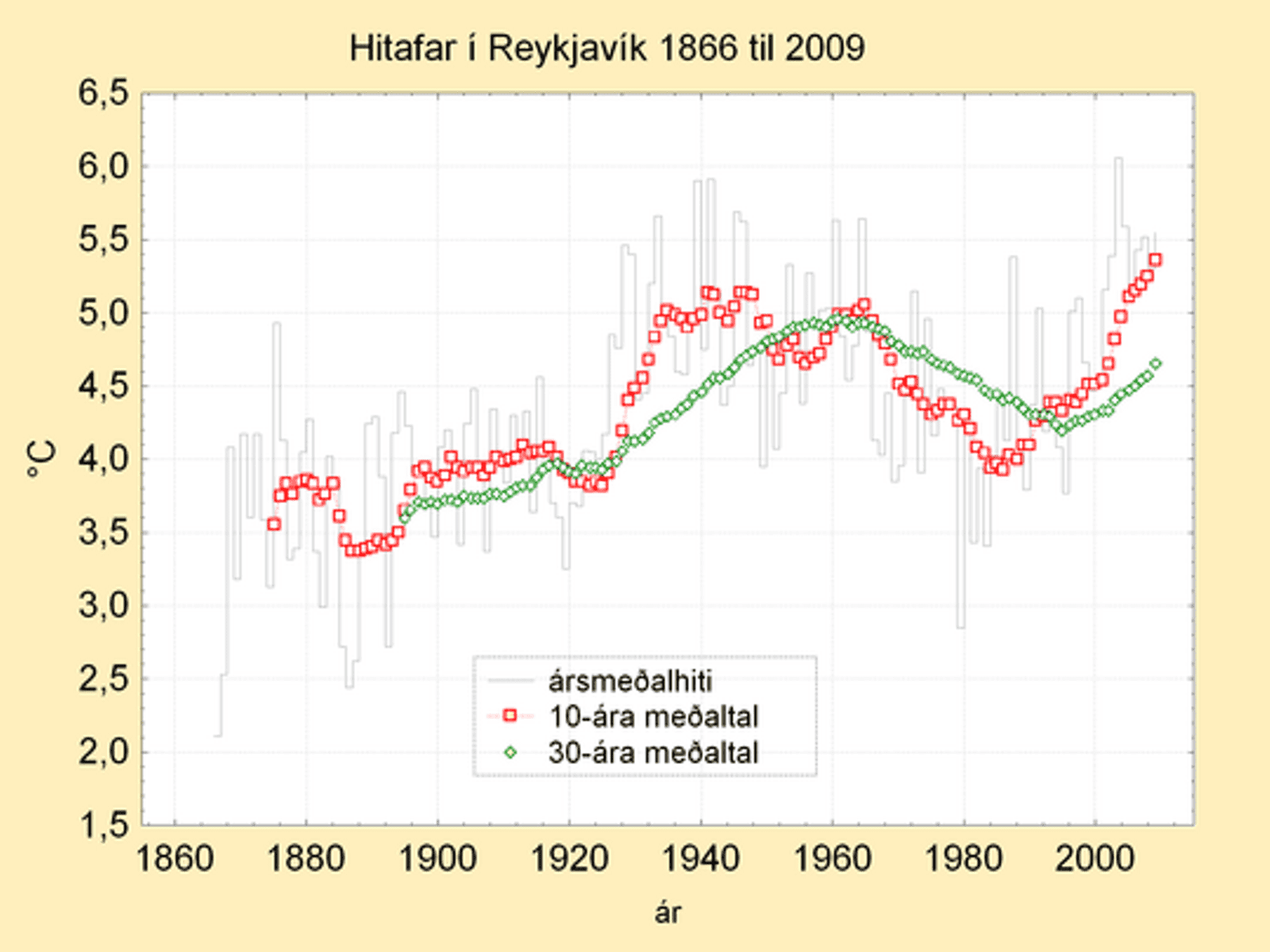
I was perusing temp graph data looking for a back door to get into GHCN (I dont seem to be able to get into the station data anymore, probably my fault) when I spotted a graph for Reykjavik from the Iceland Met.
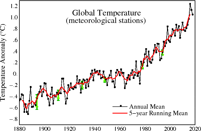
he wondered why it was so different from the GISS graph
http://data.giss.nasa.gov/tmp/gistemp/STATIONS/tmp_620040300000_14_0/station.gif
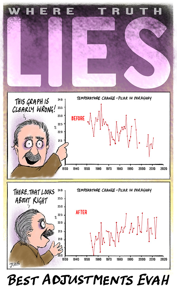
and then he came to the same conclusion that so many of us have. the homogenization schemes simply 'correct' any and all records to match the global graph
single stations are changed to look like their neighbours, neighbours are changed to look like their regions, regions are changed to look like their country, countries are changed to look like their continents, continents are changed to look like the globe. if you run the data through the homogenization enough times it all looks the same.