Navigation
Install the app
How to install the app on iOS
Follow along with the video below to see how to install our site as a web app on your home screen.

Note: This feature currently requires accessing the site using the built-in Safari browser.
More options
You are using an out of date browser. It may not display this or other websites correctly.
You should upgrade or use an alternative browser.
You should upgrade or use an alternative browser.
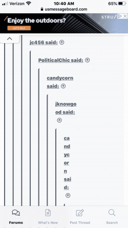
What’s with this new format? Not iPhone friendly. I see more posts that have vertical lines and single words, never saw this on the old form.
- Thread starter Cellblock2429
- Start date
- Thread starter
- #5
MindWars
Diamond Member
- Oct 14, 2016
- 42,227
- 10,743
- 2,040
- Banned
- #6
/----/ "After all, we don't want to offend anyone. "This format is more politically correct: The Reps merely indicate your emotional state rather than the content value of the post. After all, we don't want to offend anyone.
View attachment 322947
You know a few years ago there was a law suite started over Mr. Potato head the reason it was making fun of black ppl.
MacTheKnife
Gold Member
- Jul 20, 2018
- 5,977
- 2,039
- 325
They had posted they are working on it and suggested to use the quote function rather than reply to help avoid it until they get it fixed.
I have had the same problem....totally irritating
Likkmee
Gold Member
Likkmee
Gold Member
See this thread.. Asking for some editing behavior changes...
I forgot to make it sticky and it drifted down in the listings.. I've been to the Xenforo user's forum and a LOT of users are asking the same question.. IT told me they couldn't find the "nesting depth" settings.. Obviously a LOT of confusion or bugs in the new release...
In the meantime, I suggested a way to "quote distance" ourselves so it does not inconvenience the mobile users. And there ARE improvements for mobile in the update, so we're sorry stuff like this wrecks it..
They had posted they are working on it and suggested to use the quote function rather than reply to help avoid it until they get it fixed.
I have had the same problem....totally irritating
See response above..
This format is more politically correct: The Reps merely indicate your emotional state rather than the content value of the post. After all, we don't want to offend anyone.
New posting ratings coming out this week.. "likes and dislikes" have no value to a discussion board.. We'll be CLOSER to what we had before with a couple additions..
One thing I've noticed on my phone is that when a thread has more than one page I am taken to the "first unread post". For example, If I click on a thread I have never seen before, I go to post #1. If I hit back then click on the same post, I'll be taken to post #21 since there are 20 posts per page. Which is fine. The problem I'd like to see addressed is this: to get back to post #1, I have to scroll all the way down on my phone to the bottom of post #40 to the arrows and page numbers. Can you put the "arrows and page numbers" at the top so there needn't be this scrolling?
One thing I've noticed on my phone is that when a thread has more than one page I am taken to the "first unread post". For example, If I click on a thread I have never seen before, I go to post #1. If I hit back then click on the same post, I'll be taken to post #21 since there are 20 posts per page. Which is fine. The problem I'd like to see addressed is this: to get back to post #1, I have to scroll all the way down on my phone to the bottom of post #40 to the arrows and page numbers. Can you put the "arrows and page numbers" at the top so there needn't be this scrolling?
I'll ask IT.. But this is easy to do on keyboard laptop or desktop.. EVERYTHING is harder to navigate on mobile..
I agree that only having paging only at the BOTTOM is a pain.. Seems to me before Xenforo, we DID have that...
Similar threads
- Replies
- 10
- Views
- 185
- Replies
- 19
- Views
- 228
- Replies
- 20
- Views
- 331
Latest Discussions
- Replies
- 138
- Views
- 985
- Replies
- 706
- Views
- 8K
- Replies
- 41
- Views
- 123
Forum List
-
-
-
-
-
Political Satire 8060
-
-
-
-
-
-
-
-
-
-
-
-
-
-
-
-
-
-
-
ObamaCare 781
-
-
-
-
-
-
-
-
-
-
-
Member Usernotes 470
-
-
-
-
-
-
-
-
-
-


