Rasmussen: 29% STRONGLY APPROVE of the Bamster, 42% STRONGLY DISSAPROVE!

The pub from Mass is a democrat all in name, and after this election when the Dems will continue with comfortable majorities, he will switch to the Democratic Party.

I love the loonies and the libertards thinking the Dems are going to lose this fall: sheer wishful loony thinking and psycho talk.
 
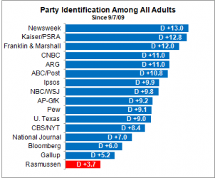
My graph proves that Rasmussen polls more Republicans than anyone else. If you can prove that Rasmussen is right and everyone else is wrong by all means do so.

View attachment 10712

Your graph represents only one thing, Rasmussen interviews a more even (balanced) audience, did you ever think that is why he is more accurate than others?!?!?!?!

That your partisanship can not see this is no real surprise.....your blindness is astounding.......

How do you know how many Republicans vs. Democrats there are in the country. You would have to know that fact in order to determine that Rasmussen's ratio is the most accurate.

Is this not the graph you used?

$parti4.png

Now tell us, SPECIFICALLY, what the correct ratio is, and tell us how you know that is the correct ratio is.

You're seriously in need of help, your graph is all that is needed, I really hate to continuously point out that you have no idea what your graph means.....
Or, alternatively, you could just admit that you're making shit up and think no one will notice.

lol

The graph was introduced by you, not me, the ratio you are looking for has no relevance.....

Take a look at the historical accuracy of let's say Newsweek, see where they were in the '08 POTUS election.....I doubt that will help you're limited understanding....ROFLMAO!!!
 
View attachment 10712

Your graph represents only one thing, Rasmussen interviews a more even (balanced) audience, did you ever think that is why he is more accurate than others?!?!?!?!

That your partisanship can not see this is no real surprise.....your blindness is astounding.......


Is this not the graph you used?

View attachment 10731


You're seriously in need of help, your graph is all that is needed, I really hate to continuously point out that you have no idea what your graph means.....
Or, alternatively, you could just admit that you're making shit up and think no one will notice.

lol

The graph was introduced by you, not me, the ratio you are looking for has no relevance.....

Take a look at the historical accuracy of let's say Newsweek, see where they were in the '08 POTUS election.....I doubt that will help you're limited understanding....ROFLMAO!!!

Rasmussen called the 2000 election for Bush by 9 points, if you want to talk history.

Why do you keep insisting that Rasmussen's ratio is the right one when you have no evidence to support it? Why don't you give us some E V I D E N C E ???
 
View attachment 10712

Your graph represents only one thing, Rasmussen interviews a more even (balanced) audience, did you ever think that is why he is more accurate than others?!?!?!?!

That your partisanship can not see this is no real surprise.....your blindness is astounding.......


Is this not the graph you used?

View attachment 10731


You're seriously in need of help, your graph is all that is needed, I really hate to continuously point out that you have no idea what your graph means.....
Or, alternatively, you could just admit that you're making shit up and think no one will notice.

lol

The graph was introduced by you, not me, the ratio you are looking for has no relevance.....

Take a look at the historical accuracy of let's say Newsweek, see where they were in the '08 POTUS election.....I doubt that will help you're limited understanding....ROFLMAO!!!

The graph was introduced to demonstrate why Rasmussen gets lower approval numbers for Obama.

Do you dispute the simple principle that if you poll more Republicans than anyone else in your approval poll that you will get lower numbers for a Democratic president?
 
Rasmussen now has Obama the same as they had him 10 months ago. So I guess all you Rasmussen fans who have also been telling us the last 10 months that Obama's approval numbers have been plunging are being told by your own guru, Rasmussen,

that you're full of shit.
 
Those numbers likely to get much, much worse:

REMEMBER: In 1930, They Didn't Know It Was "The Great Depression" Yet

REMEMBER: In 1930, They Didn't Know It Was "The Great Depression" Yet


Henry Blodget | Jun. 8, 2010, 8:50 AM | 297,663 | 81
In the past year, we've written a lot about the similarity between the rally of early 1930 and the one we had through April of this year.
The early 1930 rally came after the market had fallen nearly 50% in the fall of 1929. The spring 1930 rally took the market up nearly 50% again, to a level that was only about 20% below the previous peak.
That rally, of course, was also the biggest sucker's rally in history. After the market peaked in April 1930, it crashed again, eventually ending up down 89% from the 1929 high and more than 80% from the 1930 high. The market did not reach the 1930 high again for another quarter of a century.
The rally that recently ended in April 2010 came after a crash that was actually slightly more severe than the 1929 crash (53% versus 48%). It took the market up nearly 80% from the low! The recent rally also lasted longer than the 1930 rally did--a year, as opposed to 6 months....

Here's a play-by-play from 1930's:

REMEMBER: In 1930, They Didn't Know It Was "The Great Depression" Yet


Is this not the graph you used?

View attachment 10731


You're seriously in need of help, your graph is all that is needed, I really hate to continuously point out that you have no idea what your graph means.....

The graph was introduced by you, not me, the ratio you are looking for has no relevance.....

Take a look at the historical accuracy of let's say Newsweek, see where they were in the '08 POTUS election.....I doubt that will help you're limited understanding....ROFLMAO!!!

The graph was introduced to demonstrate why Rasmussen gets lower approval numbers for Obama.

Do you dispute the simple principle that if you poll more Republicans than anyone else in your approval poll that you will get lower numbers for a Democratic president?

Not at all, problem is YOUR GRAPH HAS +D, NOT +R......

Because there are more registered Democrats than registered Republicans. The graph represents how big a percentage more of Democrats each pollster used over the time period noted. Rasmussen of all the pollsters used the least.
 
the graph was introduced to demonstrate why rasmussen gets lower approval numbers for obama.

Do you dispute the simple principle that if you poll more republicans than anyone else in your approval poll that you will get lower numbers for a democratic president?

not at all, problem is your graph has +d, not +r......

because there are more registered democrats than registered republicans. The graph represents how big a percentage more of democrats each pollster used over the time period noted. Rasmussen of all the pollsters used the least.

Duuuuuhhhhhhhh!!!!!!!!!!

Oh one more thing the graph represents, THEY ALL POLLED MORE DEMOCRATS THAN THEY DID REPUBLICANS, HOW YOU EQUATE THAT RASMUSSEN POLLS MORE R's than D's MUST BE A NEW FORM OF MATH......
 
Last edited:
Because there are more registered Democrats than registered Republicans. The graph represents how big a percentage more of Democrats each pollster used over the time period noted. Rasmussen of all the pollsters used the least.

The only thing that tells us is that Democratics get more people to register... Show me the statistic that says more Democratics vote vs. Republicans...

Especially when people self-identify as conservative 2-1 over liberal...

Using likely voters makes more sense....

The issue is Dem v. GOP not conservative v. whacko right, House. Put the bottle down, and start thinking, please.

And to think that it's the Independent voter that are deciding the elections. :eusa_whistle:
 
Because there are more registered Democrats than registered Republicans. The graph represents how big a percentage more of Democrats each pollster used over the time period noted. Rasmussen of all the pollsters used the least.

The only thing that tells us is that Democratics get more people to register... Show me the statistic that says more Democratics vote vs. Republicans...

Especially when people self-identify as conservative 2-1 over liberal...

Using likely voters makes more sense....

1. Approval polls are not election polls so using likely voters makes NO sense.

2. the 2008 exit polls showed 39% Democrat and 32% Republicans voted.

Local Exit Polls - Election Center 2008 - Elections & Politics from CNN.com
 
not at all, problem is your graph has +d, not +r......

because there are more registered democrats than registered republicans. The graph represents how big a percentage more of democrats each pollster used over the time period noted. Rasmussen of all the pollsters used the least.

Duuuuuhhhhhhhh!!!!!!!!!!

Oh one more thing the graph represents, THEY ALL POLLED MORE DEMOCRATS THAN THEY DID REPUBLICANS, HOW YOU EQUATE THAT RASMUSSEN POLLS MORE R's than D's MUST BE A NEW FORM OF MATH......

Calm down. Nobody said Rasmussen polls more R's than D's. I said they poll more Republicans than anyone else. That is what the graph shows.
 

Forum List

Back
Top