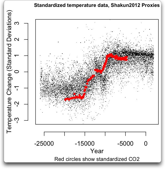
New NATURE paper uses 'hide the incline'

IanC::

I had a chance to read the OP link tonight.. It's THIS graph (the 450,000 yr record) that caught my attention..

flacaltenn-albums-charts-picture4534-400000yearslarge1.gif


On that scale, the most surprising behaviour is NOT the "which comes first" proposition which I've weakly seen sometimes on other timescales. But more consistently -- it's the "which goes last" proposition that seems to suggest some darn thing. On almost every major FALL in temp -- the temp precedes the "supposed" forcing function. Kinda violates the concept of a forcing function on that principle alone doesn't it?

Either the lags in the proxies are wrong and some axis diddling is required or the current CO2 theory would have to say that the feedbacks somehow go mostly negative at some point in the CO2 rise..

<edited for a 3rd possibility> OR the CO2 ice proxies are somehow "filtered" themselves to add delay. Perhaps liquid mixing? Or limits on the dating resolution when the cores are taken.


Forcing functions should predict BOTH the positive AND negative slopes of temperature.. Eh?


That's a good point and one I had missed. Goos catch.
 
http://www.nature.com/nature/journal/v484/n7392/full/nature10915.html

there is the link, although it is paywalled. fortunately the SI is freely available. W Eschenbach (freelance writer at WUWT) took the data and plotted it up
nature_shakun_proxies_plus_data.jpg


I recommend reading the article because it also plots all the individual proxies in thumbnail so that you can see the basic process.A reply to Shakun et al – Dr. Munchausen Explains Science By Proxy | Watts Up With That?

all-in-all a very interesting description which gives a better idea about the uncertainties in using proxy data than the clear crisp lines usually used in science papers.


but Willis wasnt finished. he wondered why Shakun2012 only used one CO2 record so he found a bunch of other ice core records for the same period and plotted them up as well.
nature_shakun_proxies_plus_co2_all.jpg
Shakun Redux: Master tricksed us! I told you he was tricksy! | Watts Up With That?

imagine that!!!

CO2 increasing while temperature was decreasing for the last 5000 years! isnt that odd?

I understand the tendency of scientists to make as strong a case for their work as possible but I am getting tired of papers chopping off inconvenient data for the sake of 'the cause'. Old Rocks and others denigrate blogs (that they dont agree with) but where else are you going to find information and analysis to form a more complete picture of what is going on? I noticed that the CO2 record stopped short in the original but I basically ignored it because I couldnt do anything about it. what percentage of people would notice that inconsistency and then be able to do something about it? one in ten thousand? so what happened to peer review, why didnt they insist that the record be extended to match the time period of the temperatures?

the problem with being a slave to authority is that you dont get to hear the objections. I dont have a big problem with Shakur2012 but I dont think they really proved their conclusion that CO2 increased first, then temperature. there are some studies one way, others show the reverse. but I am pissed off that they broke the rules of scientific investigation to make their case stronger, knowing that most people wouldnt catch on or be able to do anything about it.


LAUGH........MY.......BALLS...........OFF


20110519_0052_1-8.jpg


more bad news for the k00ks..............a compelling link Ian
 
IanC::

I had a chance to read the OP link tonight.. It's THIS graph (the 450,000 yr record) that caught my attention..

flacaltenn-albums-charts-picture4534-400000yearslarge1.gif


On that scale, the most surprising behaviour is NOT the "which comes first" proposition which I've weakly seen sometimes on other timescales. But more consistently -- it's the "which goes last" proposition that seems to suggest some darn thing. On almost every major FALL in temp -- the temp precedes the "supposed" forcing function. Kinda violates the concept of a forcing function on that principle alone doesn't it?

Either the lags in the proxies are wrong and some axis diddling is required or the current CO2 theory would have to say that the feedbacks somehow go mostly negative at some point in the CO2 rise..

<edited for a 3rd possibility> OR the CO2 ice proxies are somehow "filtered" themselves to add delay. Perhaps liquid mixing? Or limits on the dating resolution when the cores are taken.

Forcing functions should predict BOTH the positive AND negative slopes of temperature.. Eh?
Did you come up with any explanation for the consistent correlation, between CO2 and warming? Is there an exchange or two, which would explain the slight variance? Maybe Suckassbil can re-spam the picture of the woman with the large breasts; that'll fudge your theory into the pan.
 
IanC::

I had a chance to read the OP link tonight.. It's THIS graph (the 450,000 yr record) that caught my attention..

flacaltenn-albums-charts-picture4534-400000yearslarge1.gif


On that scale, the most surprising behaviour is NOT the "which comes first" proposition which I've weakly seen sometimes on other timescales. But more consistently -- it's the "which goes last" proposition that seems to suggest some darn thing. On almost every major FALL in temp -- the temp precedes the "supposed" forcing function. Kinda violates the concept of a forcing function on that principle alone doesn't it?

Either the lags in the proxies are wrong and some axis diddling is required or the current CO2 theory would have to say that the feedbacks somehow go mostly negative at some point in the CO2 rise..

<edited for a 3rd possibility> OR the CO2 ice proxies are somehow "filtered" themselves to add delay. Perhaps liquid mixing? Or limits on the dating resolution when the cores are taken.


Forcing functions should predict BOTH the positive AND negative slopes of temperature.. Eh?

That's a good point and one I had missed. Goos catch.

Yeah, right, "goos" yourself over to this:

"in this week's issue of the journal Nature, paleoclimate researchers reveal that about 12-5 million years ago climate was decoupled from atmospheric carbon dioxide concentrations. New evidence of this comes from deep-sea sediment cores dated to the late Miocene period of Earth's history.

During that time, temperatures across a broad swath of the North Pacific were 9-14 degrees Fahrenheit warmer than today, while atmospheric carbon dioxide concentrations remained low--near values prior to the Industrial Revolution.

The research shows that, in the last five million years, changes in ocean circulation allowed Earth's climate to become more closely coupled to changes in carbon dioxide concentrations in the atmosphere.

The findings also demonstrate that the climate of modern times more readily responds to changing carbon dioxide levels than it has during the past 12 million years.

"This work represents an important advance in understanding how Earth's past climate may be used to predict future climate trends," says Jamie Allan, program director in the National Science Foundation's (NSF) Division of Ocean Sciences, which funded the research.

Today's climate more sensitive to carbon dioxide than in past 12 million years

--CO2 is up, it's a good measure of ongoing warming, and here comes the methane!
 
IanC::

I had a chance to read the OP link tonight.. It's THIS graph (the 450,000 yr record) that caught my attention..

flacaltenn-albums-charts-picture4534-400000yearslarge1.gif


On that scale, the most surprising behaviour is NOT the "which comes first" proposition which I've weakly seen sometimes on other timescales. But more consistently -- it's the "which goes last" proposition that seems to suggest some darn thing. On almost every major FALL in temp -- the temp precedes the "supposed" forcing function. Kinda violates the concept of a forcing function on that principle alone doesn't it?

Either the lags in the proxies are wrong and some axis diddling is required or the current CO2 theory would have to say that the feedbacks somehow go mostly negative at some point in the CO2 rise..

<edited for a 3rd possibility> OR the CO2 ice proxies are somehow "filtered" themselves to add delay. Perhaps liquid mixing? Or limits on the dating resolution when the cores are taken.

Forcing functions should predict BOTH the positive AND negative slopes of temperature.. Eh?
Did you come up with any explanation for the consistent correlation, between CO2 and warming? Is there an exchange or two, which would explain the slight variance? Maybe Suckassbil can re-spam the picture of the woman with the large breasts; that'll fudge your theory into the pan.

There are A LOT of handy explanations why they are tightly tied -- if you've been following along.. Temperature affects growing seasons for plants. Temperature affects the CO2 balance in the ocean sequestering of CO2. Temperature determines how much CO2 is locked up in ice.. BUT NOTICE -- the AGW theory is that CO2 DRIVES temperature and that the feedbacks (both pos and neg) are relatively minor.. NOT the other way around.

So -- back to the graph.. If CO2 DRIVES the temperature... How come almost all the major temperature DECLINES in that graph start BEFORE the CO2 level starts to drop???

Curiousity like that just might hold the key to understanding HOW (and if) we could do anything to LOWER the surface temperature.. If the temperature can drop during a relatively high concentration of CO2 -- we need to explain that -- don't we?

((I'm sure OleRocks will find a volcano or an asteroid for each and every one of those "spontaneous remissions" of the earth's fever))
 
Last edited:
flacaltenn-albums-charts-picture4534-400000yearslarge1.gif


On that scale, the most surprising behaviour is NOT the "which comes first" proposition which I've weakly seen sometimes on other timescales. But more consistently -- it's the "which goes last" proposition that seems to suggest some darn thing. On almost every major FALL in temp -- the temp precedes the "supposed" forcing function. Kinda violates the concept of a forcing function on that principle alone doesn't it?

Either the lags in the proxies are wrong and some axis diddling is required or the current CO2 theory would have to say that the feedbacks somehow go mostly negative at some point in the CO2 rise..

<edited for a 3rd possibility> OR the CO2 ice proxies are somehow "filtered" themselves to add delay. Perhaps liquid mixing? Or limits on the dating resolution when the cores are taken.

Forcing functions should predict BOTH the positive AND negative slopes of temperature.. Eh?
Possibilities! It seems to me this graph shows the CO2 level consistently forces both positive and negative slopes of temperature, and we are about to go through a accelerated warming trend, relative to a lot of added methane.

It's a possibility you and your posse need to pull your heads out of each others' assholes. Your own graph is so consistent, you need to just admit you are bitches. Thanks for the graph, Fathead.

Let's go over it; at peaks, the CO2 starts to pull temps down, while at troughs, CO2 levels rise, and the temperature rises, in every major trend, such as when dead queers brought the HIV into the bath-houses, tricked, shot speed, tricked some more, and shoved their dose all the way through full-blown AIDS, to death. But you still haven't learned, to just fuck yourself!

It's a possibility Christmas is 'gay,' they tell me. Prancer loves Dancer! Pull your head out of your wingpunk's asshole, by Christmas, and watch the animals, who are still alive, since they might die off, any day now. But not reindeer. You ranting geek, your graph is good shit, so eat it all up.
 
Last edited:
IanC::

I had a chance to read the OP link tonight.. It's THIS graph (the 450,000 yr record) that caught my attention..

flacaltenn-albums-charts-picture4534-400000yearslarge1.gif


On that scale, the most surprising behaviour is NOT the "which comes first" proposition which I've weakly seen sometimes on other timescales. But more consistently -- it's the "which goes last" proposition that seems to suggest some darn thing. On almost every major FALL in temp -- the temp precedes the "supposed" forcing function. Kinda violates the concept of a forcing function on that principle alone doesn't it?

Either the lags in the proxies are wrong and some axis diddling is required or the current CO2 theory would have to say that the feedbacks somehow go mostly negative at some point in the CO2 rise..

<edited for a 3rd possibility> OR the CO2 ice proxies are somehow "filtered" themselves to add delay. Perhaps liquid mixing? Or limits on the dating resolution when the cores are taken.

Forcing functions should predict BOTH the positive AND negative slopes of temperature.. Eh?
Did you come up with any explanation for the consistent correlation, between CO2 and warming? Is there an exchange or two, which would explain the slight variance? Maybe Suckassbil can re-spam the picture of the woman with the large breasts; that'll fudge your theory into the pan.

There are A LOT of handy explanations why they are tightly tied -- if you've been following along.. Temperature affects growing seasons for plants. Temperature affects the CO2 balance in the ocean sequestering of CO2. Temperature determines how much CO2 is locked up in ice.. BUT NOTICE -- the AGW theory is that CO2 DRIVES temperature and that the feedbacks (both pos and neg) are relatively minor.. NOT the other way around.

So -- back to the graph.. If CO2 DRIVES the temperature... How come almost all the major temperature DECLINES in that graph start BEFORE the CO2 level starts to drop???

Curiousity like that just might hold the key to understanding HOW (and if) we could do anything to LOWER the surface temperature.. If the temperature can drop during a relatively high concentration of CO2 -- we need to explain that -- don't we?

((I'm sure OleRocks will find a volcano or an asteroid for each and every one of those "spontaneous remissions" of the earth's fever))

Because they do not, dumbass. Look at the graph, particularly at the point at which the decline starts. There are several periods where the CO2 decline preceded the tempertature decline.

But here is something else to consider. For that graph illustrates one very important point. Declines to ice age conditions occur in a slow manner. But, once it starts warming, and the CO2 starts increasing, the change is very rapid.

Now look at that graph again. See the little red line at the end? Note how in 150 years it has traversed nearly the same distance as it did in the change from the glaciated periods to the interglacials. But you fruitloops continue to claim that will have no effect.
 
IanC::

I had a chance to read the OP link tonight.. It's THIS graph (the 450,000 yr record) that caught my attention..

flacaltenn-albums-charts-picture4534-400000yearslarge1.gif


On that scale, the most surprising behaviour is NOT the "which comes first" proposition which I've weakly seen sometimes on other timescales. But more consistently -- it's the "which goes last" proposition that seems to suggest some darn thing. On almost every major FALL in temp -- the temp precedes the "supposed" forcing function. Kinda violates the concept of a forcing function on that principle alone doesn't it?

Either the lags in the proxies are wrong and some axis diddling is required or the current CO2 theory would have to say that the feedbacks somehow go mostly negative at some point in the CO2 rise..

<edited for a 3rd possibility> OR the CO2 ice proxies are somehow "filtered" themselves to add delay. Perhaps liquid mixing? Or limits on the dating resolution when the cores are taken.


Forcing functions should predict BOTH the positive AND negative slopes of temperature.. Eh?

thanks for actually reading the links in the OP.

I find that proxy graph to be suggestive but it is certainly not the last word on the subject. no proxy is.

I find the whole climate wars thing to be very reminescent of the fall of the USSR. it took years for Poland to fall, but then more and more countries shook off their soviet oppressors in ever shortening time spans. It took years to discredit the Hockey Stick in the public's eye but every new HS is being ripped to shreds on data and methodology in months or even days now. I cant help but think that if the 2013 IPCC report continues on the same track of pushing the CO2 agenda that they will have sealed their doom and the AR5 will be the last.

Have you been following the evisceration of Gergis over at Climate Audit? even warmist scientists are jumping on it because they can see that the horrible scientific practices involved cant be held in secret anymore. glasnost wont be a happy day for climate science led by the hockey team.
 
Instead of being a repetitive bitch -- why dontcha go back and actually DISCUSS the topic..

http://www.usmessageboard.com/5411221-post25.html

Aw, Fathead didn't like going over the graph, succinctly, since you suck, Fathead.

OK, the trends are consistent. Old Rocks has noted, how the red line at the end is headed way up, to 400 ppm, today. Just what do you want to discuss, with me, Trakar, or Old Rocks? Your fellow wingpunk-bitches post shit, pictures, smileys, and punk links.

I wonder WTF that red line is doing, way the fuck up there, all of a geologic-time sudden? Could it be AGW? Go blow a BP judge and have him issue an injunction, to Al Gore.

Fuck you, againandagainandagain, Fat bitch! :Boom2: :eek: :eusa_liar: :wtf:
 
Did you come up with any explanation for the consistent correlation, between CO2 and warming? Is there an exchange or two, which would explain the slight variance? Maybe Suckassbil can re-spam the picture of the woman with the large breasts; that'll fudge your theory into the pan.

There are A LOT of handy explanations why they are tightly tied -- if you've been following along.. Temperature affects growing seasons for plants. Temperature affects the CO2 balance in the ocean sequestering of CO2. Temperature determines how much CO2 is locked up in ice.. BUT NOTICE -- the AGW theory is that CO2 DRIVES temperature and that the feedbacks (both pos and neg) are relatively minor.. NOT the other way around.

So -- back to the graph.. If CO2 DRIVES the temperature... How come almost all the major temperature DECLINES in that graph start BEFORE the CO2 level starts to drop???

Curiousity like that just might hold the key to understanding HOW (and if) we could do anything to LOWER the surface temperature.. If the temperature can drop during a relatively high concentration of CO2 -- we need to explain that -- don't we?

((I'm sure OleRocks will find a volcano or an asteroid for each and every one of those "spontaneous remissions" of the earth's fever))

Because they do not, dumbass. Look at the graph, particularly at the point at which the decline starts. There are several periods where the CO2 decline preceded the tempertature decline.

But here is something else to consider. For that graph illustrates one very important point. Declines to ice age conditions occur in a slow manner. But, once it starts warming, and the CO2 starts increasing, the change is very rapid.

Now look at that graph again. See the little red line at the end? Note how in 150 years it has traversed nearly the same distance as it did in the change from the glaciated periods to the interglacials. But you fruitloops continue to claim that will have no effect.

I realize I am wasting my time talking to you but here goes nothing.

if you look at CO2 as a symptom rather than a cause then the surrounding evidence makes sense in a more simple way. using CO2 as a thermostat is the equivalent of adding epicycles to the planetary system, it may be pretty but it is distracting.

few serious scientists on the skeptical side deny that CO2 has some impact on the atmosphere and climate. how could it not? what the skeptics deny are the low probability doomsday predictions that are being used by unscrupulous politicians that are using this manufactured crisis for their own benefit.
 
flacaltenn-albums-charts-picture4534-400000yearslarge1.gif


Forcing functions should predict BOTH the positive AND negative slopes of temperature.. Eh?

thanks for actually reading the links in the OP.

I find that proxy graph to be suggestive but it is certainly not the last word on the subject. no proxy is.

I find the whole climate wars thing to be very reminescent of the fall of the USSR. it took years for Poland to fall, but then more and more countries shook off their soviet oppressors in ever shortening time spans. It took years to discredit the Hockey Stick in the public's eye but every new HS is being ripped to shreds on data and methodology in months or even days now. I cant help but think that if the 2013 IPCC report continues on the same track of pushing the CO2 agenda that they will have sealed their doom and the AR5 will be the last.

Have you been following the evisceration of Gergis over at Climate Audit? even warmist scientists are jumping on it because they can see that the horrible scientific practices involved cant be held in secret anymore. glasnost wont be a happy day for climate science led by the hockey team.

Seems to me this graph says the hockey stick is in your asshole and shoving. So does the AMEG site. Post a link, so we can piss on your skeptic-site report, fuckup Crapforbrains. Don't forget, since you are too much of a sock, to stop posting Fathead's graph, which shows warming is about to go wild. Don't forget! You are supposed to be disproving the warming trend. Stupid asshole.

Fathead's graph shows the warming trend is going up and off the charts, Crapforbrains.

:Boom2: :wtf:

I typically dont respond to trolls but I will make an exception.

you do realize that the red line depicts CO2 dont you?
 
flacaltenn-albums-charts-picture4534-400000yearslarge1.gif


On that scale, the most surprising behaviour is NOT the "which comes first" proposition which I've weakly seen sometimes on other timescales. But more consistently -- it's the "which goes last" proposition that seems to suggest some darn thing. On almost every major FALL in temp -- the temp precedes the "supposed" forcing function. Kinda violates the concept of a forcing function on that principle alone doesn't it?

Either the lags in the proxies are wrong and some axis diddling is required or the current CO2 theory would have to say that the feedbacks somehow go mostly negative at some point in the CO2 rise..

<edited for a 3rd possibility> OR the CO2 ice proxies are somehow "filtered" themselves to add delay. Perhaps liquid mixing? Or limits on the dating resolution when the cores are taken.

Forcing functions should predict BOTH the positive AND negative slopes of temperature.. Eh?

So -- back to the graph.. If CO2 DRIVES the temperature... How come almost all the major temperature DECLINES in that graph start BEFORE the CO2 level starts to drop???

Curiousity like that just might hold the key to understanding HOW (and if) we could do anything to LOWER the surface temperature.. If the temperature can drop during a relatively high concentration of CO2 -- we need to explain that -- don't we?

Fathead got some 'splainin' to do! :cuckoo:

Fatski, this graph isn't in your native Russian, or something. In plain English-US, the red line starts up, the blue line follows, on all major upswings. :confused:

The red line starts down, the blue line follows, on all major downswings. :mad:

But we aren't seeing exactly that, at the end of the graph, do we, fat as fuck dildina, when the plot ends at present. :eek:

What we see is a radical shoot, over about 150 years, to 400 ppm CO2, which is best explained, by simultaneous human defoliation and CO2 emissions. Do you want to offer any more chickenshit, bullshit, wingpunk circle-jerks, spam-pictures, gay porn, or any other diversion media, which would explain why you think warming is not going to follow the dramatic rise, of the shooting, red line? Repetitious, ain't it, Fathead. Move to Russia, next, sell us some oil, and call yourself 'Flacaltennbuttski.' :eusa_boohoo:

Gay as hell Crapforbrains hasn't caught on, to 'liar, liar, pants on fire.' Yeah, Crapforbrains, I know the red line is for CO2, the blue line is temperature. And your head is for up your own asshole, since Fathead is finally figuring out he pitard-hoisted you and his stupid self, with a graph which clearly shows not only global warming correlates to rise in CO2, but AGW is strongly indicated, by the way the red line jumps, at the end of the plot. :redface:

Got the picture? With your heads up each others' assholes, one of you farted, and you both blew up! Dumbshits! :Boom2: :eek: :confused:
 
Last edited:
the increase in CO2 has been significantly impacted by man's use of fossil fuels. the present increase has not been primarily caused by climactic events therefore you cannot assume that the general trend of the proxy will hold true in this case. logically speaking of course. if you want to get hysterical, be my guest.
 
http://www.nature.com/nature/journal/v484/n7392/full/nature10915.html

Global warming preceded by increasing carbon dioxide concentrations during the last deglaciation
Jeremy D. Shakun,
Peter U. Clark,
Feng He,
Shaun A. Marcott,
Alan C. Mix,
Zhengyu Liu,
Bette Otto-Bliesner,
Andreas Schmittner
& Edouard Bard
Affiliations
Contributions
Corresponding author
Nature 484,49–54(05 April 2012)doi:10.1038/nature10915Received 16 September 2011 Accepted 01 February 2012 Published online 04 April 2012


The covariation of carbon dioxide (CO2) concentration and temperature in Antarctic ice-core records suggests a close link between CO2 and climate during the Pleistocene ice ages. The role and relative importance of CO2 in producing these climate changes remains unclear, however, in part because the ice-core deuterium record reflects local rather than global temperature. Here we construct a record of global surface temperature from 80 proxy records and show that temperature is correlated with and generally lags CO2 during the last (that is, the most recent) deglaciation. Differences between the respective temperature changes of the Northern Hemisphere and Southern Hemisphere parallel variations in the strength of the Atlantic meridional overturning circulation recorded in marine sediments. These observations, together with transient global climate model simulations, support the conclusion that an antiphased hemispheric temperature response to ocean circulation changes superimposed on globally in-phase warming driven by increasing CO2 concentrations is an explanation for much of the temperature change at the end of the most recent ice age

These observations, together with transient global climate model simulations, support the conclusion that the antiphased hemispheric temperature response to ocean circulation changes superimposed on globally in-phase warming driven by increasing CO2 concentrations is an explanation for much of the temperature response at the end of the most recent ice age.

Seems to be stating what has been stated before. That the Milankovic Cycles begin a process and CO2 creates a feedback to creates the majority of the warming. Definitely states that the warming is driven by CO2.

Translation: we didn't like that the Vostok ice cores showing CO2 as a laggard and not leading the warming so we're changing the data sets to ones that fit our preconceived notions
 
the increase in CO2 has been significantly impacted by man's use of fossil fuels. the present increase has not been primarily caused by climactic events therefore you cannot assume that the general trend of the proxy will hold true in this case. logically speaking of course. if you want to get hysterical, be my guest.
Thank you, bitch. After looking over all your own wingpunk spam, you don't like my smileys? Eat your own shit! Since you have CRS, you remembered use of fossil fuels, but you were too hysterical, to remember man has simultaneously defoliated the planet.

That red plot sure jumps right up, at the end of the graph, doesn't it, asshole! :redface:

It seems Crosstard made it over here, so if you want to show him how to read Fathead's graph, go ahead. See if he re-posts it, again! I'd be hilarious, not hysterical, but I am making fun of stupid assholes, who are tragic figures, so I am neither laughing nor hysterical, about my bemusement. Eat shit, it makes you strong and stupid!

Which is what you want, isn't it. I keep writing, "don't forget," to stupid retards, with CRS, but hey, don't forget, warming, acidification, acceleration! 1,2,3, DDD!

Don't forget to suck each others' balls and vote for Obamney, wingpunks. You can do it.
 
Last edited:
http://www.nature.com/nature/journal/v484/n7392/full/nature10915.html

Global warming preceded by increasing carbon dioxide concentrations during the last deglaciation
Jeremy D. Shakun,
Peter U. Clark,
Feng He,
Shaun A. Marcott,
Alan C. Mix,
Zhengyu Liu,
Bette Otto-Bliesner,
Andreas Schmittner
& Edouard Bard
Affiliations
Contributions
Corresponding author
Nature 484,49–54(05 April 2012)doi:10.1038/nature10915Received 16 September 2011 Accepted 01 February 2012 Published online 04 April 2012


The covariation of carbon dioxide (CO2) concentration and temperature in Antarctic ice-core records suggests a close link between CO2 and climate during the Pleistocene ice ages. The role and relative importance of CO2 in producing these climate changes remains unclear, however, in part because the ice-core deuterium record reflects local rather than global temperature. Here we construct a record of global surface temperature from 80 proxy records and show that temperature is correlated with and generally lags CO2 during the last (that is, the most recent) deglaciation. Differences between the respective temperature changes of the Northern Hemisphere and Southern Hemisphere parallel variations in the strength of the Atlantic meridional overturning circulation recorded in marine sediments. These observations, together with transient global climate model simulations, support the conclusion that an antiphased hemispheric temperature response to ocean circulation changes superimposed on globally in-phase warming driven by increasing CO2 concentrations is an explanation for much of the temperature change at the end of the most recent ice age

These observations, together with transient global climate model simulations, support the conclusion that the antiphased hemispheric temperature response to ocean circulation changes superimposed on globally in-phase warming driven by increasing CO2 concentrations is an explanation for much of the temperature response at the end of the most recent ice age.

Seems to be stating what has been stated before. That the Milankovic Cycles begin a process and CO2 creates a feedback to creates the majority of the warming. Definitely states that the warming is driven by CO2.

Translation: we didn't like that the Vostok ice cores showing CO2 as a laggard and not leading the warming so we're changing the data sets to ones that fit our preconceived notions

hahaha, that is it, exactly.
 
next year's IPCC report is struggling to find papers to support its stance on CO2. just like in 2005-6 there has been a rush to get papers published just before the deadline (actually, past the deadline when it is something they want) so that they can technically rebut certain other papers, even if the rebuttal papers dont stand up scientifically.

I dont mean to sound like a conspiracy theorist but the Muller BEST papers have been in peer review for a very long time. I am suspicious that they are being held up so that they can be included at the last moment without being available for scrutiny. of course I may be wrong and perhaps peer review is just demanding that corrections are being made to improve the quality of what may be a very influential set of papers.
 
Did you come up with any explanation for the consistent correlation, between CO2 and warming? Is there an exchange or two, which would explain the slight variance? Maybe Suckassbil can re-spam the picture of the woman with the large breasts; that'll fudge your theory into the pan.

There are A LOT of handy explanations why they are tightly tied -- if you've been following along.. Temperature affects growing seasons for plants. Temperature affects the CO2 balance in the ocean sequestering of CO2. Temperature determines how much CO2 is locked up in ice.. BUT NOTICE -- the AGW theory is that CO2 DRIVES temperature and that the feedbacks (both pos and neg) are relatively minor.. NOT the other way around.

So -- back to the graph.. If CO2 DRIVES the temperature... How come almost all the major temperature DECLINES in that graph start BEFORE the CO2 level starts to drop???

Curiousity like that just might hold the key to understanding HOW (and if) we could do anything to LOWER the surface temperature.. If the temperature can drop during a relatively high concentration of CO2 -- we need to explain that -- don't we?

((I'm sure OleRocks will find a volcano or an asteroid for each and every one of those "spontaneous remissions" of the earth's fever))

Because they do not, dumbass. Look at the graph, particularly at the point at which the decline starts. [BThere are several periods where the CO2 decline preceded the tempertature decline.[/B]
But here is something else to consider. For that graph illustrates one very important point. Declines to ice age conditions occur in a slow manner. But, once it starts warming, and the CO2 starts increasing, the change is very rapid.

Now look at that graph again. See the little red line at the end? Note how in 150 years it has traversed nearly the same distance as it did in the change from the glaciated periods to the interglacials. But you fruitloops continue to claim that will have no effect.

A GOOD theory doesn't work just sometimes. There are far more instances in that record where CO2 is stable or climbing whilst the temp is dropping like a rock.. WHERE in the capital A-GW theory is that predicted? Can we expect that will happen again? Why not? Were all those DECLINES due to volcanic activity or asteroid collisions? What could cause a precipitous DROP in temp that many times in the historical record BEFORE the CO2 starts to significantly decline?

I don't care what that graph says about the last 150 years. I DON'T NEED a proxy based on insect parts and pollen and a crystal ball for that. You yourself have admitted that the proxy based views of the 20th century aren't accurate because of aerosols or El Ninos or any number of sleazy excuses that you've asserted for them. Why would you defend it now? Which is it Roxy? I'm focused on what I can deduce from the medium term history, even tho we BOTH KNOW --- the proxies have flaws...
 

Forum List

Back
Top