Well s0ns....looks like those Russian climate scientists were right about cooling!! Yuk...yuk.....
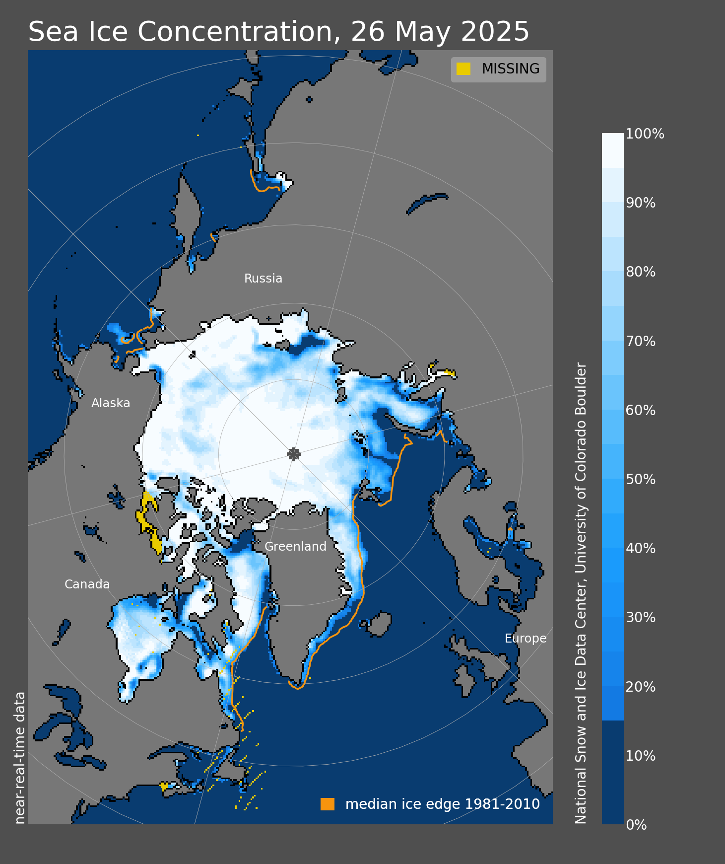
https://www.iceagenow.info/arctic-ocean-almost-totally-ice-covered-map/
Snowing in Canada this week....court vacancy.....now this.
 . Dang.... if you're a liberal you're miserable as fuck.
@www.whosnotwinning.com
https://www.iceagenow.info/arctic-ocean-almost-totally-ice-covered-map/
Snowing in Canada this week....court vacancy.....now this.
. Dang.... if you're a liberal you're miserable as fuck.@www.whosnotwinning.com