SSDD
Gold Member
- Nov 6, 2012
- 16,672
- 1,968
- 280
They took 125 years worth of January average temps (that's each days temp ÷ 31, the number of days in January) and ranked them from coldest to warmest. It's not rocket science kids.Its one pile of BS to cover up another pile of BS. This chart makes assumptions based on what base line? Where is the data to support that base line? What changes were made to the data since it was observed? why were the changes made? etc, etc, etc.... This is why adjusting the HCN data and throwing away the original set has made the whole record useless..nope, makes absolutely no sense. average temperature is average temperature, it isn't a 1 or 125. the number of days above and below average is all I need to know, so that chart means nothing but jack shit. Nor does it show any comparison to previous years at all.1 being coldest and 125 being warmest 60 represents January 2019 being about in the middle, or average for January temps. It's not 60°, it's #60 out of 125.so pick a state, say Illinois and explain what the 60 represents.Is that supposed to denote that you don't understand my explanation?
If so I can't help you, that's about as clearly as I can tell you.
Get it now?
30 days in January, were 15 above average or below average, how much above or below. useful data to show the month cold or warm. then show previous year. nope, the manipulators manipulate.
Number of cloudy days, number of snow days or rain days, wet days. we weren't supposed to get anymore snow, I recall. yet, that isn't true. it still snows. every prediction has failed bigly.
Its one huge pile of crap to cover up the lies.
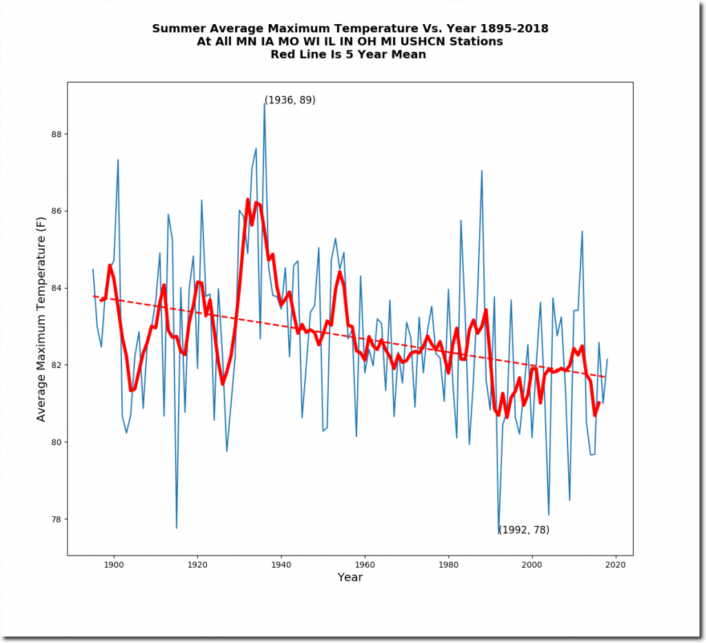
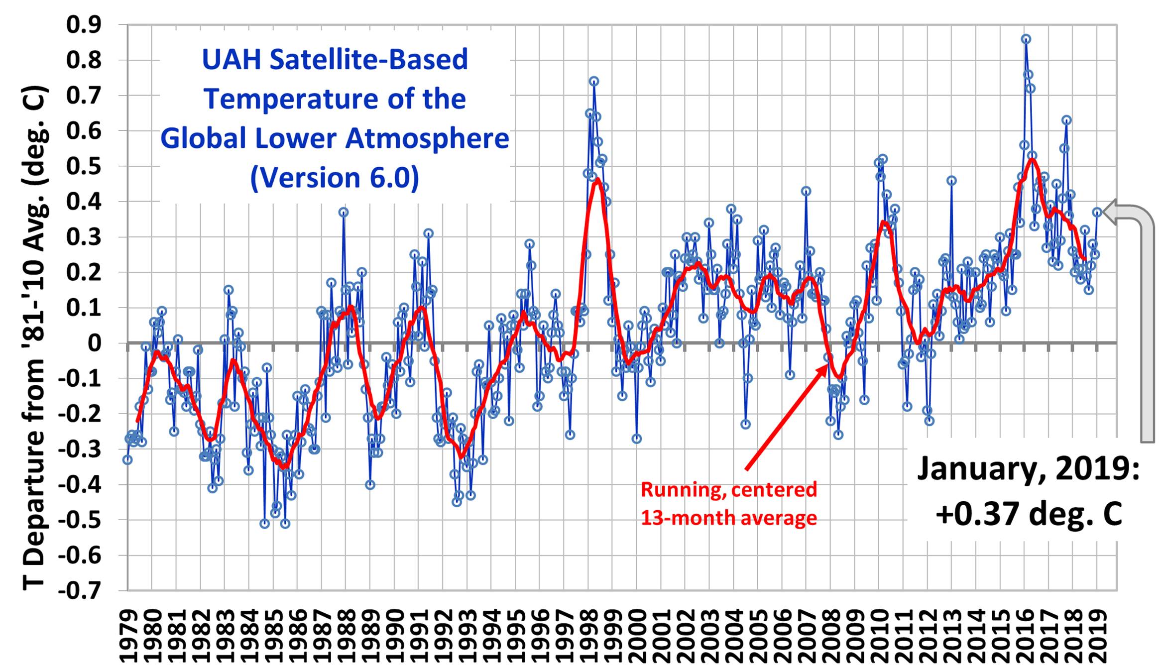
The real data don't support the claim...
