That is very interesting. It puts quite a different slant on displaying trends. GW assessment by looking at temperature rise requires a decade to see a trend given by a slope.
Energy imbalance can show a trend with only one years of data given by a single value. A graph would show a flat line above zero if the GHG's rise linearly per year. I haven't looked, but it would be interesting to find a satellite energy imbalance graph over the 3 decades and see the correlation with the temperature history. I'm sure that is available somewhere too.
Ah, I see how my overly simplistic depiction might have given rise to your assumptions. However, things are a bit more complicated than that.
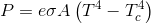
Of course, the sun's energy flux shows some inter-annual variation, as does the earth's. That's why one year's worth of data tells us nothing. Also, remember, the energy radiated is a function of the fourth power of temperature. In the simplest form, the rate of radiative change then should not be a constant. On top of that, the ENSO oscillation, that is, non-linear fluctuations in surface temperatures, along with changing cloud cover / albedo etc. add further variability, as do increasing (and variable) concentrations of GHG and their limiting impact on energy radiated to space. And that's just the beginning, and the fact that satellites detect and measure just a small sample of the earth's emission, makes that overall energy budget a case fraught with uncertainty. All told, thirty years of energy budget measurement may just be enough to give a reasonably certain assessment.
Yes, the graph you guessed would be "somewhere" would be interesting, but I wasn't able to find it.