auditor0007
Gold Member
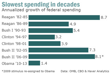
Thanks, your graph just proved what has been stated. Your hockey stick starts in 2011 and is based on a projection that includes massive increases in SS and Medicare spending that is currently out of Obama's control. What it does show though, is that Obama has hardly increased spending at all since he took office.
I can send you the name of a good optometrist. Of course that won't help much if you don't take the partisan blinders off...
What the graph shows is that massive increases coincide exactly with Obama stumbling into office.
Use a protractor and mark January 20, 2009 with the label "Incompetent boob starts here" then measure the angle of the graph going up, on either side of the point.
Get the picture?
Look, I know you're in a panic, your guy is a colossal fuckup. But do you really think telling the American people that the $5 trillion in increased debt incurred by Obama is someone else's fault will get your Messiah® reelected?
Really?
Not really my Messiah, but I'm not too concerned. I am sorry that you are incapable of reading a simple graph, but thanks for playing too. Really, listening to some of you is much more entertaining than the Sunday funnies.