Hossfly
ZIONIST
One million deaths is what percentage of the U.S. population?
Follow along with the video below to see how to install our site as a web app on your home screen.
Note: This feature may not be available in some browsers.
One million deaths is what percentage of the U.S. population?
Recently released documents from Minnesota show that fewer than 300 people died form the WuFlu, who had no other comorbidities.
The whole "pandemic" was the greatest hoax of all time.
"Global Data Shows COVID Deaths Are Lowest in Low-Vaccinated Countries"
MOST vaccinated in the world - Oh, the humanity!
#1 UAE:
View attachment 632788
#2 Cuba:
View attachment 632783
#3 Chile:
View attachment 632789
compare per 100,000 or go fish..
View attachment 632815
Excess mortality during the Coronavirus pandemic (COVID-19)
Explore data on COVID-19 excess mortality across the world.ourworldindata.org
It shows that COVID Deaths Have Been Lowest in the Highest-Vaccinated Countries. Sparsely populated regions where people barely travel, personally interact, or engage in commerce obviously excepted. If YOU still think otherwise keep going.. Check the top of the list against the bottom.. See for yourself who wins..What do YOU think that all of that shows?
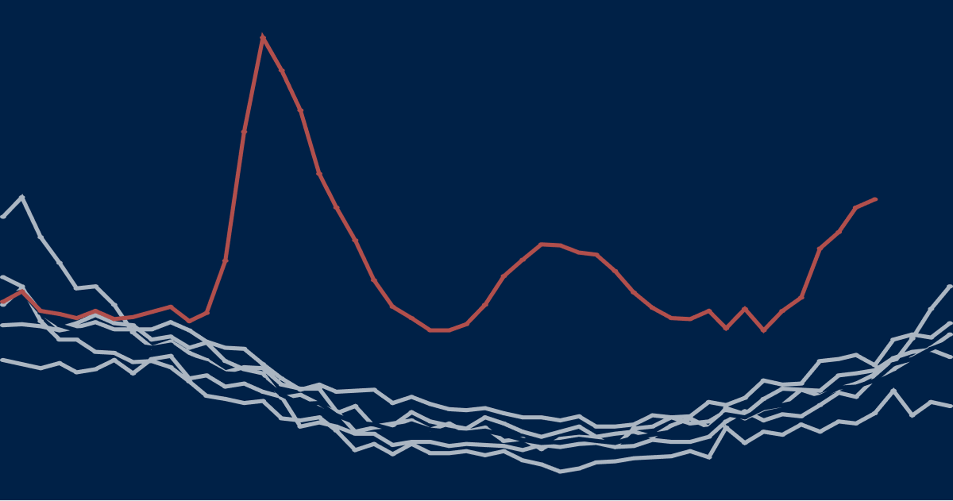
We have good data. The CDC predictably made errors to begin with and has since acted to correct them. Excess deaths provide a quick accuracy check of such data. Clearly, from cnm's chart, the Brits overreported in the beginning, New Zealand and Australia perhaps underreported (though the sample size is likely too small to really tell -- looks like a different cause of death was involved with both during that time period as well), whereas the U.S. remained relatively true to expectations.People are only resorting this "excess deaths" fad BECAUSE there is no real trust in the accuracy of the Covid death reporting. But that doesn't really solve any problem. You REALLY NEED a goof database for future research.
It shows that COVID Deaths Have Been Lowest in the Highest-Vaccinated Countries. Sparsely populated regions where people barely travel, personally interact, or engage in commerce obviously excepted. If YOU still think otherwise keep going.. Check the top of the list against the bottom.. See for yourself who wins..
No, I got it. Chile's reported data was likely wacked during those short intervals. But, like I said, keep going.. Compare them all. Take the average. Take the median. Whatever floats your dinghy!I guess what's confusing me and maybe you did not catch it --- is -- the VERTICAL scales on those graphs are NOT the same between those countries. Because CHILE was actually hit pretty hard and the vertical axis on THEIR graph in deaths/100000 goes to 2000, while the UAE maximum is only 20.
So you cant just look at the lines and compare. Best to do this with a table..
Eh, less information means easier to hide things with tables. I'd agree some things are better with tables or other tools, especially when just trying to draw something meaningful from sparse data.So you cant just look at the lines and compare. Best to do this with a table..
Eh, less information means easier to hide things with tables. I'd agree some things are better with tables or other tools, especially when just trying to draw something meaningful from sparse data.
View attachment 632815
Excess mortality during the Coronavirus pandemic (COVID-19)
Explore data on COVID-19 excess mortality across the world.
Yeah, I meant for my purposes and likely yours, since I presumed you were also aware of those potential tricks. Trust but verify. Graphs generally indicate the opposite. A desire to quickly reveal as much as possible, including various nonlinearities and deviations from the norm that tabular forms would hide or discount.Is it easier to hide stuff or misrepresent in a GRAPH than a table?? FOR SURE it is. Just messing with vert/horiz axis scaling or "normalizing" or applying some function on the "dependent axis" can make the data look better or worse. Even more sinister -- a "pseudo color" map of the data can be manipulated A LOT of ways to scare folks or give false impressions..
Surprise surprise!
Global Data Shows COVID Deaths Are Lowest in Low-Vaccinated Countries, Higher in Highest, No Global Excess Deaths
The figures in the map below can be verified by referencing US News and World Report, “Wealthy Countries Are Outpacing Poor Nations in COVID-19 Vaccination Rates,” for vaccination rates by country, and Worldometers COVID deaths by country, in deaths per million in population.
As the media struggles to blame historic excess deaths in America of up to 40% in 2021 on COVID, data from Worldometers.info, a respected statistics website, shows a shocking, different story. In countries where COVID vaccination is almost non-existent, nobody is dying of COVID.
In contrast, countries where vaccine uptake is high report some of the highest numbers of COVID deaths per million, in the top half of 215 countries, if not the top quadrile. The country with the highest number of reported COVID deaths per million in population, Peru, is 80% fully vaccinated.
But despite media hype, there were no more deaths of all causes in 2021 than there were in previous years. COVID deaths, and higher deaths of all causes, are largely a northern hemisphere, rich nation problem, with many exceptions and caveats to the rule. These are also countries where cheap remedies such as hydroxychloroquine and Ivermectin have been effectively banned.
Almost all African countries, which have extremely low vaccination rates, are in the lowest quartile of COVID deaths.
Percent of Population Fully Vaccinated Compared to Rank in COVID Deaths per Million, Out of 215 Countries ) (CLICK HERE FOR LARGER IMAGE)
Leaders of Central and Eastern European countries have every reason to want their money back from vaccine makers, as they took a beating from COVID despite high vaccine uptakes. Conversely, country after country in Africa suggests that for the lowest number of COVID deaths, vaccines should be avoided at all costs.
Moreover, pathologists in independent, multiple studies have concluded that there is a causal link between the COVID vaccines and high numbers of deaths following soon thereafter, in otherwise healthy young adults.
In October of 2021, the peer-reviewed, highly-regarded science journal Toxicology Reports published a study which estimated deaths directly caused by the vaccines “could be in the hundreds of thousands for the USA,” and stressed that long-term effects are as yet unknown.
Below: Cover of issue of Toxicology Reports

No Excess Deaths Worldwide
According to an archived Worldometers page, on December 31, 2021, worldwide deaths of all causes stood at about 58.7 million for the year 2021, exactly what would be expected, and even a little lower given the normal bulge of Baby Boomer deaths each year.
Below: Web archive crawls of Worldometers.info, 2021 (source) (LARGER IMAGE)
Below: Screen capture of December 31, 2021 all-cause world deaths (source (LARGER IMAGE)
Below are the figures for previous years’ all-cause global deaths:
2020 58.8M (1)
2019 58.8M (2)
2018 58.5M (3)
2017 58.7M (4)
2016 58.0M (5)
(See: “No excess deaths from all causes globally in 2020”)
Another shocking pattern in the data is that 27 out of 30 NATO countries are in the top half of reported COVID death rates: Bulgaria, Croatia, Canada, Czech Republic, Denmark, Estonia, France, Germany, Greece, Hungary, Italy, Latvia, Lithuania, Luxembourg, Montenegro, Netherlands, North Macedonia, Poland, Portugal, Romania, Slovakia, Slovenia, Spain, Turkey, UK, USA, Belgium. Out of these, 23 are furthermore in the top 50 or so, or the top quartile of 215 countries. All of NATO has high vaccine uptake.
It would be reasonable to hypothesize that COVID and the attendant vaccines, the latter of which have been directly, causally linked to great numbers of deaths, constituted an attack on the populations of NATO countries, with the assistance of those country’s leaders and media (see: CDC Study Falsifies Definitions to Cover Up Vaccine Deaths Shown by Autopsies.)
Crippling COVID injection reactions (view in Bitchute)
That's it then....with the numbers flat-lining in the total mortality counts the only other explanation is reassignment of death causes from other conditions. There is no spike.
We probably didWith Ivermectin and HCQ we might've even had negative excess mortality.


