Billy_Bob
Diamond Member
I love the idiocy of some here that have no clue that when you average an average there is always a +1 bias..
Follow along with the video below to see how to install our site as a web app on your home screen.

Note: This feature currently requires accessing the site using the built-in Safari browser.
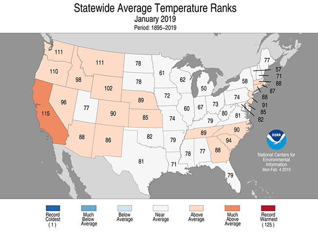
1 being coldest and 125 being warmest 60 represents January 2019 being about in the middle, or average for January temps. It's not 60°, it's #60 out of 125.so pick a state, say Illinois and explain what the 60 represents.Is that supposed to denote that you don't understand my explanation?Statewide rankings for average temperature for January 2019, as compared to each January since records began in 1895. Darker shades of red indicate higher rankings for heat, with 1 denoting the coldest January on record and 125 the warmest.explain the map. what do the numbers in each state represent?Meanwhile, back in reality, January 2019 was warmer than average over the continental USA.
Deniers won't be able to understand how that's so, because they're very stupid people.
Cause I know in Illinois it isn't 60 degrees Feb 4.
If so I can't help you, that's about as clearly as I can tell you.
Ya your opinions are worth about as much as old dumb fuck that started this thing.I love the idiocy of some here that have no clue that when you average an average there is always a +1 bias..
These idiots are conflating regional shifts in natural variation to mean some thing that it does not..Meanwhile, back in reality, January 2019 was warmer than average over the continental USA.
Deniers won't be able to understand how that's so, because they're very stupid people.
Does CA have more atmospheric CO2 than other states?
nope, makes absolutely no sense. average temperature is average temperature, it isn't a 1 or 125. the number of days above and below average is all I need to know, so that chart means nothing but jack shit. Nor does it show any comparison to previous years at all.1 being coldest and 125 being warmest 60 represents January 2019 being about in the middle, or average for January temps. It's not 60°, it's #60 out of 125.so pick a state, say Illinois and explain what the 60 represents.Is that supposed to denote that you don't understand my explanation?Statewide rankings for average temperature for January 2019, as compared to each January since records began in 1895. Darker shades of red indicate higher rankings for heat, with 1 denoting the coldest January on record and 125 the warmest.explain the map. what do the numbers in each state represent?
Cause I know in Illinois it isn't 60 degrees Feb 4.
If so I can't help you, that's about as clearly as I can tell you.
Get it now?
You're gonna hafta prove that, cause I've done a shitload of math and nobody has ever mentioned any +1 bias in averages.I love the idiocy of some here that have no clue that when you average an average there is always a +1 bias..
Obviously this is all over your head.nope, makes absolutely no sense. average temperature is average temperature, it isn't a 1 or 125. the number of days above and below average is all I need to know, so that chart means nothing but jack shit. Nor does it show any comparison to previous years at all.1 being coldest and 125 being warmest 60 represents January 2019 being about in the middle, or average for January temps. It's not 60°, it's #60 out of 125.so pick a state, say Illinois and explain what the 60 represents.Is that supposed to denote that you don't understand my explanation?Statewide rankings for average temperature for January 2019, as compared to each January since records began in 1895. Darker shades of red indicate higher rankings for heat, with 1 denoting the coldest January on record and 125 the warmest.
If so I can't help you, that's about as clearly as I can tell you.
Get it now?
30 days in January, were 15 above average or below average, how much above or below. useful data to show the month cold or warm. then show previous year. nope, the manipulators manipulate.
Says the idiot who thinks that natural changes over millennia mean nothing and the 38 year satellite records are gospel...Ya your opinions are worth about as much as old dumb fuck that started this thing.I love the idiocy of some here that have no clue that when you average an average there is always a +1 bias..

Bias correction in exponentially weighted averages - Optimization algorithms | CourseraYou're gonna hafta prove that, cause I've done a shitload of math and nobody has ever mentioned any +1 bias in averages.I love the idiocy of some here that have no clue that when you average an average there is always a +1 bias..
yep, I didn't think you knew what it meant to normal folks. like posting a picture of a volcano and saying see, a volcano.Obviously this is all over your head.nope, makes absolutely no sense. average temperature is average temperature, it isn't a 1 or 125. the number of days above and below average is all I need to know, so that chart means nothing but jack shit. Nor does it show any comparison to previous years at all.1 being coldest and 125 being warmest 60 represents January 2019 being about in the middle, or average for January temps. It's not 60°, it's #60 out of 125.so pick a state, say Illinois and explain what the 60 represents.Is that supposed to denote that you don't understand my explanation?
If so I can't help you, that's about as clearly as I can tell you.
Get it now?
30 days in January, were 15 above average or below average, how much above or below. useful data to show the month cold or warm. then show previous year. nope, the manipulators manipulate.
Have a nice day kid.
1 being coldest and 125 being warmest 60 represents January 2019 being about in the middle, or average for January temps. It's not 60°, it's #60 out of 125.so pick a state, say Illinois and explain what the 60 represents.Is that supposed to denote that you don't understand my explanation?Statewide rankings for average temperature for January 2019, as compared to each January since records began in 1895. Darker shades of red indicate higher rankings for heat, with 1 denoting the coldest January on record and 125 the warmest.explain the map. what do the numbers in each state represent?
Cause I know in Illinois it isn't 60 degrees Feb 4.
If so I can't help you, that's about as clearly as I can tell you.
Get it now?
Its one pile of BS to cover up another pile of BS. This chart makes assumptions based on what base line? Where is the data to support that base line? What changes were made to the data since it was observed? why were the changes made? etc, etc, etc.... This is why adjusting the HCN data and throwing away the original set has made the whole record useless..nope, makes absolutely no sense. average temperature is average temperature, it isn't a 1 or 125. the number of days above and below average is all I need to know, so that chart means nothing but jack shit. Nor does it show any comparison to previous years at all.1 being coldest and 125 being warmest 60 represents January 2019 being about in the middle, or average for January temps. It's not 60°, it's #60 out of 125.so pick a state, say Illinois and explain what the 60 represents.Is that supposed to denote that you don't understand my explanation?Statewide rankings for average temperature for January 2019, as compared to each January since records began in 1895. Darker shades of red indicate higher rankings for heat, with 1 denoting the coldest January on record and 125 the warmest.
If so I can't help you, that's about as clearly as I can tell you.
Get it now?
30 days in January, were 15 above average or below average, how much above or below. useful data to show the month cold or warm. then show previous year. nope, the manipulators manipulate.
Number of cloudy days, number of snow days or rain days, wet days. we weren't supposed to get anymore snow, I recall. yet, that isn't true. it still snows. every prediction has failed bigly.
He's not saying all averages a weighted +1, he's using a formula to compute a moving average which is not the same as just averaging a string of numbers.Bias correction in exponentially weighted averages - Optimization algorithms | CourseraYou're gonna hafta prove that, cause I've done a shitload of math and nobody has ever mentioned any +1 bias in averages.I love the idiocy of some here that have no clue that when you average an average there is always a +1 bias..
Whaaaat? Co2 localized how? What are you babbling about?1 being coldest and 125 being warmest 60 represents January 2019 being about in the middle, or average for January temps. It's not 60°, it's #60 out of 125.so pick a state, say Illinois and explain what the 60 represents.Is that supposed to denote that you don't understand my explanation?Statewide rankings for average temperature for January 2019, as compared to each January since records began in 1895. Darker shades of red indicate higher rankings for heat, with 1 denoting the coldest January on record and 125 the warmest.
If so I can't help you, that's about as clearly as I can tell you.
Get it now?
So CO2 was localized to CA during January? How does that work? Is that like atmospheric CO2 "warming" the oceans 700m deep?
They took 125 years worth of January average temps (that's each days temp ÷ 31, the number of days in January) and ranked them from coldest to warmest. It's not rocket science kids.Its one pile of BS to cover up another pile of BS. This chart makes assumptions based on what base line? Where is the data to support that base line? What changes were made to the data since it was observed? why were the changes made? etc, etc, etc.... This is why adjusting the HCN data and throwing away the original set has made the whole record useless..nope, makes absolutely no sense. average temperature is average temperature, it isn't a 1 or 125. the number of days above and below average is all I need to know, so that chart means nothing but jack shit. Nor does it show any comparison to previous years at all.1 being coldest and 125 being warmest 60 represents January 2019 being about in the middle, or average for January temps. It's not 60°, it's #60 out of 125.so pick a state, say Illinois and explain what the 60 represents.Is that supposed to denote that you don't understand my explanation?
If so I can't help you, that's about as clearly as I can tell you.
Get it now?
30 days in January, were 15 above average or below average, how much above or below. useful data to show the month cold or warm. then show previous year. nope, the manipulators manipulate.
Number of cloudy days, number of snow days or rain days, wet days. we weren't supposed to get anymore snow, I recall. yet, that isn't true. it still snows. every prediction has failed bigly.
Its one huge pile of crap to cover up the lies.
well it shows warmer right? why would that be if the assumption is due to CO2. that implies more CO2. He was asking how that happens and why it would be so frequent.Whaaaat? Co2 localized how? What are you babbling about?1 being coldest and 125 being warmest 60 represents January 2019 being about in the middle, or average for January temps. It's not 60°, it's #60 out of 125.so pick a state, say Illinois and explain what the 60 represents.Is that supposed to denote that you don't understand my explanation?
If so I can't help you, that's about as clearly as I can tell you.
Get it now?
So CO2 was localized to CA during January? How does that work? Is that like atmospheric CO2 "warming" the oceans 700m deep?
Whaaaat? Co2 localized how? What are you babbling about?1 being coldest and 125 being warmest 60 represents January 2019 being about in the middle, or average for January temps. It's not 60°, it's #60 out of 125.so pick a state, say Illinois and explain what the 60 represents.Is that supposed to denote that you don't understand my explanation?
If so I can't help you, that's about as clearly as I can tell you.
Get it now?
So CO2 was localized to CA during January? How does that work? Is that like atmospheric CO2 "warming" the oceans 700m deep?
You've got to be kidding me.well it shows warmer right? why would that be if the assumption is due to CO2. that implies more CO2. He was asking how that happens and why it would be so frequent.Whaaaat? Co2 localized how? What are you babbling about?1 being coldest and 125 being warmest 60 represents January 2019 being about in the middle, or average for January temps. It's not 60°, it's #60 out of 125.so pick a state, say Illinois and explain what the 60 represents.Is that supposed to denote that you don't understand my explanation?
If so I can't help you, that's about as clearly as I can tell you.
Get it now?
So CO2 was localized to CA during January? How does that work? Is that like atmospheric CO2 "warming" the oceans 700m deep?
Whaaaat? Co2 localized how? What are you babbling about?1 being coldest and 125 being warmest 60 represents January 2019 being about in the middle, or average for January temps. It's not 60°, it's #60 out of 125.so pick a state, say Illinois and explain what the 60 represents.Is that supposed to denote that you don't understand my explanation?
If so I can't help you, that's about as clearly as I can tell you.
Get it now?
So CO2 was localized to CA during January? How does that work? Is that like atmospheric CO2 "warming" the oceans 700m deep?
Well, doesn't CO2 CAUSE the warming? Are you walking back your stupid, failed theory already?