You do realize admiral hairball, that that paper was published in 2007?
Which paper? The only study you linked to is clearly dated May 18, 2013. So you got some 'splainin to do. A helpful hint, if you'd just tell the truth, you wouldn't always end up forgetting which particular lie you told.
SPIE | Proceeding | A decade of measured greenhouse forcings from AIRS
Sorry that you can't look at a graph and understand its context. Unsurprising that you have been so completely duped.
This is going to be fun, running you around in circles and watching you flail.
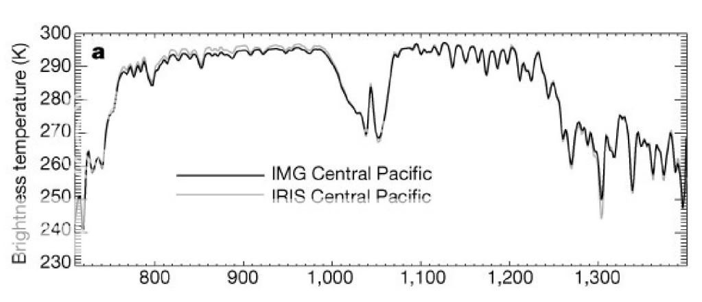
This is the first graph. Which you won't tell us the source of. Just a big mystery, it is.
If I had to guess, it looks like an amateur plotted raw data and thought it meant something, not understanding how the satellite drift over the years has to be compensated for.
depicts snapshots of OLR taken by the satellite IRIS in 1970 and by the satellite IMG in 1977. Both snapshots were taken over the central pacific at the same time of year and under the same weather conditions. It is clear to see that in the CO2 absorption bands (2.7, 4.3, and 15 micrometers) there is no decrease in OLR.
That's your second graph.
The source of that graph is Harries 2001. The abstract notably says the opposite of what you claim.
Increases in greenhouse forcing inferred from the outgoing longwave radiation spectra of the Earth in 1970 and 1997 : Abstract : Nature
---
Here we analyse the difference between the spectra of the outgoing longwave radiation of the Earth as measured by orbiting spacecraft in 1970 and 1997. We find differences in the spectra that point to long-term changes in atmospheric CH4, CO2 and O3 as well as CFC-11 and CFC-12. Our results provide direct experimental evidence for a significant increase in the Earth's greenhouse effect that is consistent with concerns over radiative forcing of climate.
--
So, you clearly didn't know the date or source of the graph, because you cribbed it from a denialist source (tallbloke). You also have little idea what it was about. But I can help you out there, being my soul oozes with a desire to help educate the less able.
First, while the black IMG line is 1970, the grey IRIS line is 1996, not 1977. Again, you don't know the basics.
Second, it shows the opposite of what you claim. This is more obvious if you take the second graph from Harries 2001 that plots the difference. You know, the graph that was right below the graph you posted and which would be impossible to miss, if someone had actually looked at the paper.
The top line shows the OLR difference between the years. Dips at 700 (15 microns) for CO2, also for ozone and methane. Your other CO2 bands (2.7, 4.3) are off the chart scale to the right. OLR rises outside the greenhouse gas bands, as it's supposed to. The middle line shows the model predictions, which match reality quite nicely.
Notably, your denier source took the first graph from Harries 2001, but then deliberately left out the second graph that clearly shows the OLR decreasing. Rather dishonest cherrypicking on their part. And you fell for it. If you had any self-respect, you'd publicly condemn that source for lying to you like that. However, if you're too deep into the cult, you'll keep defending your cult masters no matter how often they lie to you. And you'll keep parroting them and then lying outright about how you supposedly read the paper, like you got caught doing here.
Oh, your graphs 3 and 4. Tell us what paper they came from, and what they mean. You say you've read the original sources, hence that should be as easy task for you. Since I've got the original source of those graphs open in front of me, I'd suggest you not try to bullshit everyone yet another time.


")