That's one biased way of looking at it. How do you explain this?
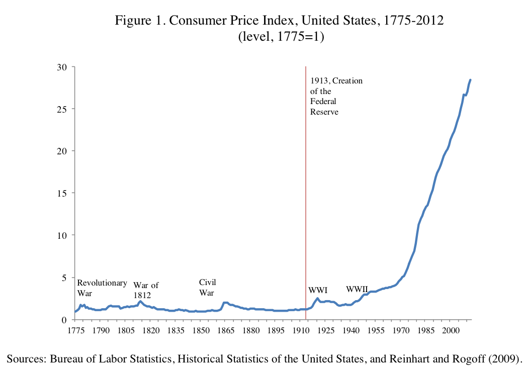
Source: The Bureau of Labor Statistics' annual
Consumer Price Index (CPI), established in 1913. Inflation data from 1665 to 1912 is sourced from a
historical study conducted by political science professor Robert Sahr at Oregon State University.
Wow, are you dumb.
Even your own chart shows less natural business cycles and more inflation after the imposition of the FED and the elimination of gold and silver. You are indeed hopeless.
You are probably clueless as to the real reason how the top .01% are able to concentrate their wealth so effectively.
Dale is right, no point in discussing anything with you.
Because the 1% pay less %wise in taxes than the middle class now? Thanks to Reaganism and dupes like you?
No they don't.
The 1% pay and effective tax rate of over 24%. The middle class, even the upper middle class don't pay anything over an effective rate of 20%.
Then start counting more than just the fed income tax.
The one tax graph you really need to know
Either way, the richest now get almost all the new wealth...because they don't PAY ENOUGH. (Most GOP dupes think 47% don't pay any taxes)- then the country and the middle class fall apart...
The Demise of the American Middle Class In Numbers.
Over the past 35 years the American dream has gradually disappeared. The process was slow, so most people didn’t notice. They just worked a few more hours, borrowed a little more and cut back on non-essentials. But looking at the numbers and comparing them over long time periods, it is obvious that things have changed drastically. Here are the details:
1. WORKERS PRODUCE MORE BUT THE GAINS GO TO BUSINESS.
Over the past 63 years worker productivity has grown by 2.0% per year.
But after 1980, workers received a smaller share every year. Labor’s share of income (1992 = 100%):
1950 = 101%
1960 = 105%
1970 = 105%
1980 = 105% – Reagan
1990 = 100%
2000 = 96%
2007 = 92%
A 13% drop since 1980
2. THE TOP 10% GET A LARGER SHARE.
Share of National Income going to Top 10%:
1950 = 35%
1960 = 34%
1970 = 34%
1980 = 34% – Reagan
1990 = 40%
2000 = 47%
2007 = 50%
An increase of 16% since Reagan.
3. WORKERS COMPENSATED FOR THE LOSS OF INCOME BY SPENDING THEIR SAVINGS.
The savings Rose up to Reagan and fell during and after.
1950 = 6.0%
1960 = 7.0%
1970 = 8.5%
1980 = 10.0% – Reagan
1982 = 11.2% – Peak
1990 = 7.0%
2000 = 2.0%
2006 = -1.1% (Negative = withdrawing from savings)
A 12.3% drop after Reagan.
4. WORKERS ALSO BORROWED TO MAKE UP FOR THE LOSS.
Household Debt as percentage of GDP:
1965 = 46%
1970 = 45%
1980 = 50% – Reagan
1990 = 61%
2000 = 69%
2007 = 95%
A 45% increase after 1980.
5. SO THE GAP BETWEEN THE RICHEST AND THE POOREST HAS GROWN.
Gap Between the Share of Capital Income earned by the top 1%
and the bottom 80%:
1980 = 10%
2003 = 56%
A 5.6 times increase.
6. AND THE AMERICAN DREAM IS GONE.
The Probably of Moving Up from the Bottom 40% to the Top 40%:
1945 = 12%
1958 = 6%
1990 = 3%
2000 = 2%
A 10% Decrease.
Links:
1 =
ftp://ftp.bls.gov/pub/special.requests/pf/totalf1.txt
1 =
https://www.clevelandfed.org/Research/PolicyDis/No7Nov04.pdf
1 =
Clipboard01.jpg (image)
2 –
http://www.whitehouse.gov/omb/blog/09/04/27/CongratulationstoEmmanuelSaez/
3 =
http://www.demos.org/inequality/images/charts/uspersonalsaving_thumb.gif
3 =
U.S. Bureau of Economic Analysis (BEA)
4 =
Federated Prudent Bear Fund (A): Overview
4 =
The Fed - Financial Accounts of the United States - Z.1 - Current Release
5/6 =
15 Mind-Blowing Facts About Wealth And Inequality In America
Overview =
http://www.ourfuture.org/blog-entry/2010062415/reagan-revolution-home-roost-charts