Little-Acorn
Gold Member
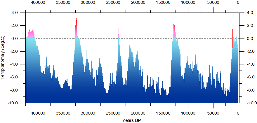
This chart is made from data taken by scientists studying deep ice in Antarctica. It starts a little more than 400 million years ago. It shows estimated global temperatures, based on the best available data, compared to the temperatures we have nowadays.
Note the pattern.
Temperatures started around where they are today. Then they dropped rapidly, not the few tenths of a degree the present hysterics are telling us about, but going down 4 to 8 degrees C. And they stayed there for more than 60,000 years.
Then they rose suddenly, as much as 10 degrees C, but quickly dropped back down to the lower levels, and stayed low for another 80,000 years.
Then they rose again for a short time, but dropped back down and mostly stayed low for another 100,000 years.
Then they rose again briefly, but dropped back down and stayed low yet again for another 100,000 years.
Then they rose again, and have stayed for a brief period... which brings us to the present day.
Note that this repeated cycle, has happened over and over, without the hand of man going anywhere near the planet in any significant way. Would anyone like to support the idea that those greedy, wasteful humans were burning too much oil, a hundred thousand years ago when the previous peak occured? Maybe driving too many SUVs two hundred thousand years ago? Maybe a jurassic Al Gore was chartering huge jets all over the world 300,000 years ago, warning his fellow humans back then about the dangers of THAT period of "global warming"?
Al Gore and the rest of his junk-science salesmen want us to believe that we will see temperatures getting warmer from where they are, with no end in sight. And he proposes massive government expenditures, massive programs, and huge government restrictions and regulations on everything we do, to try to stop temperatures from warming in the future.
But based on previous patterns, where do YOU expect temperatures to go from here?
Has Al Gore seen this chart?
______________________________________________________________________
______________________________________________________________________


