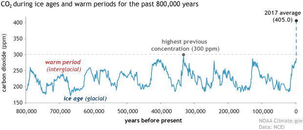
I know, snowflake. It shows CO2 for a reason. I thought you would understand. I guess not. See the CO2 cycles? Those are your warming and cooling cycles. See the unprecedented rise at the right end of the graph? That shows that what is happening is NOT part of any cycle that's been taking place for thousands of years.
Here are both CO2 and temperature for the past 300,000 years. This graph comes from AGW denier WattsUpWithThat who took this opportunity to push a wee fib. Note the right end of the blue line, labeled "383". That point is not plotted to the same scale as the rest of the data. And they said nothing about it. That should be slightly further from "300", (the top of the right hand scale) than "220" is below it. It is not. The actual CO2 level in 2007 would be outside the boundaries of this graphic. Today's CO2 value is almost the full height of the graph above "300".
They have also spliced modern, instrumented CO2 data onto ice core data with no indication that they have done so. WattsUpWithThat has crucified climate scientists on multiple occasions for doing precisely that.
They have also NOT spliced modern instrumented temperature data onto the temperature trace, giving the impression that there has been no increase in temperature for the last few centuries.