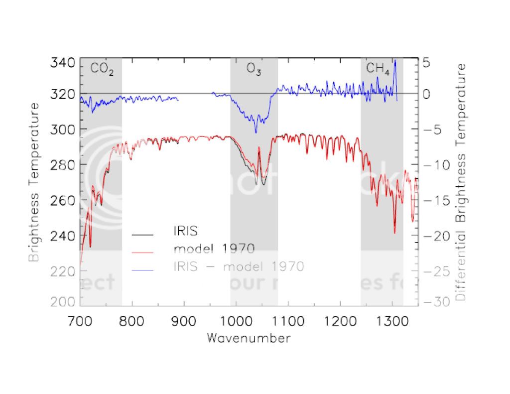
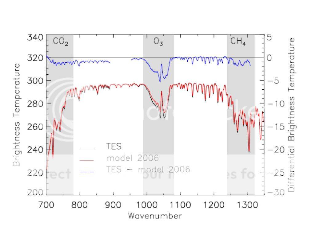
The next two images were taken by IRIS in 1970 and TES in 2006 respectively. In these graphs, the black line represents the actual measurement taken by the sattellite, the red line represents what the climate models predict and the blue line represents the difference between the model data and the actual data.
Feel free to print out the two graphs and overlay them. You will find that the black lines (actual measured data) are identical indicating this time, that there is no difference between outgoing longwave radiation in the CO2 absorption spectrum between 1970 and 2006. Again, if AGW theory were correct, then the outgoing longwave radiation should be less as the blue lines on the graphs indicate. As you can see, this is not the case. There has been no increase in the absorption of outgoing longwave radiation in the CO2 spectrum between 1970 and 2006 in spite of the presence of more atmospheric CO2.