Poor Crick with his CantReadAGraph (CRAG) syndrome. Falls for YET MORE SkepshitScience bullshit. But this time -- it's hysterical..

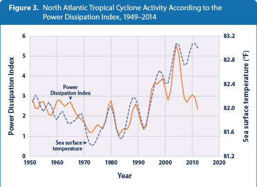
Only the cartoonist zealots at SkepShitScience could put a horizontal axis on a graph that ENDS in 2005, and then CRAYON IN --- a point labeled 1998 to 2007... It's a ******* cartoon. Not a chart of anything close to reality.
WHY the **** do you live in intellectual gutters???

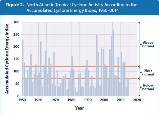
THIS is what has happened in the Atlantic Since 1945... Lying bastards at SShit will prey on the stupid.. .
When you only look at TROPICAL STORMS --- like those devious SkepShits did (before they got tthe crayons out) you see the advent of satellites capable of FINDING a mere 4 or 6 hour storm that barely triggers the definition of a Trop storm. And satellites like that were around from 1980 on. Also more ocean buoys and P3 flights going out more often to check on "invest areas"..
Tell us, oh graphing expert, where you would plot an average taken from 1998-2007?
Since when does the AVERAGE conveniently fit onto an existing yearly point anyways. Should have been marked as bar lines. And you don't include any "averages or trend lines" that fit to data OUTSIDE the range of your graph. Didn't even seem to plot from 2004 or 2005.. It's a cartoon Bullwinkly.
And it's purposely deceptive including tropical storms that have been redefined and were largely undetectable prior to about 1980.. The chart I gave above goes back to 1944 or so. THAT's the reality of the Atl. Hurricanes.
THO ---- strangely enough. I could not find ANY CHARTS that went up to 2015.. Since NOAA would be the most likely to publish that crap ---- WHY do you think that might be? (Nobody wants that to be seen).. It's embarrassing..
The average of 1998-2007 is a single value. It would NOT be plotted as a bar. And it would obviously be plotted in the center of its span, the end of 2002, precisely where it WAS placed. You seem to be the one having difficulty with simple graphs Mr Scientist.
Note where the 5-yr average line ends.


 And always exposed and publically humiliated by the climate skeptics in here!!!
