a year ago, and again after Muller's congressional statement, I said both sides would be disappointed with the BEST results. I predicted a small decrease in trend (wrong) and a large increase in uncertainty (?wrong?).
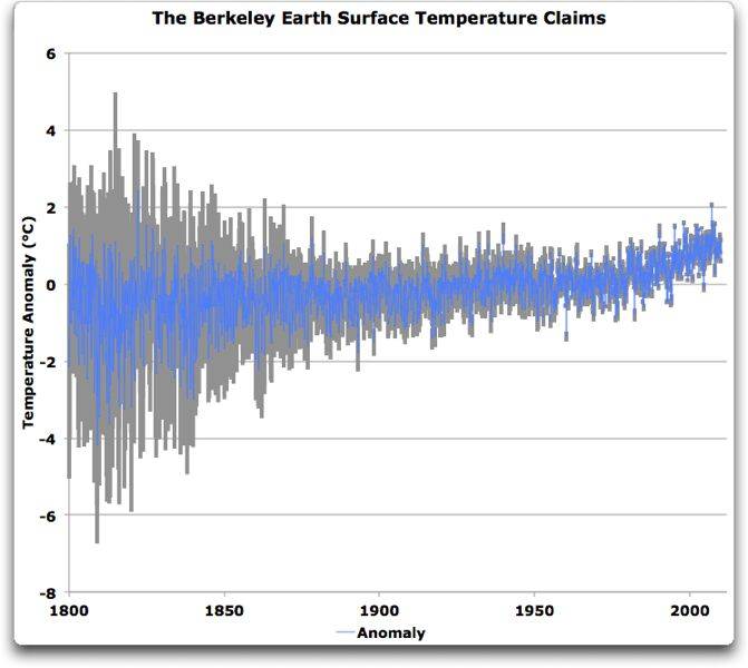
here is a plot of BEST monthly data and 95% CI. thanks to Willis
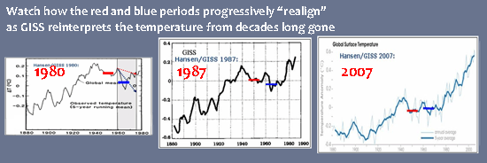
I must admit that this was the type of graph that I was expecting rather than smoothed and re-smoothed narrow lines that give a totally different picture of what is going on. I am not sure how they got from the monthly unsmoothed data with considerable uncertainty to smoothed 10 year average data with very little uncertainty but I am not a statistician.
lies, damned lies, and statistics. its funny how climate science is so prone to influenceing public opinion simply by the way they present the evidence.
Your first chart does not come from Berkley, and does not seem to match the Berkley data. I notice you didn't give the link to your source, probably because it is the dishonest Anthony Watts site.
What the BEST data actually says | Watts Up With That?
Here is the Berkley website with the data at the bottom on the page that was supposedly used;
Berkeley Earth Surface Temperature (© 2011)
Click to download
analysis chart data.
Here are a couple of charts and pull quotes from the Anthony Watts site about the BEST data.
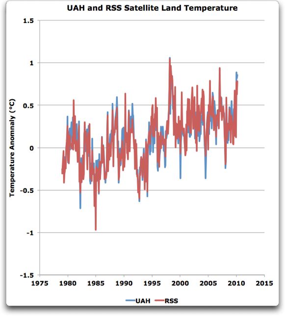
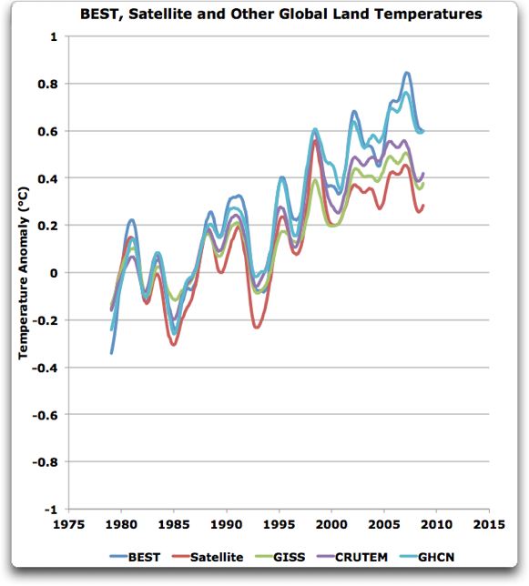
Figure 2. UAH and RSS satellite temperature records. Anomaly period 1979-1984 = 0.
Remember what we would expect to find if all of the ground records were correct. Theyd all lie on or near the same line, and the satellite temperatures would be rising faster than the ground temperatures. Here are the actual results, showing BEST, satellite,
GISS,
CRUTEM, and
GHCN land temperatures:
Figure 3. BEST, average satellite, and other estimates of the global land temperature over the satellite era. Anomaly period 1979-1984 = 0.
Notice how two different anomaly periods are used, one of which is only 5 years!!!!! No honest person would ever use an anomaly period of less than 20 years.
Here is another bit of dishonesty from the Watts site;
Oh, yeah, one more thing. At the top of the BEST dataset theres a note that says:
Estimated 1950-1980 absolute temperature: 7.11 +/- 0.50
Seven degrees C? The GISS folks dont even give an average, they just say its globally about 14°C.
The HadCRUT data gives a global temperature about the same, 13.9°C, using a gridded absolute temperature dataset. Finally, the Kiehl/Trenberth global budget gives a black-body radiation value of 390 W/m2, which converts to 14.8°. So I figured that was kind of settled, that the earths average temperature (an elusive concept to be sure) was around fourteen or fifteen degrees C.
Now, without a single word of comment that I can find, BEST says its only 7.1 degrees
say what? Anyone have an explanation for that?
The explanation is obvious to honest people, the Watts site is comparing two different temperature periods. The HadCRUT average temp, for example, is from the period 1961 to 1999, a 40 year average, but the BEST average is from 1950 to 1980, a shorter and earlier temp period. Only someone intent on deception would ever compare the two!!! HadCRUT starts 10 years warmer and extends 20 years warmer than the BEST average ... say Watts? Anyone have an explanation for that?