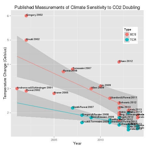
Nice cartoon there.. Not entirely accurate and does not provide the links or sources for the data. Particularly in terms of solar forcings, there's be a concerted effort to not include the run-up in Total Solar Irradiance since the Little Ice Age. Don't know why or how it get left out of your Looney Tune. But actual satellite data tells a much different story..
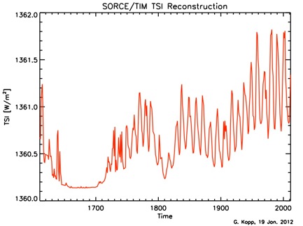
Now could be because they NEED to ignore shit like this and tell folks to count sunspots. Sunspots are NOT as accurate as that graph from TIM-SORCE satellite group..
Everywhere you look -- the truth seems to have been rearranged a bit. And in this case, the warmers have convinced folks that WHATEVER caused our blip of temperature rise has to look exactly like the resulting temperature increase.
In the past 6 yrs or so -- Climate Science is correcting that misconception. The Earth's Climate system does NOT respond in terms of days or months or even decades to external forcings. NOW it is believed that a forcing could take up to a century to manifest in a "Global Avg Temp. Change" ..
So that solar increase since the 1700s -- even tho it is now level off at a max for a couple decades may STILL be adding to increased temperatures today..