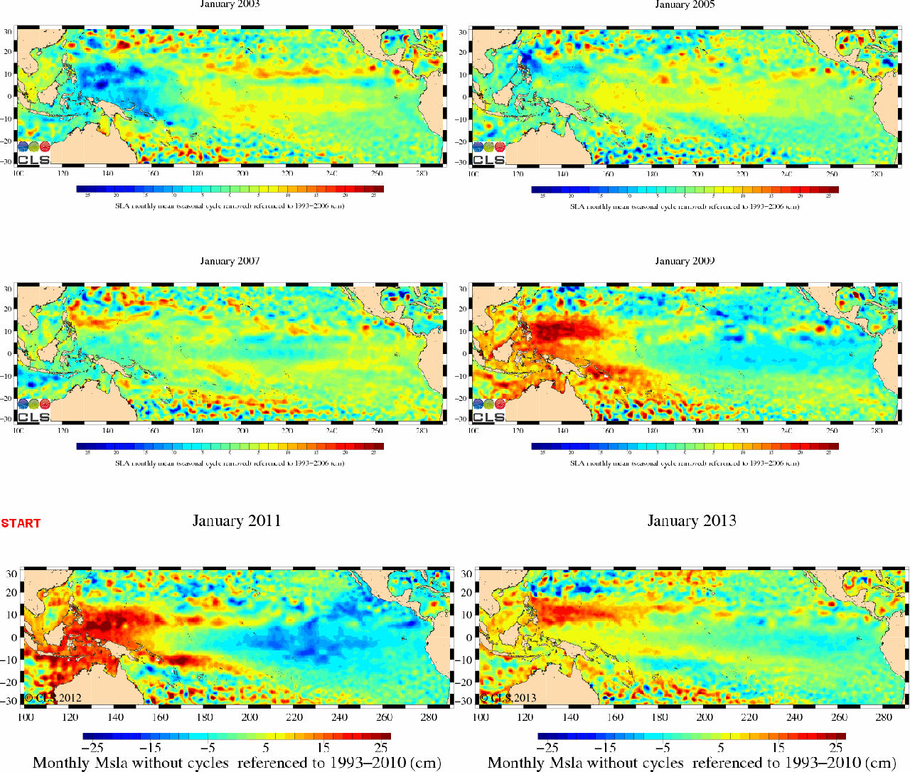
Here's an interesting graph. It came from a commenter on your Herald Sun article. His text submissions read as follows:
Dr Brian replied to Giorgio
Tue 02 Sep 14 (12:42pm)
Geoff, for a highly regarded professor and statistician , McItrick is still cherry picking, but he is still cherry picking.
Here is an alternative set of data. [Graph below, though there is other info at the link --Crick]
Dr Brian replied to Giorgio
Tue 02 Sep 14 (12:56pm)
And I note that the Graph is not by McItrick, but the “ever excellent” WUWT, who
have not shown the actual WFT trend line, but put in one more to their liking.
Watts is so excellent he repudiated the central content of two of his own sections, referring to it as “minutiae” when neither he nor his fans could counter what I said about graphs he was presenting, and telling me to pull my head out of my rear end.
Excellent. Truly excellent.
Dr Brian replied to Giorgio
Tue 02 Sep 14 (01:07pm)
Pardon me mods for doing this piecemeal, but I should add that the actual trend for the Hadcrut4 data which Watts’ crew have misrepresented is
Trend: 0.093 ±0.100 °C/decade (2?)
While not statistically significant this is higher than the warming rate for the last century:
Trend: 0.073 ±0.011 °C/decade (2?)


 ........
 mAgIc
mAgIc