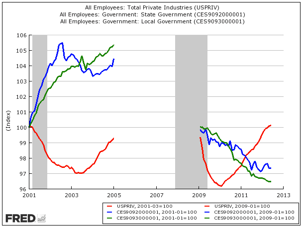
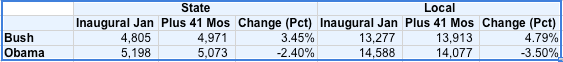
Where is the federal employee plot on that chart? States are broke, so they are slashing spending. This makes sense. What about the federal employees vs. the private sector?
I wish i could find harder data.
Anyone can pick and choose data that says what they want it to say, whala a chart comes into existence that even matches the data. Neat little thing data is.

Well, yeah. the original OP chart is void of federal employees vs. private employees. I wonder why that is?
Could it be because the federal government employs more people than the private sector, which would make the entire argument that Obama has not increased the size of government void and therefore a lie?
That's what i see here. The federal govt. has steadily grown while the states/locals are forced the slash spending due to budget shortfalls.
That graph was the only one I could find on it because it seems people want to talk about the pay between private/public more than the figures on how many people the federal govt. employs. Which by the way, is sad. [B
]The federal workers make almost double that of the private workers that pay the public workers salaries[/B]. That's not sustainable. Especially if federal payroll head counts continue to increase.


")

 .
.
