1947-1979 v 1980-now

Keynes: The Return Of The Master by Robert Skidelsky does a very good job of making a similar argument to this article.

That is a fantastic book, and one of the best mainstream explanations of both current macroeconomic thought and its application to this crisis. Even if one disagrees with Keynes, it's well worth the read.
 
...Which graph are you talking about and how did you come up with 'less than 1%'?
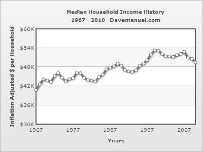
This one
median_household_income.gif

2010 - 48.2
1975 - 43.4

48.2/43.4 = 1.110599078

1.110599078^(1/(2010-1975)) = 1.003001627
1.003001627 - 1 = 0.003001627
0.003001627 X 100% = 0.3001627%...
That graph was from your link. If you don't trust it than we can drop it, but it's not as bad as some I've seen and it does disprove editec's notion that a drop in union membership means a drop in middle class income. In fact, your data show a percent increase in real income for every percent drop in union membership.

They also show that before Obama got elected, real middle class incomes had been growing at an annualized 1%/year for 25 years, and with Obama they've fallen by 4% per year.

Hey, we all know none of this proves causality, but like editec pointed out, it's 'interesting'.
 

Forum List

Back
Top