Satellite battle: Five reasons UAH is different (better) to the RSS global temperature estimates

Sunsettommy

Diamond Member
Mar 19, 2018
14,896
12,529
2,400
Jo Nova

July 10th, 2017

Excerpt:

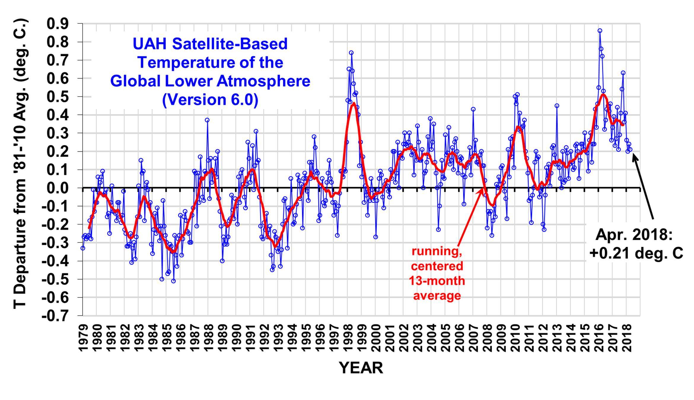
"And so the adjustments war ramps up a notch.

There are two main groups that use essentially the same NASA and NOAA satellites to estimate global temperatures. In the last year, they’ve both made adjustments, one down, and one up, getting further apart in their estimates. In ClimateWorld this is a big deal. Believers are excited that now a satellite set agrees a bit better with the maligned “hot” surface thermometers. But UAH still agrees more with millions of weather balloons. The debate continues. Here’s my short synopsis of the Roy Spencer (and John Christy) from the “Comments on the new RSS lower tropospheric temperature set.” (If something is wrong here, blame me)."

LINK
 
We all know that Global Warming, or Climate Change, is real so it's not surprising that they have to adjust the data to fit their theory.

That's real science, amiright?
 
UAH_LT_1979_thru_March_2018_v6.jpg


http://www.drroyspencer.com/wp-content/uploads/UAH_LT_1979_thru_March_2018_v6.jpg

Lows of about -0.5 to -0.4 in the '80s and '90s. Highs at that time about +0.2 to +0.4. Since 2014, we have not had a minus low, and several highs above +0.5. No matter whose data you use, serious warming.

You continue to ignore the IPCC's per decade warming rate prediction/Projection failure

I am glad you keep posting the UAH chart, since it is devastating to the AGW conjecture.

Keep it up.
 
http://www.drroyspencer.com/wp-content/uploads/UAH_LT_1979_thru_April_2018_v6.jpg

UAH_LT_1979_thru_April_2018_v6.jpg


Looks like we have a pretty steep line from left to right. Not only that, but look at the difference in the current drop from the El Nino high to the La Nina low. The drop from every other cycle has gone below the zero line, this cycle has thus far not gone below +o.2. So, I use Dr. Spencer's graph because it is the most conservative of the ones keeping track of the increasing warmth. And it shows a rapid warming.
 
Please explain. The data clearly show warming at an accelerating pace.
 
http://www.drroyspencer.com/wp-content/uploads/UAH_LT_1979_thru_April_2018_v6.jpg

UAH_LT_1979_thru_April_2018_v6.jpg


Looks like we have a pretty steep line from left to right. Not only that, but look at the difference in the current drop from the El Nino high to the La Nina low. The drop from every other cycle has gone below the zero line, this cycle has thus far not gone below +o.2. So, I use Dr. Spencer's graph because it is the most conservative of the ones keeping track of the increasing warmth. And it shows a rapid warming.

No warming since 1998

Warming rate no different from previous warming rates since the 1800's. I have posted the evidence in front of you before, but you ignore as you must to continue your delusions.

Total warming rate since 1979 is just .50C over 4 decades time.
 
Please explain. The data clearly show warming at an accelerating pace.

No it is still less than the 1990's IPCC per decade MINIMUM warming rate of .20C, gosh that was only 28 years ago!

You guys are way off as usual.
 

Forum List

Back
Top