Global Cooling Chills Summer

BAM! Check out all those cold temps!

Cold June in Manhattan well below normal.

Among coldest Junes in Pheonix since 1913.

LA came in at 5 degrees below normal.

Boston almost 5 degrees below normal.

New Zealand climate center releases headline - Temperatures: Lowest ever for May in many areas, colder than normal for all.

Two South African vagrants froze to death.

Chicago had the COLDEST July 8th since 1891.

Yonkers received a snow storm - in JULY.

In Melbourne Australia, temps have been 10 degrees BELOW normal.


Global Cooling Chills Summer 2009 by Deroy Murdock on National Review Online

By the way, the earth's temperature has dropped .74 degrees since Al Gore released an Inconvenient Truth in 2006...


Brrr....
 
BAM! Check out all those cold temps!

Cold June in Manhattan well below normal.

Among coldest Junes in Pheonix since 1913.

LA came in at 5 degrees below normal.

Boston almost 5 degrees below normal.

New Zealand climate center releases headline - Temperatures: Lowest ever for May in many areas, colder than normal for all.

Two South African vagrants froze to death.

Chicago had the COLDEST July 8th since 1891.

Yonkers received a snow storm - in JULY.

In Melbourne Australia, temps have been 10 degrees BELOW normal.


Global Cooling Chills Summer 2009 by Deroy Murdock on National Review Online

By the way, the earth's temperature has dropped .74 degrees since Al Gore released an Inconvenient Truth in 2006...

CON$ never tire of repeating the same lies no matter how many times their lies are exposed!!! :cuckoo:

From your link:

“The latest global averaged satellite temperature data for June 2009 reveal yet another drop in Earth’s temperature. . . .Despite his dire warnings, the Earth has cooled 0.74 degrees F since former Vice President Al Gore released An Inconvenient Truth in 2006.”

From the UHA data your link cites:

Information from Global Hydrology and Climate Center, University of Alabama - Huntsville, USA The data from which the graphs are derived can be downloaded here.
Temperature Variation From Average:
Lower Troposphere:
Global:
June 2009: + 0.01°C

But in spite of your link's misrepresentation of June, I bet you STILL really believe the Earth has cooled .74 degrees F from 2006 to 2008! :rofl:

Climate Monitoring
Global Temperature Highlights - 2008
The combined global land and ocean surface temperature from January-December was 0.88 degree F (0.49 degree C) above the 20th Century average of 57.0 degrees F (13.9 degrees C).

Global Temperatures
The global annual temperature for combined land and ocean surfaces in 2006 was +0.54°C (+0.97°F) above average
57.97 - 57.88 = .09 which to deniers = .74 :cuckoo:

The temperatures in your graphs are all adjusted. Why were they adjusted?

As you well know, they were adjusted because Ditto-Dopers Christy and Spencer at UAH got CAUGHT using the WRONG SIGN when they "corrected" for Dinural Drift of satellites.

Should you believe anything John Christy and Roy Spencer say? « Climate Progress

First off, they were wrong — dead wrong — for a very long time, which created one of the most enduring denier myths, that the satellite data didn’t show the global warming that the surface temperature data did. As RealClimate wrote yesterday:
We now know, of course, that the satellite data set confirms that the climate is warming , and indeed at very nearly the same rate as indicated by the surface temperature records. Now, there’s nothing wrong with making mistakes when pursuing an innovative observational method, but Spencer and Christy sat by for most of a decade allowing — indeed encouraging — the use of their data set as an icon for global warming skeptics. They committed serial errors in the data analysis, but insisted they were right and models and thermometers were wrong. They did little or nothing to root out possible sources of errors, and left it to others to clean up the mess, as has now been done.
Amazingly (or not), the “serial errors in the data analysis” all pushed the (mis)analysis in the same, wrong direction. Coincidence? You decide. But I find it hilarious that the deniers and delayers still quote Christy/Spencer/UAH analysis lovingly, but to this day dismiss the “hockey stick” and anything Michael Mann writes, when his analysis was in fact vindicated by the august National Academy of Sciences in 2006 (see New Scientist’s “Climate myths: The ‘hockey stick’ graph has been proven wrong“).
Which is why deniers use only their old erroneous data to claim global cooling. Once the proper sign is used even the two Ditto-Dopers had to admit their satellite data matched the surface readings and the climate models. Of course CON$ always leave that part out. The CON$ervative web of deceit only works on those who DON'T know what CON$ leave out.

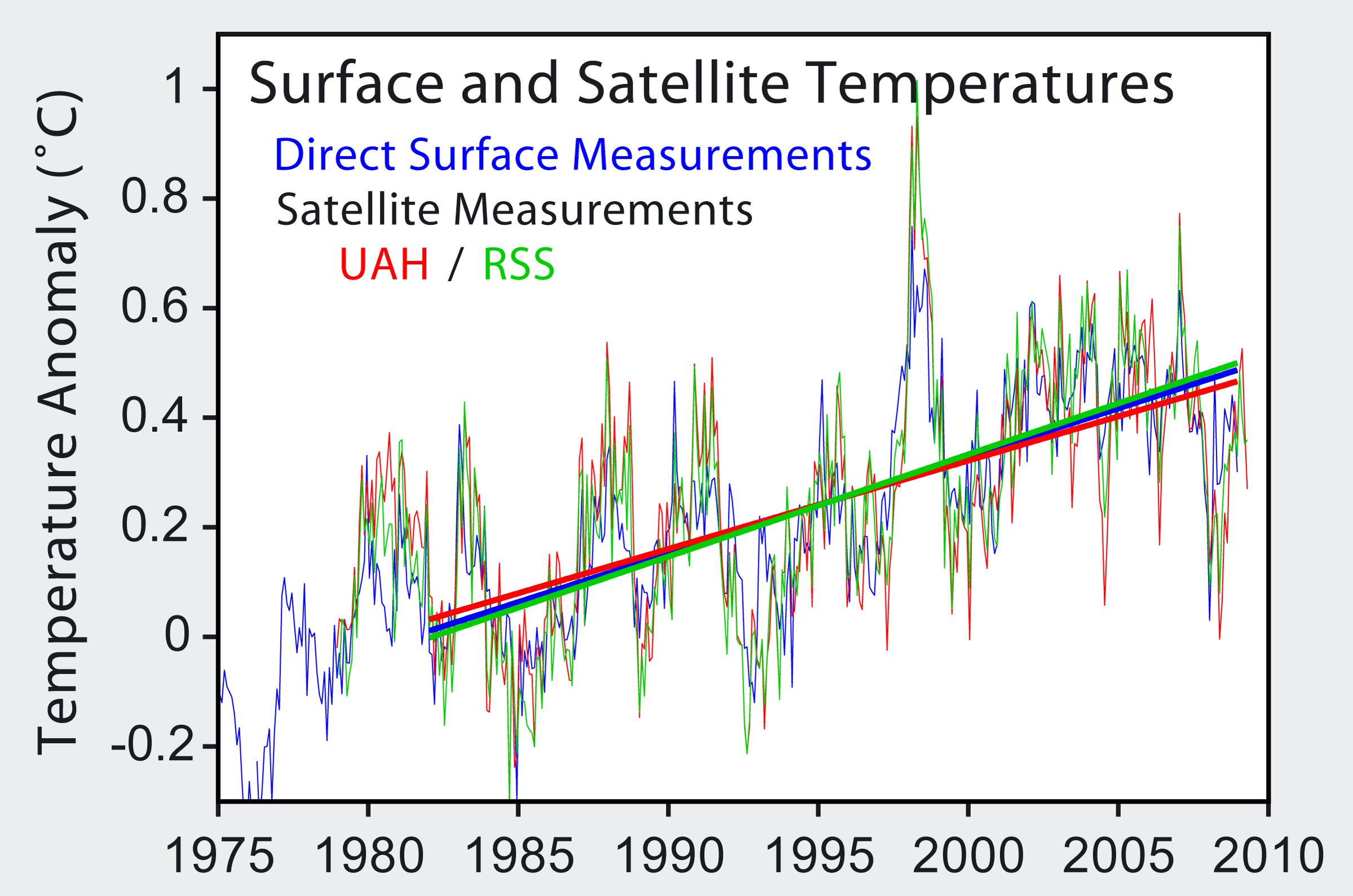
Satellite show little to no warming in the troposphere

An "Executive Summary" by the U.S. Climate Change Science Program, co-authored by John Christy of UAH concludes:
"Previously reported discrepancies between the amount of warming near the surface and higher in the atmosphere have been used to challenge the reliability of climate models and the reality of human induced global warming. This significant discrepancy no longer exists because errors in the satellite and radiosonde data have been identified and corrected. While these data are consistent with the results from climate models at the global scale, discrepancies in the tropics remain to be resolved.

This difference between models and observations may arise from errors that are common to all models, from errors in the observational data sets, or from a combination of these factors. The second explanation is favored, but the issue is still open."​
In other words, according to UAH, satellite measurements match the models apart from in the tropics. This error is most likely due to data errors. According to RSS, satellites are in good agreement with models.
Satellite_Temperatures.png
 
Hmmmm......... Well here we go again, the usual suspects lying out both sides of their mouths to prove a falsehood. June, 2009, was the second warmest on record. That is the fact that shows what disengenous idiots these fools be.

NOAA - National Oceanic and Atmospheric Administration - NOAA: Global Ocean Surface Temperature Warmest on Record for June
July 17, 2009

The world’s ocean surface temperature was the warmest on record for June, breaking the previous high mark set in 2005, according to a preliminary analysis by NOAA’s National Climatic Data Center in Asheville, N.C. Additionally, the combined average global land and ocean surface temperature for June was second-warmest on record. The global records began in 1880.

Global Climate Statistics
The combined global land and ocean surface temperature for June 2009 was the second warmest on record, behind 2005, 1.12 degrees F (0.62 degree C) above the 20th century average of 59.9 degrees F (15.5 degrees C).
Separately, the global ocean surface temperature for June 2009 was the warmest on record, 1.06 degrees F (0.59 degree C) above the 20th century average of 61.5 degrees F (16.4 degrees C).
Each hemisphere broke its June record for warmest ocean surface temperature. In the Northern Hemisphere, the warm anomaly of 1.17 degrees F (0.65 degree C) surpassed the previous record of 1.12 degrees F (0.62 degree C), set in 2005. The Southern Hemisphere’s increase of 0.99 degree F (0.55 degree C) exceeded the old record of 0.92 degree F (0.51 degree C), set in 1998.
The global land surface temperature for June 2009 was 1.26 degrees F (0.70 degree C) above the 20th century average of 55.9 degrees F (13.3 degrees C), and ranked as the sixth-warmest June on record.
Notable Developments and Events
El Niño is back after six straight months of increased sea-surface temperature anomalies. June sea surface temperatures in the region were more than 0.9 degree F (0.5 degree C) above average.
Terrestrial warmth was most notable in Africa. Considerable warmth also occurred in Siberia and in the lands around the Black and Mediterranean Seas. Cooler-than-average land locations included the U.S. Northern Plains, the Canadian Prairie Provinces, and central Asia.


Here's a temperature tracking record from the technology of today as opposed to the technology of the days of Vasco de Gama:

The Reference Frame: UAH: June 2009: anomaly near zero

Global mean temperature according to UAH MSU for the first 8.5 years i.e. 102 months of this century. Linear regression gives a cooling trend by a hefty -1.45 °C per century in this interval. So if someone tells you that the trend is "of course" positive as long as we omit the year 1998, you may be very certain that he or she is not telling you the truth.

UAH MSU has officially released their June 2009 data. This time, they're faster than RSS MSU. The anomaly was +0.01 °C, meaning that the global temperature was essentially equal to the average June temperature since 1979. June 2009 actually belonged to the cooler half of the Junes since 1979.

And if someone uses the UHA data, COOKED by Ditto-Dopers Christy and Spencer, you may be very well certain that he or she is not telling the truth and is too STUPID, lazy or deceitful to find out the truth.

:eusa_whistle:

$133.gif
 
BAM! Check out all those cold temps!

Cold June in Manhattan well below normal.

Among coldest Junes in Pheonix since 1913.

LA came in at 5 degrees below normal.

Boston almost 5 degrees below normal.

New Zealand climate center releases headline - Temperatures: Lowest ever for May in many areas, colder than normal for all.

Two South African vagrants froze to death.

Chicago had the COLDEST July 8th since 1891.

Yonkers received a snow storm - in JULY.

In Melbourne Australia, temps have been 10 degrees BELOW normal.


Global Cooling Chills Summer 2009 by Deroy Murdock on National Review Online

By the way, the earth's temperature has dropped .74 degrees since Al Gore released an Inconvenient Truth in 2006...

As much as I like to debunk global warming, this entire post is completely off.

1: Temperatures are below "AVERAGE" not below "NORMAL." Many people consistently intermix the terms, and they shouldn't. The "AVERAGE" temperature is a mean. It is an average of temperatures that day for the past 30 or so years. If we are below average or above average, it does not mean anything except that we were below average or above average.

2: Our temperatures will INCREASE this winter and next Summer because of El Nino. I would not doubt we will have an ABOVE average winter in terms of temperature.

If you look at meteorology and climatology as a whole, you can see micro weather patterns, the ones that last days/weeks and you see macro weather patterns, the ones that last for decades. 1995 - 2005 was one of the warmest decades on average, but we have since cooled down. I think 2006 - 2016 will be one of the coolest decades on record because of the lack of strenght from El Nino and how strong La Nina and neutral negative ENSO events are. We see the sign of the end of the warm decade and the beginning of the cool decade through the type of hurricane season we had in 2005. It was sort of a grand finale, like in fireworks. But in reality, and this again is a completely hypothetical meteorological term, but the Earth has a system of checks and balances. The Earth warms from the sun, so it cools itself down by releasing energy. Since the Earth can't hop onto a treadmill or catch frisbees all day long, the biggest way it releases energy is through hurricanes. Except in 2005 it released TOO MUCH energy and thus we have the cooling we've seen over the past 3 years. I suspect we have 5-7 more years of slight cooling and then by 2015-2016, we'll start warming again. This happens every 7-13 years or so. So when people say "omigosh, the 1930s were very cold and we're much warmer today than we were back then" they're only half right. We are not "much" warmer today than we were in the 1930s, but 2 degrees means the difference between a cold rainstorm and a blizzard.

There are also, and this is completely hypothetical, super-Macro weather patterns that last hundreds of years. Right now we're in an inter-glacial phase, meaning we're warming. But this is only because we just came out of a mini ice age 150 years ago. These interglacial phases last hundreds of years... so while one decade might be warm and another cold, overall for the next 150-250 years, we'll be warming. That idea is based upon the length of the medieval warm period - the first record we have of this phenomenon. This is completely natural and normal for the Earth to do and man is not causing it.
 
David, we are on the down cycle of the Milankovic Cycles. We should have started a gradual cooling 6000 years ago.

Now you think 2006 to 2016 will be one of the coolest decades on record. That will be a stretch, as we have already had the eighth warmest year on record in 2008. Not only that, but I will state that I think that we will have at least two years in that period that will exceed 1998 and 2005. 2010 may be one of those years.
 
Here's a temperature tracking record from the technology of today as opposed to the technology of the days of Vasco de Gama:

The Reference Frame: UAH: June 2009: anomaly near zero

Global mean temperature according to UAH MSU for the first 8.5 years i.e. 102 months of this century. Linear regression gives a cooling trend by a hefty -1.45 °C per century in this interval. So if someone tells you that the trend is "of course" positive as long as we omit the year 1998, you may be very certain that he or she is not telling you the truth.

UAH MSU has officially released their June 2009 data. This time, they're faster than RSS MSU. The anomaly was +0.01 °C, meaning that the global temperature was essentially equal to the average June temperature since 1979. June 2009 actually belonged to the cooler half of the Junes since 1979.

And if someone uses the UHA data, COOKED by Ditto-Dopers Christy and Spencer, you may be very well certain that he or she is not telling the truth and is too STUPID, lazy or deceitful to find out the truth.

:eusa_whistle:

7810d1248586860-global-cooling-chills-summer-133.gif

A prefect twofer!
A perfect example of the gullibility of CON$ and the technique of deception the programmers use by rationalizating the most deceptive starting points.

The poster is gullible enough to think that chart supports Christy's and Spencer's UAH claim that "this" century's "102 months" (even though this century is 114 months old, a whole year suddenly disappeared from the UAH data :cuckoo:) [obviously a cold year :lol:] is -1.45 degrees C below last century's average.
First of all, the chart doesn't even show the last century!!!
Even starting the century at 2001 as thy do, they STILL don't show any -1.45 loss!!!!
The most anti Global Warming argument you could make about that cherry-picked segment is temps have leveled off, but there is no -1.45 loss.
The 102 months start in Jan 2001 at .5 degrees C and every year after that except 2004 averaged warmer than 2001, as well as warmer than every year before it except 1998.
But the brainwashed SEE the -1.45 degree C loss. :rofl:

This chart will show why the last century was deliberately left out by the poster.

glob-jan-dec-pg.gif
 
BAM! Check out all those cold temps!

Cold June in Manhattan well below normal.

Among coldest Junes in Pheonix since 1913.

LA came in at 5 degrees below normal.

Boston almost 5 degrees below normal.

New Zealand climate center releases headline - Temperatures: Lowest ever for May in many areas, colder than normal for all.

Two South African vagrants froze to death.

Chicago had the COLDEST July 8th since 1891.

Yonkers received a snow storm - in JULY.

In Melbourne Australia, temps have been 10 degrees BELOW normal.


Global Cooling Chills Summer 2009 by Deroy Murdock on National Review Online

By the way, the earth's temperature has dropped .74 degrees since Al Gore released an Inconvenient Truth in 2006...

As much as I like to debunk global warming, this entire post is completely off.

1: Temperatures are below "AVERAGE" not below "NORMAL." Many people consistently intermix the terms, and they shouldn't. The "AVERAGE" temperature is a mean. It is an average of temperatures that day for the past 30 or so years. If we are below average or above average, it does not mean anything except that we were below average or above average.

2: Our temperatures will INCREASE this winter and next Summer because of El Nino. I would not doubt we will have an ABOVE average winter in terms of temperature.

If you look at meteorology and climatology as a whole, you can see micro weather patterns, the ones that last days/weeks and you see macro weather patterns, the ones that last for decades. 1995 - 2005 was one of the warmest decades on average, but we have since cooled down. I think 2006 - 2016 will be one of the coolest decades on record because of the lack of strenght from El Nino and how strong La Nina and neutral negative ENSO events are. We see the sign of the end of the warm decade and the beginning of the cool decade through the type of hurricane season we had in 2005. It was sort of a grand finale, like in fireworks. But in reality, and this again is a completely hypothetical meteorological term, but the Earth has a system of checks and balances. The Earth warms from the sun, so it cools itself down by releasing energy. Since the Earth can't hop onto a treadmill or catch frisbees all day long, the biggest way it releases energy is through hurricanes. Except in 2005 it released TOO MUCH energy and thus we have the cooling we've seen over the past 3 years. I suspect we have 5-7 more years of slight cooling and then by 2015-2016, we'll start warming again. This happens every 7-13 years or so. So when people say "omigosh, the 1930s were very cold and we're much warmer today than we were back then" they're only half right. We are not "much" warmer today than we were in the 1930s, but 2 degrees means the difference between a cold rainstorm and a blizzard.

There are also, and this is completely hypothetical, super-Macro weather patterns that last hundreds of years. Right now we're in an inter-glacial phase, meaning we're warming. But this is only because we just came out of a mini ice age 150 years ago. These interglacial phases last hundreds of years... so while one decade might be warm and another cold, overall for the next 150-250 years, we'll be warming. That idea is based upon the length of the medieval warm period - the first record we have of this phenomenon. This is completely natural and normal for the Earth to do and man is not causing it.[/QUOTE]

Yup.

AGW is complete rubbish...
 
Code asked:

The temperatures in your graphs are all adjusted. Why were they adjusted?[/quote]

Ed answered:

As you well know, they were adjusted because Ditto-Dopers Christy and Spencer at UAH got CAUGHT using the WRONG SIGN when they "corrected" for Dinural Drift of satellites.

Code responds to Ed:

Not just that series of weeks. Every temperature since 1880 has been adjusted and not by anyone outside of the NASA NOAA group. Every temperature since that time it seems will continue to be adjusted. Based on what, I do not know.

Strangely, the temperatures before the late 60's all have been adjusted cooler while the ones after the late 60's have all been adjusted warmer. Is it possible that an Indiana Jones type search has unearthed a cache of temperature readings previously unknown to NOAA?

If they are working with exactly the same data set, it makes one wonder why recorded temperatures would be adjusted post record. Of course, maybe it wouldn't make some wonder...

GISS for June – way out there « Watts Up With That?
 
Last edited:
Strangely, the temperatures before the late 60's all have been adjusted cooler while the ones after the late 60's have all been adjusted warmer. Is it possible that an Indiana Jones type search has unearthed a cache of temperature readings previously unknown to NOAA?

If they are working with exactly the same data set, it makes one wonder why recorded temperatures would be adjusted post record. Of course, maybe it wouldn't make some wonder...

GISS for June – way out there « Watts Up With That?

:eusa_whistle:
 
This is an interesting discussion among folks with knowledge of the topic and who seem to be well enough informed to be off the scale of anyone's geek detector:

http://rankexploits.com/musings/2009/gisstemp-warmest-june-since-1998/

tetris (Comment#16279)
July 15th, 2009 at 9:45 am
Lucia,
In my experience [you know my background] there comes a point where a given source of information, regardless of subject matter, crosses a line where it loses basic credibility, and as a very minimum should be treated as a curious outlier or more appropriately, as suspicious and its data discarded. As I have posted before, GISS wandered into that realm quite some time ago [as evidenced at CA] and this latest data concoction puts it firmly over the edge.

There is a crucial difference between adjusting data on re-calibration grounds [as RSS and UHA have done] and blatantly cooking the books. Nylo’s observation says it all and I think you’re making a mistake in continuing to include GISS data in your calculations. Doing so in the face of what we know might start to affect your credibility

Eric (Comment#16281)
July 15th, 2009 at 10:13 am
re: #16279

I disagree. Lucia does us all a service by posting tends and standard analysis of all the main data sources. If she didn’t do this I, for one, would not know that GISS was such an outlier. Continuing to include it, IMO, only adds to the cred of this blog.

thanks & keep up the good work.

Eric (Comment#16284)
July 15th, 2009 at 10:32 am
oh, and…

This is not my field, but where I come from any data set that becomes such an outlier has some ’splainin to do.

Is it reasonable to expect an explanation from the GISS folks now?

lucia (Comment#16286)
July 15th, 2009 at 10:39 am
Eric–
I don’t think GISSTemp is an “outlier”. GISS and NOAA have higher recent trends than Hadley, RSS and UAH which are similar to each other. But, we need to remember that
* RSS and UAH measure slightly different things than GISSTemp, NOAA and HadCrut,
* RSS and UAH just process the same information differently.
* NOAA, HadCrut and GISSTemp all select from similar raw sources and then process a little differently.

So, we can’t know what the differences mean. If one ends up way out of whack relative to others over the long haul, then we’ll begin to know. But the difference in short term trends…well.. that tells us something about measurement noise!

MikeN (Comment#16287)
July 15th, 2009 at 10:50 am
OK, I thought you were doing trends from June to June.

lucia (Comment#16290)
July 15th, 2009 at 10:54 am
MikeN–
I nearly always start trend in January. That convention at least minimizes the total range of possible cherry picking! (Imagine if we could just run a script hunting for the start month and end month that give the “right” answer! On top of that, define the filter width M that we like and so on.)

Eric (Comment#16299)
July 15th, 2009 at 12:28 pm
Lucia -

Thank you for setting me straight. I appreciate the education.

hunter (Comment#16351)
July 15th, 2009 at 9:39 pm
Is there any reason, considering the political activity of GISS and the demonstrated warming bias of their data sources, to give this any real credibility? Especially since this product is now an outlier?

David Gould (Comment#16352)
July 15th, 2009 at 9:50 pm
Except … it’s not an outlier. And, given that el nino conditions starting during June, warming for that month is to be expected.

tetris (Comment#16356)
July 15th, 2009 at 10:46 pm
Hunter [16351]
This goes to the heart of the question: whereas the satellite data [UHA, RSS and e.g Argos] and other metrics show an absence of warming over the past +/- decade, GISS and HAD data series have without exception and invariably been “adjusted” upwards to show not only warming but an increased rate of warming, the latest “adjusted” GISS anomaly data being par for the course. A number of observers [yours truly included] have commented that given our growing understanding of natural variations in weather/climate, this accelerating upward set of “trend adjustments” [the June anomaly being an order of magnitude out relative to the satellite data] is quite simply impossible, and that therefore, by extension the credibility of the GISS and HAD data series has become singularly suspect. I am not alone in thinking that it is the GISS data series as a whole that should be treated as the true anomaly, and not as our host continues to do, as a legitimate basis for trend calculations.

GREAT POST!

:clap2::clap2:
 
And if someone uses the UHA data, COOKED by Ditto-Dopers Christy and Spencer, you may be very well certain that he or she is not telling the truth and is too STUPID, lazy or deceitful to find out the truth.

:eusa_whistle:

7810d1248586860-global-cooling-chills-summer-133.gif

A prefect twofer!
A perfect example of the gullibility of CON$ and the technique of deception the programmers use by rationalizating the most deceptive starting points.

The poster is gullible enough to think that chart supports Christy's and Spencer's UAH claim that "this" century's "102 months" (even though this century is 114 months old, a whole year suddenly disappeared from the UAH data :cuckoo:) [obviously a cold year :lol:] is -1.45 degrees C below last century's average.
First of all, the chart doesn't even show the last century!!!
Even starting the century at 2001 as thy do, they STILL don't show any -1.45 loss!!!!
The most anti Global Warming argument you could make about that cherry-picked segment is temps have leveled off, but there is no -1.45 loss.
The 102 months start in Jan 2001 at .5 degrees C and every year after that except 2004 averaged warmer than 2001, as well as warmer than every year before it except 1998.
But the brainwashed SEE the -1.45 degree C loss. :rofl:

This chart will show why the last century was deliberately left out by the poster.

glob-jan-dec-pg.gif
Code asked:

The temperatures in your graphs are all adjusted. Why were they adjusted?

Ed answered:

As you well know, they were adjusted because Ditto-Dopers Christy and Spencer at UAH got CAUGHT using the WRONG SIGN when they "corrected" for Dinural Drift of satellites.

Code responds to Ed:

Not just that series of weeks. Every temperature since 1880 has been adjusted and not by anyone outside of the NASA NOAA group. Every temperature since that time it seems will continue to be adjusted. Based on what, I do not know.

Strangely, the temperatures before the late 60's all have been adjusted cooler while the ones after the late 60's have all been adjusted warmer. Is it possible that an Indiana Jones type search has unearthed a cache of temperature readings previously unknown to NOAA?

If they are working with exactly the same data set, it makes one wonder why recorded temperatures would be adjusted post record. Of course, maybe it wouldn't make some wonder...

GISS for June – way out there « Watts Up With That?

UAH gets caught using the WRONG SIGN among other things FOR YEARS, no problem for deniers, just call years "weeks," and completely ignor UAH's claim of -1.45 degrees C cooling the last 8.5 years.

The GLOBAL temps show warming, no problem for deniers, just cite US only temps being adjusted in your "Whatts Up With That" link, and use them as if they were GLOBA temps which didn't shift.

UAH's current numbers are out of line again after Christy and Spencer have come up with a new way to fudge the numbers down, no problem for deniers, call UAH's positive reading for June "negative" in your same link using the US data as global and claim everyone agrees with UAH except GISS/GISTEMP and nobody outside the NOAA group agrees with GISTEMP even though the British Hadley satellite temp data is much much closer to GISTEMP than UAH.

From your own favorite junkscience.com web site comes the below data and this quote from UAH. As was shown in my earlier post, the Dinural Drift gives cooler data but UAH deceptively and defiantly continues to use the wrong sign in their corrections:
"[FONT=arial, verdana, helvetica][FONT=arial, verdana, helvetica]As noted below, the diurnal drift of NOAA-15 is becoming more obvious. We are still working on a correction scheme to remove this spurious warming effect."[/FONT][/FONT]

UAH MSU 6-2009: +0.01 °C. Rank: 17/31
Warmest June in this series was in 1998.
Average last 12 months: 0.15 °C

GISTEMP 6-2009: +0.63 °C. Rank: 2/130
Warmest June in this series was in 1998.
Average last 12 months: 0.51 °C.

NCDC Anomaly 6-2009: +0.62 °C. Rank: 2/130
Warmest June in this series was in 2005.
Average last 12 months: 0.54 °C.

HadCRUT3 6-2009: +0.50 °C. Rank: 3/160
Warmest June in this series was in 1998.
Average last 12 months: 0.40 °C

HadAT 6-2009: +0.40 °C
HadCRUT3-1850.png

HadCRUT3-1850.html
 
Last edited:
And if someone uses the UHA data, COOKED by Ditto-Dopers Christy and Spencer, you may be very well certain that he or she is not telling the truth and is too STUPID, lazy or deceitful to find out the truth.

:eusa_whistle:

7810d1248586860-global-cooling-chills-summer-133.gif

A prefect twofer!
A perfect example of the gullibility of CON$ and the technique of deception the programmers use by rationalizating the most deceptive starting points.

The poster is gullible enough to think that chart supports Christy's and Spencer's UAH claim that "this" century's "102 months" (even though this century is 114 months old, a whole year suddenly disappeared from the UAH data :cuckoo:) [obviously a cold year :lol:] is -1.45 degrees C below last century's average.
First of all, the chart doesn't even show the last century!!!
Even starting the century at 2001 as thy do, they STILL don't show any -1.45 loss!!!!
The most anti Global Warming argument you could make about that cherry-picked segment is temps have leveled off, but there is no -1.45 loss.
The 102 months start in Jan 2001 at .5 degrees C and every year after that except 2004 averaged warmer than 2001, as well as warmer than every year before it except 1998.
But the brainwashed SEE the -1.45 degree C loss. :rofl:

This chart will show why the last century was deliberately left out by the poster.

glob-jan-dec-pg.gif

Dipshit....

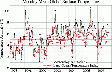
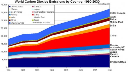
The chart I posted is for the last 13 years, 1996-2009. If CO2 emmissions have been exploding then why isn't there a direct correlation between CO2 emmissions and the rise in temperature. The chart shows that AGW is a crock of shit....:eusa_whistle:
 

A prefect twofer!
A perfect example of the gullibility of CON$ and the technique of deception the programmers use by rationalizating the most deceptive starting points.

The poster is gullible enough to think that chart supports Christy's and Spencer's UAH claim that "this" century's "102 months" (even though this century is 114 months old, a whole year suddenly disappeared from the UAH data :cuckoo:) [obviously a cold year :lol:] is -1.45 degrees C below last century's average.
First of all, the chart doesn't even show the last century!!!
Even starting the century at 2001 as thy do, they STILL don't show any -1.45 loss!!!!
The most anti Global Warming argument you could make about that cherry-picked segment is temps have leveled off, but there is no -1.45 loss.
The 102 months start in Jan 2001 at .5 degrees C and every year after that except 2004 averaged warmer than 2001, as well as warmer than every year before it except 1998.
But the brainwashed SEE the -1.45 degree C loss. :rofl:

This chart will show why the last century was deliberately left out by the poster.

glob-jan-dec-pg.gif

Dipshit....

The chart I posted is for the last 13 years, 1996-2009. If CO2 emmissions have been exploding then why isn't there a direct correlation between CO2 emmissions and the rise in temperature. The chart shows that AGW is a crock of shit....:eusa_whistle:

Typical CON$ervative deception, when caught making a fool of oneself, try to change the subject.

The post you replied to was about UAH falsely claiming that the last 8.5 years cooled by -1.45 C compared to the last century's average.
 
Last edited:
A prefect twofer!
A perfect example of the gullibility of CON$ and the technique of deception the programmers use by rationalizating the most deceptive starting points.

The poster is gullible enough to think that chart supports Christy's and Spencer's UAH claim that "this" century's "102 months" (even though this century is 114 months old, a whole year suddenly disappeared from the UAH data :cuckoo:) [obviously a cold year :lol:] is -1.45 degrees C below last century's average.
First of all, the chart doesn't even show the last century!!!
Even starting the century at 2001 as thy do, they STILL don't show any -1.45 loss!!!!
The most anti Global Warming argument you could make about that cherry-picked segment is temps have leveled off, but there is no -1.45 loss.
The 102 months start in Jan 2001 at .5 degrees C and every year after that except 2004 averaged warmer than 2001, as well as warmer than every year before it except 1998.
But the brainwashed SEE the -1.45 degree C loss. :rofl:

This chart will show why the last century was deliberately left out by the poster.

glob-jan-dec-pg.gif

Dipshit....

The chart I posted is for the last 13 years, 1996-2009. If CO2 emmissions have been exploding then why isn't there a direct correlation between CO2 emmissions and the rise in temperature. The chart shows that AGW is a crock of shit....:eusa_whistle:

Typical CON$ervative deception, when caught making a fool of oneself, try to change the subject.

The post you replied to was about UAH falsely claiming that the last 8.5 years cooled by -1.45 C compared to the last century's average.

Typical chicken little lunacy when you can't explain why temperature and CO2 emmissions aren't directly correlated you claim the chart is false.

Again, rather than admit UHA lied about a -1.45 C drop in temp the last 8.5 years as compared to the last century's average just continue to try to change the subject even though the chart YOU posted does not have anything to do with CO2, but somehow gives permission to UHA to lie about 102 months of global cooling. Brilliant rationalization. :cuckoo:

Ok genius post where I listed UHA as a source?:cuckoo:

Btw...look at CO2 emmissions over the same period 1996-2009 hmm....no correlation

http://photos.mongabay.com/07/co2_country_area_2030-max.jpg
$co2_country_area_2030-max.jpg
 

Forum List

Back
Top