I'm really disappointed in you Ian. You haven't spent one word attempting to defend what Spencer did with that data or those model results. Sou's reveal is correct. Spencer tried to argue with her and failed. You haven't even tried. Spencer's graph is complete shite and you soil yourself pushing it.
hmmm....I have a suggestion for you crick. every time you feel 'disappointed' with me I think you should go back and re-read my comments because you probably havent understood them.
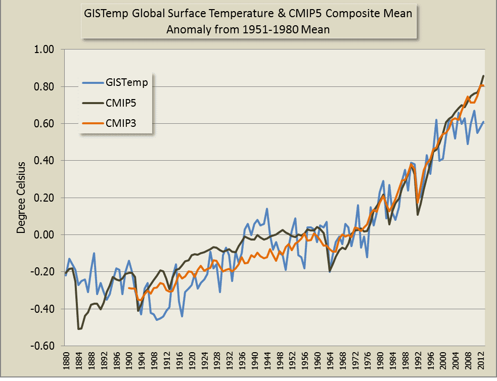
my position is that the Christy graph showing trend lines only, with every line starting at 1979 is the most informative and easily understood graph. the models run hot.
the problem with comparing things on a graph is how to show what changes are happening. to do that you have to 'normalize' the starting position on the graph so that everything starts at the beginning and the changes are obvious. there is no 'right' way to do it. it is always a trade off to lose some precision but get a more easily understood comparison. still with me?
you (actually Sou, you seldom have original thoughts) decided that she didnt like the way Spencer normalized the starting values (offsets). no matter what values you use, the trend for the models is higher than the trend for the measured temperatures.
if you offset the models to a lower value, they will take longer to diverge out of the +/- error range. but they are still diverging. even the IPCC graph shows that they are diverging and have just about broken out of the 95% significance level.
and for RCP4.5 to boot.
you say I should be defending Spencer. why? I dont particularly like the way he did his graph. if he used the 5 year average from 79-83 then he should have started plotting from 81 in my mind, but so what?
the models run hot!! no amount of complaining over offsets is going to change that.