toobfreak
Tungsten/Glass Member
- Apr 29, 2017
- 102,897
- 110,199
- 3,615
Newsweek produced a safety study that just released today pointing to the safest and most dangerous states.
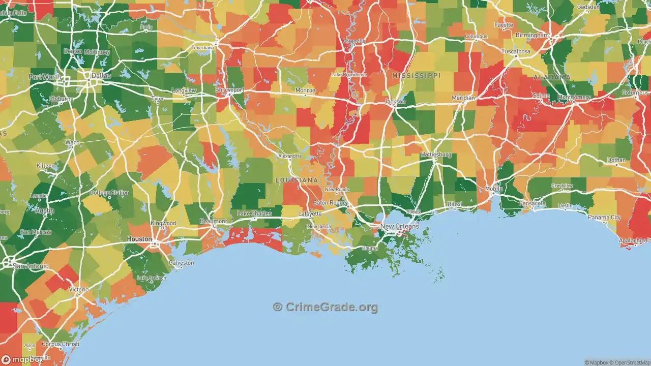
Oh goodie. What braindead idiot decided on plotting their data as all various shades of grape? Were all their other crayons rented out that day? Basically, all the chart shows is either dark grape of light grape with medium grape barely distinguishable in the middle.
And no mention of the various scores for the various factors (air, crime, COL, etc.) scored state by state so we can see the data that went into their scoring.
")